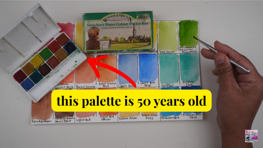
I found this vintage Winsor & Newton watercolor set online, and I have no idea exactly how old it is. But based on the packaging, I realized it might be older than me! So, I decided to become a watercolor archaeologist and find out what watercolor painting looked like decades ago, before the internet, and before most of the paints we use today even existed.
I examined this set, looking for clues for its age, and learning a little about watercolor history and vintage vs modern color choices along the way.
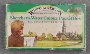
The set comes in a small paper box that measures 4” x 2” x 3/4”. On the back, I found a description of the set in four different languages, along with this manufacturing address:
Whitefriars Avenue, Wealdstone, Middlesex HA3 5RH, England
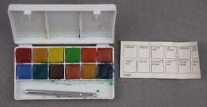
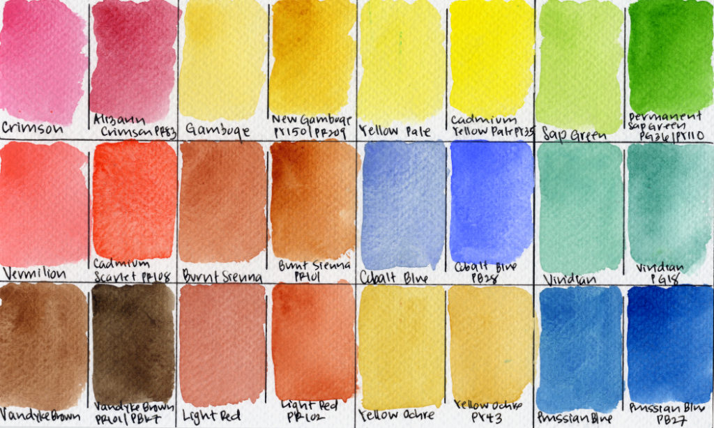
Taking a look inside, the set included 12 half pans in a compact plastic palette, very similar to the box that Winsor & Newton uses for their Cotman sets. The paints included are:
- Crimson
- Gamboge
- Yellow Pale
- Sap Green
- Vermilion
- Burnt Sienna
- Cobalt Blue
- Viridian
- Vandyke Brown
- Light Red
- Yellow Ochre
- Prussian Blue
Of course, I was very curious about when this set might have been released, and so I looked to the address for clues. Winsor & Newton was established in 1832, although they didn’t begin manufacturing paint in the Wealdstone district in London until 1937. This location closed in 2010 when Winsor & Newton moved their manufacturing to France in 2010. So, I am reasonably sure that this set was made before 2010.
Another clue would be the name of the conglomerate that owns Winsor & Newton on the label. The company was owned by Reckitt & Colman until the early 1990s, when they sold the company to ColArt. Unfortunately, the packaging makes no mention of that, and so no clues there.
My next clue was in the pamphlet, which mentions that Cotman watercolors are available in tubes, although not in pans at that point. The Cotman line was introduced in the 1960s, and so I can be sure that this set is not from earlier than that.
But the biggest clues for me actually came from the paints themselves. Modern watercolor artists know the difference between PB29 and PB27. We debate granulation, transparency, and lightfastness online. But, before the 1990s, most artists never saw a pigment code at all, because it was not common pratice for companies to publish pigment information. Most artists simply bought paints by name: alizarin crimson, sap green, gamboge, etc. If this set were from the 1990s onward, I’d expect at least some pigment information, or the word “hue” or “permanent” in some of these paints like Crimson and Gamboge. I’d also expect this set to include Winsor & Newton’s proprietary paints, like Winsor Yellow, Windsor Blue, and Winsor Green if it was made from the 1990s onward.
The color selections themselves are also clues. The palette feels like a very traditional “English Landscape” palette.
- Van Dyke Brown was a very common paint to include in landscape palettes in the 1960s and 1970s. WN still carries it, but their modern 12-pan set doesn’t come with it anymore.
- Light Red is another paint common in vintage watercolor palettes, and it was a staple for bricks and soil. While WN still carries, they also no longer include it in their modern 12-pan set.
- But the biggest clue was the combo of Cobalt Blue, Prussian Blue, and Viridian. Modern palettes have almost universally replaced these with Ultramarine Blue, Phthalo Blue, and Phthalo Green because they are much cheaper.
Again, this feels like a very classic mid-20th century landscape palette, in the tradition of Victorian landscape painters, with lots of earth colors and paints with limited chroma.
Based on all this, along with the packaging, the old Wealdstone address, the traditional color selection, and the lack of pigment information, I’d date this set to the late 1970s-early 1980s, which makes this palette about 40-50 years old.
I swatched all the paints, and compared them to the modern Winsor & Newton equivalents – do check out the above video for all the details!
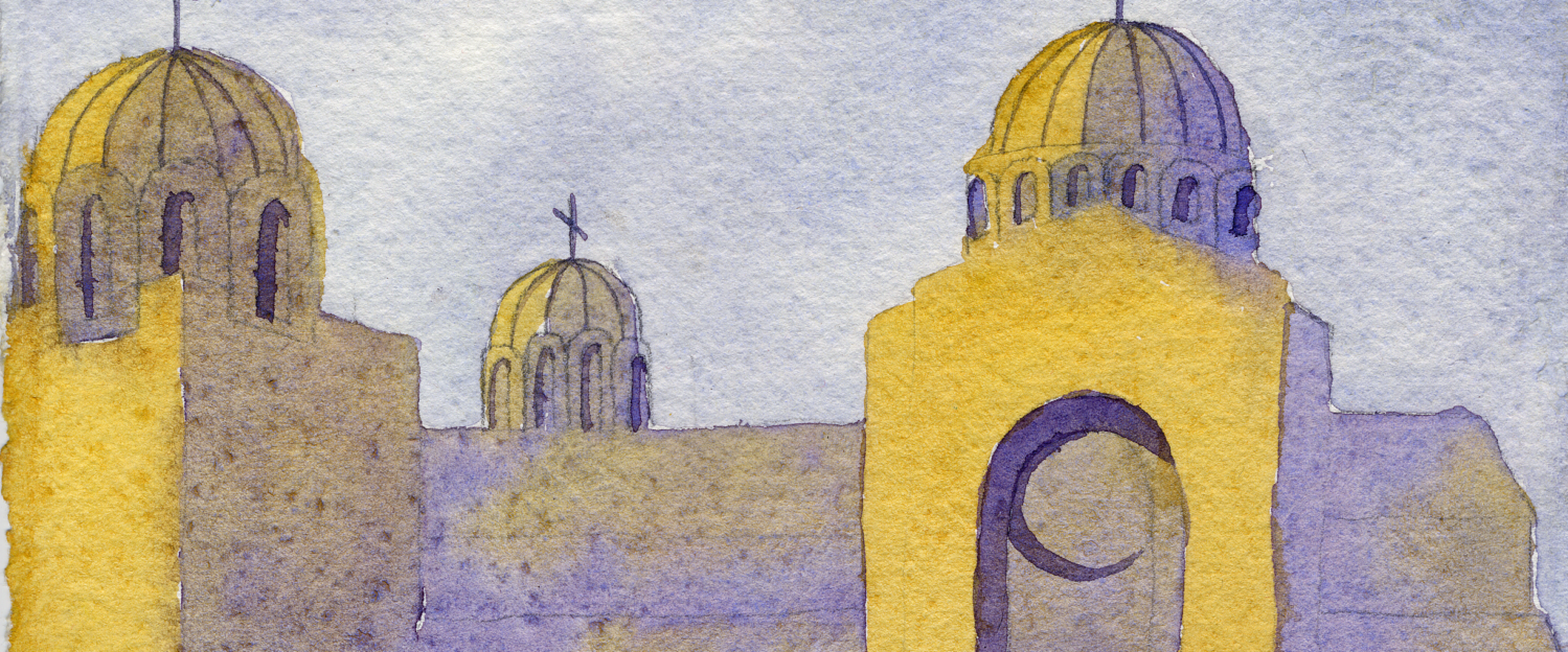
These days, my modern palette is organized around pigment chemistry and behavior, and I know the pigment codes of every single one of my paints. But, this vintage palette is organized around color names only, and this is really illustrative of the change in watercolor culture in the last 40 years. And the fact that it’s called a Sketcher’s Box is perfect, because it tells you exactly what Winsor & Newton thought watercolor was for at the time: not studio painting, not color theory exercises, but taking this little box outside, sitting in front of a church, river, or village scene, and making a sketch. And I think that’s pretty cool.
Could an artist in 1985 make a beautiful watercolor with this set? The answer is definitely yes. As a pigment and paint collector, we often spend a lot of time chasing the newest pigments and palettes, but artists have been sketching casually with far fewer color options – and far less information – than we have today. So, make that your motivation to grab your brushes and paint today.
Thank you for joining me today for this deep dive into watercolor history! Stay curious, and happy painting.