
This month:
- Rosa Gallery reformulated their watercolor line
- Phoenix may have quietly admitted their pigments were mislabeled
- Schmincke released the nerdiest watercolor set I’ve ever seen
- Daniel Smith debuted their inventory registry
- And an artist tested which blue creates the best portrait shadows.
This is the Watercolor News Report for May, and as usual, all the links are in the titles – let’s dive in!
Paint Releases and Updates
Schmincke Releases a Wonderfully Nerdy Historic Watercolor Set
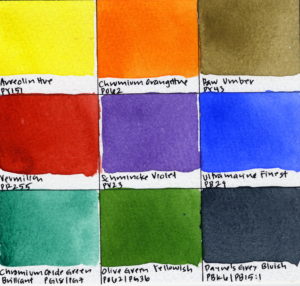
Schmincke recently released one of the most wonderfully niche watercolor sets I’ve seen in a while: a retro-inspired HORADAM set based on the old DIN 201 technical drafting standard once used by architects, engineers, and surveyors. According to Schmincke, each color historically corresponds to a different construction material in technical drawings, like orange for bronze and wood, purple for cast steel, and grey for concrete and stone masonry.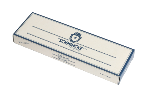
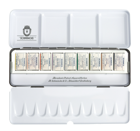
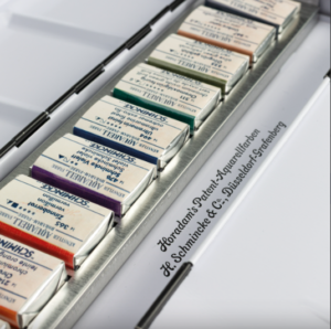
The set includes nine colors in a revived historical metal palette and labels, including:
- Aureolin Hue PY151
- Chromium Orange Hue PO62
- Raw Umber PY43
- Vermilion PR255
- Schmincke Violet PV23
- Ultramarine Finest PB29
- Chromium Oxide Green Brilliant PG18/PG7
- Olive Green Yellowish PO62/PG36
- Payne’s Grey Bluish PBk6/PB15:1
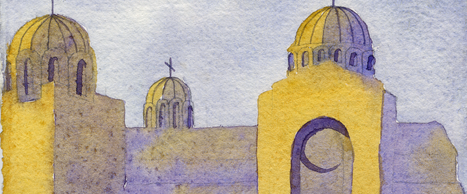
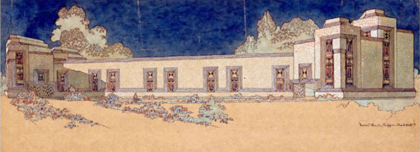
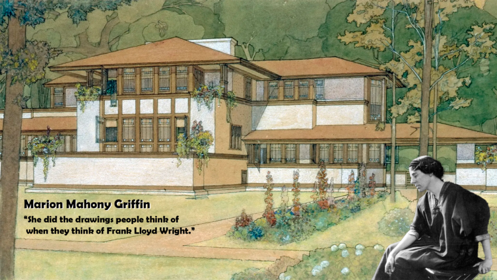
What makes this especially interesting to me is that it connects directly to a whole tradition of architectural watercolor rendering before the digital era. Architects and illustrators carefully designed harmonious compositions using restrained palettes, simplified value structures, and grouped masses to communicate visual information. One of the most important figures in this tradition was Marion Mahony Griffin, whose stunning watercolor renderings for Frank Lloyd Wright and later the Canberra city plan in Australia helped define the visual language of Prairie School architecture in the early 20th century. Her work integrated architecture, landscapes, and atmospheric watercolor washes in ways that still feel modern today.
This feels like the perfect example of the kind of deeply nerdy art history release that I like to see. Even outside of the historical angle, the palette itself actually is harmonious and usable for modern urban sketching.
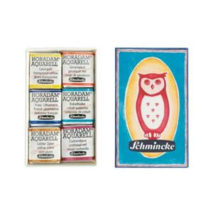
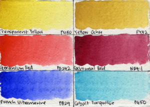
Schmincke’s Tiny Matchbox Set Is One of the Cutest Releases of the Year
Speaking of Schmincke, I also had a chance to take a closer look at their tiny retro-inspired Matchbox watercolor set, which is absurdly tiny and quite charming. The literal matchbox with the Schmincke logo and the inclusion of a rare historical pigment make this set a collector’s item, but the palette itself is also usable and thoughtfully designed. The set includes six half pans, including:
- Transparent Yellow PY150
- Yellow Ochre PY42
- Geranium Red PR242
- French Ultramarine PB29
- Cobalt Turquoise PG50
- And the historical pigment Cochineal Red NR4:1
I actually made an entire video breaking down the set – swatching the colors, analyzing the palette, and examining who I think this palette is really for – check it out below. I’ll also be bringing you a complete analysis of Cochineal Red next week, so make sure to subscribe to my channel so you don’t miss out.
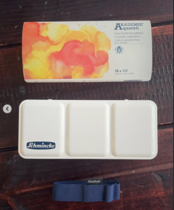
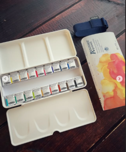
Schmincke Releases a Limited Edition Akademie Plein Air Set
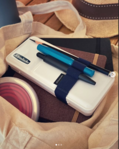
Schmincke also released a limited edition plein air set for their student-grade AKADEMIE watercolor line. The set includes 18 half pans housed in a compact white plastic travel palette, along with a built-in elastic band designed to hold brushes or pencils while keeping the palette securely closed during transport.
This is a smart design for outdoor painting and travel sketching. I’ve noted in previous Watercolor News Reports that watercolor companies seem to be releasing a huge number of plein air sets lately, likely reflecting the growing popularity of plein air painting and travel sketching within the watercolor community. I like to see more brands putting real thought into travel sets lately, especially as plein air painting and urban sketching continue to grow in popularity.
That said, I’m not a huge fan of the AKADEMIE paints themselves. In my experience, other student-grade lines like Van Gogh by Royal Talens, Sonnet by Nevskaya Palitra, and Shinhan Professional by Shinhan are all much cheaper and noticeably better performers. Still, for artists who already enjoy Schmincke products or want a compact all-in-one travel setup, this could still be an appealing option.
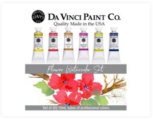
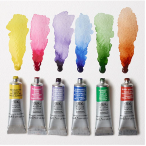
Da Vinci Releases a New Floral Watercolor Set
Da Vinci released a new floral watercolor set. The set comes with six 15mL tubes, and includes:
- Da Vinci Yellow (PY154)
- New Gold (PR101/PY83)
- Quinacridone Red (PR209)
- Magenta Rose Quinacridone (PR122)
- Phthalo Blue Red Shade (PB15)
- Leaf Green (PG7/PY65)
Overall, I actually think this is a really strong palette: vibrant, transparent, and full of high-tinting colors that make a lot of sense for floral painting.
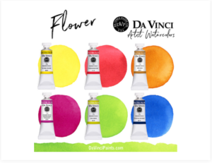
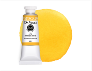
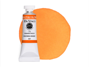
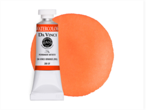
My only critique is the inclusion of PY83 in New Gold, since it’s a pigment that is only marginally lightfast. Personally, I probably would have preferred something like Arylide Yellow Deep (PY65), Benzimida Orange (PO62), or Da Vinci Orange (PO73), all of which are lightfast and work beautifully in floral palettes. Still, I think this is a thoughtfully designed set overall, and I definitely recommend checking it out if you enjoy bright, modern floral palettes.
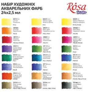
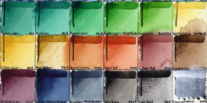
Rosa Gallery Reformulates Their Student-Grade Line
Rosa Gallery has released two new watercolor sets in their student-grade line, Rosa Studio: a Plein Air set and a Portrait set, each available in both 16-pan and 24-pan versions.
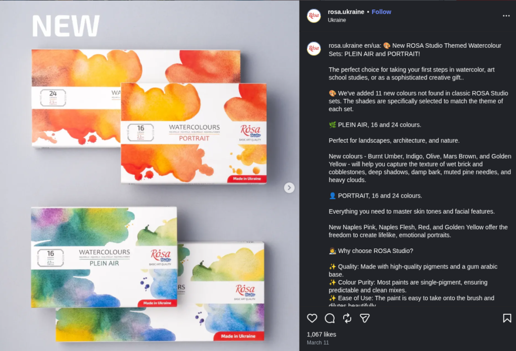
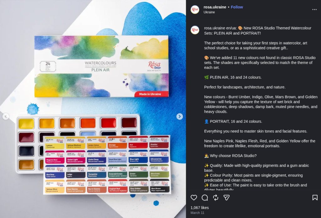
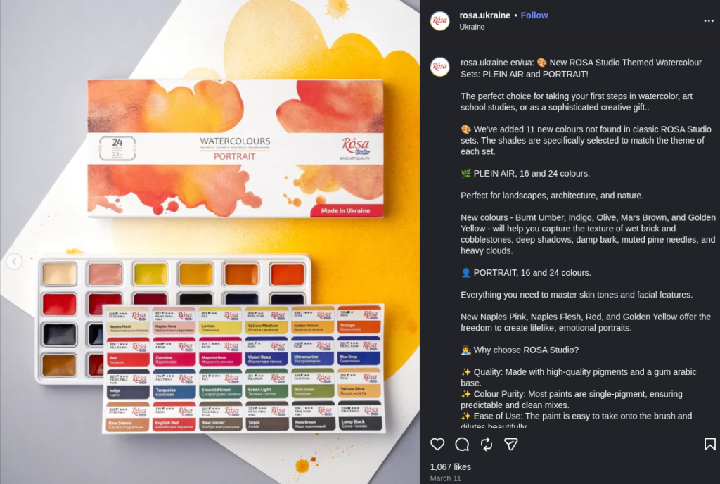
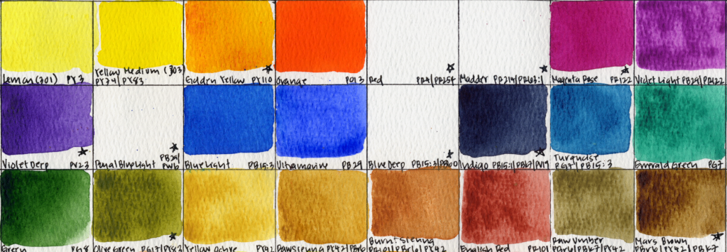
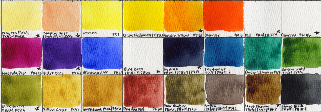
Their original lineup included only 24 paints, which were conveniently available in a 24-pan set. They’ve now added several new interesting choices to their range. The additions include lightfast paints like Royal Blue Light PB29/PW6, Golden Yellow PY110, Magenta Rose PR122, and Blue Deep PB15:3/PV19. They also changed the pigments in two of their paints: Violet Deep was PV3 and is now PV23, Madder was PR144/PR63:1 and is now PR214/PR63:1, and Carmine was PR57:1 and is now PR146. I’ve marked all the new paints and pigment changes with an asterisk. (Magenta Rose, Olive Green, Indigo, and Mars Brown are almost identical to their professional line, so I included them in the swatches). The lineup still includes several fugitive pigments, but that is to be expected in most student-grade paints.
Between the two, I think the Portrait Set is the most well balanced, and includes most of their new paints. I do wish they hadn’t included Naples Flesh and Naples Rose. I’m not a fan of pastel paints in portrait palettes because white pigments can make watercolor layering and wet-on-wet more difficult, and watercolor portraits are usually built using these techniques. I also dislike the idea of the “flesh tone” colors being pale beige or pink, especially considering that most skin tones in the world are not close to those hues. Overall, these sets are probably going to be a pass for me, but let me know if you’ve had a chance to try them out.
Phoenix Watercolor Quietly Changes Pigment Information on Professional Line
When Phoenix first released their Professional Watercolor line at the end of 2025, it felt like one of the most exciting budget releases of the year. Around $90 for 36 15 mL tubes was shocking, especially considering that several colors were listed as traditionally expensive mineral pigments like Viridian PG18 and Cerulean Blue PB35. I published a complete review of this set, and initially came away really impressed by the value.
But recently, I noticed something interesting while revisiting the pigment charts on their website: several pigments appear to have quietly changed. Viridian is now listed as PW6/PG7 instead of PG18, which aligns much more closely with how the paint actually behaved in my earlier testing. Cerulean Blue also appears to have changed from PB35 to PW6/PB15, again matching my suspicion that it didn’t behave quite like a traditional cerulean. Even more surprising, Permanent Mauve, previously listed as PV16 Manganese Violet, is now PW6/PR122.
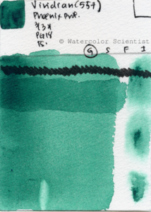
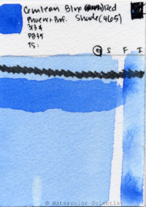

To be clear, I still think the set is probably a very solid value for beginners and intermediate painters, especially since it still includes Cobalt Turquoise PG50, Perylene Violet PV29, and Mars Black PBk11.
But I do wish the company had been more transparent about the reformulations and labeling changes, especially because I suspect that the pigments were never accurate to begin with. This turned into a good reminder that watercolor labels don’t always tell the full story, and that sometimes careful observation of paint behavior by artists in the community can reveal discrepancies long before the manufacturer updates the pigment information.
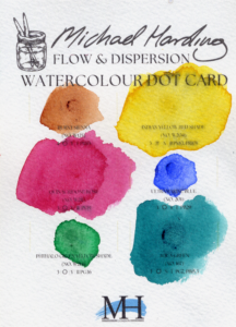
Michael Harding Releases Watercolor Dot Cards
Michael Harding has released new dot cards for their watercolor line, which is a great way to try the brand without committing to full tubes. Their paints have developed a strong reputation for rich pigment loads and smooth handling, and dot cards are honestly one of the best ways to test a watercolor line since you can experience the actual flow, granulation, transparency, and rewetting of the paints firsthand.
I did try the Flow and Dispersion dot card, which included two paints I hadn’t tried in their range: Indian Yellow PY83/PR101 and Phthalo Green Yellow Shade PG36. Each dot had a decent amount of paint, and as with all of Michael Harding paints, they were incredibly vibrant and beautiful.
Dot cards a smart move for a watercolor line that’s still relatively new compared to long-established brands. If you’ve been curious about Michael Harding watercolors, this is probably one of the most affordable ways to explore the range at less than $5 USD per card.
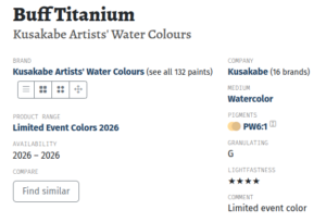
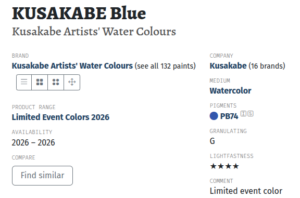
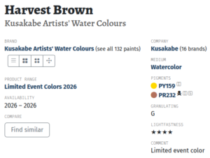
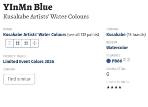
Kusakabe Announces Three Limited Edition Colors for 2026
Kusakabe has announced four new limited edition watercolor paints for 2026: Kusakabe Blue (PB74), Harvest Brown (PY159/PR233), YInMn Blue (PB86), and Buff Titanium (PW6:1). The selection is really interesting to me because it includes a rare pigment: YInMn Blue. QoR and Schmincke had this very pricey pigment in their range for a hot second in the past as well. I’ve never been able to try it, and I don’t think I’ll be able to try Kusakabe’s version since their paints are not common in the US.
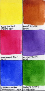
Winsor & Newton Releases a Floral Watercolor Set
Winsor & Newton has also released a new floral watercolor set. The set comes with six 5mL tubes, and includes:
- Aureolin Hue PY151/PBr7
- Burnt Sienna PR101
- Permanent Rose PV19
- Winsor Violet PV23
- Ultramarine Blue Green Shade PB29
- Hooker’s Green PY110/PG36
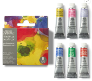
I tend to like floral sets because they always include high-chroma transparent paints, and that’s true for this set as well. You’ve got a strong cool red and a violet for vibrant petals, a warm earth tone for muting mixes, and Ultramarine Blue Green Shade is an excellent mixing blue. Additionally, Hooker’s Green is a vibrant home-base green that you can quickly mute with Burnt Sienna or Permanent Rose. This palette would work well for landscapes, portraits, and botanical studies as well.
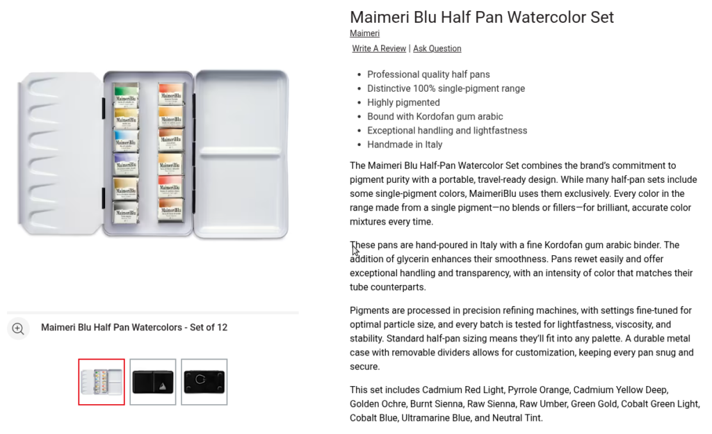
MaimeriBlu Releases a New 12 Half-Pan Watercolor Set
MaimeriBlu has released a new 12 half-pan watercolor set housed in a small metal tin. The set includes:
- Green Gold PY129
- Cadmium Yellow Deep PY35
- Raw Sienna PBr7
- Raw Umber PBr7
- Gold Ochre PY43
- Burnt Sienna PBr7
- Pyrrole Orange PO71
- Cadmium Red Light PR108
- Ultramarine Blue PV15
- Cobalt Blue PB28
- Cobalt Green Light PG50
- Neutral Tint PBk26
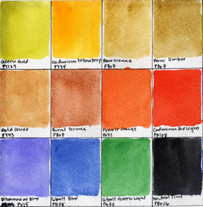
MaimeriBlu exclusively offers only single-pigment paints, and overall I really like their paints. I initially thought this palette included both Ultramarine Blue PB29 and Cobalt Blue PB28, but MaimeriBlu’s Ultramarine Blue is actually PV15, and it is identical to an Ultramarine Violet. This is an unusual addition to a set, and I like that.
The palette leans very heavily into yellow earth colors, and I’d argue that three is too many for a 12 pan set. Additionally, I don’t think earth pigments are MaimeriBlu’s strong suit. To me, the line really shines with their cadmiums, cobalts, and especially their transparent phthalos and quinacridones, which feel much more vibrant and distinctive. I would have loved to have a cool red or cool blue for mixing flexibility instead of Gold Ochre, which is one of my least favorite paints in the line.
One inclusion I really appreciate is their Neutral Tint, which uses the very unusual pigment PBk26. It creates these incredibly deep dark values and is a really fun paint to experiment with.
The biggest issue for me, though, is the price. At around $150, I honestly think this is a pretty rough value proposition, especially considering you can often find MaimeriBlu sets with six 12 mL tubes for around $30. So while I think the paints themselves are excellent, I’m not convinced this particular set makes a lot of sense financially.
Holbein Introduces New Chroma Pearl Watercolors
Holbein recently announced a new line of Chroma Pearl Watercolors, a series of iridescent “pearl-infused” paints designed to shimmer and shift in the light. The collection includes eight colors: Red, Pink, Yellow, Lime, Green, Blue, Azure, and Violet.
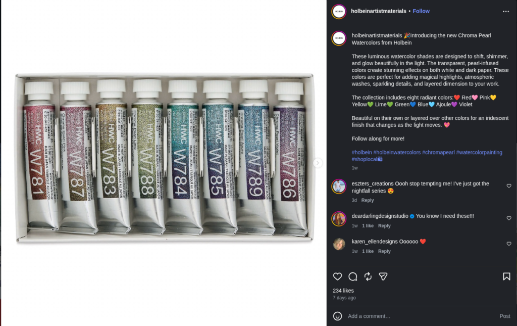
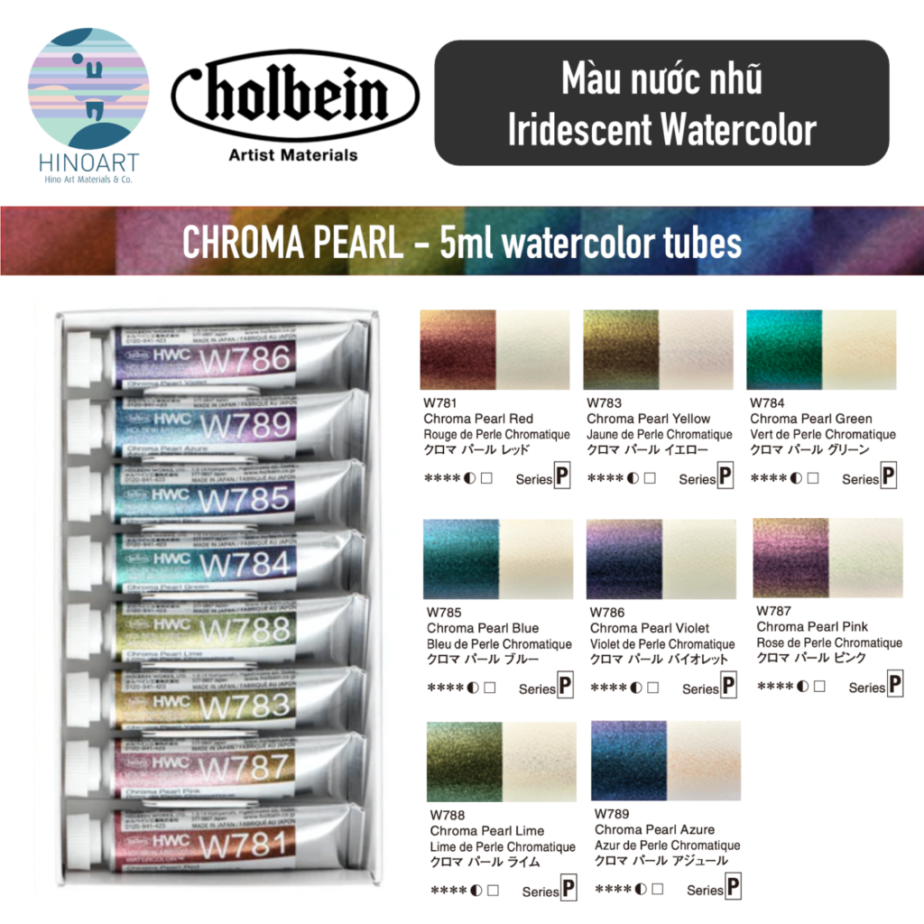
Iridescent and mica paints are not my thing. I tend to prefer traditional watercolor effects over shimmer or metallic finishes. That said, some of the mica-based paints I’ve tried from brands like Paul Rubens and White Nights have been very rich and heavily pigmented. And since I already really enjoy Holbein’s watercolor line overall, I’m hopeful these will be good quality for artists who enjoy incorporating pearlescent effects into their work.
Blick Acquires Plaza Art
One of the bigger art industry stories recently is that Blick has acquired Plaza Art, continuing the long trend of consolidation within the art supply world. Plaza Art was especially well known on the East Coast and in the Washington D.C. area, and for many artists it had a more local and authentic feel compared to larger national chains. Their website goes directly to Blick’s site as of March 19th.
This isn’t new territory for Blick. Over the years, the company has also acquired regional chains like Utrecht, and increasingly feels like the dominant force in the American brick-and-mortar art supply market. On one hand, Blick stores are incredibly well stocked and accessible, which many artists appreciate. But on the other hand, it’s always a little bittersweet to see beloved regional art stores disappear into larger corporate brands. I think a lot of artists have mixed feelings about this trend overall.
Watercolor Science Watch
Mijello Shares a Surprisingly Thoughtful Breakdown of Palette Staining
One of the interesting watercolor science posts I came across this month was a “Color Lab” breakdown from Mijello discussing why some watercolor pigments stain palettes more than others. The post explains that staining is largely a physical process rather than a chemical one, with smaller organic pigment particles tending to penetrate micro-pores in palette surfaces more easily, while larger inorganic pigments are more likely to sit on the surface and wipe away cleanly.
I think it’s really cool to see a paint company discussing particle size, staining behavior, and pigment structure in an educational way. I would love to see more watercolor brands lean into this kind of pigment science content instead of relying purely on marketing buzzwords.
Daniel Smith Breaks Down How to Read a Watercolor Tube
Daniel Smith recently published a useful guide explaining how to actually read the information printed on a watercolor tube, including pigment codes, lightfastness ratings, transparency, staining, and series pricing. Honestly, I think this kind of knowledge is one of the most empowering things a watercolor artist can learn, because it allows you to build palettes, and ultimately create art, with much more confidence and understanding of your materials.
It’s easy to think of paint names as just marketing, but once you understand how to interpret pigment information, you start realizing why certain paints granulate, why some mixtures become muddy, why some colors fade faster, or why two paints with similar names behave completely differently.
I appreciate seeing paint companies encourage artists to become more informed consumers. Understanding your paints deeply changes the way you approach mixing, palette design, and even subject selection. Definitely worth reading if you’re newer to watercolor or if you’ve ever felt overwhelmed by all the information printed on paint tubes.
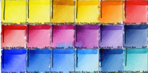
Testing the Best Blue for Watercolor Portraits
Another fun piece of watercolor experimentation this month came from watercolor portrait artist Miwa Gardner, who tested three different blues in portrait painting: Ultramarine Blue PB29, Phthalo Blue Green Shade PB15:3, and Phthalo Blue Red Shade PB15:6. I always love seeing artists exploring color choices scientifically instead of relying on old fixed rules, especially in portraiture where there is so much room for subjective portrayal of emotion.
For the experiment, they used PY154 and PR254 as their control pigments and compared how each blue behaved when mixed into portrait palettes. Their results were fascinating: they found that Ultramarine Blue PB29 created the most natural-looking shadows overall, likely because of its red bias and granulation. Meanwhile, Phthalo Blue Green Shade PB15:3 produced very intense, punchy mixtures that could easily push skin tones too blue. Phthalo Blue Red Shade ended up feeling like a really nice middle ground between the two: punchier than Ultramarine, but not quite as overpowering as PB15:3.
I liked how practical and visually clear the comparisons were, and I’d love to see more artists openly test pigments this way instead of relying on vague “warm vs cool” color theory discussions.
Daniel Smith Launches a Paint Inventory Registry
Daniel Smith has launched a new online paint inventory registry. The system lets you catalog your paints and filter them by properties like granulation, staining strength, transparency, and whether they’re single-pigment colors, which is useful for palette planning and avoiding buying paints with similar properties.
My one disappointment is that you can only register Daniel Smith paints. I think it would have been amazing if the system supported paints across multiple brands so artists could organize their entire watercolor collection in one place. You also have to create an account to use it. Still, it’s a fun and thoughtful tool, especially for artists who already use a lot of Daniel Smith colors.
Stephen Quiller Breaks Down the Different Types of Watermedia
American Watercolor recently published an article by Stephen Quiller breaking down the differences between watercolor, gouache, acrylic, and casein. Quiller discusses not just the technical differences between the media, but also how they personally use each one in the field and studio depending on the subject, portability, layering needs, and surface quality.
I’ve taken one of Quiller’s color theory classes before, I really appreciate how thoughtfully they approach art materials. I learned a lot about the tradeoffs between the different watermedia – for example, watercolor being easy to lift and transport, acrylic allowing permanent glazing layers, gouache offering matte opacity, and casein sitting somewhere in between with its velvety surface and gradual curing process.
I also think it’s refreshing to see an artist openly talk about mixing different watermedia instead of treating watercolor as a rigidly pure medium. Definitely worth checking out if you’re curious about expanding beyond traditional transparent watercolor.
Liz Steel Breaks Down Lost-and-Found Edges
Urban sketcher Liz Steel recently published an article about lost-and-found edges in watercolor and drawing, and I think it’s one of those concepts that can completely change how people think about realism and focus in painting. Instead of outlining every object equally, they talk about intentionally allowing some edges to disappear while sharpening others, which helps guide the viewer’s eye and creates a much stronger sense of atmosphere and depth.
I like that they approached the topic very practically rather than theoretically, showing how softening or completely losing edges can simplify busy scenes and keep paintings from feeling overly stiff or overworked. I spent a whole week learning about edges in watercolor during Pleinairpril this year, and I think edge control is one of the most underrated skills in watercolor because so much of watercolor’s beauty comes from suggestion rather than complete definition.
Art Market Highlights
Charles Demuth and the Power of Simplicity
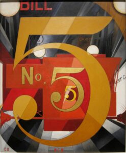
In art market news, a stunning sale this month was Blue Plums by Charles Demuth, which sold for $178,000 USD. Demuth was an American watercolorist known for his lively and precise still lifes, although his most famous painting is probably I Saw The Figure 5 in Gold.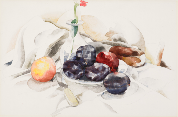
Blue Plums is an excellent example of his still lifes. The painting feels crisp and contemporary, with soft and luminous fruit isolated against a stark white background. It’s a strong example of how effective watercolor can be when artists fully embrace the white of the paper. Works like this remind me that ideas like selective detail, minimal backgrounds, and lost-and-found edges have deep roots in watercolor history.
John Marin Abstract Watercolor Sold Well Below Estimate
One watercolor that completely fascinated me this month was John Marin’s From the Bridge that appeared in Christie’s Modern American Art Online sale. What especially surprised me is that the painting sold well below estimate, which was a little shocking considering how iconic the piece is.
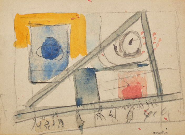
I suspect part of the reason is that Marin occupies an awkward place in the market where he’s historically important and deeply respected by watercolor artists and historians, but his more abstract works can still feel difficult for collectors compared to cleaner realist American watercolor paintings. The market for American modernism is also more selective unless a work is considered especially iconic or museum-level, and that goes double for watercolors.
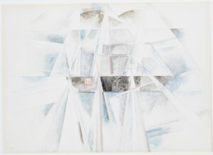
Personally, I found this painting incredibly compelling precisely because I’ve been deep-diving into composition lately. The way Marin creates harmony and balance with the warm yellows and reds across the painting, and invites us to look further using the triangle and the central enclosure, is really effective. There are so many competing elements, and yet your eye still moves through the painting in a surprisingly controlled way because of the little figures at the bottom – I feel like I can just see the people on their way to work during their morning commute. There’s a lot to learn from Marin’s understanding of visual rhythm and structure. Even over a century later, the painting still feels quite modern.
Upcoming Watercolor Exhibitions
Upcoming Exhibition: North American Watercolor Society Member Exhibition
The North American Watercolor Society announced the winners of the Member Exhibition, and it featured artists working across styles ranging from realism and urban sketching to loose atmospheric and experimental work. The full catalog has been published – check it out for insipiration for your art practice.
Upcoming Exhibition: Transparent Watercolor Society of America Exhibition Awards Announced
The Exhibition Awards for the Transparent Watercolor Society of America were also announced. They showcased everything from portraits to landscapes to still lifes, with styles ranging from extreme realism to dreamy abstraction and everything in between. Large international exhibitions like this are always fascinating because they bring together artists working across an enormous range of styles, from highly detailed realism and urban sketching to loose atmospheric and experimental work.
Upcoming Exhibition: Texas Watercolor Society’s 77th Annual Exhibition
The Texas Watercolor Society’s also published the results for the 77th Annual Exhibition on their site. The exhibition includes some stunning works. These kinds of exhibitions often end up being a great snapshot of where watercolor painting is heading regionally and nationally.
The LPAPA Waterworks Juried Watercolor Show Now on View
This annual exhibition by the Laguna Plein Air Painters Association showcases a wide range of contemporary watercolor work, from traditional plein air landscapes to expressive and experimental approaches to the medium. The exhibition is open from May 7th to June 1st in Laguna Beach, CA.
Women in Watercolor 2026 International Juried Competition Opens for Entries
The 7th Annual Women in Watercolor International Juried Competition is now open for entries! Sponsored by Holbein, this online-only exhibition celebrates women watercolor artists from around the world and features over $17,000 in cash awards along with additional merchandise prizes. Entry is open through June 8, 2026, and artists may submit up to five paintings across different categories including landscape, portrait, abstract, still life, and wildlife.
Thank you for joining me today for this month’s Watercolor News Report! Drop all your thoughts and questions in the comments, and as usual, happy painting!