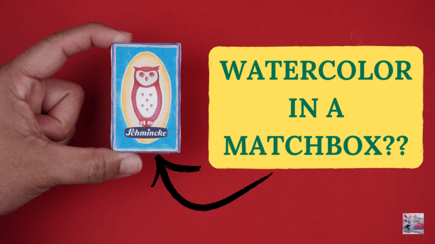
Today we’re taking a look at one of the most adorable watercolor sets I’ve seen in a while: Schmincke’s new Matchbox Set.
I almost never buy watercolor sets anymore. I’m pretty picky about pigments, and most pre-made palettes just don’t make much sense to me personally. Usually there are fugitive paints I don’t use, convenience mixtures I don’t want, or huge gaps in mixing potential.
But this set immediately caught my attention for two reasons.
First of all… it is tiny. Like absurdly tiny! It comes in this adorable little paper matchbox, which immediately activated the part of my brain that likes miniature art supplies. But more importantly, this set includes a half pan of Cochineal Red, pigment NR4:1. I have been wanting to try this pigment for a really long time.
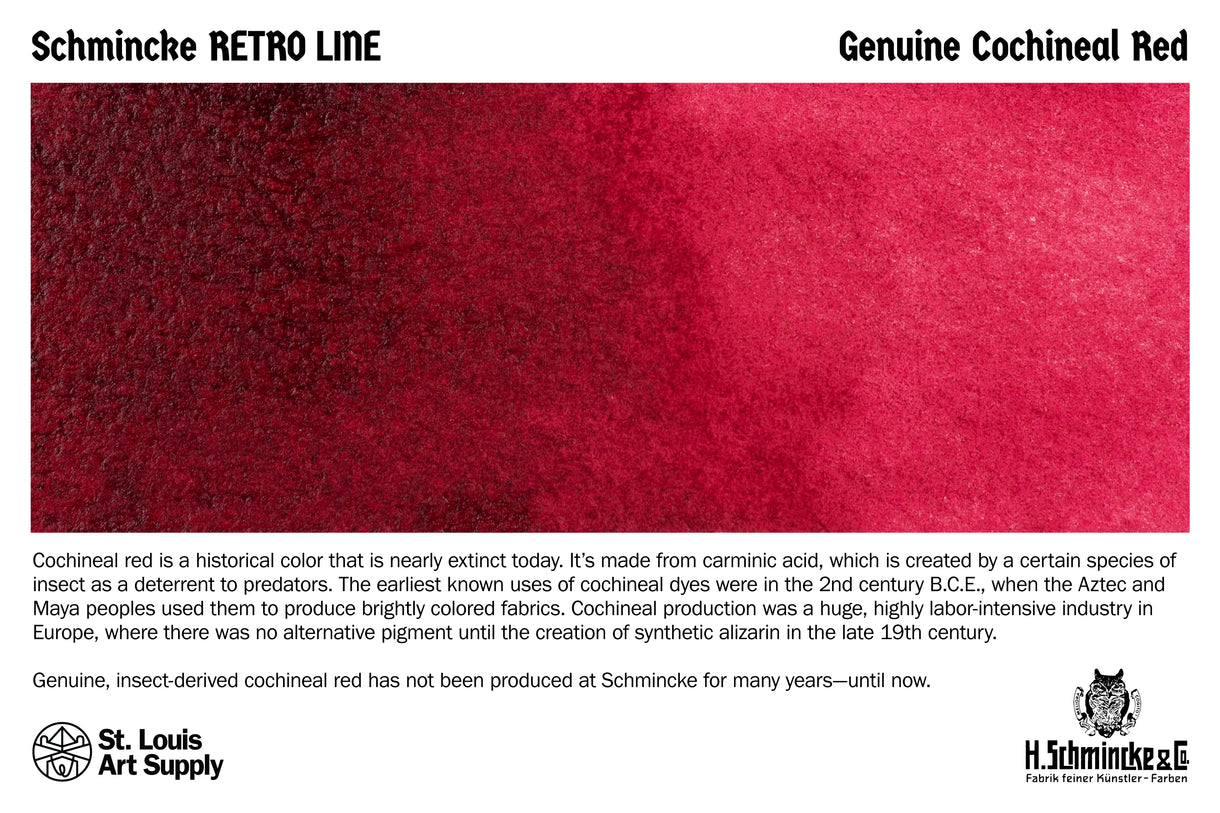
Up until now, I had only seen Schmincke offer it open-stock as a 15 milliliter tube for almost thirty dollars, which is a LOT for a pigment that is notoriously not lightfast. So when I saw I could finally try it in a smaller pan set, I was immediately curious.
What confused me, though, was the rest of the palette. Because Cochineal Red is part of Schmincke’s Retro Line, which focuses on historical pigments and historical painting experiences… but the other five paints in the set are not historical pigments at all. So I wondered: what exactly is this palette trying to do? Is this a historical palette? A modern travel palette? A novelty collector’s item? Or an experiment in combining historical and modern watercolor behavior together?
So naturally, I had to test it.
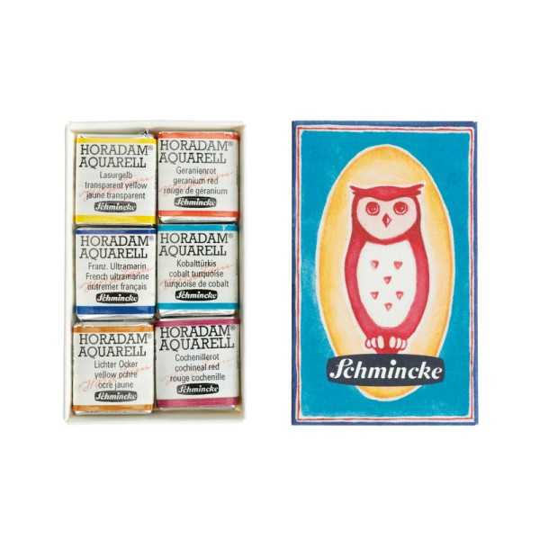
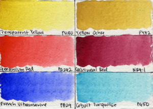
The set costs about fifty-eight dollars total, which comes out to around $9.75 per half pan. Inside, you get six colors:
Transparent Yellow PY150
Geranium Red PR242
Cochineal Red NR4:1
French Ultramarine PB29
Cobalt Turquoise PG50
and Yellow Ochre PY42.
You have a warm yellow, a warm red, a cool red, a warm blue, a turquoise, and an earth pigment. The palette definitely leans warm given that most of the paints are yellows and reds. Two of the pigments are transparent, three are strongly granulating, four are staining, and three are high tinting.
The personality of this palette starts becoming obvious pretty quickly once I started testing the mixes. This palette lends itself to dreamy atmospheric mixes!
Oranges are incredibly easy to mix here, which makes sense considering how warm-biased the palette is overall.
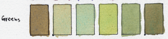
Muted greens were also very easy. Now, because there’s no cool yellow in the set, you really cannot make those super vibrant Leaf Green or May Green that you might get from something like PY3 or Lemon Yellow mixed with Phthalo Green. But I don’t really mind that. For landscape painting, muted natural greens are usually far more useful to me anyway, and this palette handles those beautifully.
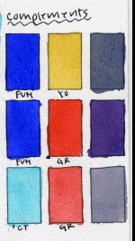
The complement relationships in this set are also really interesting. French Ultramarine mixed with Yellow Ochre creates this beautiful warm neutral that feels incredibly natural and earthy. Meanwhile, Cobalt Turquoise mixed with Geranium Red creates these cool, soft, light-valued neutrals that are absolutely gorgeous for atmosphere and distance.
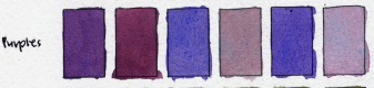
And then we get to the star of the show: Cochineal Red. This is a historical pigment that has disappeared from artists’ palettes due to poor lightfastness, eventually being replaced by pigments like Alizarin Crimson, Rose Madder, and later modern quinacridone pigments. While testing this palette, I was surprised to see that Cochineal Red behaves not like most historical pigments, but much more like modern cool reds, both in its hue and in its physical characteristics. So for today, I mainly want to focus on how it functions within this particular palette… but we are absolutely going to do a deeper dive on this pigment, so watch out for that in a couple of weeks. What I will say for now is that it creates some really beautiful soft violets with French Ultramarine and with Cobalt Turquoise.
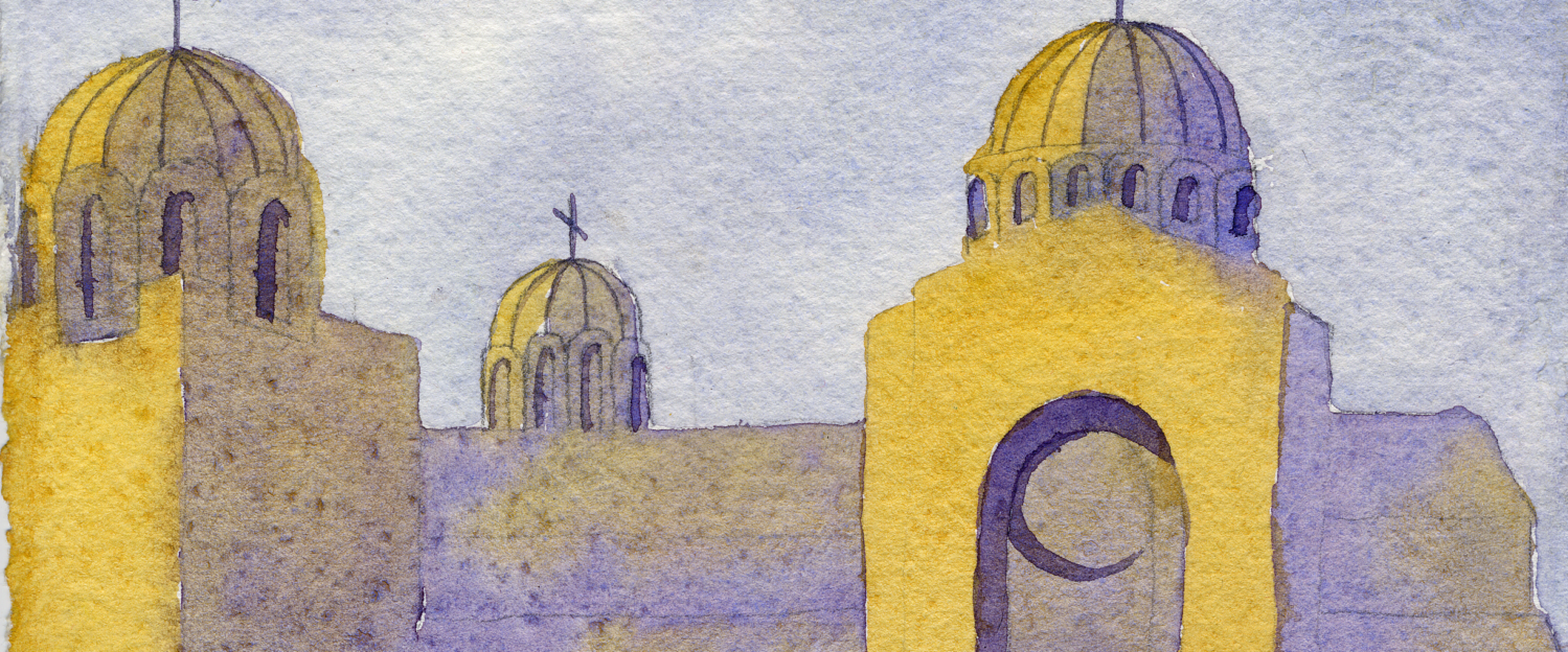
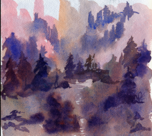
As always, I put my new palette through its paces with a full painting. As always, I start with a practice painting focusing on big shapes and values to see if it can do what I need it to do before committing to a full painting. I used my Khadi fat book – I always like doing sketchbook paintings first because it lets me understand how a palette actually behaves in a real painting situation rather than relying only on in swatches. I painted a soft dreamy landscape inspired by the mountains of New Mexico.
But during the painting, I realized something important about this limited palette. This palette is absolutely beautiful at creating granulating atmospheric washes. The first washes here are stunning – the granulation and separation, the soft textures…this palette absolutely excels at wet-on-damp atmospheric passages.
But once everything dried and I tried coming back in with darker finishing details, the limitation became very obvious. This palette really struggles to create dark neutrals because both blues, which are the backbone of a palette, are very granulating and this interferes with the resulting darkness of mixes. Adding dark details at the end is important to me in my paintings. My best dark mixtures were combinations of Transparent Yellow, Cochineal Red, and French Ultramarine… but even then, the mixtures never became as dark or inky as I personally wanted.
And suddenly I had this massive feeling of déjà vu because I realized this palette was reminding me of another set I’ve used before: the Urban Sketching Set by Roman Szmal. That set also relied on French Ultramarine and Cobalt Turquoise, both very granualting paints, as the mixing blues in the palette.
And while I absolutely loved the atmosphere those pigments created, I had the exact same problem there too. Granulating blues are gorgeous. But when you try to build really deep, unified, inky darks with them… things become much harder.
I don’t want you to think of this as a limitation, but rather as a revelation of what this palette is trying to do. This is not a palette optimized for maximum versatility. It’s a novelty palette with an interesting historical pigment, and the selection of paints are optimized for atmosphere. It prioritizes soft granulation, rich midtones, and dreamy landscape washes over super-dark values. And once I realized that, the set made a lot more sense to me.
Now, there are definitely things I would change. For me, I need a way to mix a dark neutral. If I really want to keep it in this box that fits only the six half pans, I’d probably sacrifice either the Yellow Ochre or the Cobalt Turquoise, and add either Indanthrone Blue PB60 or Phthalo Blue Red Shade PB15:6. This would dramatically improve the ability to mix dark neutrals and chromatic blacks.
Alternatively, you could simply supplement the palette with something like Payne’s Grey, Indigo, or Neutral Tint.
And while I absolutely loved finally getting to try Cochineal Red, I do think its poor lightfastness severely limits the long-term practicality of the set for me.I will likely swap it out for a lightfast cool red, maybe something like Alizarin Crimson Quinacridone PV19 by Da Vinci or Permanent Alizarin Crimson PR264 by M. Graham.
I should also mention that the matchbox itself truly is made of paper. It’s adorable and I love it, but I would not recommend painting directly from the box long-term because it will probably get damp and break apart over time.
So overall, my impression of this set is that it is less of a practical all-purpose palette… and more of a fascinating little atmospheric landscape palette with a historical twist.
I’m really glad Schmincke made something this weird and unique. Even when a palette isn’t perfect, it can still teach us something important about how pigments shape the kinds of paintings we make.
Thank you for joining us at Watercolor Scientist, where we ask weird questions, test our hypotheses, and share our results with the world!