Hi everyone, and welcome to Watercolor News Report — your monthly roundup of what’s new in watercolor, from paint releases and pigment changes to research, exhibitions, and the art market.
This week, we’re looking new paints by Rosa Gallery and Deep Deep Light, three exciting new sets by Winsor & Newton along with a shocking discontinuation, and a new travel set from Schmincke featuring one of my favorite artists. We’re also covering Daniel Smith’s new interactive color map, the importance of tap vs purified water in your paintings, major watercolor sales at auction, and exhibits you won’t want to miss.
If you enjoy these watercolor experiments and want to go deeper, I share a lot more behind the scenes on Patreon and here on YouTube.
Members get access to my Watercolor Lab Notebook, where I post high-resolution images of all my pigment deep dives and mixing experiments, and sneak peeks from the tests we run on this channel.
You’ll also get early access to new videos, the full replay of my Watercolor Lab livestreams, and the ability to vote on upcoming experiments. All the links are in the description of the video!
Paint Brand Updates, New Paints, and Discontinuations
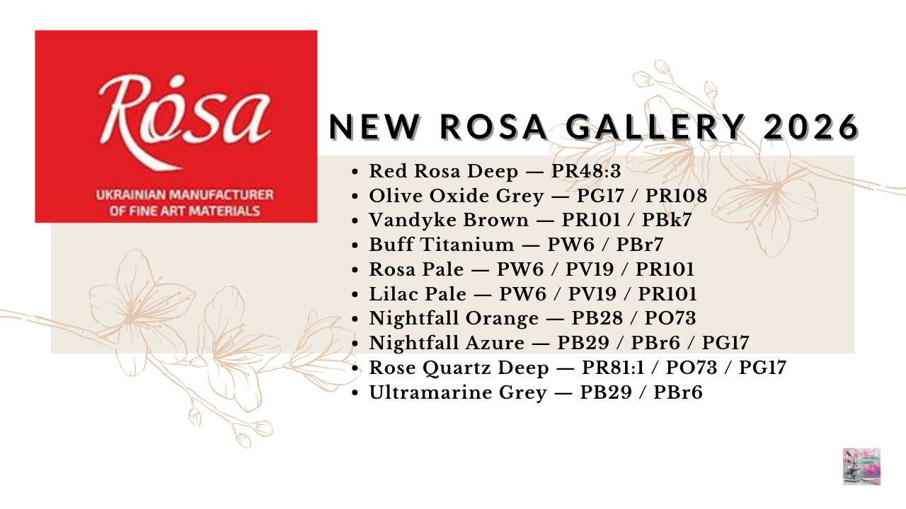
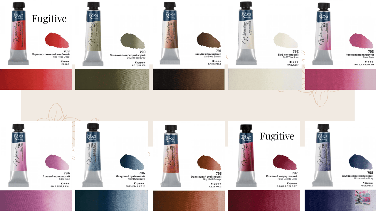
Rosa Gallery Releases 10 New Paints
Rosa Gallery has released ten new watercolor colors last month, many which feature mixes with Pyrrol Orange PO73, Chromium Oxide Green PG17, and Mars Brown PBr6.
- Red Rosa Deep — PR48:3
- Olive Oxide Grey — PG17 / PR108
- Vandyke Brown — PR101 / PBk7
- Buff Titanium — PW6 / PBr7
- Rosa Pale — PW6 / PV19 / PR101
- Lilac Pale — PW6 / PV19 / PR101
- Nightfall Orange — PB28 / PO73
- Nightfall Azure — PB29 / PBr6 / PG17
- Rose Quartz Deep — PR81:1 / PO73 / PG17
- Ultramarine Grey — PB29 / PBr6
Three of these are soft pastel mixes, which we’ve seen brands like Daniel Smith do recently as well. This new release has a few standout colors — Nightfall Orange and Olive Oxide Grey are my favorites. That said, I haven’t picked them up yet for a couple of reasons.
First, many of these colors are actually fairly easy to mix yourself, as you can see here. Of course, convenience mixes can still be beautiful and useful, so that alone wouldn’t stop me from buying them.
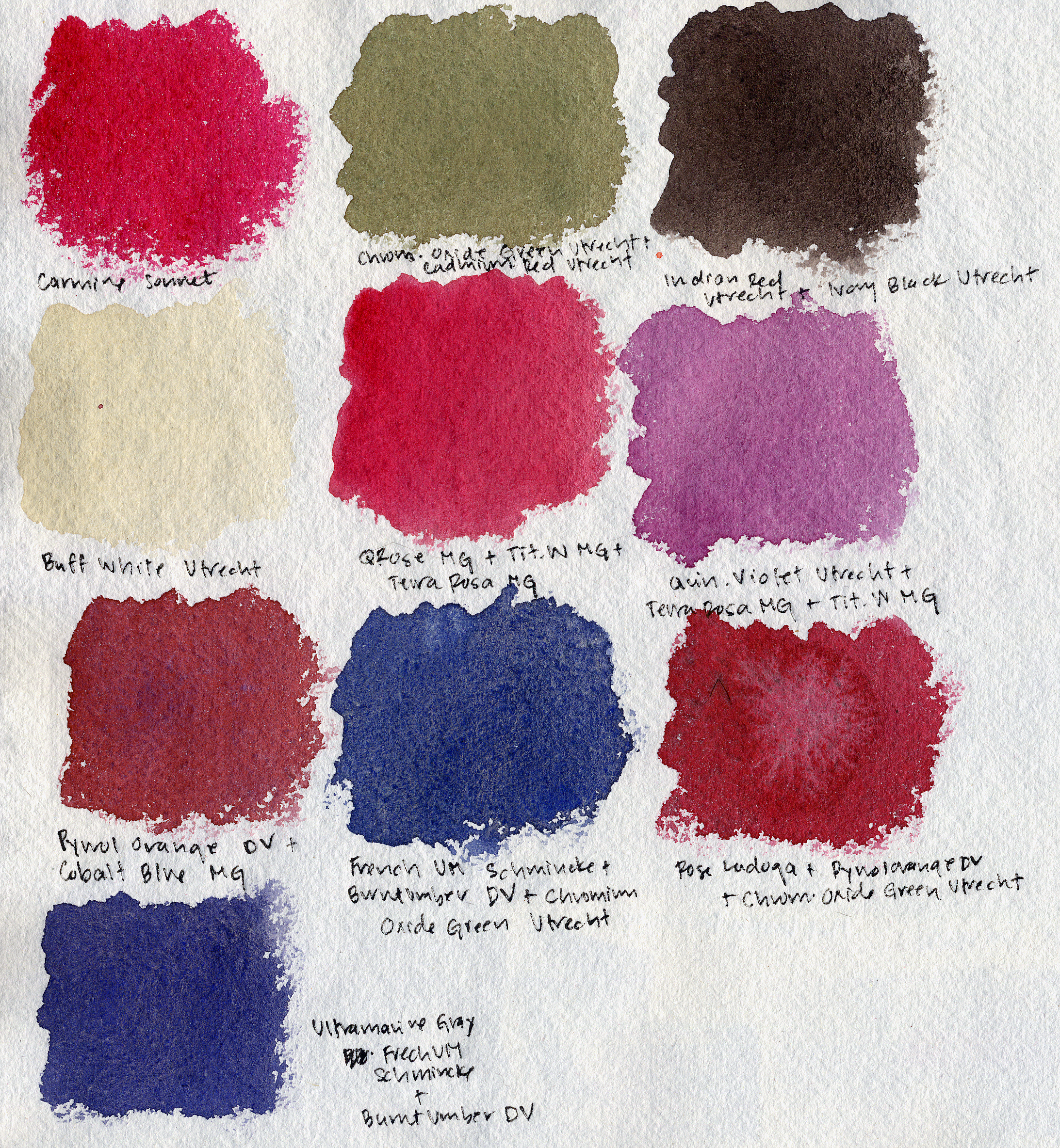
The bigger issue for me is lightfastness. A surprising number of these mixes contain pigments that aren’t particularly lightfast, even though the paints are labeled with three out of three stars for lightfastness. The ones that make me pause are the mixes containing PR48:3, PR81:1, and PBr6.
That said, I still think these colors are perfectly fine for sketchbooks or casual work, where long-term permanence isn’t necessarily the priority.The important thing is just that you know ahead of time.
Blockx Discontinues 3 Pigments
Belgian manufacturer Blockx has announced that three pigments are being discontinued:
- Cobalt Violet — PV14
- Cobalt Blue Dark — PB74
- Barite Yellow — PY31 (only in oil paint)
These are all historically interesting mineral pigments, but they’ve always been somewhat niche due to cost and availability, and are never included in starter sets.
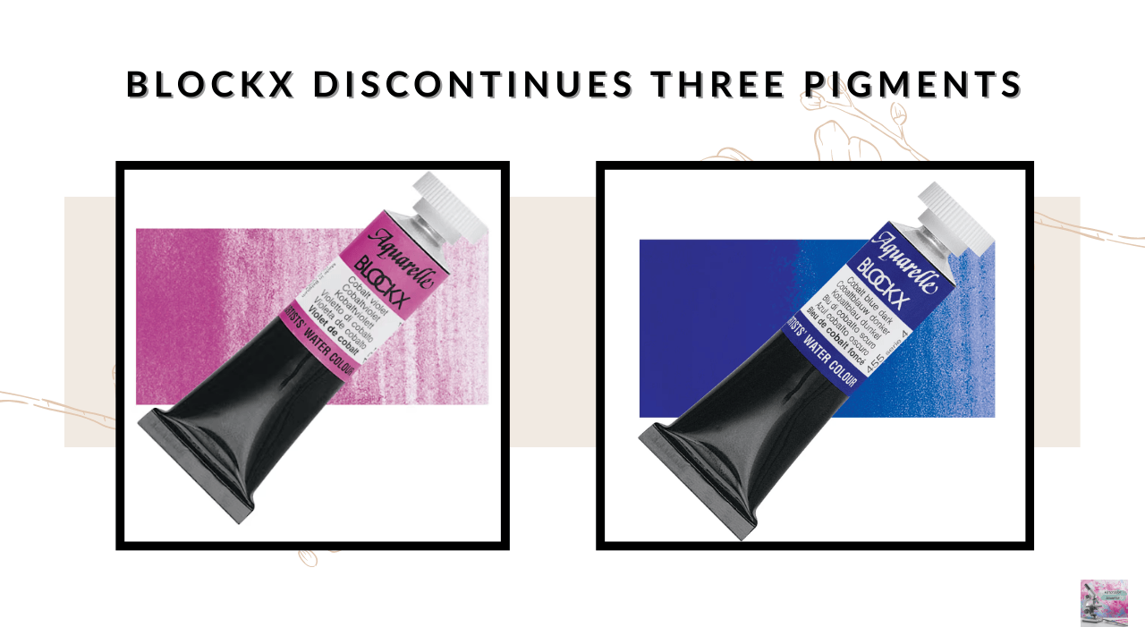
PB74 exists in several watercolor brands, including Roman Szmal, Schmincke, and MaimeriBlu. PV14 is a pigment that is beautiful but troublesome in watercolor, and we saw last month that M. Graham discontinued their version as well. It truly is a stunning pigment like no other, so collectors and pigment enthusiasts may want to grab a tube of it while they’re still available from this brand.
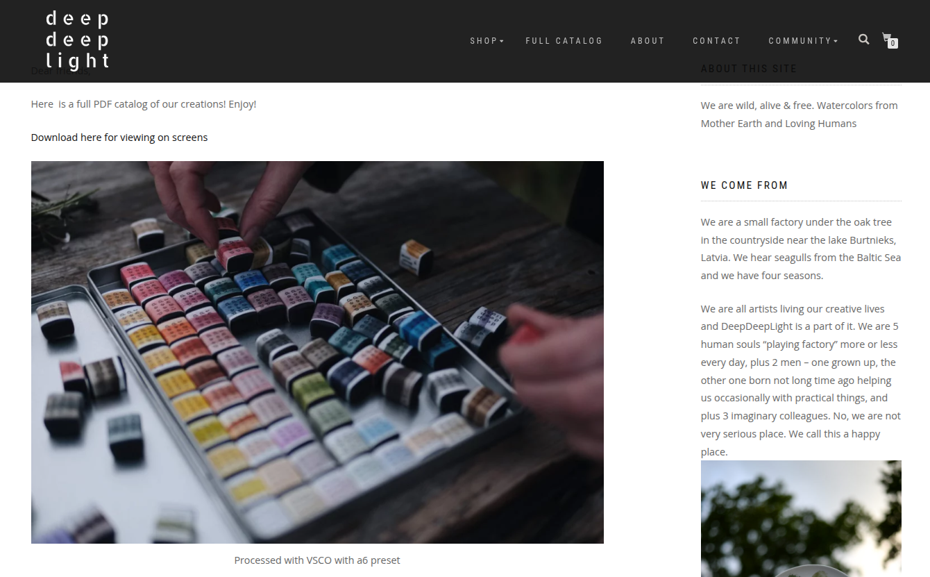
Deep Deep Light Introduces Primary Blue
The brand Deep Deep Light has released a new paint as part of their transparent primary triad:
- Primary Blue — PB29
PB29 is of course Ultramarine Blue, a popular favorite as a primary blue. Although it is warmer than Cobalt Blue, and less transparent than Phthalo Blue, I still like it as a primary blue option. I’ve never had the opportunity to try out these paints, as they are quite pricey in the US. If you have, let me know in the comments
Winsor & Newton Discontinues Viridian PG18
In other pigment news: Winsor & Newton has discontinued Viridian PG18 from its watercolor line as of the end of 2025. This continues a long trend across the industry where true viridian is often replaced with mixes using Phthalo Green – in this case, Winsor & Newton replaced it with a mix of PG7, PY42, and PY43.
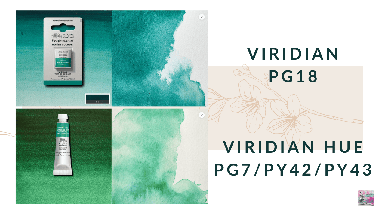
I love granulating green pigments – in fact, I just made a whole video about them that you can check out on the card above – and so I am sad that PG18 is leaving this brand. Additionally, PG18 has a soft granulation and light value that behaves completely differently than PG7, and so I can’t imagine it is a convincing dupe. However, if you’ve tried it, and you’ve found it similar, let us know in the comments!
Winsor & Newton Releases Three New Limited Palette Sets
Winsor & Newton has also released three themed watercolor sets, each containing six 5 mL tubes. And I know I’ve said this before — but themed limited palettes are really having a moment right now! We’ve seen Daniel Smith, White Nights, and Da Vinci release similar curated palettes over the last year.
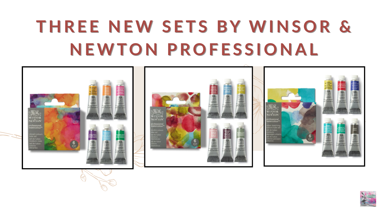
Winsor & Newton doesn’t release new products very often, and hasn’t released a themed set in a while so it’s interesting to see how they’ve put their spin on this trend. At around $40 USD for six 5 mL tubes, these sets are actually a relatively affordable way to try the Winsor & Newton Professional Watercolours range. And, I like that there are no repeats between these sets.
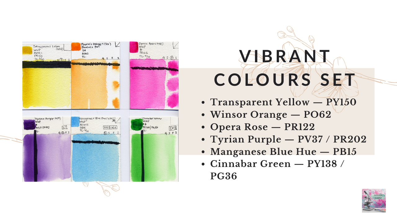
Vibrant Colours Set
- Transparent Yellow — PY150
- Winsor Orange — PO62
- Opera Rose — PR122
- Tyrian Purple — PV37 / PR202
- Manganese Blue Hue — PB15
- Cinnabar Green — PY138 / PG36
The vibrant colours set is clearly designed to produce bright, high-chroma mixes. I like that they chose mostly transparent pigments, which generally mix very cleanly. However, I do wish they had used a different blue instead of Manganese Blue Hue, not because it is not beautiful, but because Manganese Blue Hue has a lower tinting strength compared to the rest of the palette, which can make balancing mixes more difficult, especially because blues are the backbone of a limited palette.
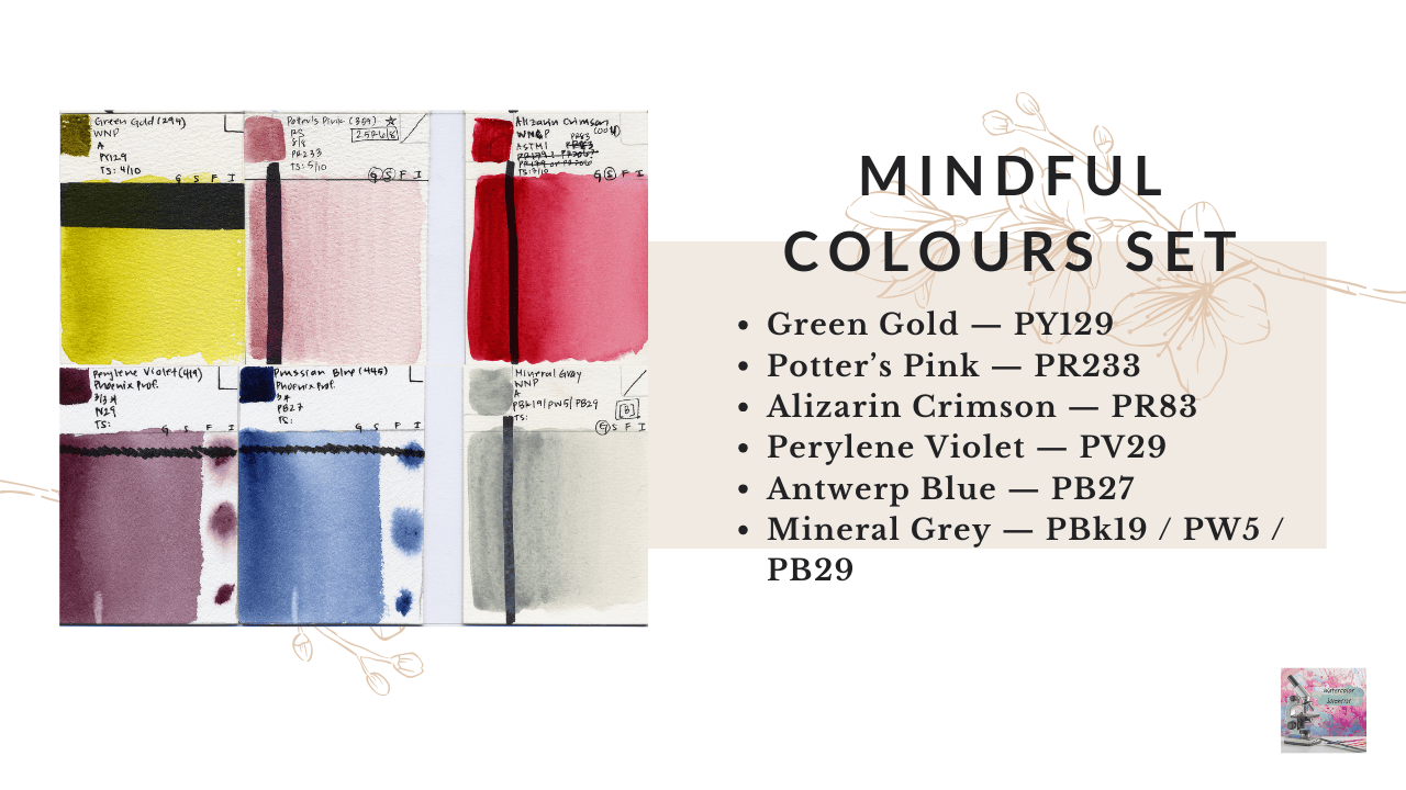
Mindful Colours Set
- Green Gold — PY129
- Potter’s Pink — PR233
- Alizarin Crimson — PR83
- Perylene Violet — PV29
- Antwerp Blue — PB27
- Mineral Grey — PBk19 / PW5 / PB29
The Mindful Colours set is intended for softer, meditative palettes with subtle neutral mixes. Personally, I’m not as enthusiastic about this one. Alizarin Crimson and Perylene Violet look different straight from the tube, but they actually produce very similar dark mixtures, so I wish the set had included either an orange or a green to expand the mixing possibilities. Because the only yellow is a cool yellow, it’s impossible to mix vibrant oranges, and a green is always convenient in a palette. I do love Mineral Gray – but it’s not a great mixer, which is not great in a six-tube limited set.
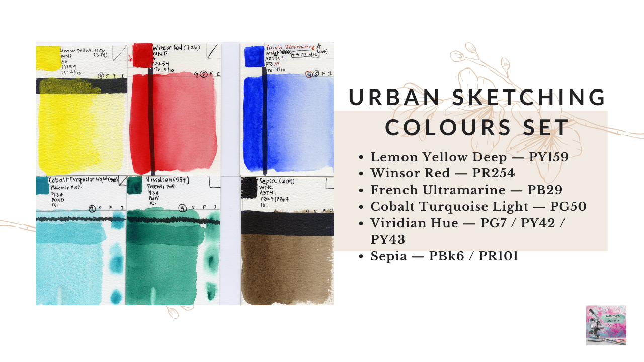
Urban Sketching Colours Set
- Lemon Yellow Deep — PY159
- Winsor Red — PR254
- French Ultramarine — PB29
- Cobalt Turquoise Light — PG50
- Viridian Hue — PG7 / PY42 / PY43
- Sepia — PBk6 / PR101
The Urban Sketching set is actually my favorite of the three sets. It’s essentially a primary-based palette with granulating secondaries, which is a nice combination for urban sketching. And I like that the set allows you to create a deep inky neutral in two ways: by mixing complements with Winsor Red and Viridian Hue for a cooler neutral, or with French Ultramarine and Sepia for a warmer neutral.
Schmincke Releases Hazel Soan Travel Set
Schmincke has partnered with watercolor artist Hazel Soan to release a limited edition travel palette.
The set includes:
- Aureolin Hue — PY151
- Indian Yellow — PY110 / PY154
- Yellow Raw Ochre — PY42 / PY43
- Raw Umber — PY43
- Transparent Sienna — PR101
- Alizarin Crimson — PR83:1
- Vermilion — PR255
- Ruby Red — PV19
- Schmincke Violet — PV23
- Ultramarine Finest — PB29
- Prussian Blue — PB27
- Cobalt Azure — PB35
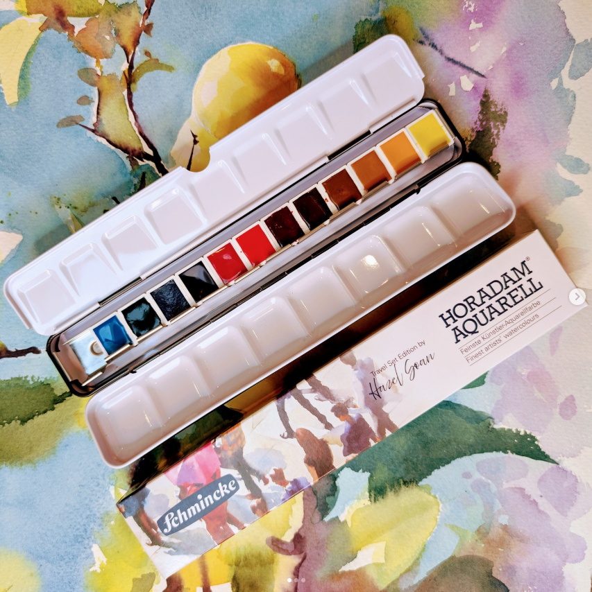
You get:
- 2 yellows
- 3 reds
- 1 violet
- 3 blues
- 3 earth pigments
Notably, there are no greens or neutrals, which isn’t surprising because Hazel Soan rarely uses convenience greens in her paintings. Sadly, this set includes a fugitive pigment – Alizarin Crimson PR83 – and PB27 and PV23 both have marginal lightfastness. This is a shame because Schmincke paintsare not cheap, and I do get annoyed when artists are expected to pay top dollar for paints that fade reliably, often within six weeks in the case of Alizarin Crimson.
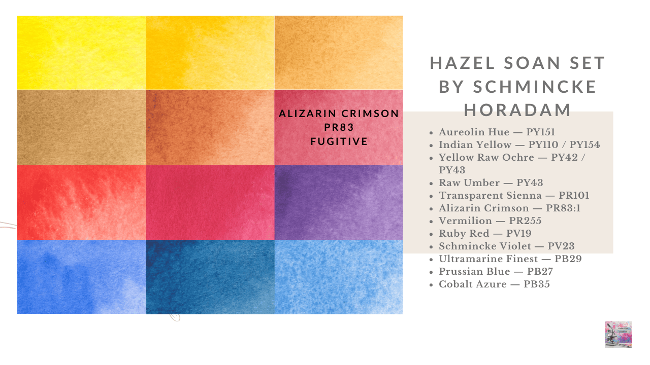
It is not as if there are not excellent alternatives to Alizarin Crimson. Perylene Maroon PR179 and Pyrrole Red Rubine PR264 mix very similarly, and have much better lightfastness. Da Vinci also has a single pigment Alizarin Crimson version made with PV19 that is my favorite. So, there are options. But, otherwise, from a color theory perspective, this is a very solid limited palette.
And if you’re interested in working with limited palettes, I also highly recommend her book The Art of the Limited Palette — it’s a really beautiful and inspiring resource.
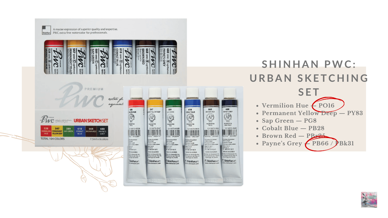
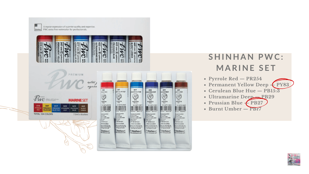
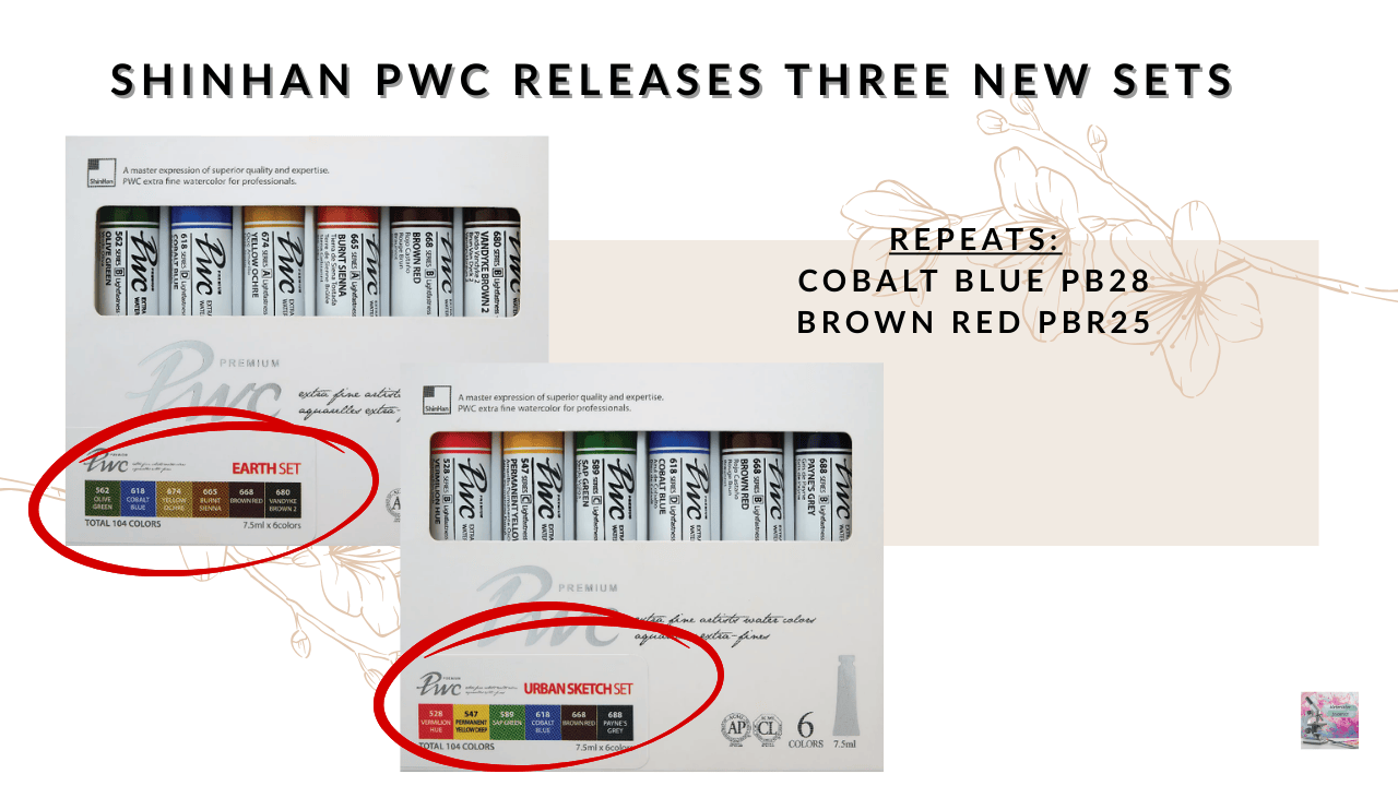
Shinhan PWC Releases Three New Sets
Shinhan PWC has also released three themed watercolor sets.
Urban Sketching Set
- Vermilion Hue — PO16
- Permanent Yellow Deep — PY83
- Sap Green — PG8
- Cobalt Blue — PB28
- Brown Red — PBr25
- Payne’s Grey — PB66 / PBk31
Marine Set
- Pyrrole Red — PR254
- Permanent Yellow Deep — PY83
- Cerulean Blue Hue — PB15:3
- Ultramarine Deep — PB29
- Prussian Blue — PB27
- Burnt Umber — PBr7
Earth Set
- Olive Green — PY83 / PG8
- Cobalt Blue — PB28
- Yellow Ochre — PY42
- Burnt Sienna — PR101
- Brown Red — PBr25
- Vandyke Brown 2 — PR101
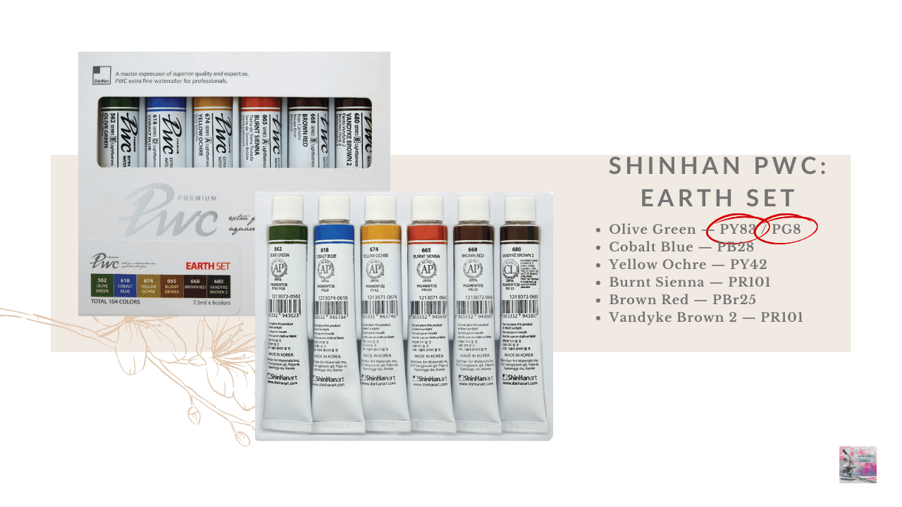
These sets are six tubes of 7.5mL paint, so they are smaller than their old sets. There are quite a few repeats between the sets, notably Cobalt Blue and Brown Red, but I love Shinhan’s version of both of these pigments, so I can’t complain.
Overall, I do like Shinhan PWC paints. I find them to be highly pigmented and very easy to rewet, which makes them pleasant to work with.
I also think these sets are thoughtfully designed — especially the Urban Set, which feels very well balanced. A warm yellow and an orange-red makes mixing browns and neutrals with cobalt blue very easy, and it’s nice to have a green. The inclusion of Brown Red and Payne’s Grey adds a lot of versatility for urban sketching and neutral mixes.
That said, I do find it disappointing when reputable companies release sets that include fugitive pigments.
Several of these colors raise some concerns for lightfastness — PO16, PB66 are both very fugitivge, and PB27, PG8, and PY83 have borderline lightfastness depending on the formulation.
For artists who prioritize permanence, that’s something worth keeping in mind when considering these sets.
Watercolor Science In the Community
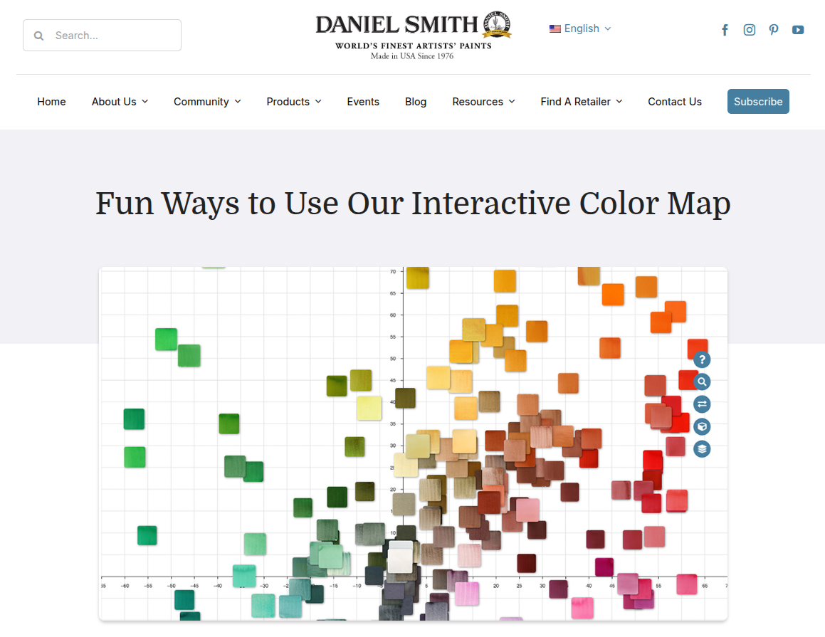
Exploring the Daniel Smith Interactive Color Map
Daniel Smith recently shared a tutorial showing fun ways to use their Interactive Color Map, which is a surprisingly powerful tool for exploring watercolor pigments.
The map organizes the company’s colors using the CIE-Lab color space, allowing artists to visualize pigments based on perceptual lightness and hue relationships rather than a traditional 2-D color wheel.
The tutorial highlights several practical ways artists are using the tool:
- Planning palettes by filtering pigments based on properties like granulation, transparency, staining, or lightfastness
- Discovering new pigments by exploring colors within specific hue families
- Comparing up to 20 paints side-by-side before buying or adding them to a palette
- And even using it as a learning tool for studying pigment codes and properties.
For artists interested in the science of watercolor pigments, tools like this are especially interesting because they show how colors relate to one another in a measurable color space, using not just the hue but also their physical properties, rather than just on a color wheel.
The Importance of Clean Water in Watercolor
Paint manufacturer Mijello Mission Gold recently shared an interesting demonstration about something we rarely think about in watercolor: the quality of the water we use while painting.
In the post, they show how clean versus dirty rinse water can dramatically affect color saturation. Paint mixed with contaminated water appears noticeably duller and less vibrant compared to paint mixed with clean water. The difference is remarkable, especially in yellow hues.
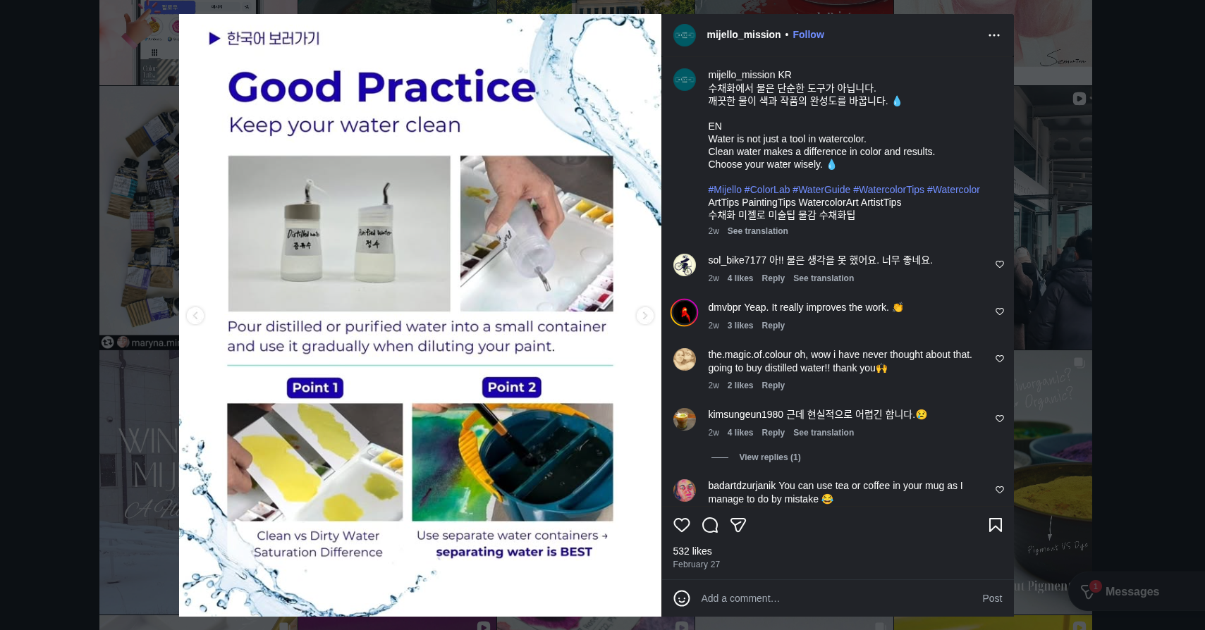
They also recommend avoiding tap water when possible, since minerals, impurities, and pH variations can potentially affect pigments over time. Instead, they suggest using distilled or purified water, especially for the final rinse.
Their recommended system uses three rinse containers:
- First rinse: tap water to remove most of the pigment
- Second rinse: tap or purified water for further cleaning
- Final rinse: purified or distilled water before picking up fresh paint
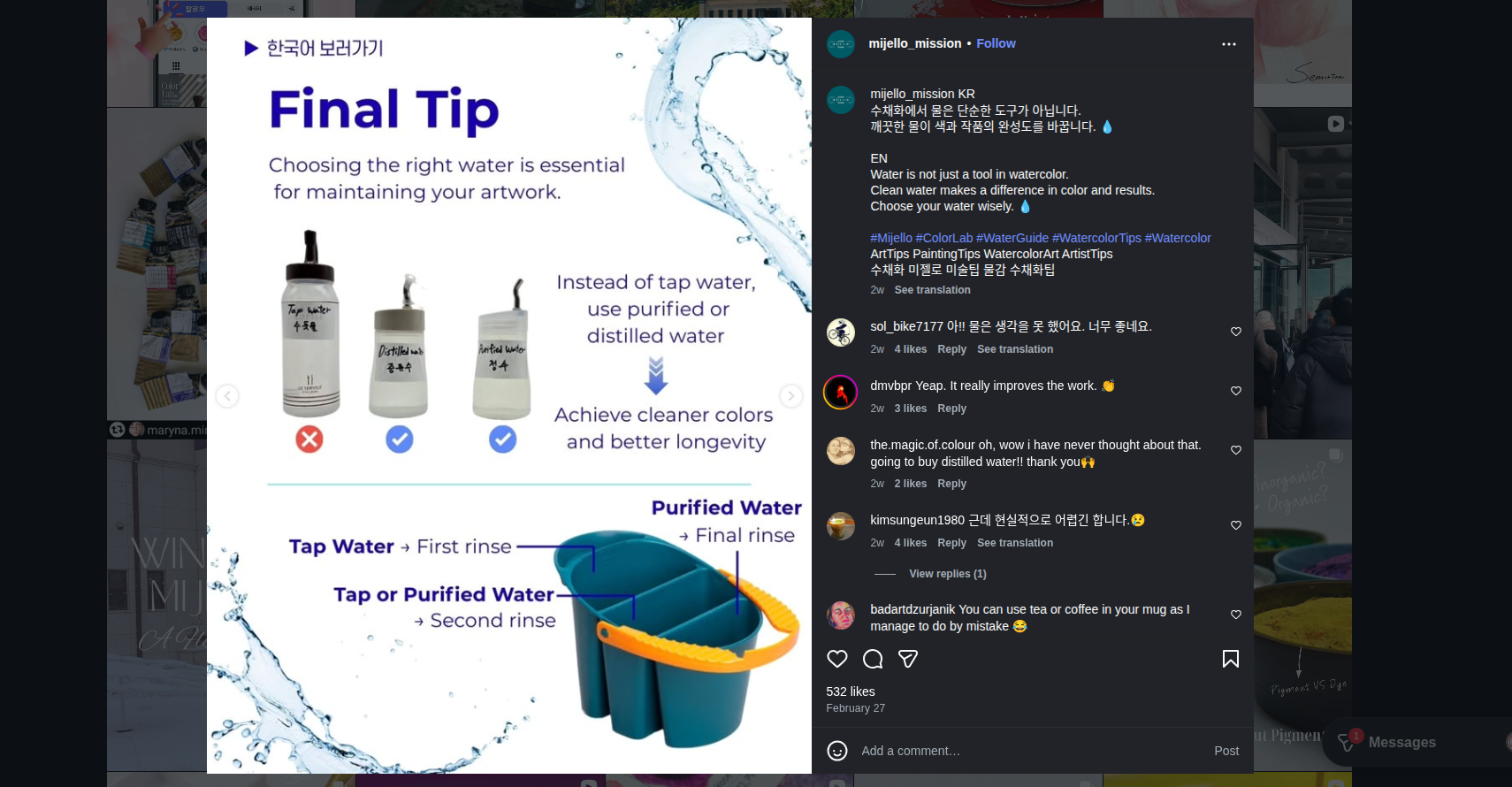 The interesting point here is that water purity doesn’t just affect the color you see on the page today—impurities and unstable pH can potentially affect the long-term permanence and lightfastness of watercolor pigments as well.
It’s a good reminder that in watercolor, water is not just a solvent — it’s part of the chemistry of the painting.
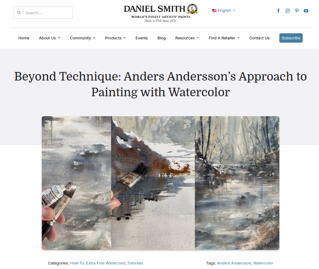
Anders Andersson on Painting Beyond Technique
Artist Anders Andersson recently shared a thoughtful tutorial with Daniel Smith that focuses less on step-by-step technique and more on the mindset behind watercolor painting. In the demonstration, Andersson explains how he builds depth through layered foreground, middle ground, and background shapes. He varies repeating elements like tree trunks to create natural rhythm, and limits his color choices to maintain harmony.
He also emphasizes protecting the character of pigments—letting colors mingle on the paper rather than overmixing them on the palette —and strengthening contrast with dark accents at the end of a painting. I love peeks into an artists’ mind like this because it offers a glimpse into how careful observation and experimentation guide his creative decisions.
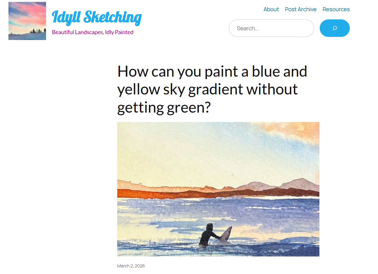
Painting a Blue–Yellow Sky Without Getting Green
A recent post from the blog Idyll Sketching tackled a classic watercolor problem: how to paint a blue and yellow sky gradient without accidentally creating green. I live in a semi-arid desert with gorgeous blue and pale yellow skies, and I have painted so many green skies accidentally!
The key insight is surprisingly simple—don’t let the colors physically mix while wet. Instead, the author recommends working in layers. First, paint the yellow wash and allow it to dry completely. Then apply a transparent blue gradient over the top. Because the underlying layer is dry, the colors optically mix rather than physically mixing, which helps avoid that unwanted green color.
This is a great example of how understanding the difference between optical mixing versus physical pigment mixing can dramatically change your results in watercolor.
It’s also a reminder that sometimes the solution isn’t choosing different pigments—it’s changing the timing and structure of your washes.
Art Market Updates
A Paul Signac Watercolor Far Exceeds Estimate
La Baie (Saint-Tropez) by the iconic Paul Signac, who we talked about in my recent deep dive into Cerulean Blue, recently appeared at Christie’s.
The painting was executed in 1907 and is a watercolor with brush, ink, and pencil on paper measuring about 20.8 × 25.8 cm (8¼ × 10⅛ inches).
The work carried an estimate of £15,000–£25,000, but ultimately sold for £88,900, dramatically exceeding expectations.
Signac is best known for his oil paintings and his role in developing Neo-Impressionism and Pointillism, but works like this show us not only how important watercolor studies were in his practice, but how he achieved color vibrancy in a transparent medium.
Not only are these small studies beautiful in their own right, they’re also incredibly valuable for artists to study. Looking closely at them can reveal a lot about the pigments being used, the brushstrokes chosen, and how the composition is structured. For painters interested in color and technique, they provide a rare window into how master artists experimented with light and atmosphere in real time.
Contemporary Watercolor at Auction
Another watercolor that caught my eye was by Swiss multimedia artist Nicolas Party recently sold at Christie’s, which I think is a nice reminder that watercolor continues to appear even in the contemporary art market.
The work, Landscape (2013), is a large watercolor on paper measuring about 76 × 56 cm. It sold for £127,000, far above its estimate of £40,000–£60,000.
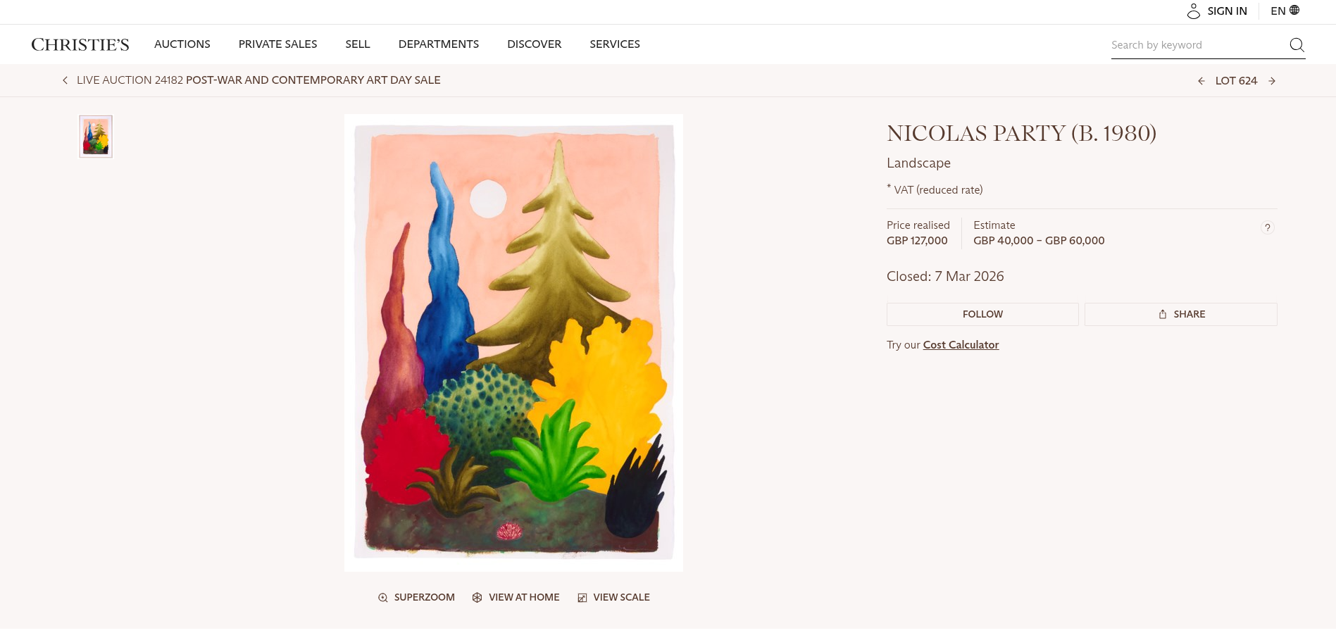
Party is best known for colorful pastel portraits and landscapes, but his practice spans many media, including sculpture, installations, and works on paper. Seeing a watercolor achieve this kind of result is interesting — it shows that even artists working across many mediums still turn to watercolor as part of their practice.
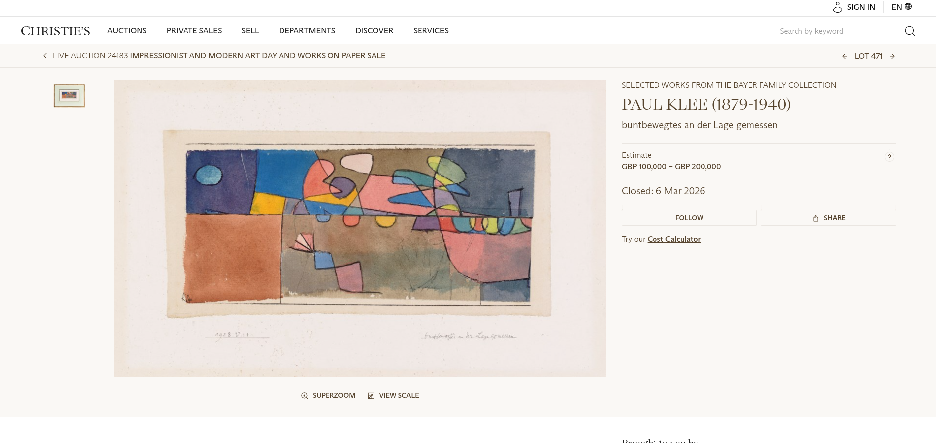
Paul Klee and the Power of a Single Color Accent
Another fascinating work in the sale was by Paul Klee. The piece, buntbewegtes an der Lage gemessen from 1928, is a small work in gouache, watercolor, pen, and ink on paper measuring about 13.5 × 27.5 cm.
The painting sold at Christie’s for an impressive £6,985,250, demonstrating the strong demand for Klee’s works from his Bauhaus period.
What I especially love about this composition is the way Klee orchestrates color across the surface. Much of the painting is built from cool blues, greens, and purples, but there’s a single small red accent that immediately draws the eye.
This is exactly the kind of compositional strategy we talked about in my Cadmium Red deep dive, where we looked at Klee’s careful color studies. He often treated color almost like musical notation, placing small accents of high-chroma color to guide the viewer’s eye through the painting. In fact, many of his works from this period are structured almost like visual musical scores, translating rhythm and harmony into color and shape.
It’s a beautiful reminder that sometimes one carefully placed color can carry enormous visual weight in a composition.
Wifredo Lam and Afro-Caribbean Modernism
Another work that really caught my attention in this sale was by Wifredo Lam, an artist whose work I adore.
Lam was one of the most important modern painters of the 20th century, known for fusing Cubist and Surrealist visual languages with Afro-Caribbean spiritual traditions. Born in Cuba to a Chinese father and a mother of African and Spanish descent, Lam developed a distinctive style filled with hybrid figures and symbolic forms inspired by Afro-Cuban spiritual and cultural lived experiences.
The work in this sale, Sans Titre (1938), is a gouache painting measuring about 19″x25″, and it sold at Christie’s for £76,200, comfortably above its estimate of $30,000–$50,000.
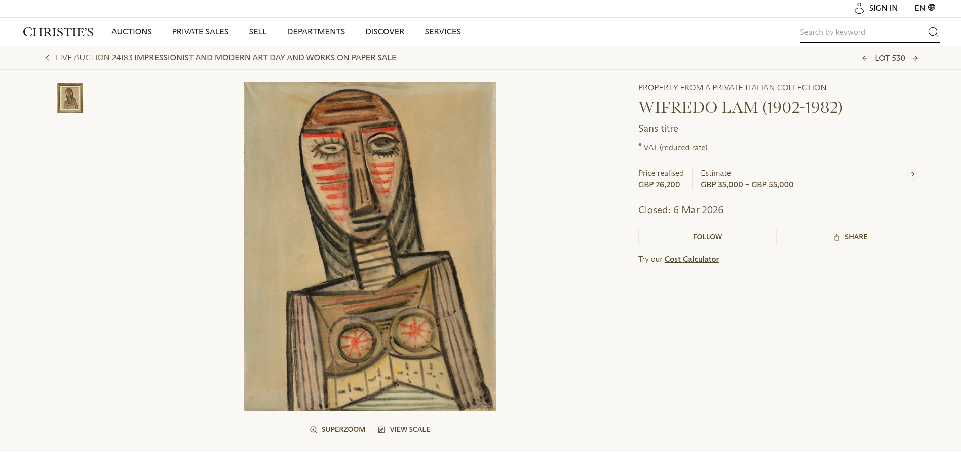
Lam’s work is powerful because it bridges multiple cultural traditions—bringing together European modernist ideas with African spiritual heritage and Caribbean identity to create an entirely new visual language.
For me personally, this kind of work is especially meaningful. Seeing artists draw on African spiritual traditions and diasporic cultural history within modern art movements is something is very close to my heart.
Looking at works like these—from Signac’s pigment-rich studies to Klee’s carefully orchestrated color accents and Lam’s symbolic figures—reminds us that works on paper aren’t just beautiful objects. They’re also incredible learning tools for painters interested in pigment, brushwork, and composition.
Exhibits You Won’t Want to Miss
American Watercolor Society announces winner of International Exhibition
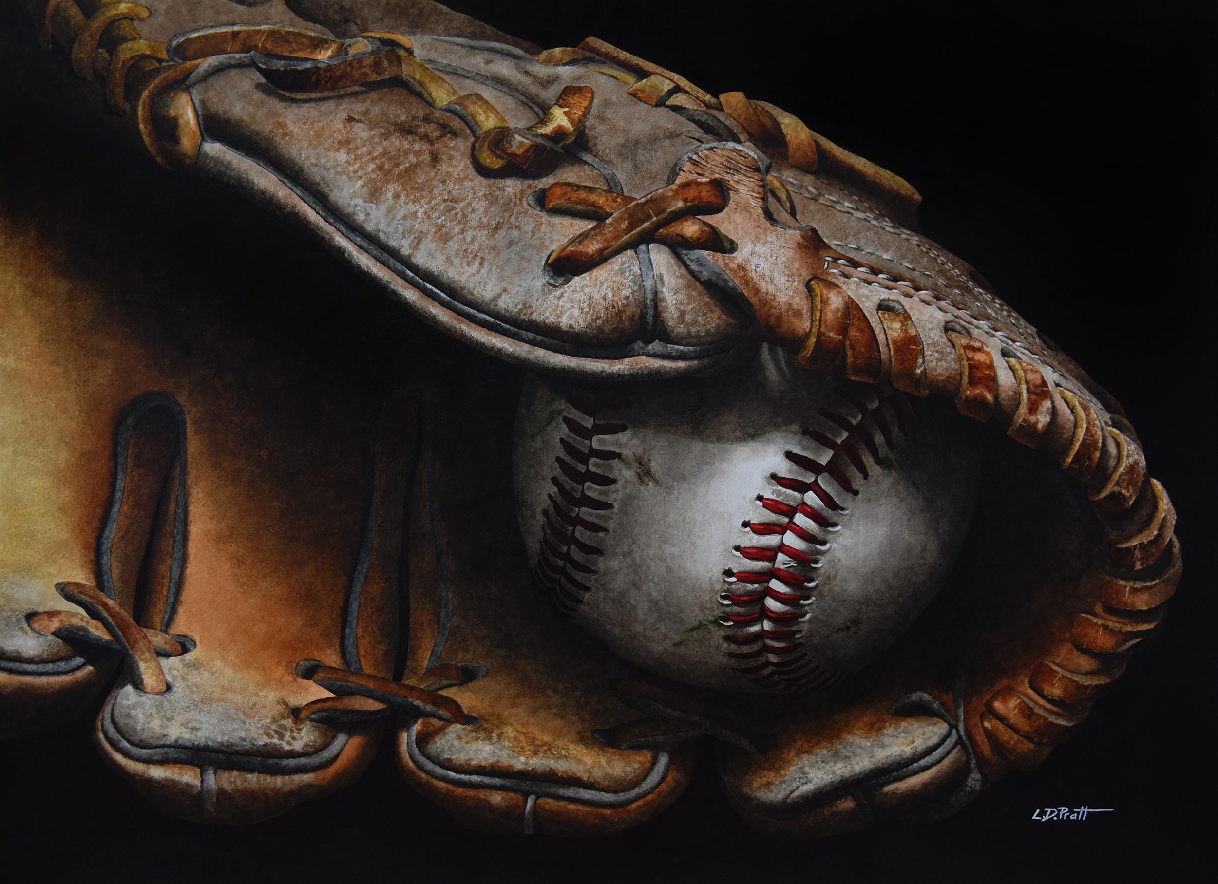
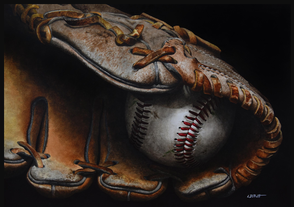
Artist Lynn D. Pratt was awarded the Gold Medal of Honor at the 159th American Watercolor Society International Exhibition for their painting In the Pocket.
The piece is a striking hyper-realistic watercolor of a baseball glove, with a baseball resting in the shadow inside the glove.
This is one of the most prestigious watercolor exhibitions in the world, featuring work selected from artists across dozens of countries and showcasing a wide range of contemporary approaches to water media.
The exhibition is free and open to the public, and after the New York showing, a selection of works will travel across the United States as part of a year-long touring exhibition.
If you’re able to visit, it’s a rare opportunity to see award-winning watercolor paintings up close, including this year’s Gold Medal of Honor winner.
If you’d like to see the painting in person, it will be on display at the Salmagundi Club in New York City as part of the exhibition, running April 7 through May 1.
Thank you for joining me for this month’s Watercolor News Report. I bring you the lastest every third Saturday of the month, so don’t forget to hit like and subscribe so you don’t miss the next one. Happy painting!