This month:
- Schmincke goes absolutely wild with really good summer releases
- Roman Szmal brings us two new limited edition colors along with a gorgeous new set
- Holbein introduces some weird little granulating fruits and veggies
- Federal Tonic debuts the perfect sky blue
- And Tintoretto raises the bar – literally – for new watercolor gear.
Welcome to Watercolor Scientist, and this is the Watercolor News Report for September.
Paint Releases and Updates
Schmincke Horadam
Schmincke hit it out the park this summer with some really cool releases
Schmincke Releases Five New Paints
- They started the summer off by releasing five new paints in their range, with three of them being curated by artists.
- Feeling Peachy x Evan Woodruffe PY53/PO64/PR207 (045)
- Berliner Spreegrun x Gris PY150/PBr7/PY43/PBk31 (046)
- Red Ochre x Hazel Soan PR102 (047)
- Amber PBr33/PR108/PY150 (048)
- Lavender PV15/PW6 (049)
- I like that they added Red Ochre as a single pigment color – it’s a very Hazel Soan color for sure. And I really like that they added Lavender – this is a very useful paint. It’s surprising that they didn’t have this paint in their range before now.
- The other colors are certainly beautiful and interesting, although I’m not sure what role they would realistically play in a mixing palette
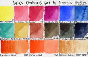
Schmincke Juicy Orange set
- Then, Schmincke released the Juicy Orange set. This set is curated to be similar to their Pretty Pink set released in 2025.
- This set contains 15 half pans – 12 standard paints, and 3 orange paints in theme with the set. It also includes an orange Da Vinci brush, which seems to be a size 2 quill brush.
- The paints in the set are:
- 216 pure yellow PY154, 343 quinacridone red light PR207, 351 ruby red PV19, 369 quinacridone magenta PR202, 494 ultramarine finest PB29, 484 phthalo blue PB15:1, 519 phthalo green PG7, 656 yellow raw ochre PY42/PY43, 649 English Venetian red PR101, 663 sepia brown PB15:1/PBr7/PBk9, 784 perylene green PBk31, 787 Payne’s grey bluish PBk6/PB15:6. The three themed paints are 218 transparent orange PO71, 359 Saturn red PO64, and 912 volcano orange PY159/PR108
- The set does not include new paints, and so is simply new curation rather than a range expansion.
- I think this set is really neat. The company must’ve gotten a strongly worded memo from artists stating that we do not want another set with Lemon Yellow and Permanent Green Olive! These colors are beautiful and good mixers, and I think their choice of orange paints is excellent – one transparent muted orange, one very vibrant orange-red, and a granulating orange. Very cool!
Schmincke Gingko Edition set
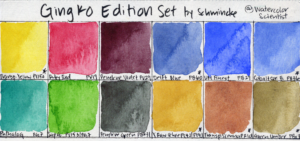
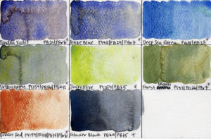
- Schmincke also released a limited-edition Gingko watercolor set. The box has beautiful gingko leaves painted by Mexican artist Maria Botella. The set comes with 18 half pans – 12 standard paints and 8 super-granulating paints
- The set includes:
- 209 Transparent Yellow PY150, 351 Ruby Red PV19, 371 Perylene Violet PV29, 482 Delft Blue PB60, 494 UM Finest PB29, 499 Cobalt Cerulean B PB36, 519 Phthalo G PG7, 530 Sap G PY153/PG7, 784 Perylene G PBk31, 656 Y Raw Ochre PY42/PY43, 653 Transparent Sienna PR101, 665 G Umber PBr7 and
- 983 Tundra V PB29/PBr6, 967 Haze B PY43/PB29/PBr7, 954 Deep Sea G PG18/PB29, 936 Urban Green PY159/PB36/PBk11, 932 Shire Olive PY159/PB35, 944 Forest Brown PY43/PG26/PBr7, 926 Urban Red PY159/PR108/PB35/PBr6, 965 Glacier Black PBk11/PB35
- Of course the box is beautiful, but I also really like that they included colors that are not usually in their sets. The mix of supergranulating paints is cool, even though I do find them all very easy to mix myself.
Schmincke luxury box
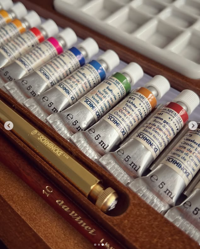
- Schmincke also released a luxury box with twelve 5 mL tubes of paint, including the 3 historical colors that they released earlier this year, which I covered in my WNR in February.
- The set includes:
- 102 Perm Chinese W PW4, 210 Gamboge Gum PY150/PY65, 220 Indian Y PY110/PY154, 365 Vermilion PR255, 375 Solferine PR122/PW4, 494 UM Finest PB29, 492 Prussian B PB27, 530 Sap G PY153/PG7, 655 YO PY42, 661 BS PR101/PBk8, 675 Cassler Brown NBr8, and 780 Ivory Black PBk9
- It also includes porcelain palettes and trays, and a pencil and a size 10 round Da Vinci brush.
- This is a set with a vintage feel, which makes sense with the inclusion of three historical paints. I always like to see Schmincke release tube sets, especially since, again, their pan sets often feature the same lineup of paints every time.
Schmincke Akademie Hydrangea Box
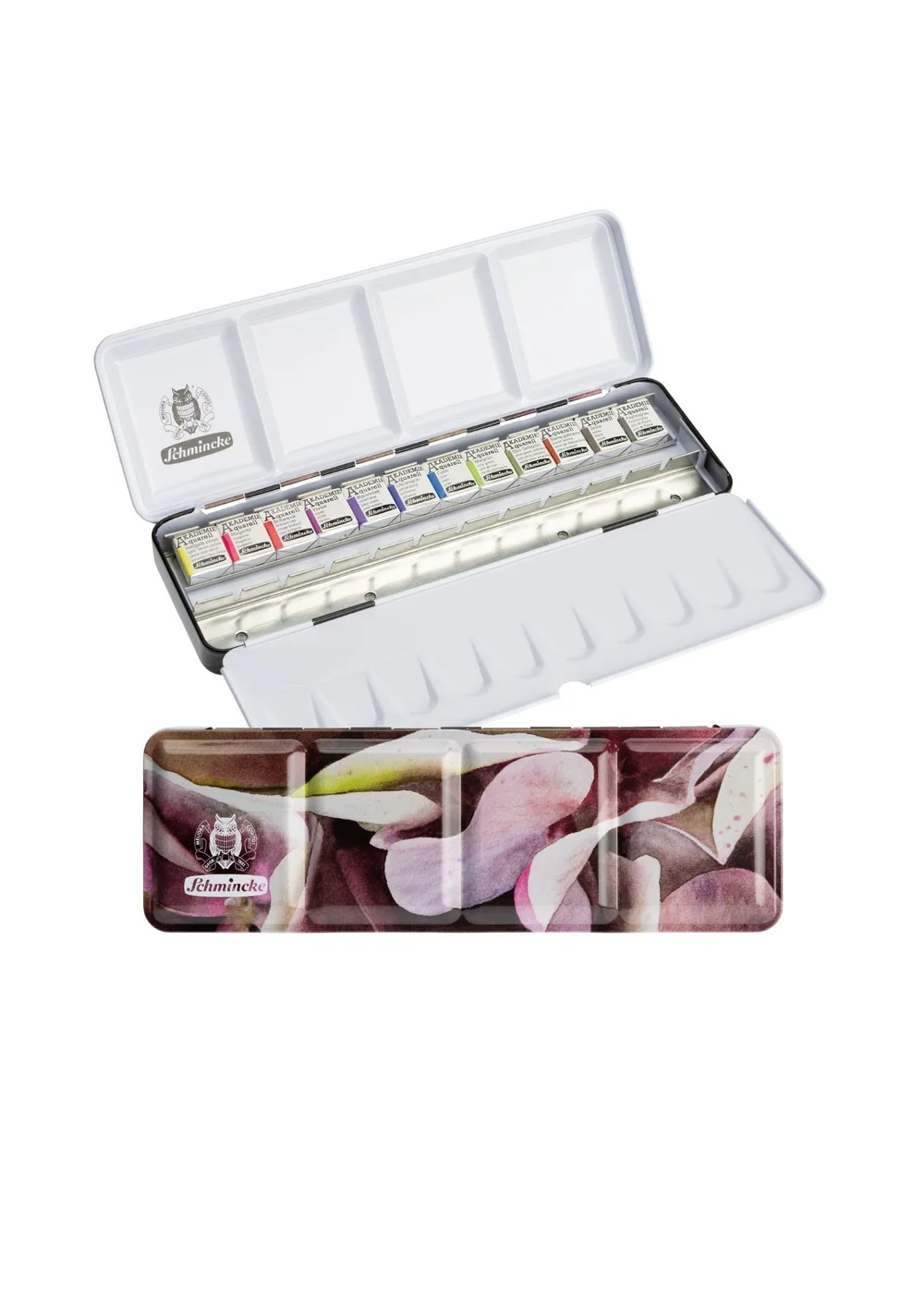
- Schmincke didn’t leave their student-grade Akademie range behind either. The new Akademie Hydrangea box features art by the German-Ukrainian artist Alona Hryn.
- The set includes 12 half-pans:
- 222 LY Lemon PY3, 336 Magenta PV42, 337 Brilliant R PR254, 440 V PV55, 441 VB PV23, 443 UM PB29, 448 Cyan PB15:3, 552 May G PY151/PG7, 554 Olive G Yellowish PO62/PG36, 662 BS PR101/PBk6, 665 Sepia PB15:1/PBr7/PBk6, 770 Payne’s Grey PR101/PBk7/PB29
- The set includes three new paints they introduced in February.
- I’ve said it before: I’m not a huge fan of the AKADEMIE paints themselves. In my experience, other student-grade lines like Van Gogh by Royal Talens, Sonnet by Nevskaya Palitra, and Sennelier Petite Aquarelle by Sennelier are all much cheaper and noticeably better performers. But again, the metal palette really is the draw here.
Roman Szmal Aquarius
Roman Szmal Aquarius has been on a roll as well for the last few months. They were prominently featured in the USk Symposium this summer, and we got some really cool releases from it.
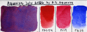
Aquarius July 2026
- Roman Szmal debuted their new paint, Aquarius July 2026. They have a tradition of beta testing out new paints named after the month and year that they’re released.
- This paint is made from PR254/PV19/PB29.
- This granulating color mixes Ultramarine Blue along with two pigments that are close in hue but have different properties, Pyrrol Red PR254 and Quinacridone Red PV19. It’s quite similar to their much-loved Aquarius Violet, which is made from PB29/PV19/PR255, although Aquarius July 2026 looks more saturated and pinkish. I like granulating paints with Ultramarine Blue in them because they tend to be good mixers, and I’m excited to try this paint out sometime in the future.
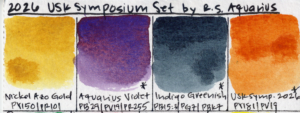
2026 USk Symposium Set
- Roman Szmal produced a four-paint set for the 2026 Urban Sketchers Symposium in Toulouse. The set comes in the cutest bright red metal palette, similar to last year’s periwinkle palette which I definitely eventually snagged, and love because I can fit 15 half pans in it.
- The set contains 4 half-pans:
- Nickel Azo Gold PY150/PR101, Aquarius Violet PB29/PV19/PR255, Indigo Greenish PB15:3/PG7/PBk7, and a brand-new orange called USk Symposium 2026 PY181/PV19
- Roman Szmal did the same thing last year: released a set for the USk Symposium, with three standard colors and one limited USk Symposium-themed paint.
- This new paint includes an unusual pigment PY181, and I love that.
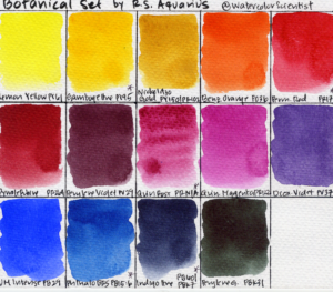
Roman Szmal new Botanical Set
- Finally, they released a new botanical set, with artwork by Polish artist Izabeli Kuśmider-Wolskiej on the cover.
- The set includes 14 full pans:
- 204 Lemon Y PY61, 266 Gamboge H PY95, 380 Nickel Azo Gold PY150/PR102, 208 Benzymidazolone O PO36, 322 Perm R PR170, 328 Pyrrole Rubine PR264, 402 Perylene V PV29, 381 Quin Rose PR N/A, 332 Quin Magenta PR122, 218 Dioxazine V PV37, 254 UM Intense PB29, 225 PBRS PB15:6, 220 Indigo H PB60/PBk7, 409 Perylene G PBk31
- I’ve said it many times: I love Roman Szmal’s paints. They’re not as affordably priced as they once were, but I love the smoothness and clarity of their paints, and they offer really interesting pigment options, and so I spring for their full pans a couple of times a year during sales at Jackson’s. This botanical set is pretty perfect, with transparent non-granulating paints that are incredibly well-suited for botanicals. A couple of the paints, including Permanent Red PR170 and Dioxazine Violet PV37, are only marginally lightfast, which is a shame in a palette full of very lightfast paints.
Holbein
Holbein had fruits and vegetables in mind this summer.
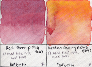
Limited-Edition Colors “Red Turnip” and “Melon Orange”
- Keeping with their yearly theme of producing a whimsical vegetable-themed granulating color during summer art festivals, Holbein released WG506 “Red Turnip” at the Holbein Art Space Summer Festival
- According to Holbein’s announcement, Red Turnip “uses muted white and granular, vibrant violet and orange pigments.”
- Holbein also released WG508 Melon Orange, described as “using a granulating yellow pigment within a soft orange to express the sweet, juicy flesh of a melon”
- I did not find pigment information for either of these paints.
- WG529 Cabbage Green PY159/PY3/PG7/PW6 released in 2024, and Carrot Orange WG509 was released last year, and is made from PY159/PO73/PY110
- Holbein seems to have developed a whole little family of fruit-and-vegetable themed granulating colors, released during their summer festivals, and it’s very wholesome. If anybody watching managed to get a tube of Red Turnip or Melon Orange at the Summer Festival, please do send me a photo of the pigments, I’m very curious!
Two New Supergranulating Colors
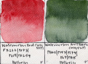
- Holbein also announced two new colors, coincidentally also fruit-themed: Watermelon Red PR233/PO73/PV19/PR254 (WG507) and Watermelon Peel Green (WG527) PBk11/PY53/PY74/PG7/PB15, as part of their supergranulating range
- You’ll be tired of hearing me say it, but – I find these colors quite cool and interesting, but I don’t own any Holbein supergranulating paints because they are very easy to mix myself.
White Nights
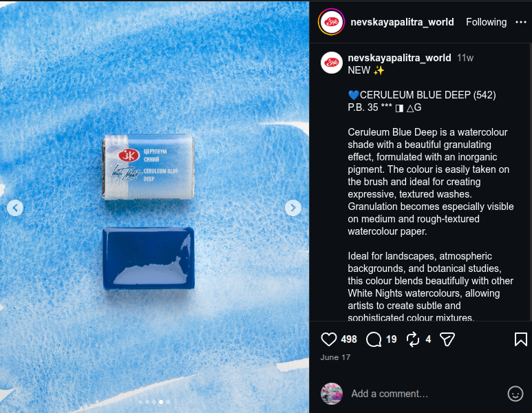
New Paint: Ceruleum Blue Deep PB35
- White Nights released their new paint Ceruleum Blue Deep this summer. It’s a single pigment paint made from PB35. This is a lovely granulating light-valued blue paint that seems very similar to me as their original Ceruleum Blue, which was also made from PB35. I haven’t been able to get my hands on it, but I’ve never met a PB35 I didn’t like.
White Nights Animalistic Set Refresh
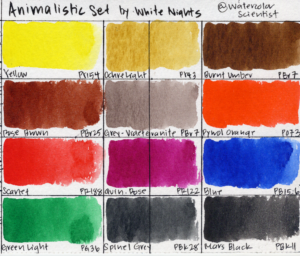
- White Nights also gave their Animalistic Set a refresh.
- This set was originally released two years ago with an adorable cat on the box. The artwork is now by Irena Makoveyeva, and features a cool little owl.
- The set includes the same paints: Yellow PY154, Ochre L PY43, BU PBr7, Rose Brown PBr25, Grey-V Granite PBr7, Pyrrol O PO73, Scarlet PR188, Quin Rose PR122, Blue PB15:6, GL PG36, Spinel Grey PBk28, and Mars Bk PBk11
- I love White Nights paints, and I have and love this set. I find it to be really well balanced for landscapes as well. I like that it includes the unusual pigment PBk28, and that it includes an unusual grey variety of PBr7.
New Themed Sets
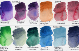
- White Nights also released four new themed sets, each with three 10mL tubes.
- Sunset: 382 Rose Mist PB28/PR122, 398 Purple Mist PG50/PV19, 635 Sunset Mist PB29/PO73
- Flame: 388 Orange Mist PBk8/PO64, 389 Scarlet Mist PG19/PR188, 387 Ruby Mist PG19/PR170
- Moss: 763 Yellowish G Mist PB35/PY3, 762 G Mist PB28/PY3, 760 G Shadows PBk11/PG7
- North Sea: 595 Sea Mist PG50/PB15:3, 561 Turq-Rose Mist PB28/PR264, 562 Grey-B Mist PB29/PBk7
- Now, none of these are really functional triads on their own. Think of them as fun additions to a palette that already has a solid lineup of core mixers. Of the four, I think I’d recommend Sunset for its cool violet neutrals that work really well in landscapes. But much like Schmincke’s and Holbein’s and Roman Szmal’s supergranulating paints – my real recommendation is buy the single-pigment paints and mix them yourself.
Blockx
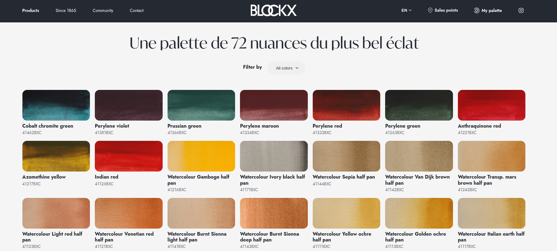
- Blockx, a Belgian brand, recently added 9 paints to their watercolor range, totaling 81 paints.
- Jane Blundell was the one who spotted and wrote on her blog last month that Blockx may have expanded from 72 to 81 colors.
- You would never know from Blockx’s website or their Instagram, since like many art companies, their social media is sort of sparse, and their website rarely get updated.
- The new paints include: Cobalt Chromite Green PG26, Perylene Violet PV29, Prussian Green PG7/PB60, Perylene Maroon PR179, Perylene Red PR149, Perylene Green PBk31, Anthraquinone Red PR177, Azomethine Yellow PY129, and Indian Red PR101
- I own a few Blockx paints from when I took a color theory course. I find them nice to use but nothing special. I do think this expansion was very necessary for them, since their range was sorely lacking in both dark-valued paints, and in more modern high-tinting pigments. It’s definitely like they went through and chose from a pigment nerd’s “best of” list!
Kremer
New: Hard Edge Cadmium Set
- Kremer debuted their Hard Edge watercolor set.
- The set comes with 28 full pans, and it includes 12 cadmium paints are only available in this set, not open-stock.
- There are 5 cadmium yellows, 4 cadmium oranges, 3 cadmium reds
- Also has 4 greens including Cobalt Green, 5 blues including Cobalt Turquoise, 3 violets including Ultramarine Violet, 2 reds including Perylene Maroon, and a very unique warm variety of Bismuth Yellow PY184
- I dearly love cadmium pigments, there are just no other pigments like it. This set of rainbow cadmium paints is very beautiful to me. I haven’t pulled the trigger on it because it’s $200 USD. I’m not saying it’s not good value, I actually think it is good value given the amount of paint, and given that it includes a metal palette. For comparison, Schmincke’s 24 full pan set costs the same, for less paint, and for far less interesting paints.
Flora Watercolor Set
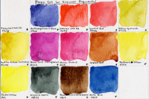
- Kremer also released a Flora set.
- The set includes 14 full pans for about $125 USD.
- The set includes 114108 Eggshell W PW18, 231008 Anthraquinone B PB60, 231788 Orange DPP RA PO73, 232028 Scarlet R PR166, 233308 Yellow Greenish PY129, 233508 Indian Y Imitation PY150, 234018 Quin Pink transparent PR122, 234028 Quin Pink D PV19, 234938 Gubbio R, 236518 Brilliant Y PY74, 238508 Studio Y PY3, 241208 Special Bk NIR Perylene G, 407208 BU Dark Brown PBr7, and 452108 Paris B PB27
- I love floral sets for their transparency, vibrancy, and clarity, and this one looks really beautiful. It also includes a single pigment PW18. which I’m definitely curious about.
New watercolor: Caput Mortuum
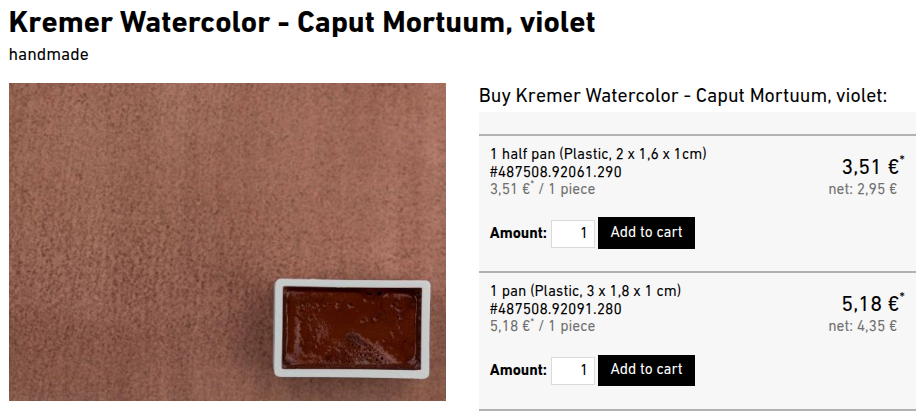
- Kremer also introduced a new paint, Caput Mortuum
- It’s made from PR101, and it looks quite earthy and beautiful.
Federal Tonic Watercolor
Curt’s Blue PW6/PB15:1
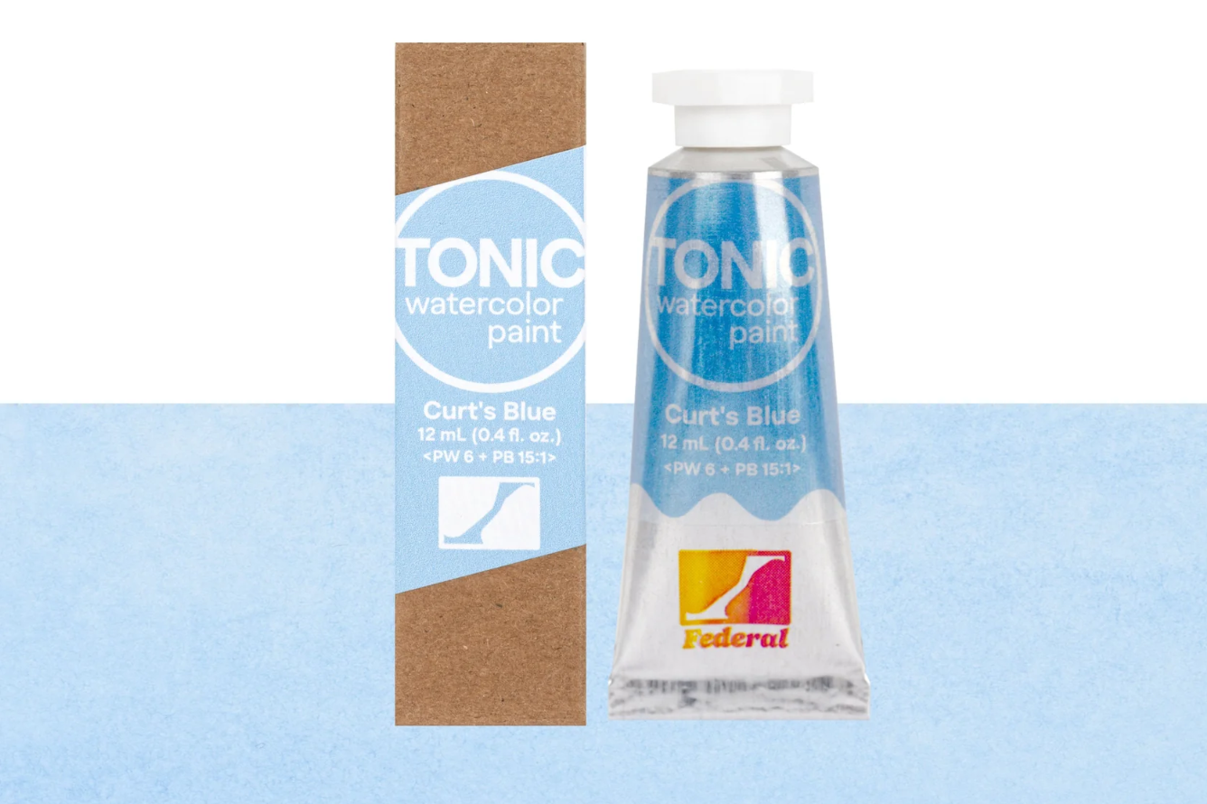
- Federal Tonic introduced a new paint: Curt’s Blue
- This paint was named after the company’s warehouse manager who is a skilled artist
- According to their site, Curt’s Blue is made from PW6 and a touch of PB15:1 – so little PB15:1, that it would be hard to mix on your own. They recommend it for skies and subtle shadows since it does granulate gently.
- I recently tried ten of this company’s paints, and found them incredibly pigmented and lovely to use.
New Random Watercolor Gear
Hahnemuhle Releases Mini Bamboo Palette
- Hahnemuhle released an adorable tiny bamboo palette. If it looks familiar, that’s because this style of mini wooden palette has been everywhere since GO DRAW released their original clever clip-on design back in 2022. So while this isn’t an original idea, I suppose this is Hahnemuhle’s own stamp on a very popular trend.
Tintoretto Raises the Bar for Brush Sets
- Tintoretto introduced the Ironbar watercolor brush set with magnetic brushes. Tintoretto is an Italian company probably best-known for their travel brushes. Their new Ironbar watercolor brush set is really clever – the end of the brush handle is magnetic, and the brush hangs on a magnetic bar and allows it to dry in the optimal position for brushes in order to avoid hair damage or mold. The standard set includes a size 0 and a size 6 round, but the Ironbar mini is half the price and includes a size 4 round, a size 2 quill, and a size 0 detail brush. The brush selections are excellent, and I think the designs are really neat.
Tintoretto: New Travel Brushes
- Tintoretto also released a new set of travel brushes. The sets all come with four brushes – size 2, 4, 6, and 8 round brushes – in these really cool little wooden cases. At about $225, these are far too expensive for me to try, but if you’ve ever used a Tintoretto travel brush, let me know in the comments!
Art Toolkit: Large Triad Template
- For my fellow color theory nerds, Art Toolkit introduced a Large Triad Template perfect for color wheels and mixing studies. They already have a smaller 3” template, but this one 4.5”.
- They are made of sturdy aluminum, and are split into six sections. The bigger swatch area is better in my opinion because this way you have room for letting the colors mingle and show you a gamut of mixes rather than just one small uniform swatch. My favorite part of these are that they have a protractor at the edge – very nerdy detail!
Da Vinci Introduces GO Travel Brushes
- And finally, Da Vinci converted their popular Colineo, Casaneo, Spin, and Maestro brushes their new range of GO travel brushes. Now, it took me a second to get these straight, but: Colineos are synthetic Kolinksy sable, Casaneos are synthetic squirrel, Spin are synthetics, and Maestro and real Kolinksy sable. The ranges include rounds, flats, liners, and mops. They are quite pricey, but a good mop travel brush might be worth it!
Watercolor Science in the Community
Why Do Earth Colors Look Different?
Erik Lundgren explored on their blog why there is so much variety in hue and physical characteristics in the same earth pigment. They painted out 12 different Raw Umbers and noted that they differed radically between manufacturers. The article explores how place of origin can change the characteristics of a paint – for example, raw umber from Umbria, Italy was darker and rich in manganese, while raw umber from Germany was more yellow-brown and cleaner in tone. The crystal structure of earth pigments can also be manipulated to change its color and transparency; PR101 being both Transparent Red Oxide and Indian Red and Caput Mortuum is a really good example of this. They also provide excellent advice on how to choose the right earth pigment for you.
Reconstruction of 500 Year Old Painters’ Workshop
A group of scientists from Harvard investigated the painting practices of 16th century artists’ workshops in India, where the Bhagavata Purana folios were made. Using careful X-ray fluorescence analysis, scientists examined not just the pigments used in these illustrations, but even in what order the pigments were used. This helped clarify the extent of use of underpaintings, which they found were typically done in indigo, and the extent of use of negative painting, which was often done on floral motifs. These folios contained a variety of pigments: clay white, indigo, ultramarine, cinnabar, bone black, red ochre, and orpiment. The artists changed the pigment properties including hue through pigment mixing ratios, opacity, and layering. Binding media could not be determined. This is a fascinating deep dive, especially if the intersection of art history, pigment chemistry, the history of colonization and the theft of important cultural artifacts, and labor history is fascinating to you.
The Science Behind Crumbly Watercolor
Mijello recently discussed watercolor paint stability when dried in pans. I’m sure we’ve all had the experience of watercolor paint crumbling in its pan, and how impossible it is to reconstitute it after it occurs. Mijello explained that paint cohesiveness, or its ability to stick together, is important not just to its stability in pans, but its stability once its painted on paper, which I had never thought about. They also explained that crumbly paint can sometimes occur due to uneven blobs of paint in the pan, and that this is why it’s important to stir the paint into an even layer once you squeeze it into the pan, which is another thing that had never occurred to me.
This deep dive was very timely, because the artist Miwa Gardner had recently compared glycerin, honey, gum arabic, and watercolor medium as fixes for crumbly paint on their blog – in the case of their experiment, for Prussian Blue, which is indeed notoriously crumbly. They reviewed the jobs of different additives, and the pros and cons to each, and compared them all to a control of water only. The experiment is carefully documented, and is so educational, I love this level of nerdy detail.
Copper Pigments and Paper Degradation
A group of conservation scientists in Germany and Austria investigated the properties of copper-containing pigments like verdigris, atacamite, malachite, and azurite on paper and performed artificial aging studies with them to examine how they catalyze paper deterioration.
Now, you might be wondering: don’t modern artists use copper-containing pigments such as Phthalo Blue, Phthalo Green Blue Shade, and Phthalo Green Yellow Shade, and will they degrade the paper in my paintings? But here’s the interesting part: the copper atom in these pigments is safely tucked away in the middle of a large, stable organic molecular structure, as opposed to the copper atoms in these older pigments, which exist as chemically available copper ions that can participate in oxidation reactions that attack the cellulose in paper. I recommend checking the complete article out for the results of the study – you might be surprised to discover the pigment that led to the most paper destruction.
How Archival is Your Watercolor Paper?
And finally, conservation scientists in Germany published new research on how and why white lignin-free paper changes in color as it ages. For context, lignin is a structural protein in plants, and it is removed during processing of cellulose paper because it leads to rapid yellowing and degradation of sizing.
WIth what was essentially lightfastness testing with xenon light meant to simulate sunlight, they found the expected changes secondary to UV exposure. However, they also found that even trace iron contamination can accelerate oxidation and yellowing. The presence of cellulose in paper also accelerates aging because of the presence of chromophores, which are little molecular structures that absorb light and create visible color. As paper oxidizes, new chromophores form, which leads to yellow paper. Intact gelatin sizing can protect paper but light exposure damages that sizing. But, if you think that 100% cotton lignin-free white paper means it is archival, think again. The scientists concluded that even 100% cotton, lignin-free paper that is visually white should not be assumed to be automatically archival.
Conclusion
It had been a few months since I released a Watercolor News Report, and there was so much product and science news this time that I am holding Art Market News and Current Exhibitions for the next report rather than rushing through them. Both segments will be back next report.
That wraps up today’s Watercolor News Report. If you have the scoop on a new paint, pigment change, study, or exhibition that caught your eye, drop it in the comments — I’d love to keep this a community-driven report!
Please do check out my memberships on YouTube and Patreon!
https://www.patreon.com/c/watercolorscientist/membership
As always, stay curious and happy painting!