Schmincke has released five new watercolors – and this is one of the strangest groups of new paints I’ve tested. Some surprised me, some left me wondering who they were made for, and one is destined to become very popular. Let’s examine their pigments, handling, mixing behavior, and whether any of them deserve a place in your palette.
We have Feeling Peachy, Berliner Spreegrün, Red Ochre, Amber, and Lavender. I examined their pigments, granulation, transparency, tinting strength, and how they mix. But there was actually one question I was most interested in: what are these paints for?
Schmincke’s announcement on Instagram
Because like most watercolor artists, I have a tendency to swatch a beautiful new paint and immediately think: “Ohhh I need this!” But being beautiful on a swatch card is only the first reason to put something on your palette. A paint should also have a purpose. Maybe it’s a really useful mixing color. Maybe it gives you a texture that is difficult to create any other way. Maybe it’s a convenience mixture that saves you three steps every time you paint a landscape.
And there’s one more thing I want to look at with every one of these paints: How easy is it to DIY? Because even if a paint is beautiful and useful, if I can recreate essentially the same thing in thirty seconds using colors I already own, that changes how valuable it is to me as a separate paint. On the other hand, sometimes the hue is technically easy to reproduce, but the physical behavior – the granulation, separation, tinting strength, or texture – is much harder to copy.
So today we’re going to investigate all five of these new colors and figure out not only what they look like, but what job, if any, each one could actually have on a watercolor palette.
How to Analyze a New Paint
Whenever I get a new paint, the first thing I do is obviously swatch it, and this is a useful habit. A swatch can tell me the mass tone. It can show me the undertone as I dilute the paint. I can get some idea of granulation, staining, transparency, maybe even flow. But to really understand a paint, I need a lot more information, and for that I make a full analysis and a tiny thumbnail sized painting to understand how it interacts with other paints. To see the systematic breakdown of how I test a brand-new watercolor paint—including staining, transparency, granulation and all of that—I actually have an entire video about that.
So for each of these five colors, I’m going to ask basically the same questions.
Let’s start with probably the color I was most immediately curious about.
FEELING PEACHY
This is Feeling Peachy. And right away, this is the sort of color that I think is the most dangerous to watercolorists, because just look at it! the hue is so striking, and the name feeling peachy is so adorable! This is exactly the kind of color where I make one swatch and immediately want it. But, let’s first figure out what it actually does.
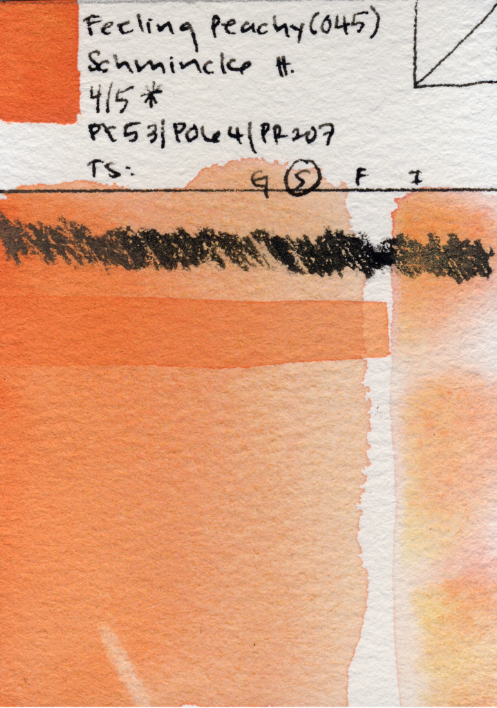
Feeling Peachy was curated by artist Evan Woodruffe, who’s collaborated with Schmincke on curated sets before. I own one of those sets, which coincidentally contains all three pigments used to make Feeling Peachy: PY53, PO64, and PR207.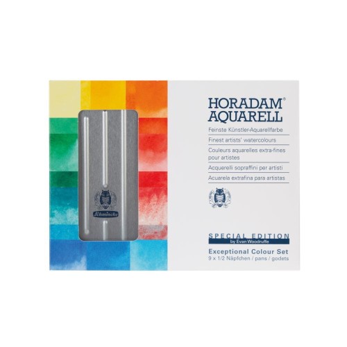
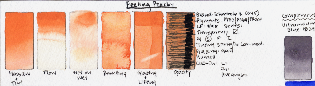
It is staining, non-granulating, semi-transparent, and it glazes quite well. although it is non-granulating, it does separate into pink, orange, and yellow components wet on wet and the effect is really pretty. It’s light valued, And that light value contributes quite a bit to the way this paint feels. PY53 is Nickel Titanate Yellow, and that pigment gives the mixture this sort of naturally pastel quality even though there isn’t actually a white pigment in the formulation. It has low to moderate tinting strength. I often get asked what tinting strength is, and you can think of it as how dominant a paint is in a mix, or how much it influences a mix. an example of a high tinting paint would be phthalo green, we’re just a little bit goes along way. A paint having high or low tinting strength is not good or bad. A low-tinting color can actually be wonderful if I want to make very subtle adjustments to another paint. But it can be frustrating if I’m constantly adding more and more of it to a mixture and nothing is happening.
Hue-wise, I actually really like it. To my eye, it falls somewhere between a Jaune Brilliant and a Shell Pink, except without the white pigment that you would normally find in those colors. The hue remains a pastel orange in masstone and in tints. Feeling Peachy has four out of five stars for lightfastness. I am surprised at its relatively high lightfastness rating – Saturn Red PO64 is only marginally lightfast.
Its best complements are warm blues like Ultramarine Blue PB29 and Cobalt Blue PB28. And with Ultramarine Blue in particular, Feeling Peachy can create a very, very dark storm gray. That’s actually quite beautiful, but personally, it isn’t what I would want for most sunny daytime skies. If I were using Feeling Peachy specifically for skies, I would probably pair it with lighter-valued blues such as Cerulean Blue or Cobalt Blue so I could preserve that atmospheric quality.
And then there’s my other question: Can I already make this? Because convenience colors aren’t bad. I love convenience colors. But I want to know whether I’m buying something that I actually already own. In this case, Feeling Peachy is very easy to DIY, especially because I literally own the three pigments used to make it.
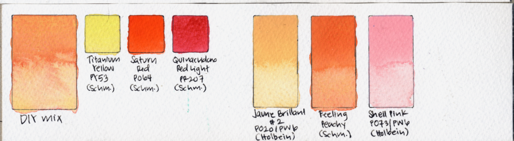
I don’t think this is a must-have color for most palettes. But I can absolutely see someone loving it specifically for florals or for skies, particularly if these kinds of soft warm pastel colors show up frequently in their work. So my provisional category for Feeling Peachy is: CONVENIENCE MIX.
BERLINER SPREEGRÜN
Next is Berliner Spreegrün. And this is almost the opposite problem of Feeling Peachy. This is not necessarily the color that’s going to grab your attention with its hue. This is a very dark forest green. Berliner Spreegrün was curated by the artist Gris, and it’s a four-pigment mixture of PY150, PBr7, PY43, and PBk31.
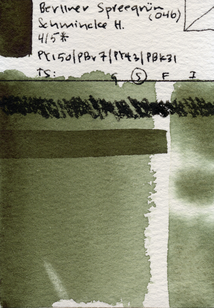
It has four out of five stars for lightfastness. Its staining, semi-transparent, glazes well, and has moderate-to-high tinting strength. It’s very dark-valued and very, very mildly granulating. And I do mean mildly. There is this very subtle brown-green granulation that I find quite beautiful, but you really have to look for it. Schmincke actually describes this as a warmer alternative to Perylene Green, which I find quite accurate and which immediately gives us something useful to test, which is: does this solve a problem that Perylene Green doesn’t? And I find that Berliner Spreegrün handles very much like Perylene Green, PBk31, but it has a more yellow undertone. In fact, it reminds me quite a bit of Roman Szmal’s Forest Green and Sennelier’s Forest Green.
This paint is quite dark-valued. One reason I really like dark valued colors on a palette is that they can let you reach your darkest values without mixing six different paints together. it just makes for an efficient palette. This paint also has a high tinting strength. Its best complement in my testing is Quinacridone Violet, PV19.
As for DIYing it? The hue itself isn’t particularly hard to DIY, especially since it’s essentially perylene green with a touch of py150 and raw Sienna, which Schmincke’s case is made from a mix of PBr7 and PY43. But very dark-valued convenience mixtures are an interesting exception to my usual thinking about DIY paints. Getting the hue approximately right is one thing. Getting exactly the right pigment concentration and value—so I can immediately pick up a very dark green without remixing it every time—can actually be challenging. So I can see real value in having something like this premixed.
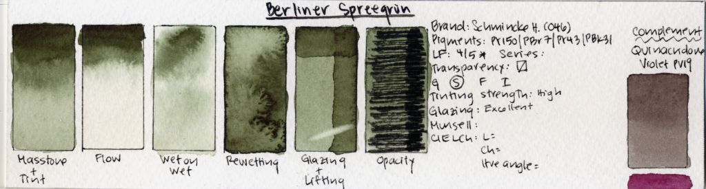
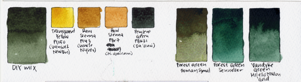
So Berliner Spreegrün’s potential role is pretty clear to me. This is competing for a dark-green / chromatic-neutral slot. Not everybody needs that slot, especially if you already have very dark value of colors like indigo, neutral Tint, or Payne’s Gray that is all ready for filling that role. but if you paint a lot of foliage botanicals forests or landscapes a pre-mixed dark green that dilutes beautifully can be incredibly useful. I think this could be especially useful for achieving dark values in forest landscapes. I could also see it working beautifully in a floral palette, where having a very dark, slightly warm natural green available immediately could be extremely convenient.
Do I think it’s necessary? No. I still don’t find it particularly essential on a palette, especially if you already have something like Perylene Green and good warm yellows or earth colors. But I appreciate that it is genuinely different from Perylene Green. And again, that subtle brown-green granulation is very pretty. So I would put Berliner Spreegrün mostly in: CONVENIENCE MIX.
And maybe just a little bit in: REDUNDANT.
RED OCHRE
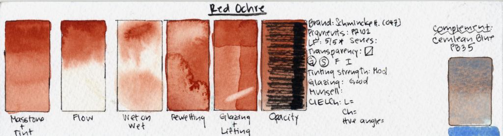
Next we have Red Ochre, developed with Hazel Soan. And I might be the most interested in this one from a practical painting standpoint. Because earth reds are some of the least exciting paints to look at, yet some of the most useful paints to own. This is a single-pigment PR102 paint.
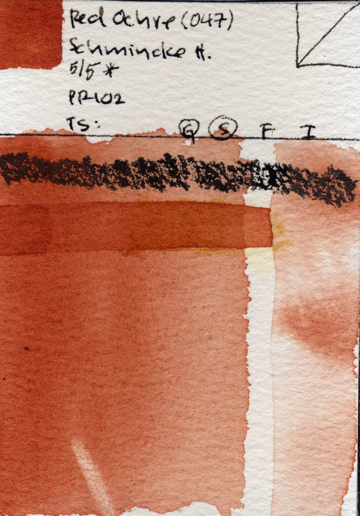
And given that Hazel Soan’s previous curated palettes with Schmincke tend to prioritize single-pigment paints that are good mixers, I don’t find that choice surprising at all. I talked about hazel soan’s most recent curated pallet with schmincke in my last Watercolor News Report.
It has five out of five stars for lightfastness. It’s staining, granulating, semi-transparent, decent at glazing, low-to-moderate in tinting strength, and mid-valued. I generally really like single-pigment paints. Partly because you don’t have to worry about multiple pigments separating unexpectedly in mixtures, and they also tend to simplify questions around lightfastness compared with multi-pigment convenience mixtures. Schmincke describes this as a softer earth red than sienna or burnt sienna, and suggests things including red rocks, skin, brick, roofs, landscapes and figures. That is a huge range of potential applications.
The hue of this paint is really beautiful. I’m accustomed to red ochres like the one from White Nights, which is more orange-leaning, more opaque, and can feel quite strident in mixtures. This is much more pink-leaning and delicate. And I love it.
Its best complement in my testing is Cerulean Blue PB35. As you can probably imagine this paint would work really well in landscapes. I just got back from a trip to the Southwest, for which I made a video curating a Southwest themed palette, which I will link here. This paint would have fit in so well into that palette
But Red Ochre isn’t limited to landscapes. I can see a paint like this working in so many different kinds of palettes: portraits, landscapes, florals, figure painting, even urban sketching.
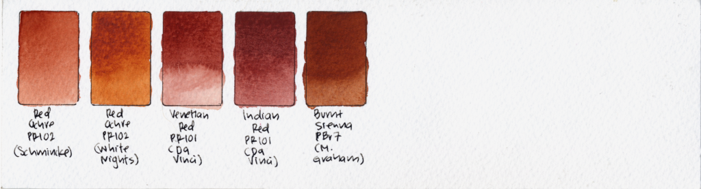
Unlike some of the other colors today, I don’t think its usefulness depends on you painting one particular subject. So for Red Ochre, I’m very comfortable putting this one under: WORKHORSE PAINT.
AMBER
Now we get to the weird one. This is Amber. And Amber is made from PBr33, PR108, and PY150. And I am fairly sure that the PR108 component here is Schmincke’s extremely granulating Volcano Red.
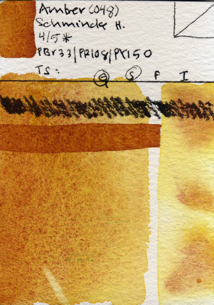
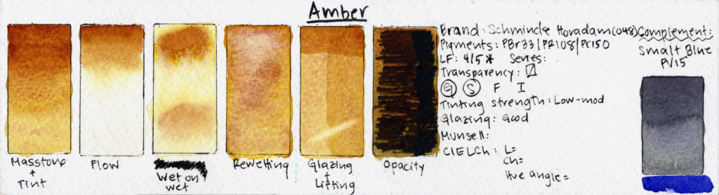
It has four out of five stars for lightfastness. It’s granulating, staining, semi-transparent, surprisingly decent at glazing, and has low-to-moderate tinting strength. One weird physical thing I noticed: like Nickel Azo Yellow, PY150, and quite a few paints containing a lot of it, Amber develops this peculiar texture when it’s panned. it almost feels like your brush is scrubbing against a smooth plastic. It isn’t unpleasant and it doesn’t interfere with rewetting at all. It’s just one of those weird watercolor-material things that I thought was worth pointing out.
Schmincke’s description of this one specifically emphasizes the way the color changes with water and paper texture. That immediately tells me something: this paint probably isn’t primarily about hue. It’s about behavior. Paints like this require a slightly different standard. If I judge Amber based on whether I can mix this exact color from colors I already own, I may be asking the wrong question. Of course I can mix this hue! What I need to ask is: can I reproduce this behavior? This paint granulates quite a bit even in mass tone. PBr33 and PR108 are much heavier pigments than PY150, and wet-on-wet the difference is particularly obvious. The PY150 diffuses outward very evenly and creates that characteristic bright yellow halo, while the heavier brown and red pigments tend to remain more localized.
This is where granulating mixtures get really interesting. Multiple pigments can move through wet paper at different rates and settle into the texture differently. And suddenly the paint is producing variation without me physically painting every variation. I have video about this exact concept in granulating paint, and how to analyze their potential in a swatch.
Its best complement in my testing is Smalt Blue, PV15, from Winsor & Newton. Ultramarine Violet by Schmincke and M. Graham would work well here as well. Hue-wise, Amber is actually a little difficult for me to place. The closest comparison that comes to mind is something like Quinacridone Deep Gold from Daniel Smith.
Technically, this is another paint that is quite easy to DIY. PBr33, PR108 and PY150 aren’t doing something conceptually difficult to understand. But there is an important caveat. If my suspicion about the PR108 is correct, you would really need something with the behavior of Volcano Red to recreate this exact effect. So this paint is theoretically easy to DIY, but logistically, maybe not if you don’t have Volcano Red in your stash.
But here’s the tradeoff. A paint that’s wonderful because of its complicated physical behavior may not be the paint I reach for when I need a clean, predictable mixes. Every pigment I add creates another participant in that mixture. And that can be beautiful but also often chaotic. This is why I don’t really like saying that granulating paints are “bad mixers.” They’re not – they’re just less predictable mixers. And sometimes unpredictability is exactly what I want. If I’m painting florals? then Maybe not. If I’m painting a giant New Mexican rock wall? Then give me the chaos!
So Amber, to me, is competing much more for a special-effect / texture-color slot than a traditional mixing slot. And that’s a completely legitimate reason for a paint to exist.
However, I have to admit: out of all five of these paints, this is the only one that I just don’t really like. I don’t particularly like the hue. I don’t particularly like the way the pigments separate. And I can absolutely appreciate that the texture it creates can be really beautiful. But I think if they had picked almost any other transparent color other than PY150, I might have liked the effect better. I even liked this mix better when I DIYed it using Transparent Yellow Oxide PY42, Raw Sienna PBr7, and Da Vinci Yellow PY154 in the place of Nickel Azo Yellow PY150.
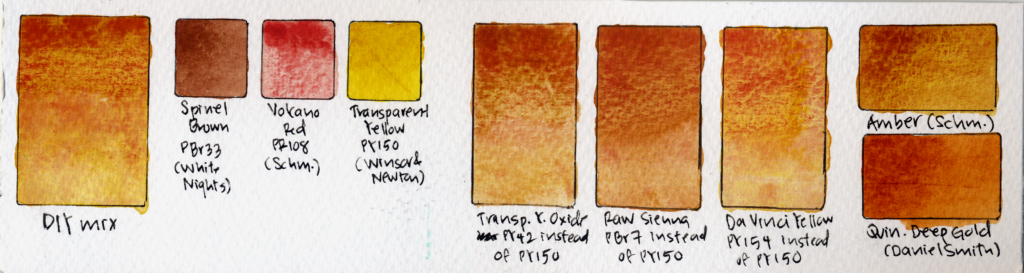
But, Nickel Azo Yellow’s bright acid yellow halo surrounding the brown and red granulation is an effect that aesthetically, isn’t especially pleasing to me, and I personally just can’t think of much of a use for. But because of all this, Amber goes firmly in: SPECIAL EFFECT. And possibly just a tiny bit into an additional category I’ve created specifically for this paint: WHY?
LAVENDER
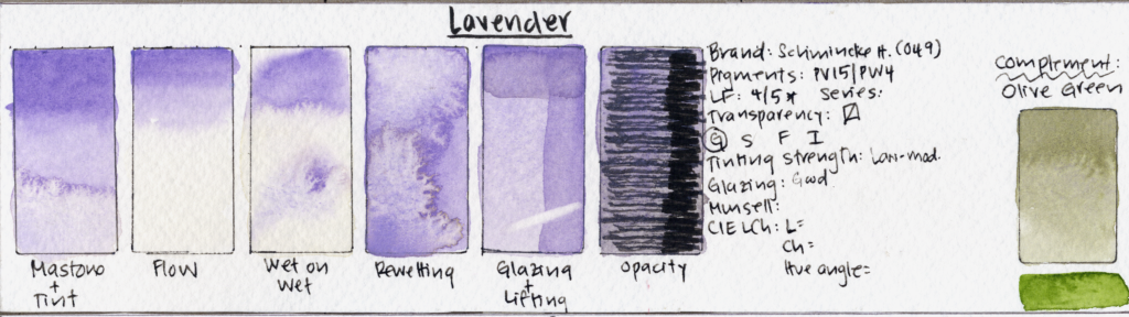
Finally, Lavender. Schmincke describes this as a delicate granulating blue-violet based on PV15, and importantly, it’s nonstaining. The full mixture is PV15 plus PW4.
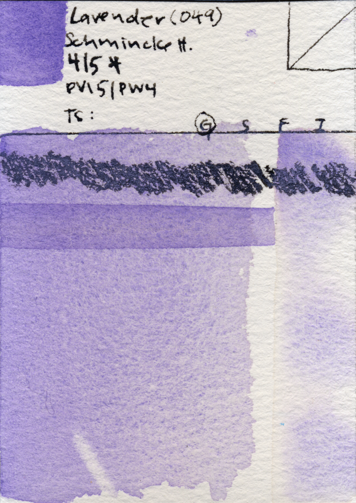
It has four out of five stars for lightfastness. It’s granulating, non-staining, semi-transparent, low-to-moderate in tinting strength, decent at glazing, and light-to-mid-valued. And Lavender is a genuinely useful type of paint to have on a watercolor palette. I’ve actually made an entire video about what Lavender paint is and how to use it, so I’ll put a card here if you want a much deeper dive.
There are a couple of things I particularly like about Schmincke’s version. The granulating particles are quite large. That contributes both to how non-staining the paint is and to this really pronounced and uniform texture that I personally find incredibly pretty. I also find the choice of Zinc White PW4 rather than Titanium White PW6 interesting. That choice makes this paint somewhat less pastel-like than some other lavender paints. And I don’t think that’s inherently good or bad – it just depends on whether you prefer your Lavender to be lighter or darker-valued. Its best complement in my testing is Olive Green.
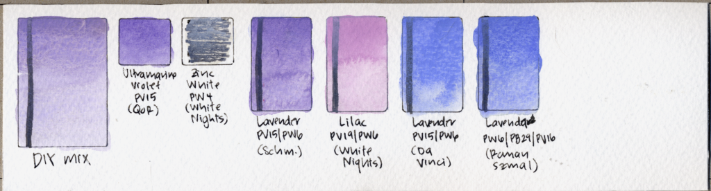
But there is one thing about this Lavender that I personally have a hard time getting past: it is very purple-leaning. This is where the name “Lavender” gets a little nebulous. You can DIY Lavender pretty easily by taking a granulating violet pigment like Ultramarine Violet PV15 or Manganese Violet PV16—combining it with a warm blue such as Ultramarine Blue PB29, or Cobalt Blue PB28, and then adding a white pigment. I prefer Titanium White PW6 for this purpose.
But here, Schmincke has only used PV15 and a white pigment. So to my eye, this starts looking much more like Lilac than what I personally think of as Lavender. I’ve compared it to Lilac by White Nights, Lavender by Da Vinci, and Lavenda by Roman Szmal Aquarius. If we compare them to Schmincke’s version, I think you can see what I mean. It falls somewhere between the two—but definitely closer to Lilac. This is entirely a preference thing. I love Lavender but I really don’t like Lilac paint. So I tend to want my Lavenders to be noticeably blue-leaning. That does not mean Schmincke made this paint incorrectly. I think of this as useful data for me, and useful data for you, which is really the entire point of doing these tests.
And as I mentioned, DIYing Lavender is not difficult. In fact, that’s why I no longer keep Lavender as a dedicated paint on my own palette. I always have a granulating warm blue and I always have a granulating violet. I also always keep a little tube of PW6. So if I actually need Lavender, I can mix it in seconds.
Which means that even though I think Lavender as a color category is extremely useful, Schmincke’s Lavender goes into: CONVENIENCE MIX.
SO…WHICH ONES ARE ACTUALLY USEFUL?
Now I think we can finally answer the question we started with. Based on our tests, I decided that:
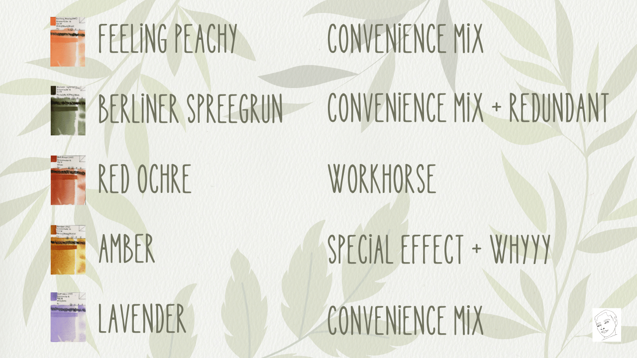
And this is probably the biggest takeaway from our analysis today. When we’re evaluating paint, we have a tendency to ask: “Is this a pretty color?” This is an important question, because fundamentally we should be getting Joy from our paints, and us enjoying the color is an important part of that!
But when looking at a paint for its practical painting potential, I don’t think that’s a useful question. Instead, ask:
- What job does this paint perform?
- Does it give me a hue that is difficult to mix?
- Does it give me a useful shortcut?
- Does it provide something useful like high tinting strength or dark value?
- Does it give me unusual physical properties like granulation or separation that can help me create texture and atmosphere?
- Can I easily DIY it from paints I already own?
Because two painters can test the exact same paint and reach completely different conclusions. A botanical painter and an urban sketcher need different things from a pallet. the same is true for A portrait painter and a landscape painter. And someone who loves smooth transparent glazing may actively dislike the exact physical property that makes another painter obsessed with a paint.
That’s why I think analyzing watercolor gets so much more interesting once we stop treating pigments like points on a color wheel. Watercolor paint isn’t just color: it’s color PLUS physical behavior. And both of those things determine what happens in the painting.
So, these are my first conclusions about Schmincke’s five new limited-edition colors! I am very curious which one you would actually put on your palette. do also let me know what you would use it for.
Check out The Swatch Archive for high-resolution swatches of today’s paints!
as always, please do check out my memberships on YouTube and patreon for a lot more watercolor science, and look out for episode 1 of my new podcast “The Watercolor Science Report”.

As always, stay curious and happy painting!