

Watercolor is sometimes less of an art medium, and more like a highly regulated competitive sport.
You must protect your highlights – but you cannot use white.
You must create dark values – but you cannot use black.
You must convey depth and detail – but you cannot use opaque paint.
But during my investigations, I realized something important: most of these rules started as a useful idea, meant to make learning watercolor easier. But some of these rules became bigger than their original idea. And, some of these ideas are just aesthetic preferences that we’ve been told are facts.
Why Do Art Rules Exist?
Rules are useful because teaching watercolor is difficult. Imagine you’re teaching someone who has never used watercolor. They load their brush with thick paint and very little water, rub the paper repeatedly, and create a patchy area. Then they panic, add more paint, scrub again, and end up with a dull overworked mess. I know I’ve been there many times.
As a teacher, you could explain moisture levels, brush loading, paper sizing, pigment binder, pigment concentration, drying stages, and the relationship between brush pressure and paper integrity. Or, you could just say: “Try to put down the wash in one stroke and don’t fuss with it thereafter.” This is really solid beginner advice!
Eventually though, we all grow as painters, and learn the finer points of water control, paper, and brush technique. This wisdom should add context to the rules we learned as beginners, but curiously the same rules we learned as beginners continue to live context-free in our memory. Because of this, “Try not to fuss with this wash once you put it down” becomes “In watercolor, you should never go back into a wash.”
For the three rules that I’ll be chatting about today, I asked myself these questions:

To me, this is how to approach these complicated rules with curiosity and scientific inquiry, rather than treating the rules as watercolor doctrine.
#1: Never Use Black
Black pigments are among humanity’s oldest art materials, and artists have valued and used them for thousands of years. So, how did black pigments go from staple art materials to paint box pariahs?
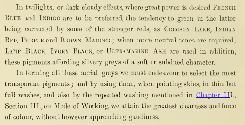
Black pigments have always been an established paint material even in watercolor. In his 1855 watercolor manual, George Barnard recommended diluted Ivory Black for grey skies and distant landscape elements. So avoiding black wasn’t just a discovery that made an older art material obsolete. It was just an approach among many.
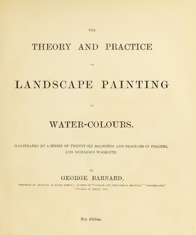
We don’t have to only look at historical painters – there’s plenty of modern precedent for using black pigments in watercolor. Nicolas Lopez, Paul Wang, and Agus Budiyanto all make beautiful use of black iron oxide PBK11’s granulation in their art. Alvaro Castagnet, Thomas Schaller, and Michael Solovyev all include Neutral Tint in their palette. These are artists whose paintings I admire for their light and vibrancy, and they achieve it despite having black in their palette.
This brings me to a particularly interesting point. Artists sometimes advise against black pigments while recommending Indigo, Payne’s Grey, or Neutral Tint instead. But most formulations of these paints contain black. Daniel Smith’s Indigo is made from PB60/PBk6. QoR’s Payne’s Gray is made from PB15:3/PBk7/PV19.
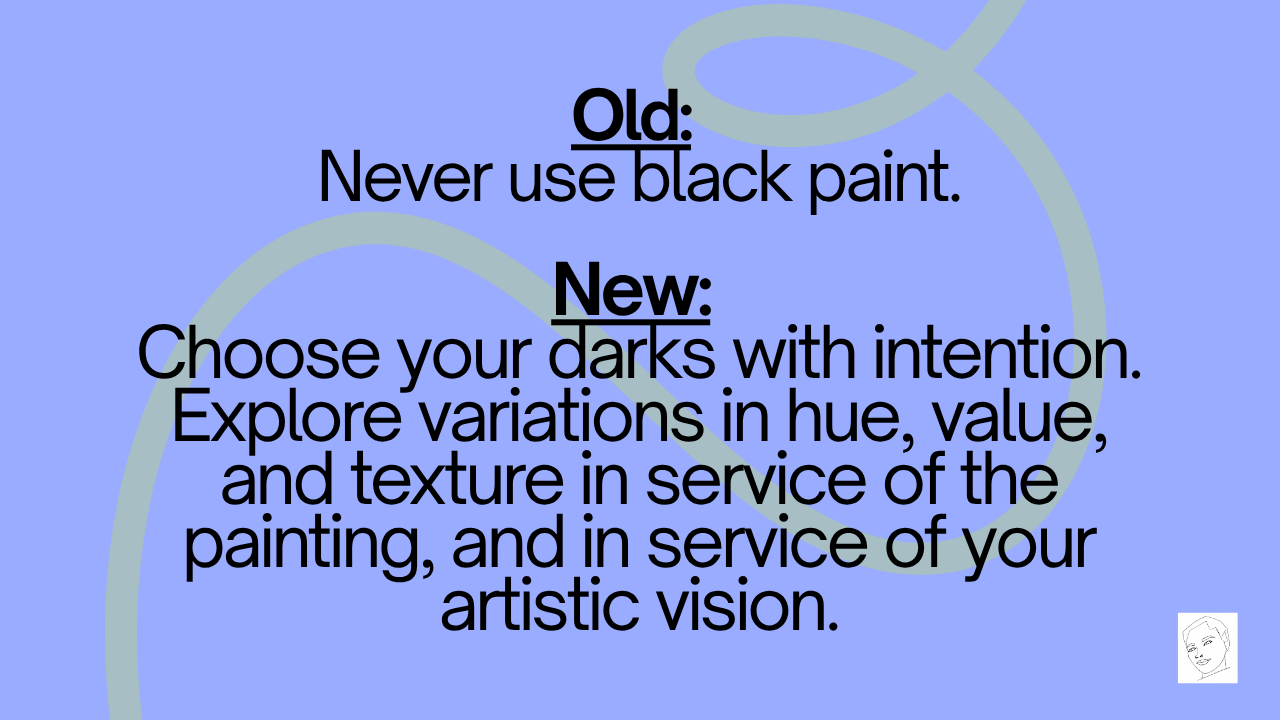
There is a useful kernel of warning that I think is true for me inside “never use black”. If I automatically reach for Ivory Black to paint every shadow, I might overlook opportunities for shifts in hue and value. But using black doesn’t prevent those variations. I can mix other colors into the black pigment to make Indigo or Payne’s Grey, or straight up introduce it into a wash. And for some artists, monochromatic shadows with black pigments may be what their artistic vision dictates, and that’s very valid.
So, what would be an improved version of this rule?
#2: Never use white
White paint receives an even stranger accusation: that it’s not real watercolor.
But this was not always the case. White paint has a long history in watercolor, and was prominently used in the work of JMW Turner. The introduction of Chinese White in 1834 expanded artists’ options for opaque mixtures and highlights. But by the mid-19th century, some British artists and critics were already arguing that opaque watercolors, often called bodycolor, weren’t legitimate watercolor.

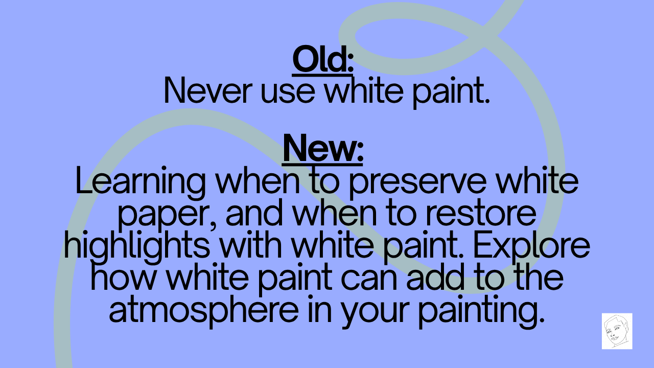
Traditionally, watercolorists are taught to preserve highlights by leaving the white of the paper untouched. This is valuable advice! Planning your highlights helps you to think carefully about value shapes in your painting, and helps create a sense of light. But preserving white paper is a technique, a means to an end. There are other ways to create light areas as well.
The rule “Don’t Use White” extends beyond highlights. Mixing white into transparent watercolors can also be considered no longer “real watercolor”.
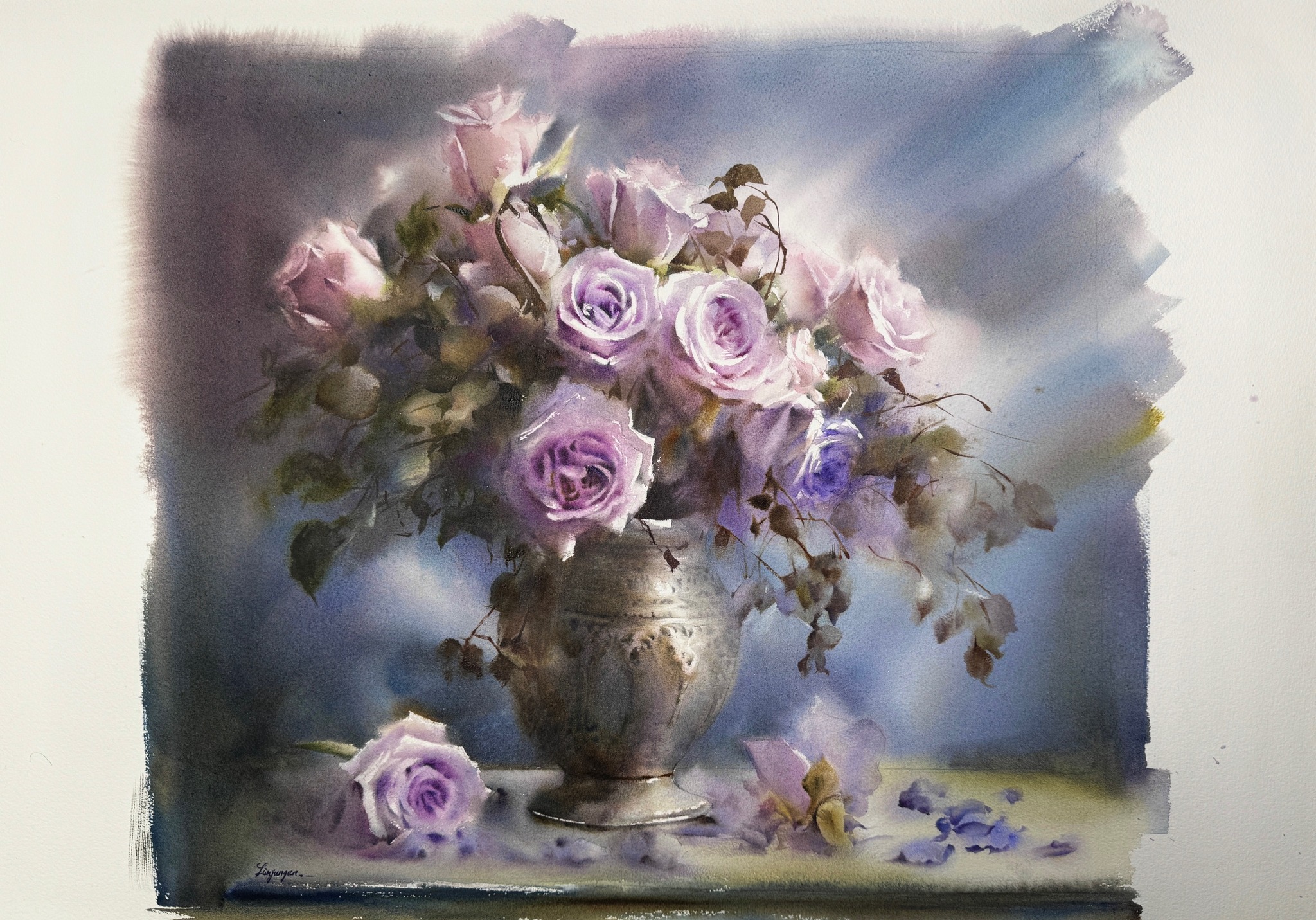
The idea behind this is that the white of the paper is a watercolorist’s equivalent of white paint. To lighten a color, we dilute it with water and allow more of the paper to show through. This is a very useful approach. But personally, when I mix white into my watercolors, I’m not just looking for a lighter value. White pigments like Chinese White PW4 and Titanium White PW6 soften bright watercolors and give them a deep, velvety quality that I love. They also create dreamy atmospheres with granulating paints.. Lin Gungun uses pastel watercolors to create beautiful effects in florals.
My version of this “rule” is:
#3: “Don’t Use Opaque Paint”
White paint is a good segue into another rule: never use opaque watercolor. I’m especially interested in this one because I deeply love transparent paints. But, transparency isn’t the end all be all in watercolor paint – it’s just a useful material property that is right in certain situations. So how did it become a test of artistic legitimacy?
Transparent washes have a long history in watercolor. In 18th century Britain, artists used thin washes to tint drawings made in ink or graphite.

At the turn of the 19th century, artists like Thomas Girtin and JMW Turner helped expand watercolor into a more ambitious painting medium, using stronger and more expressive washes to capture light and atmosphere.
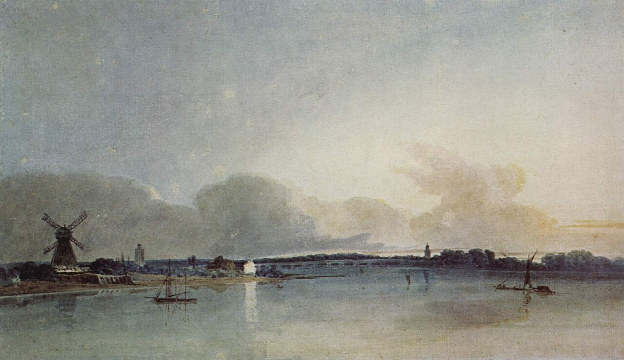
Their palettes didn’t have the phthalos and quinacridones we have today. This doesn’t mean that traditional artists didn’t have transparent paints. But they also used earth pigments like Yellow Ochre, Burnt Sienna and Indian Red which tend to be more opaque.
So the history isn’t that watercolorists originally used only perfectly transparent pigments, and then someone came along and ruined everything with a tube of opaque paint. Instead, transparency became an ideal that artists and critics used to define the medium. As we discussed with white paint, opaque paint was already contentious in Victorian Britain. Again, critics championed transparent watercolor in contrast to the growing use of opaque bodycolor. So, we have a tradition of valuing transparency that became an argument that transparency determined watercolor legitimacy. And I do understand the attraction – a transparent wash can be beautiful. But its beauty doesn’t mean that opacity is wrong.
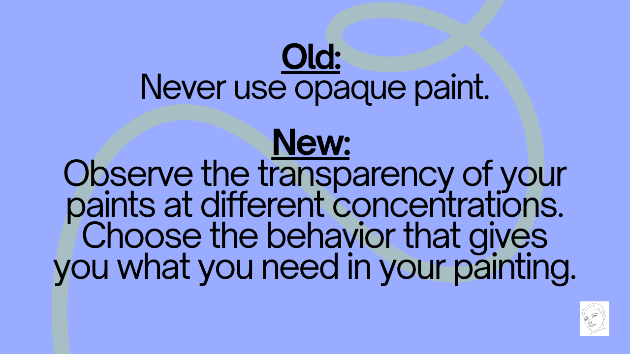
So, before throwing away your opaque paints, ask yourself these questions: will this paint cover something that I want to keep visible? Will the opacity help achieve the effect I need? These are the most important questions, rather than if opaque watercolors are cheating.
So, I would replace “never use opaque watercolor with”:
Final Thoughts
After spending nearly an hour dismantling rules, I will admit that I have some rules of my own.
First: learn what your materials do. Approach them with curiosity, and understand their strengths and limitations. With these observations in hand, decide if an art material is right for you, even if it might be considered “cheating.”
Second: identify your goal. Do you want to paint and relax in a sketchbook? Do you want to work up to larger paintings? What is your artistic vision, and how can you achieve it? On a smaller scale in a painting: why are you making this painting? What do you want to communicate? What vibe are you going for? Do you want to carefully plan your painting, or do you want to spontaneously see where the water and paint take you? Then pick your supplies based on which can help you achieve this vision. There is no best pigment or technique, only tools that are more or less suited to a particular result.
Third: distinguish a preference from a rule. Painting without black can encourage you to carefully observe shadows. Painting without white can encourage you to boldly preserve large areas of white paper. Painting without opaque paints can teach you how to build depth and detail. And so, I encourage you to challenge yourself with these limitations.
Observe what you see, learn from it, then decide if it’s right for you – even if it’s against watercolor rules.
Let me know in the comments what watercolor rules you swear by, and which you break all the time.
Thank you for joining me for the first episode of The Pigment Podcast! As always, stay curious and happy painting!