

When we talk about limited paletts, there’s one piece of advice that comes up all the time: choose some version of the three primaries, a yellow, a red, and a blue. And the reasoning seems to make sense: if you choose these colors carefully you can mix a surprisingly large range of colors from just three paints.
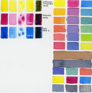
But I think that can imply that the goal of a limited palette is always to create the largest possible mixing range. And I don’t think that’s always the point. Sometimes the largest mixing range is just not what I’m looking for. Sometimes, I’m not trying to build a palette around the color wheel. I’m trying to build a mood.
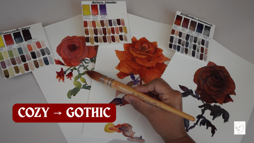
Autumn, especially as we move toward Halloween, is such a good excuse to explore this idea. So many of the colors that create cozy, moody, or spooky atmospheres live outside the traditional primary palette. Today, we are going to build a series of small Autumn palettes, starting with bright October sunlight and gradually moving through dark academia haunted forests Gothic colors graveyards, and eventually a palette where every single paint is fugitive, to remind us that life is fleeting.
My ultimate question will be: what colors and pigment characteristics do I need to create a particular atmosphere? And I want to start at the brighter end of autumn before things get progressively darker.
October Light
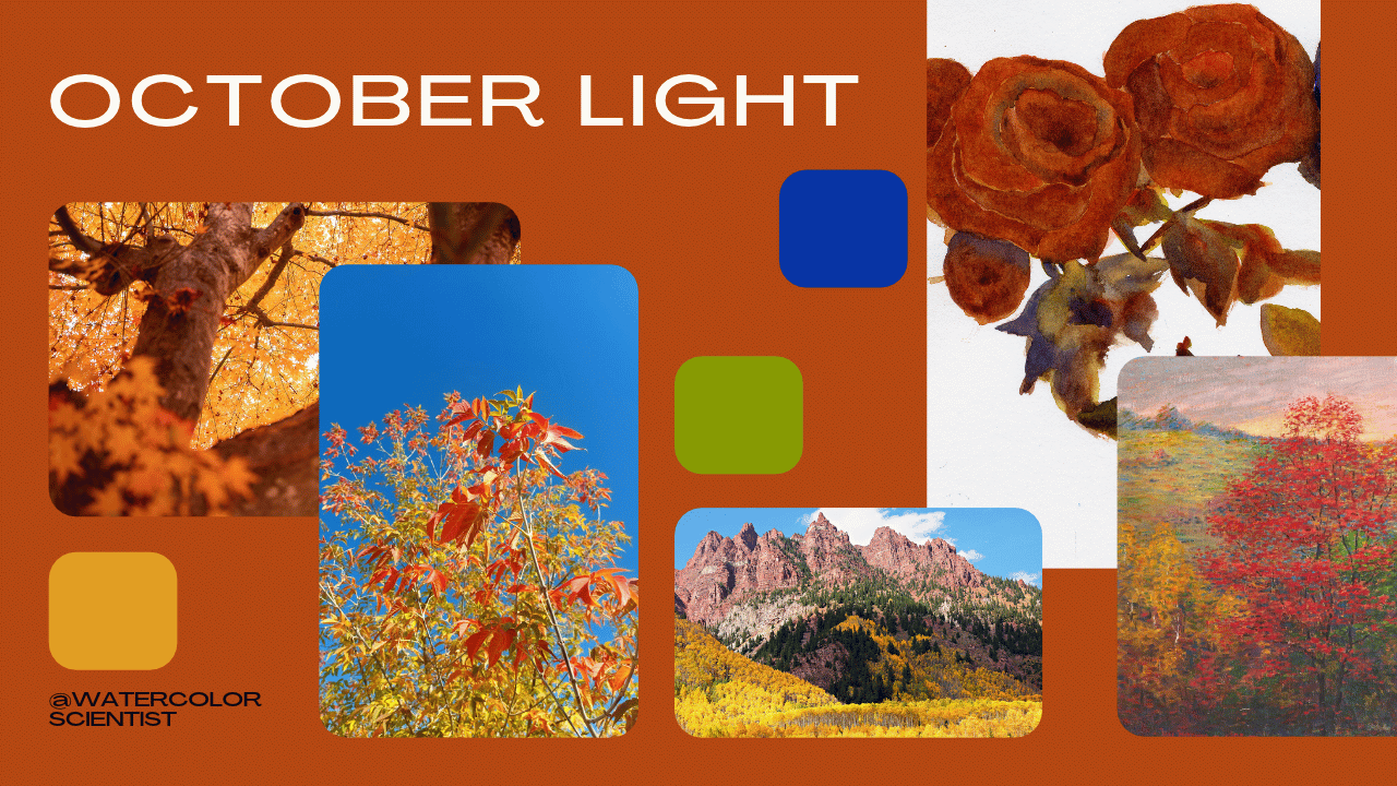
The first palette is October light. For this palette, I wanted the feeling of a clear autumn afternoon, golden grasses, that intense warm blue that you sometimes get in an autumn sky, and leaves that are somewhere between yellow and rust. So I’m using Raw Sienna PBr7 by M. Graham, Quinacridone Sienna PO48/PY150/PR209 by Daniel Smith, Green Gold PY129 by MaimeriBlu, and Cobalt Blue Deep PB28 by Da Vinci.
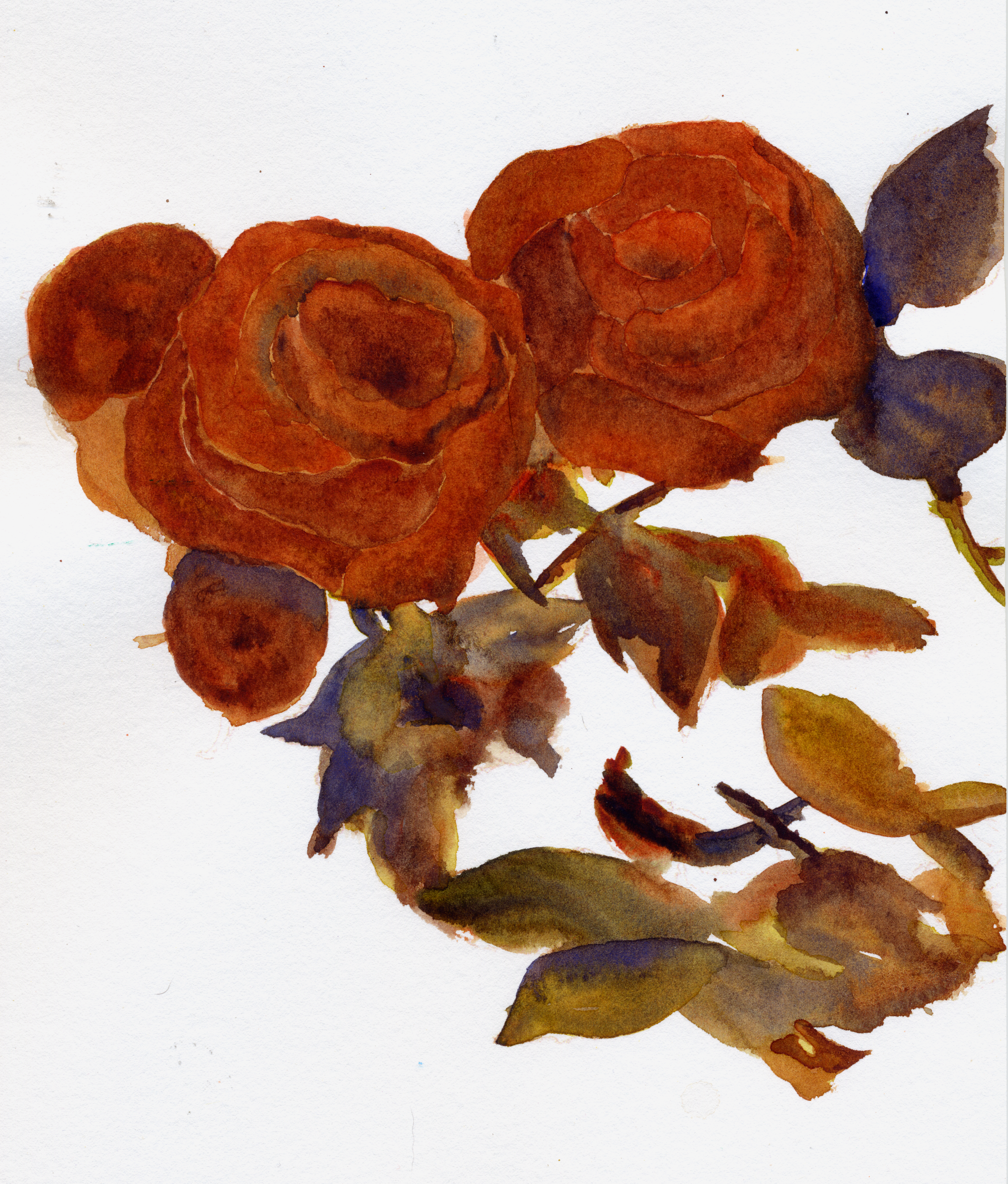
Dark Academia
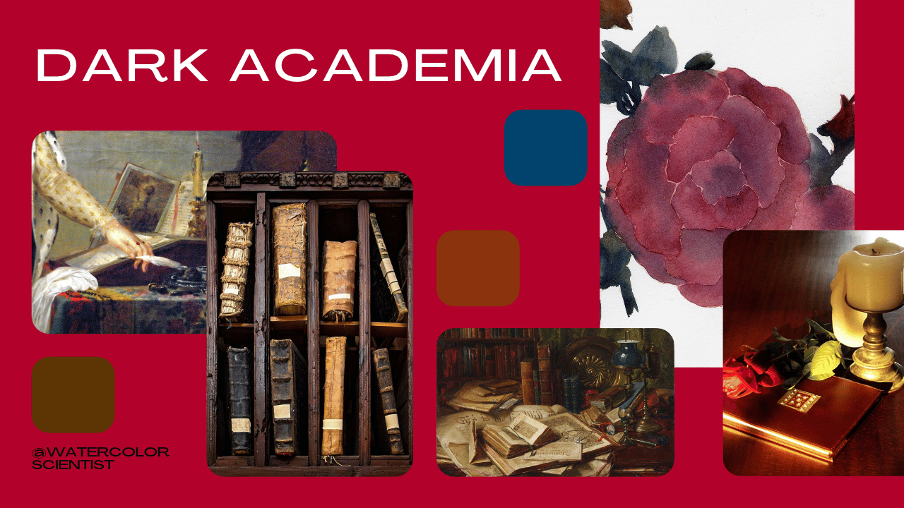
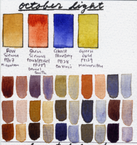
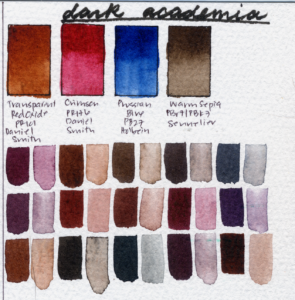
The next palette moves us indoors. For this one, I used Transparent Red Oxide PR101 by Daniel Smith, Carmine PR176 by Daniel Smith, Warm Sepia PBr7/PBk7 by Sennelier, and Prussian Blue PB27 by Holbein. This palette is all old wood, leather, books, ink, deep red fabric, and dimly lit interiors. This palette has a very restricted color range. And that’s what makes it work. If I were trying to maximize my color range I’d make very different choices. But if I want to create the mood of a reading nook with a stack of old books beside a dark wooden desk, these are the right paints for that job.

Haunted Forest
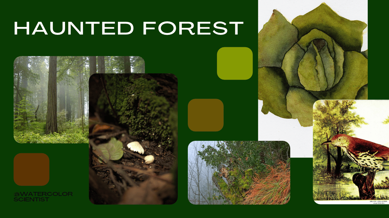
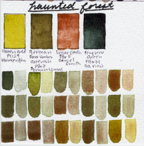
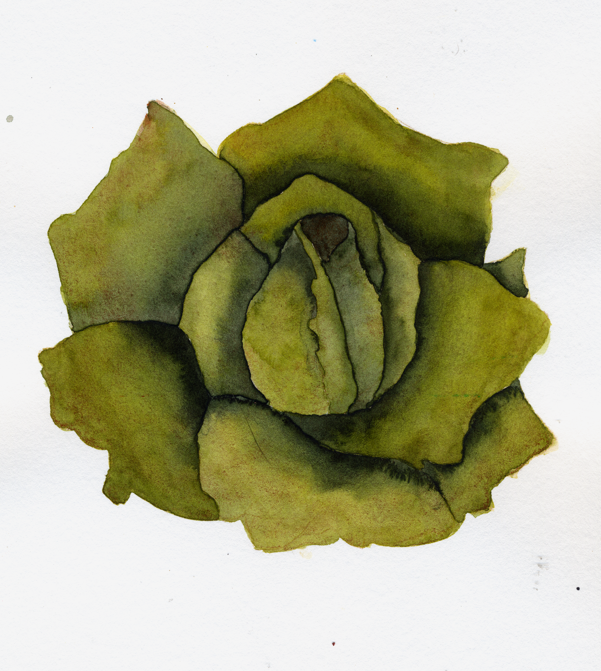
Next is Haunted Forest. This one is Green Gold PY129 by MaimeriBlu, German Greenish Raw Umber PBr7 by Roman Szmal Aquarius, Lunar Earth PBr11 by Daniel Smith, and Perylene Green PBk31 by Da Vinci. We have many different kinds of green here, but Lunar Earth has a purpose here as well: the wild brown granulation is just as important in this palette as the golden green dusky brown and forest green hues.
Gothic Romance
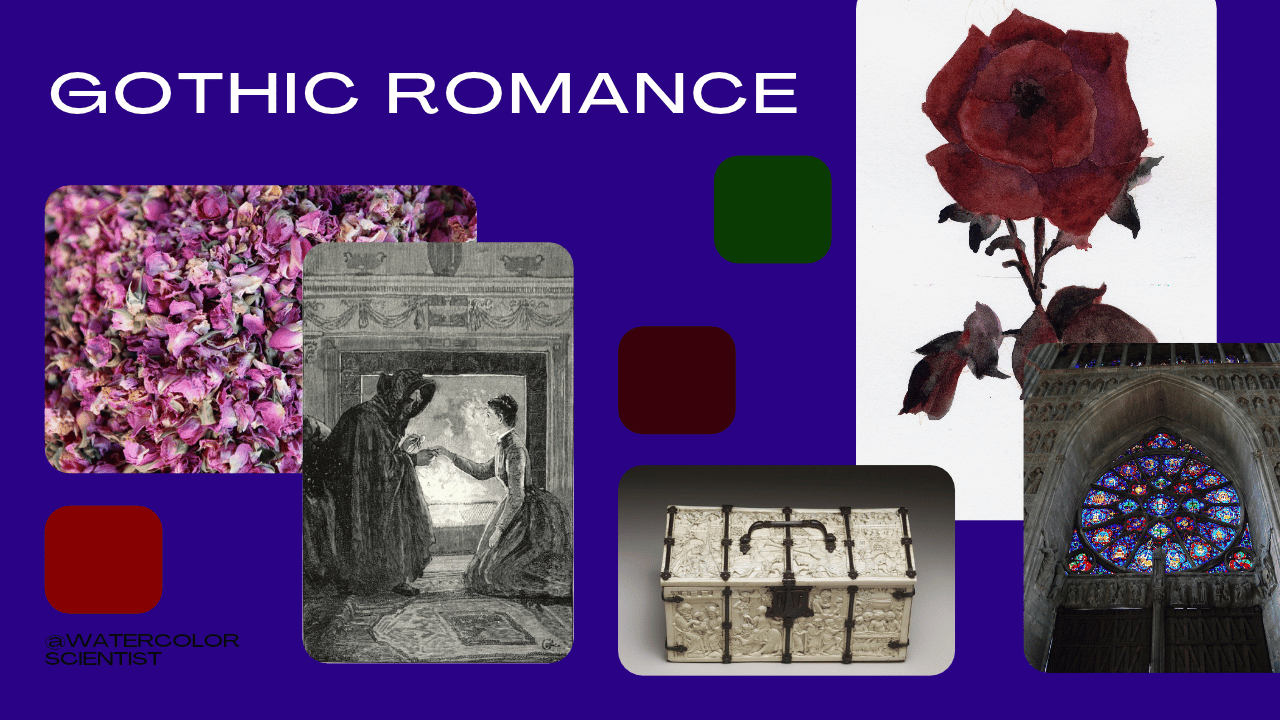
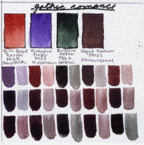
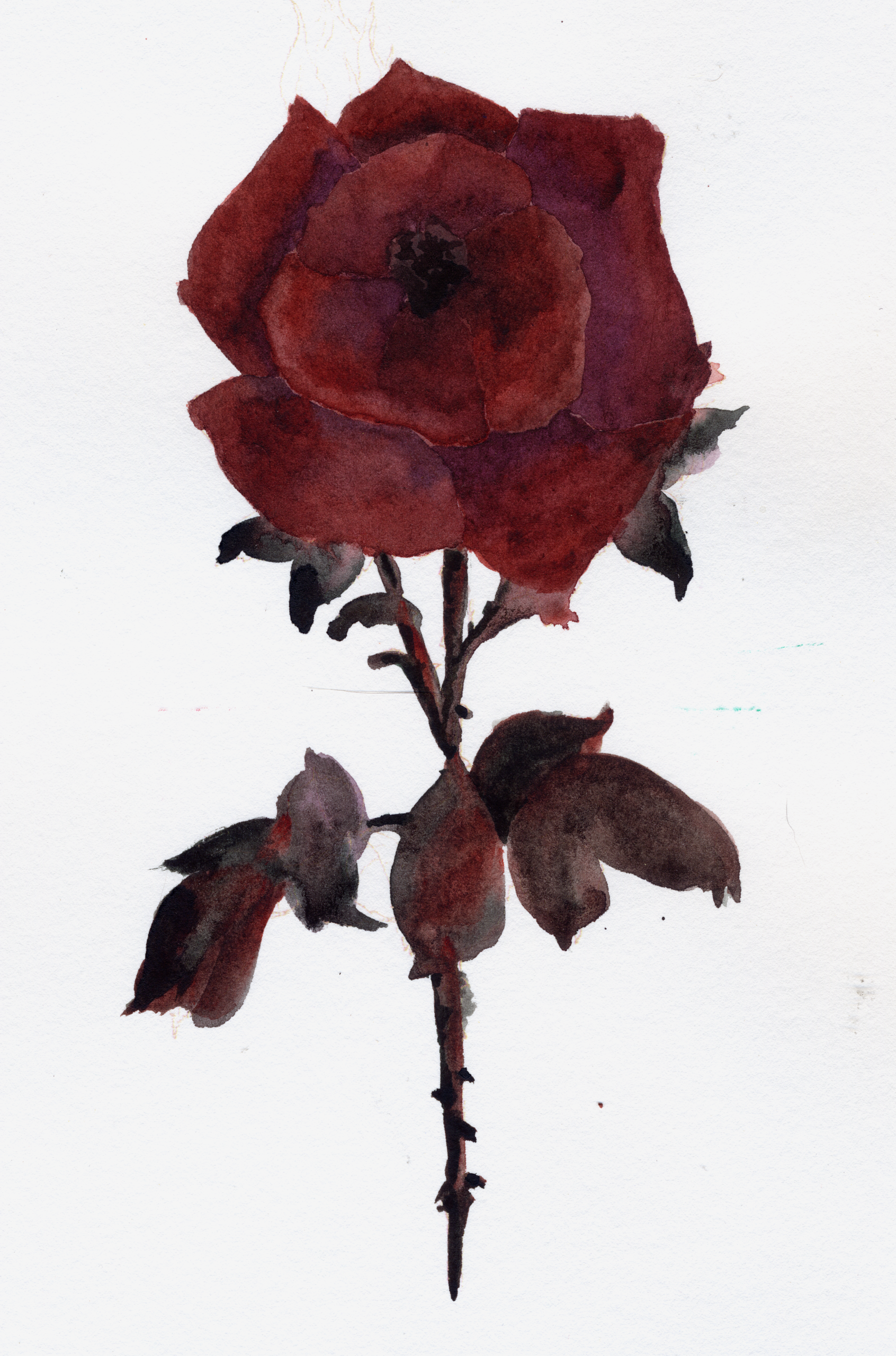
Now we’re moving into high drama. This is Gothic Romance. For this palette I used Quinacridone Burnt Scarlet PR206 by Daniel Smith, Dioxazine Violet PV23 by M. Graham, Perylene Green PBk31 by Da Vinci, and Caput Mortuum PR102 by Roman Szmal. What interests me about this one is the variety of darks we can create because there are so many near complements in this palette. We don’t need a black pigment because we can create dark neutrals with Quinacridone Burnt Scarlet and Dioxazine Violet, Caput Mortuum and Perylene Green, and Dioxazine Violet and Perylene Green.
Victorian Mourning
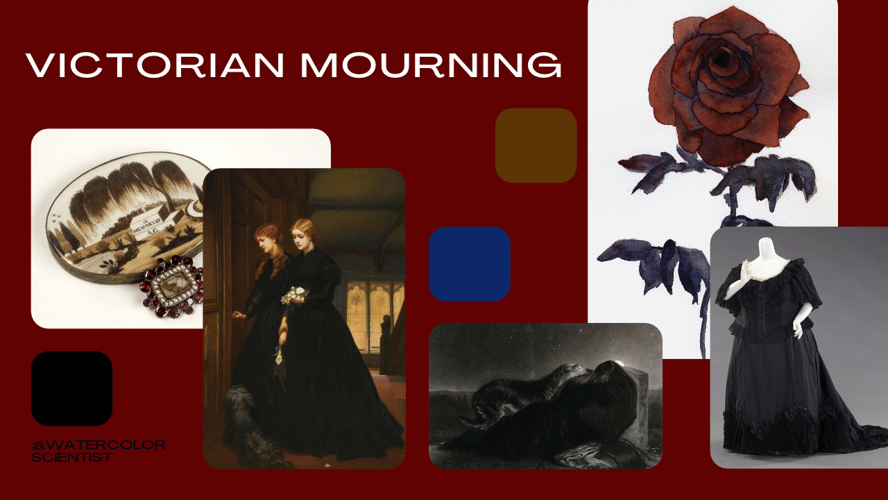
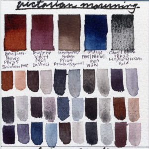
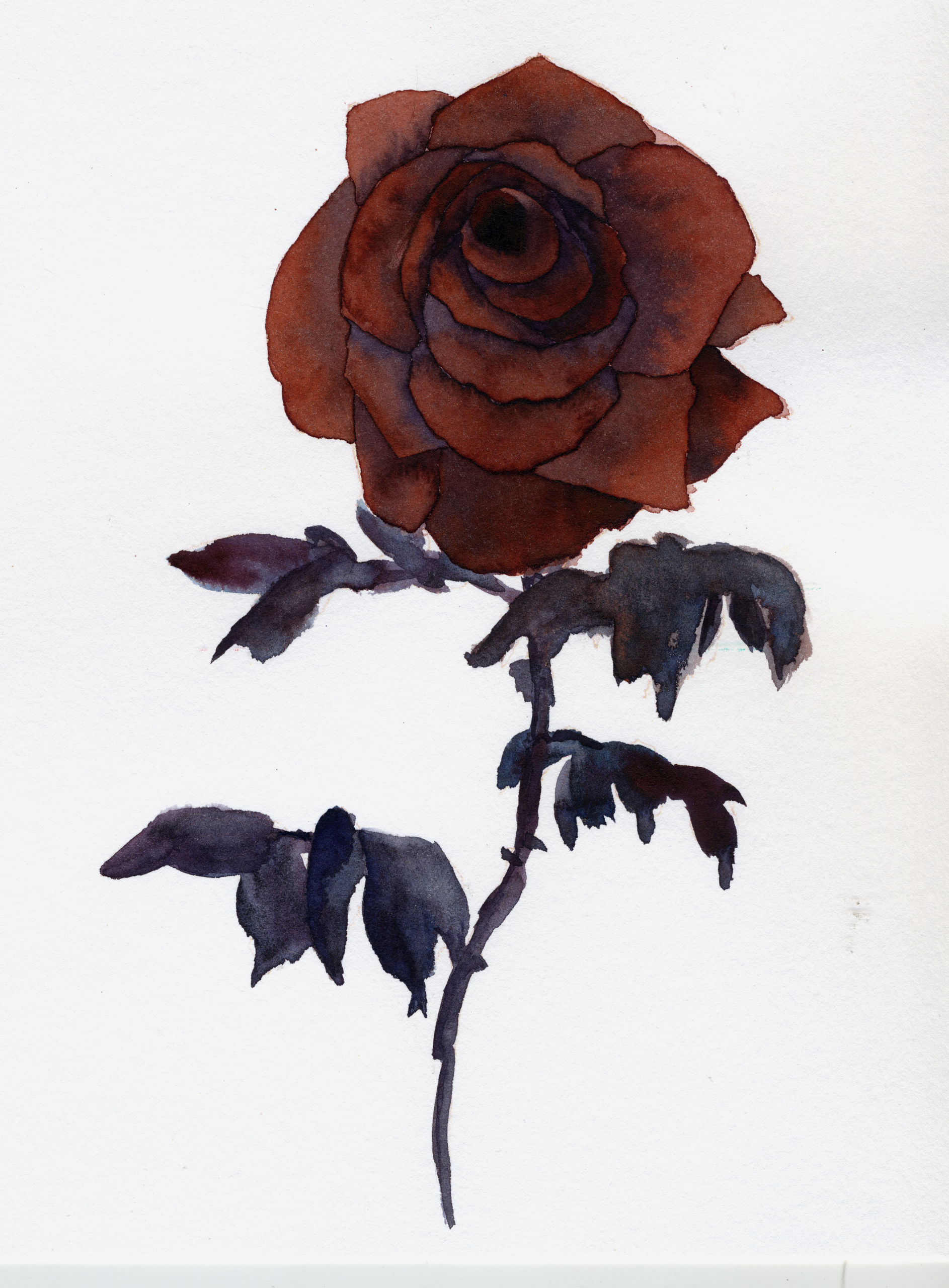
Victorian Mourning is even more restrained. For this one, I chose Benzimidazolone Brown PBr25 by ShinHan PWC, Perylene Violet PV29 by Da Vinci, Manganese Brown PY164 by Roman Szmal Aquarius, Indigo by Winsor & Newton, and Cobalt Black PBk27 by Mijello Mission Gold. The inspiration here is dark wood, faded red fabric, old photographs, black clothing, brown black interiors, and cold blue shadows. This palette is not especially colorful, and that’s exactly why I like it.
Halloween Night
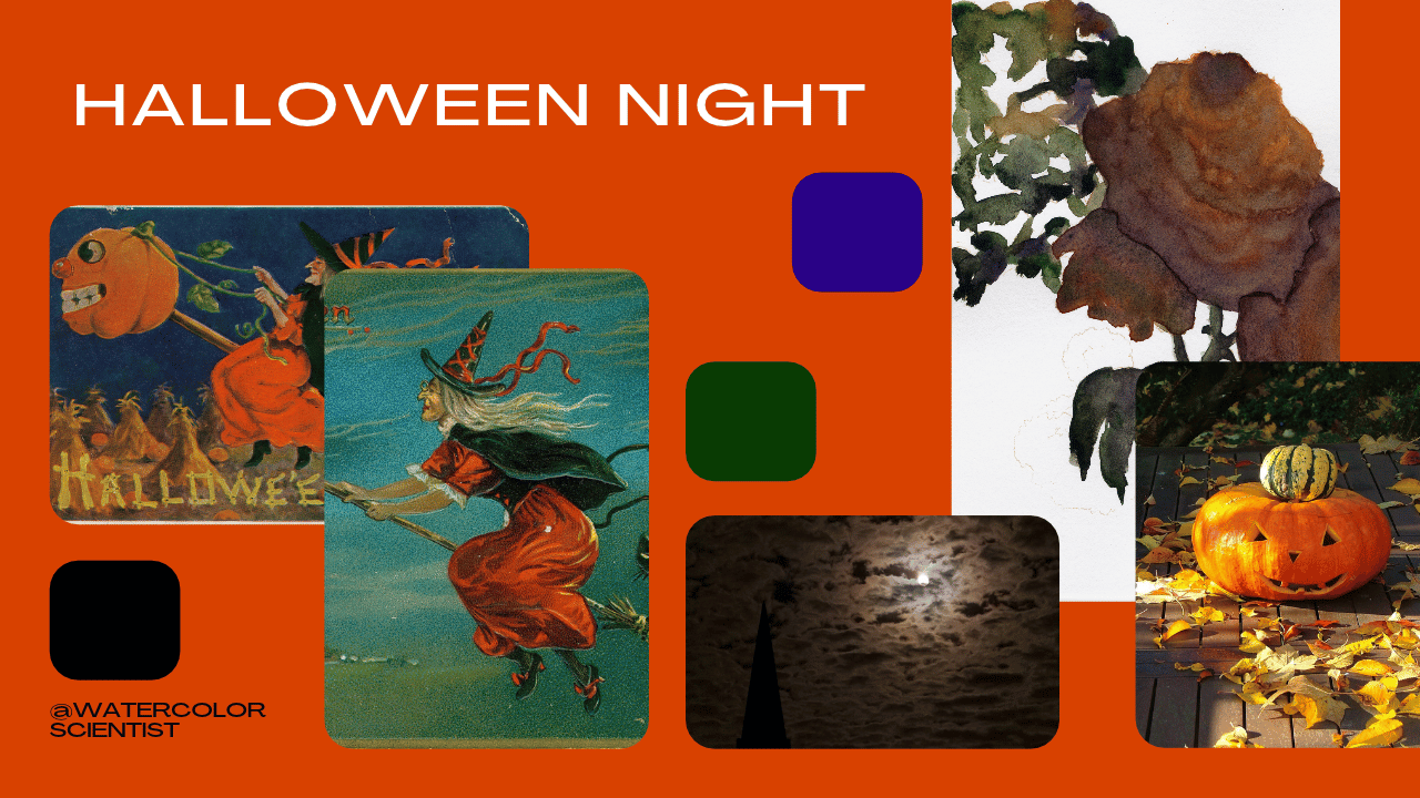
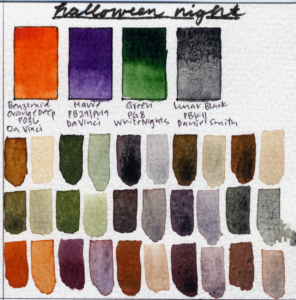
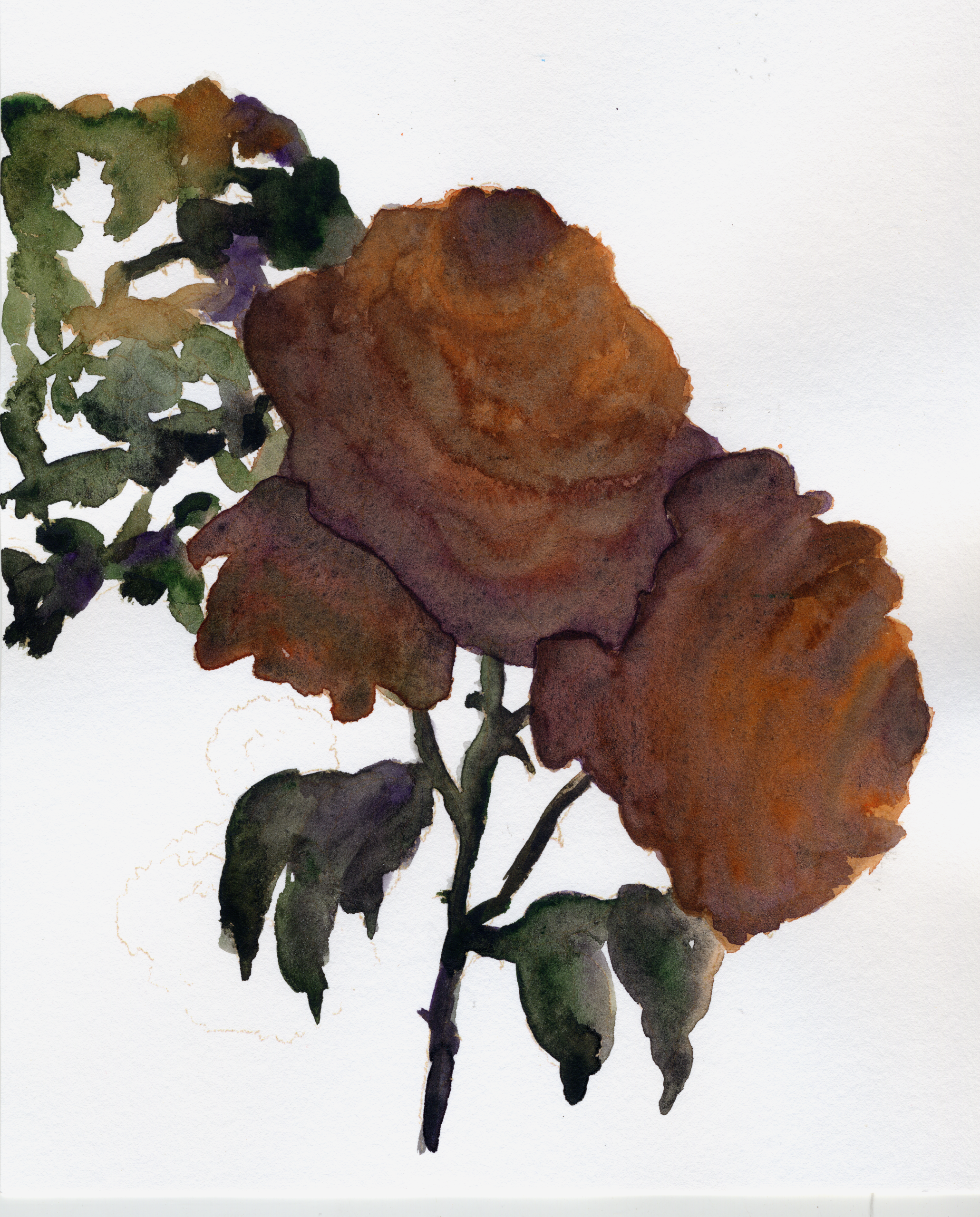
Next is Halloween Night. I chose Benzimidazolone Orange Deep PO36 by Da Vinci, Mauve PB29/PV19 by Da Vinci, Nitroso Green PG8 by White Nights, and Mars Black PBk11 by Daniel Smith. Orange, violet, green, and black. These colors immediately read as Halloween, but I still want them to function as a serious painting palette. A limited palette doesn’t become wrong just because one of the colors is black. Sometimes black is exactly what creates the atmosphere.
Poison Garden
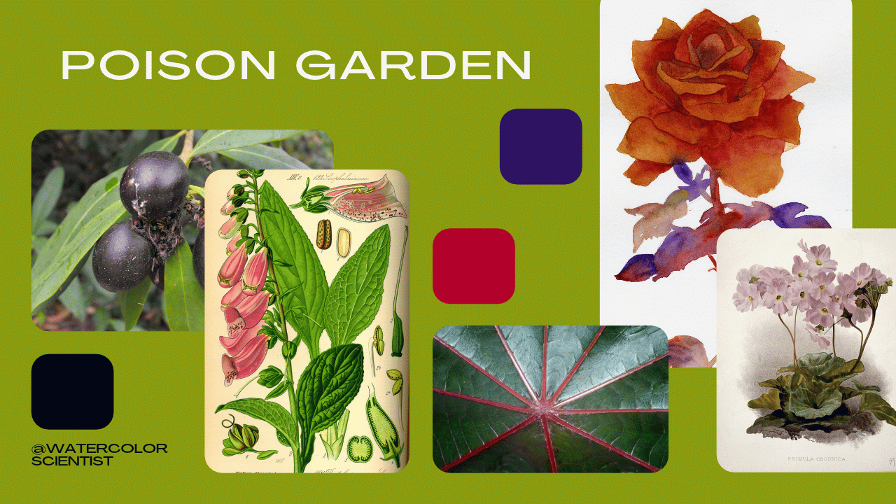
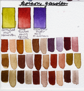
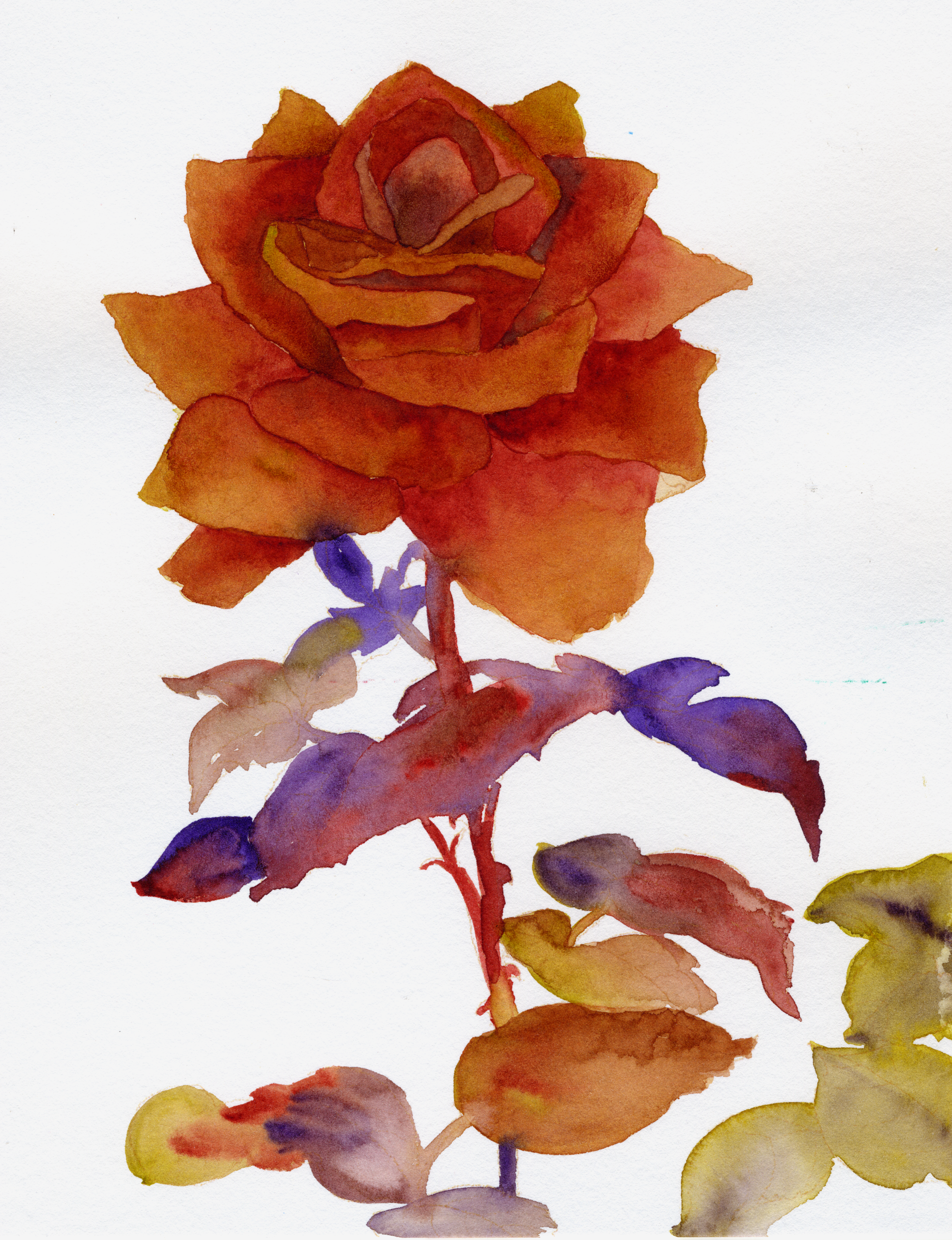
The next palette might be the strangest one today. This is Poison Garden. I chose Green Gold PY129 by MaimeriBlu, Deep Scarlet PR175 by Daniel Smith, and Dioxazine Violet PV23 by M. Graham. My goal here was not naturalistic botanical colors; I wanted this palette to feel slightly wrong. If I want the foliage to feel unnaturally yellow, and I want deeply violet shadows, and I want a red flower to feel almost too vivid against the dusky hues around it, this is the right palette for that.
Graveyard
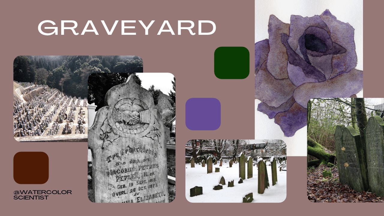
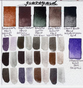
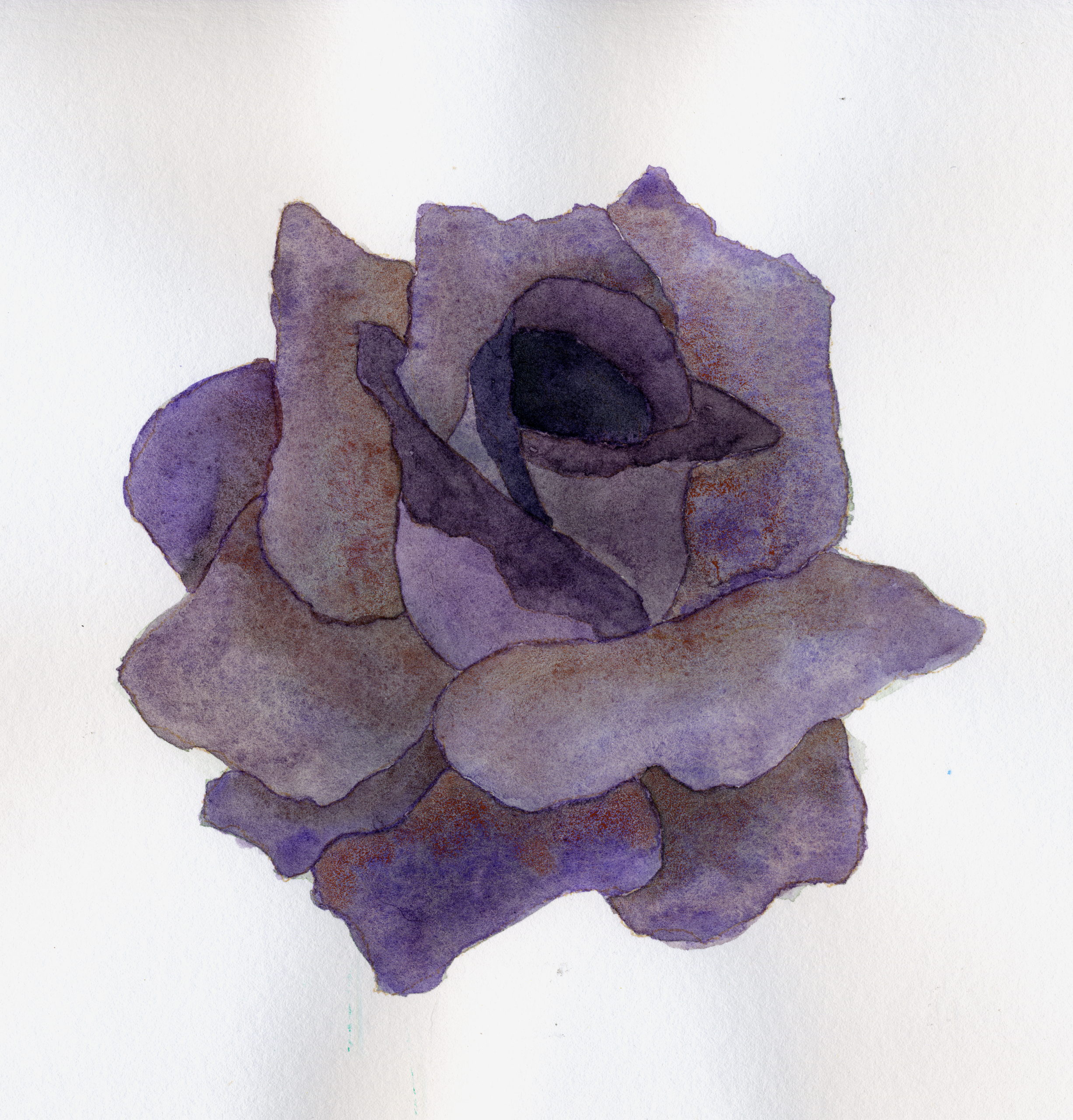
Next we arrive at Graveyard. This is one of the largest palettes in this group with six colors: Lunar Earth PBr11 by Daniel Smith, Caput Mortuum PR102 by Roman Szmal Aquarius, Ultramarine Violet PV15 by Da Vinci, Gray Violet Granite PBr7 by White Nights, Perylene Green PBk31 by Da Vinci, and Cobalt Black PBk27 by Mijello Mission Gold. This is a palette designed around the physical characteristics of the paint just as much as the color. And I love that.
November
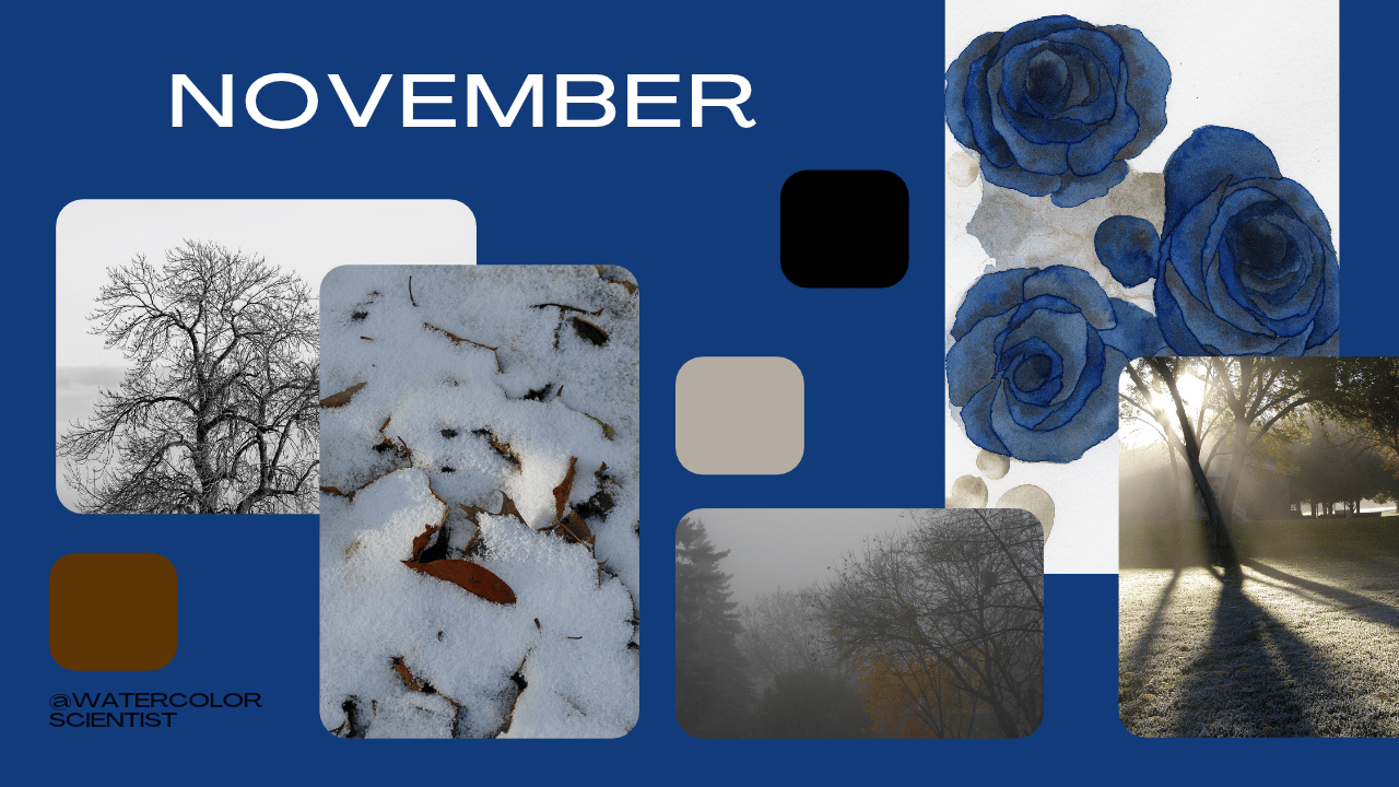
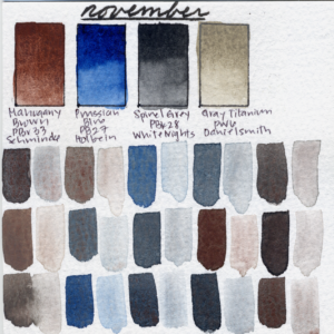
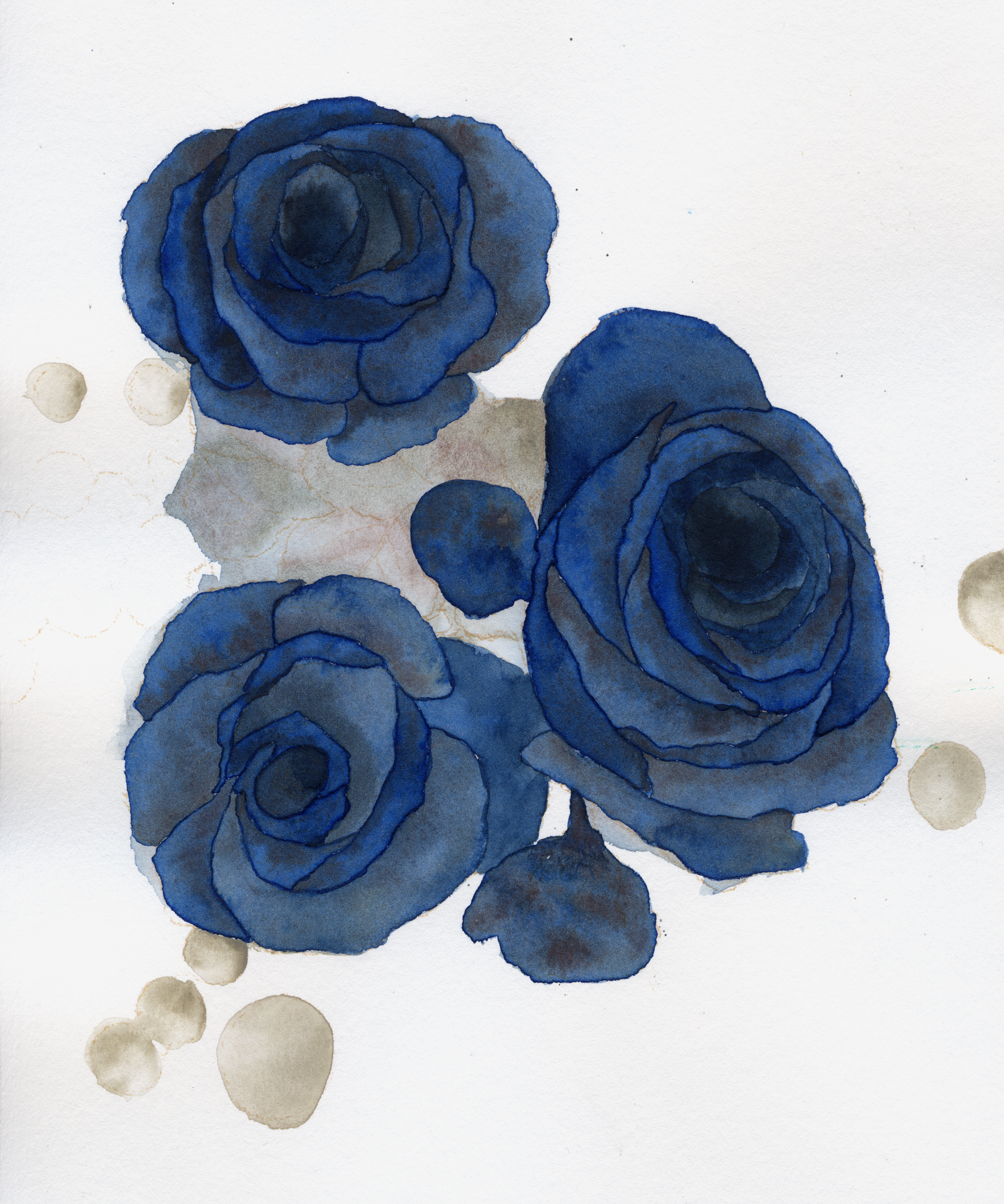
Eventually we arrived at November. For this one I chose Spinel Brown PBr33 by Schmincke, Spinel Grey PBk28 by White Nights, Gray Titanium PW6 by Daniel Smith, and Prussian Blue PB27 by Holbein. I really enjoyed Gray Titanium here because the opacity itself is part of the palette. A more opaque pigment can create mist, pale branches, or an overcast sky in a different way than a transparent wash would. And that is not cheating at watercolor, that’s just part of designing a palette.
Memento Mori
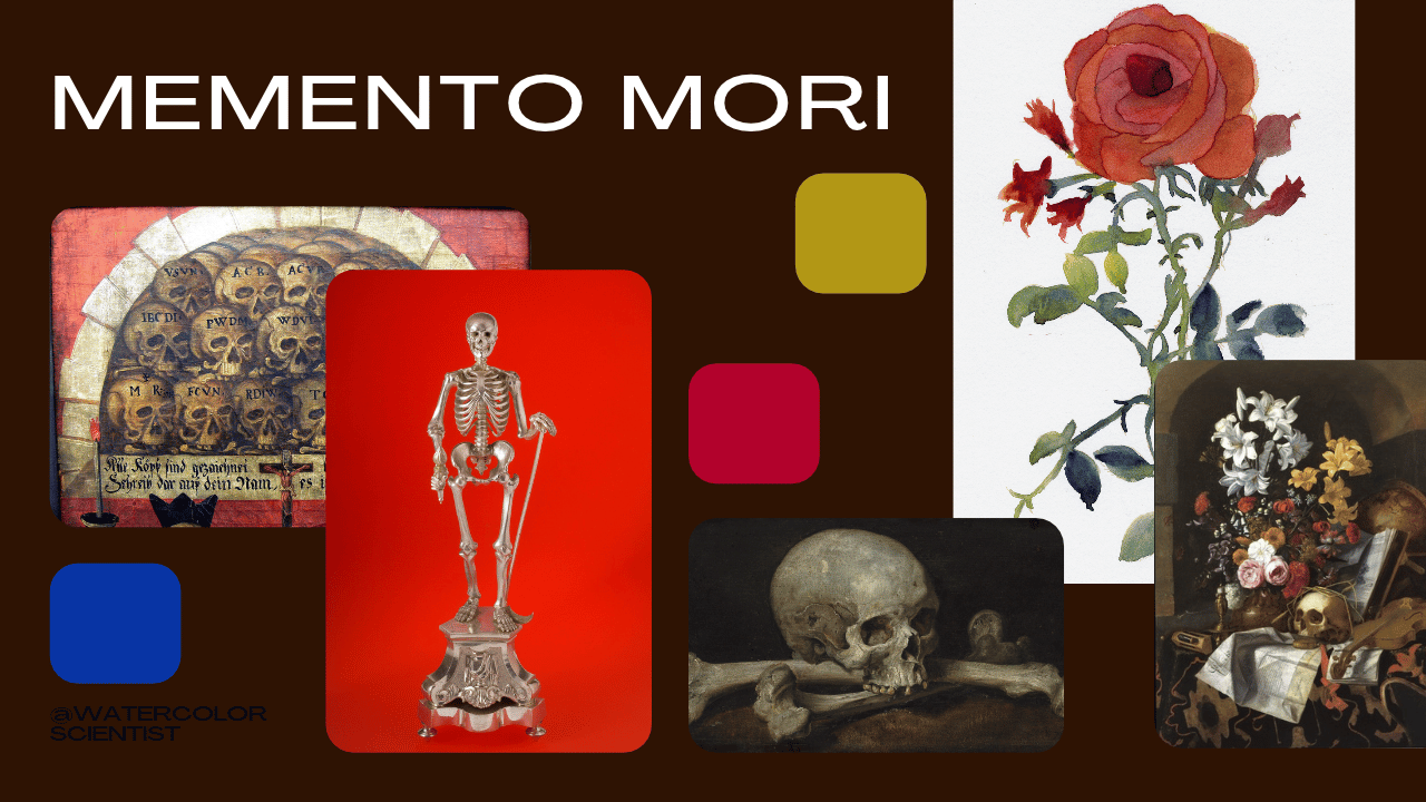
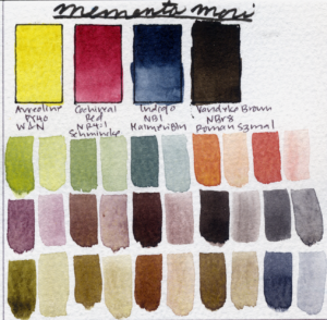
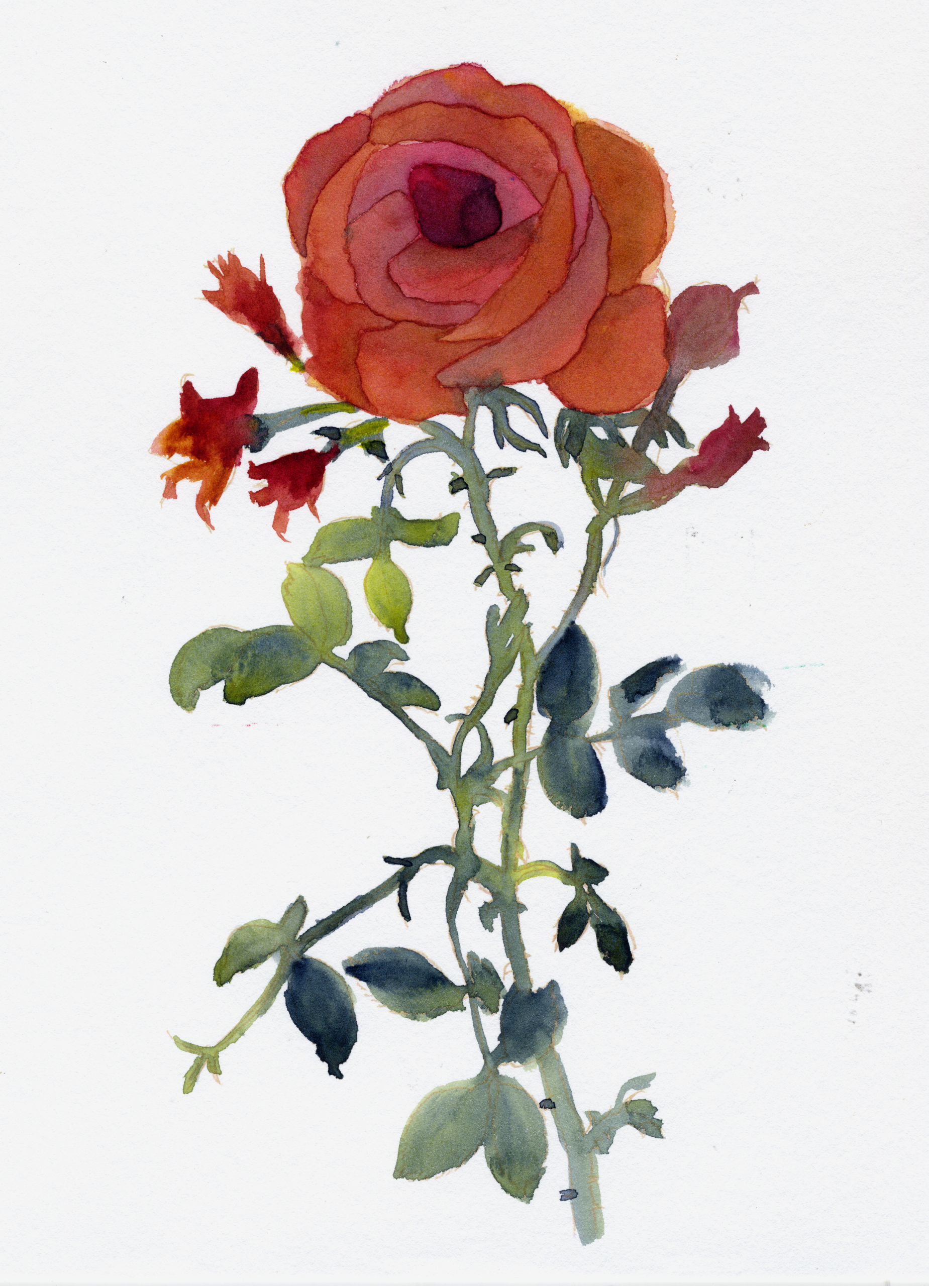
And finally I wanted to make one palette that takes the Autumn theme in a slightly different direction. This is Memento Mori. I chose Cobalt Yellow PY40 by Winsor & Newton. Cochineal Red NR4:1 by Schmincke. Natural Indigo NB1 by MaimeriBlu. And Van Dyke Brown NBr8 by Roman Szmal Aquarius. These are colors with poor lightfastness that fade in the sun. This is not the palette I would choose if my goal was to make a painting that remains unchanged for generations. But that’s exactly my point. Autumn itself is about transition; the leaves change color because they’re dying. Change, life, and death are inherent to the changing seasons. And I thought there was something appropriate about ending with a palette whose colors are also temporary.
Final Thoughts
In all of these palettes we deliberately gave up maximum color mixing range in exchange for granulation, texture, and desaturation that help create a mood. And that’s the larger idea I wanted to explore today. A limited palette doesn’t have to be a miniature version of a full palette and it definitely doesn’t have to include a traditional primary triad. So today, I encourage you to look through the paints you already own. Choose them for color, but also choose them for texture, behavior, and mood. And then go make the autumn painting of your dreams!
Thank you so much for joining me today for a deep dive on all the spooky, cozy, and romantic limited palettes for autumn. Let me know in the comments which limited palette was your favorite, and if you make a painting with it, please post it in my community tab, I love looking at your art. As always, please check out my YouTube and Patreon memberships, and as always, stay curious and happy painting!
All image attributions can be found here: https://docs.google.com/spreadsheets/d/1HV44XEWm0QlpT0mZKGcQT_ZE0Vz-Y8LujArxfeYkUeE/edit?usp=sharing