Cochineal red is a beautiful – and pricey – red pigment that is as prized today as it was 300 years ago, though now primarily as a historical pigment with unique properties. But the history behind the pigment is what truly makes it fascinating. Cochineal went from being a commonly-used dye in textiles, to becoming a top-secret commodity as valuable as gold, reserved almost exclusively for two things: the garments of royalty, and the paintings they commissioned from artists like Titian, Rembrandt, Van Dyck, and El Greco. But there’s more to this pigment than meets the eye. Like many pigments, it sits in an intersection between history, science, and the human price of art.
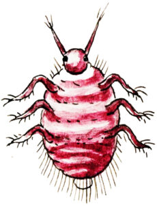
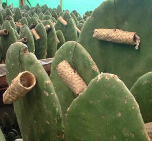
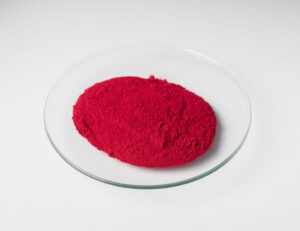
Cochineal red is a natural pigment, and its pigment code is NR4. Its use began as early as 2000 BC in present day Mexico and Central America. The pigment was derived from cochineal insects, who were carefully caught in nests, dried, and crushed to obtain the brilliant red dye made from carminic acid. That dye was then “laked”, meaning it was boiled with ammonia to separate the solids and treated with alum salts to precipitate the pigment into what became known as crimson lake or carmine lake.
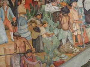
It was used widely in textiles throughout the Indigenous cultures, and Spanish colonizers quickly identified it as a valuable commodity at the beginning of Spanish colonization of the Aztec empire. The knowledge of cochineal production was stolen and brought to Europe, where it became a prized trade good and a status symbol in the clothing of royalty, religious leaders, and the military. But the greed for cochineal red led Spain to demand its production through forced labor of Indigenous peoples, much as it did with gold, in an attempt to monopolize the market for the pigment throughout Europe as a closely guarded secret.
That same greed ultimately was a considerable driver for the abduction and sale of stolen and enslaved African peoples for the next 300 years. This dark history allowed Spain to maintain a monopoly on cochineal red until the 19th century, when synthetic red dyes and pigments were introduced, crushing the Spanish economy that was deeply dependent on the trade of cochineal red.
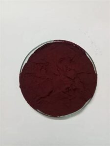
In the art world, artists had relatively few vibrant red pigments available to them, and so the introduction of cochineal red to Europe led to its enthusiastic adoption by artists with wealthy patrons. The pigment was prized for its saturation and transparency. Naturally, it produces a vibrant red-pink hue, but when treated with lime during the laking process, it shifts into a beautiful violet hue.
It was featured prominently in works such as:
- Diana and Callisto, Titian
- The Milkmaid, Johannes Vermeer
- Bedroom at Arles, Vincent Van Gogh
- The Fighting Temeraire, J.M.W. Turner
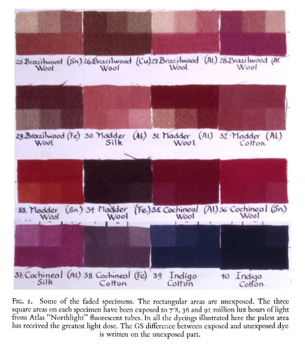
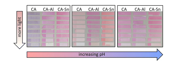
However, these laked pigments had a fatal flaw: extremely poor lightfastness and permanence.
- With respect to lightfastness: the hue we perceive in pigments is dependent on their chemical structure, which is held together by links called chemical bonds. You can think of their chemical structure like a brick wall, and the chemical bonds are the cement holding the bricks together. Ultraviolet light from the sun breaks down these bonds, and just like a brick wall without cement, the structure falls apart. Once the chemical structure breaks down, it is no longer cochineal red, and its color changes completely – in this case, into a dull brownish-red. You can see the changes in this Van Gogh painting, whose floorboards were vibrant pink but now only the blue underpainting remains, and this other example, where only a brownish color remains.
- On the other hand, permanence refers to stability against physical elements. Carmine and crimson lakes are unstable in moisture, and change hue when exposed to water as well. They are sensitive to acids and alkali, and will even fade under incandescent light.
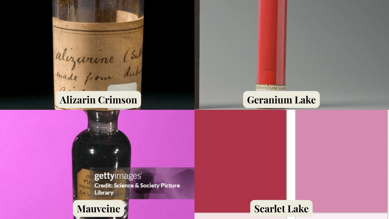
Once synthetic laked dyes and pigments were discovered in the 19th century, cochineal red was replaced by pigments such as:
- Synthetic Alizarin PR83
- Geranium Lake
- Mauveine
- Crimson Lake
- Scarlet Lake
Ironically, the lightfastness of all these replacements was also quite poor, especially in watercolor.
Now, if you’ve watched my Anatomy of a Pigment episode on Cerulean Blue, you’ll know that one of the major drivers of the Impressionist movement, and its iconic vibrant color palette, was the explosion of pigment chemistry innovations in the late 19th century, particularly the invention of lightfast cobalt and cadmium pigments. However, cadmium red arrived much later than the other cadmiums, and wasn’t widely available until the turn of the 20th century. So, red pigments remained an unsolved problem for artists, who continued to use these fugitive pigments and dyes as their only options for saturated red in their paintings – at least until the stunning invention of quinacridone pigments like PV19 and PR122 in the mid-20th century.
With all this in mind, let’s take a closer look at a modern version of Cochineal Red NR4. This particular version is made by Schmincke Horadam, which I finally got a chance to try as part of their recently released Matchbox Set. I made a whole video reviewing and analyzing this set, I’ll link it here.
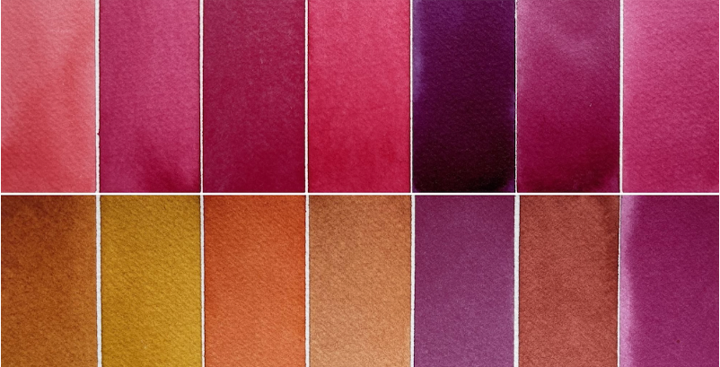
I expected this pigment to behave like most ancient pigments: semi-opaque, granulating, and with low tinting strength. I was stunned when my initial tests showed it behaving almost exactly like modern quinacridone pigments.
It is transparent and non-granulating, with a beautiful vibrancy in both masstone and tints. Because of this, it is excellent at glazing. It is moderately tinting, moderately staining, and it flows well, although that is probably helped by the ox gall that Schmincke uses in their watercolor formulations.
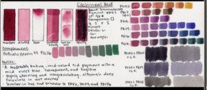
It has a deep red hue, and I suspected that its best complement would be Phthalo Green Yellow Shade PG36, and I was correct. Together, they make dark, inky neutrals. In mixes with pigments around the color wheel, NR4 functions beautifully as the primary red in a palette: muting greens into dusky forest hues, creating brilliant violets with Ultramarine Blue, and producing fiery burnt oranges with Nickel Azo Yellow PY150.
Compared to modern pigments, I would say it leans closer to a true red than PV19, which is more pink-violet. It’s very close in hue and in physical characteristics to:
- Benzimidazolone Carmine PR176 (DS, Mijello, PR Jumei)
- Alizarin Crimson PR83 (WNP, Shinhan PWC, Holbeinx2)
- Permanent Pink FL PR187 (WN, Rembrandt)
- Pyrrole Red Rubine PR264 (MG, VG, RS, Rembrandt, PR Student)
- Anthraquinone Red PR177 (Mijello, QoR)
When deciding what to paint, I wanted to highlight it in a stormy sky with the sun just beginning to peek through. I used the Matchbox set for the entire painting.
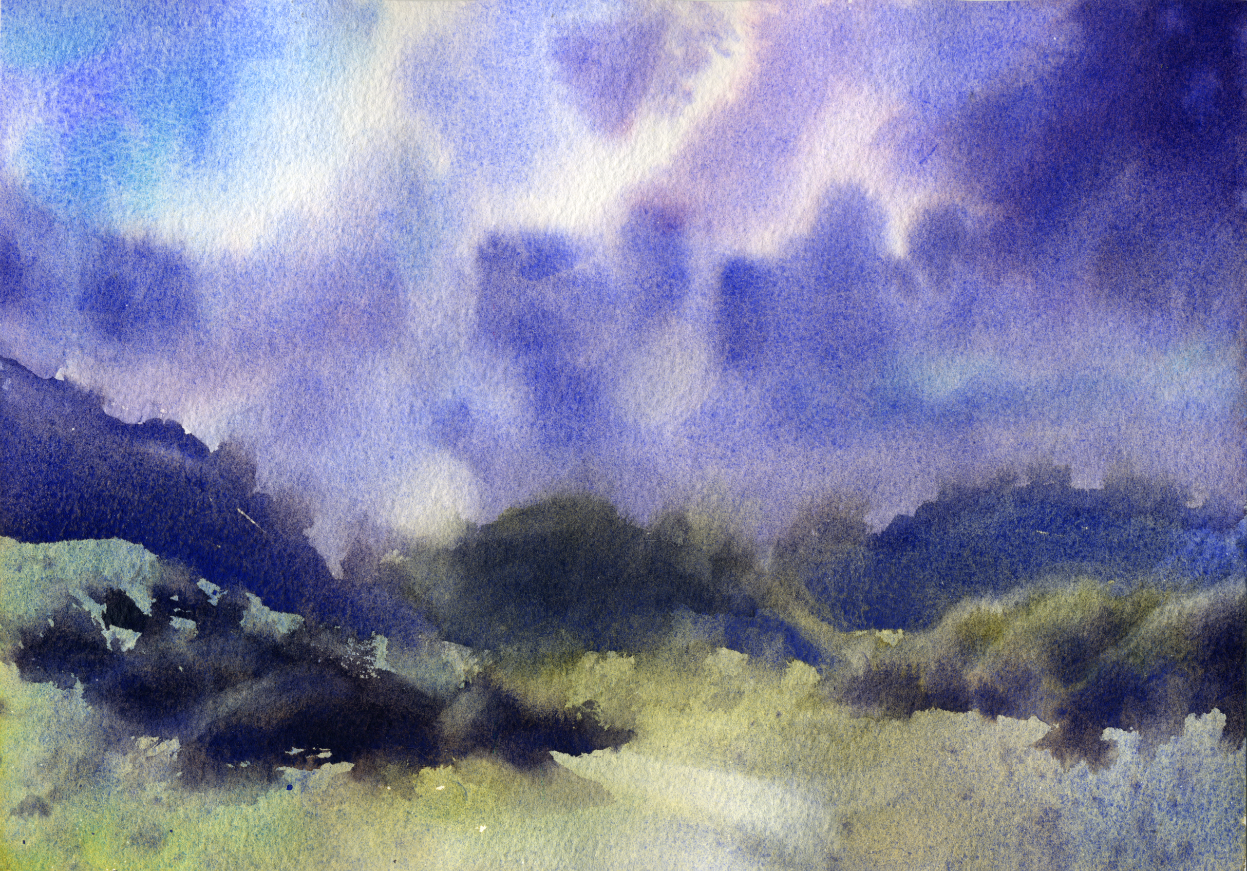
I can absolutely see why artists loved this pigment. Cochineal Red lends itself to gorgeous soft pink hues in skies, and its transparency works well alongside the granulation of French Ultramarine and Cobalt Turquoise. It is also perfect for muting the vibrant greens made with Cobalt Turquoise and Nickel Azo Yellow.
I’ve really enjoyed continuing this Anatomy of a Pigment series. Like Cerulean Blue in the previous episode, Cochineal Red sits at a fascinating intersection between art history, chemistry, and the very real human consequences tied to our art materials. It also acts as a bridge between ancient earth and organic pigments and the modern synthetic pigments we known and love in today.
Thank you so much for joining me today, and let me know in the comments your tips for protecting a painting made with fugitive paints. In the meantime, I’m gonna go put this painting in a drawer to protect it from the sun. Stay curious, and happy painting!