Hello everyone, and welcome back to the Mastering Pigments series.
In this series we take a deep dive into individual watercolor pigments — their chemistry, history, strengths, weaknesses, and how to use them in your art practice. Today we’re exploring one of the most beloved blues in watercolor: Cerulean Blue PB35.
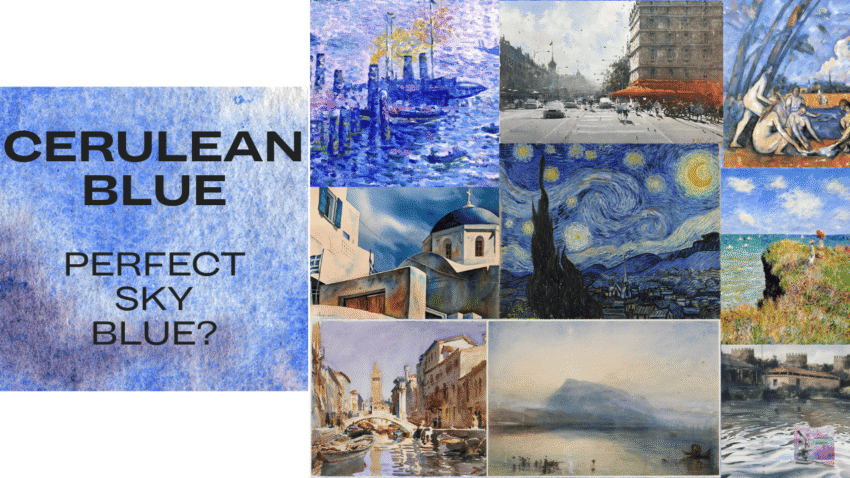
Most artists think of Cerulean Blue as the quintessential sky color. But here’s the strange thing: two completely different pigments — PB35 and PB36 — are both sold as Cerulean Blue… even though they behave very differently.
In this video we’re going to break down the true characteristics of Cerulean Blue, what artists like Monet and Sargent used it for, and which version might belong in your palette. And of course, we’re gonna take a look at tons of beautiful swatches.
Let’s get started.
What is Cerulean Blue?
Cerulean Blue is the pigment PB35, chemically known as cobalt stannate. Cerulean blue was introduced in the 19th century during the rise of modern pigment chemistry.
Its color doesn’t come from dyes or laked pigments. Instead, the color comes from the way the cobalt atoms sit inside a crystal lattice and interact with light. This crystal-based color explains several of cerulean blue’s unusual properties:
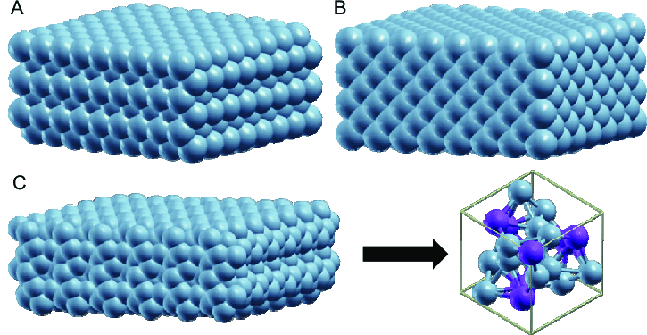
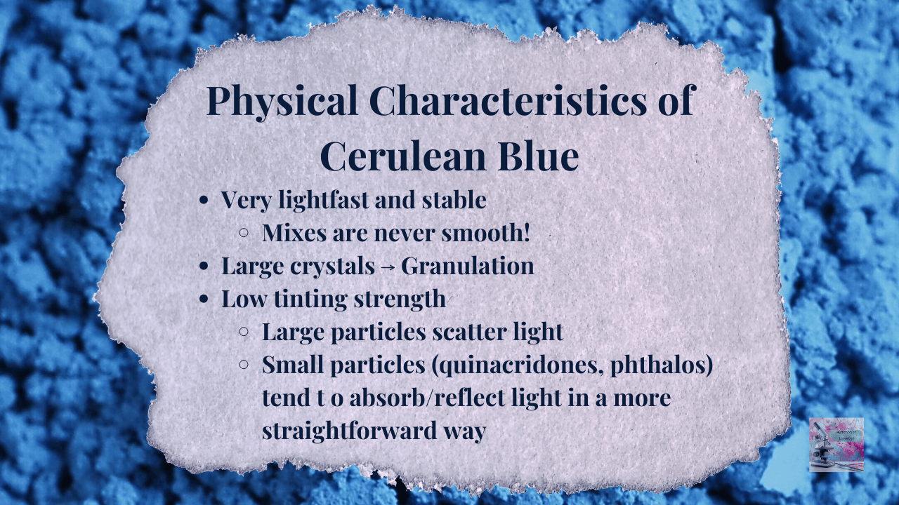
It is incredibly lightfast and stable. It has strong granulation – the pigment particles are relatively large mineral crystals, which settle into the texture of watercolor paper. It has low tinting strength – it scatters light rather than strongly absorbing it, which is why it has a soft, delicate color.
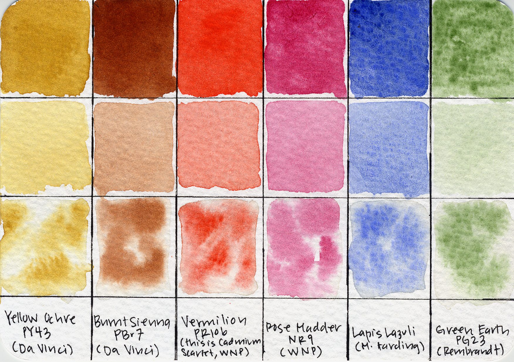
Traditional palettes prior to 1800 were quite limited, and were made up of desaturated earthy pigments like Burnt Sienna, and low-tinting pigments like Rose Madder, Green Earth, and Lapis Lazuli.
When Titian painted this dazzling blue sky in Bacchus and Ariadne in 1523, Cerulean blue didn’t exist yet. The sky was painted with natural ultramarine made from lapis lazuli — a pigment so expensive it was literally worth more than gold.
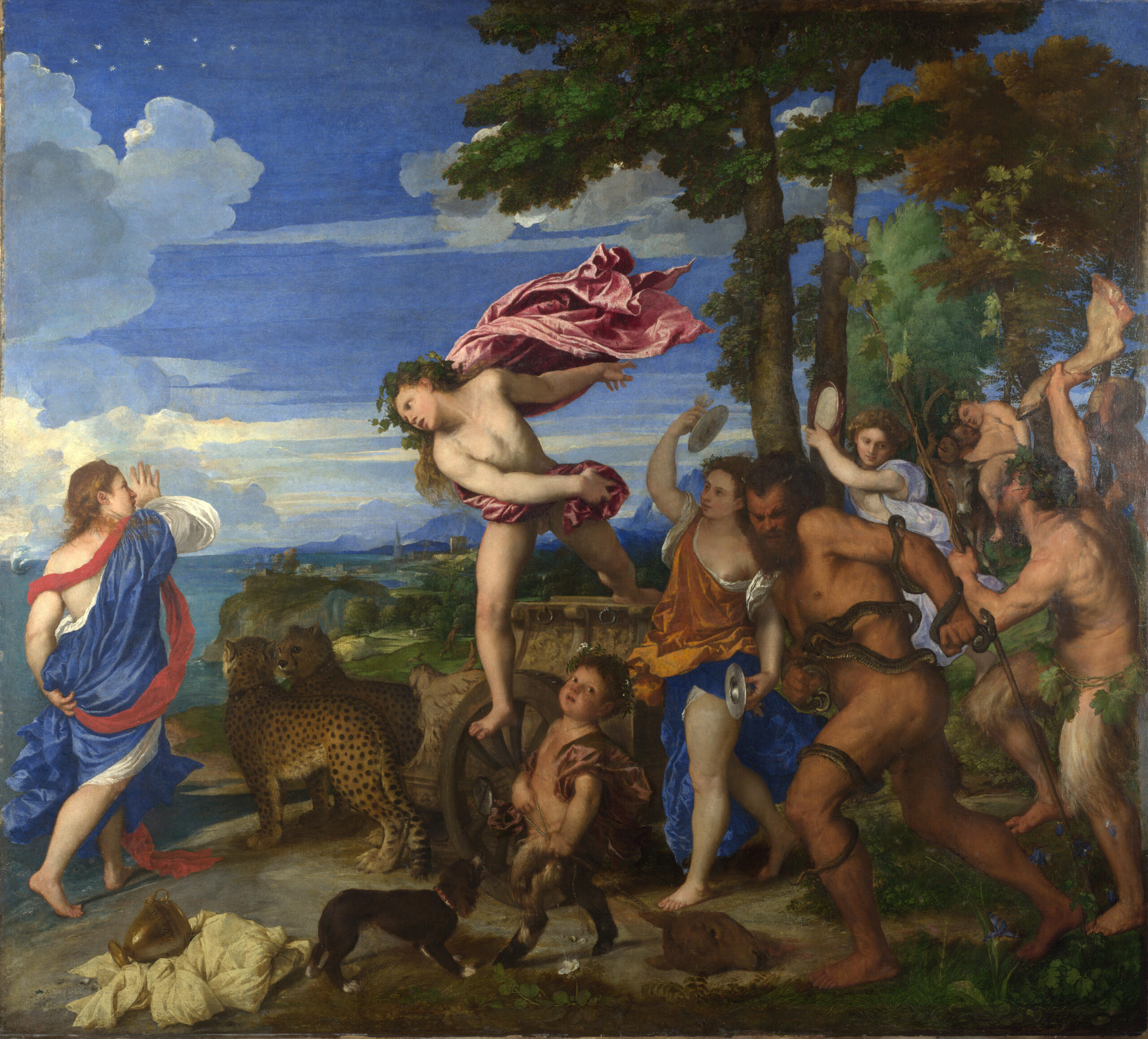
Cerulean blue wouldn’t be invented for another 300 years. Unlike ultramarine or cobalt blue, it was naturally light-valued, opaque, low-tinting, and slightly green-biased. It created natural sky colors without the purpling that ultramarine produces when mixed with white.
Historical Use in Painting
Between 1800 and 1870, chemistry introduced a wave of new pigments.
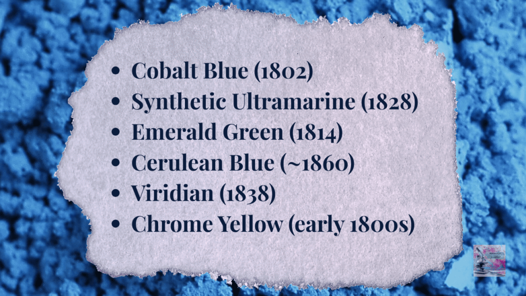
The invention of synthetic pigments—cobalt blue, viridian, chrome yellow, cadmiums, and later cerulean blue—dramatically expanded the available color range. These new pigments were lightfast and vibrant, and with the invention of the collapsible metal paint tube, this paved the way for the pure color strokes characteristic of this era of Impressionism.
Many Impressionist painters embraced cobalt pigments, including:
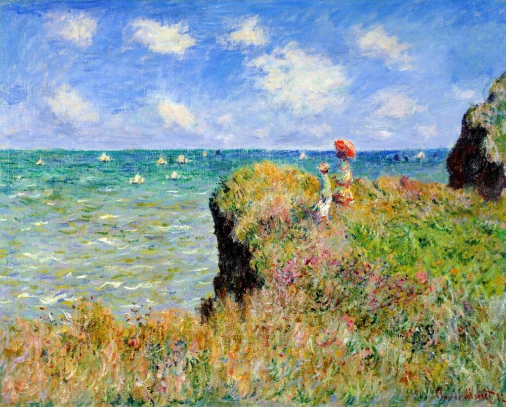
The Cliff Walk at Pourville (1882) — Claude Monet
Cerulean blue was a staple sky pigment for him. He used it frequently for its opacity, and greenish bias that was excellent for maritime landscapes.
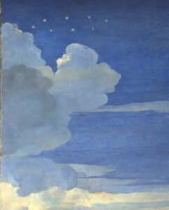
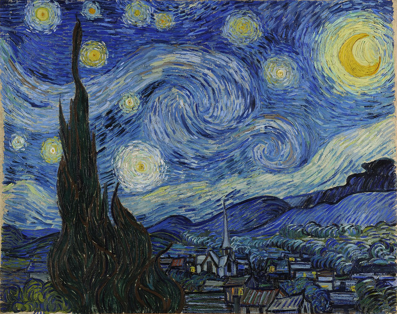
The Starry Night (1889) — Vincent van Gogh
Van Gogh used cerulean blue’s low tinting, light valued qualities by dabbing it alongside cobalt blue and ultramarine blue in his skies.
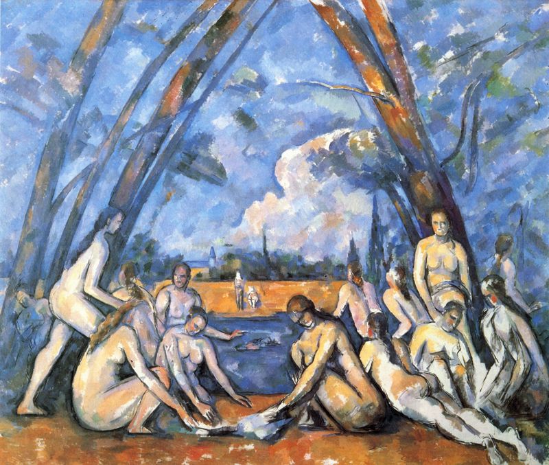
The Large Bathers (1900–1906) by Paul Cézanne
Cezanne layered cerulean, cobalt, and ultramarine blues to create his famous “planes of color” that created tiny tonal shifts.
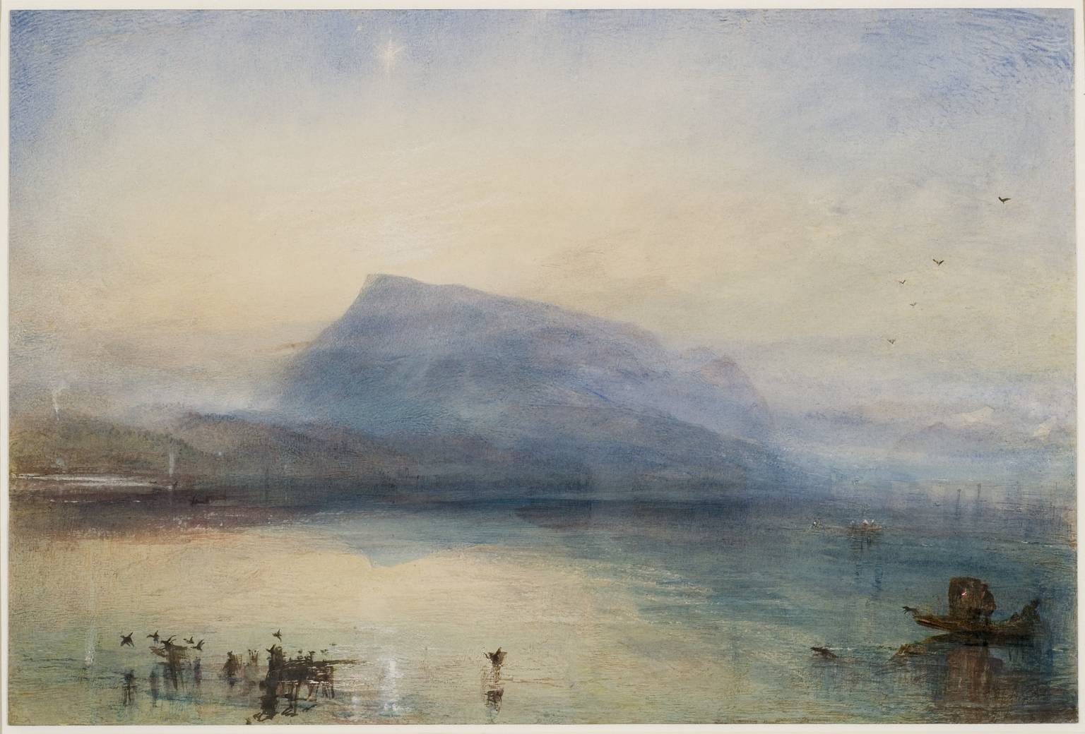
The Blue Rigi (1842) by J.M.W. Turner
While Turner often used cobalt blue, later analyses suggest cerulean pigments appeared in some of his late materials as the pigment became available. This watercolor uses the very pale cerulean blue to describe distant sky and atmosphere, and you can see the gorgeous granulation in the top corners.
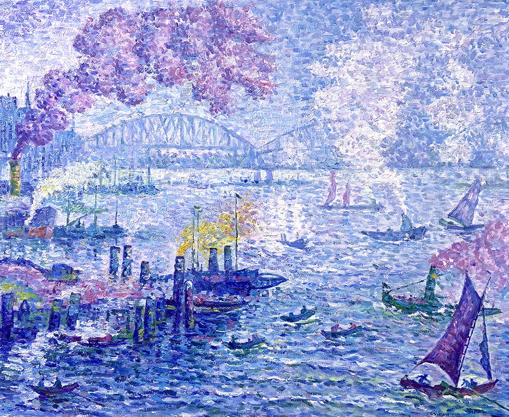
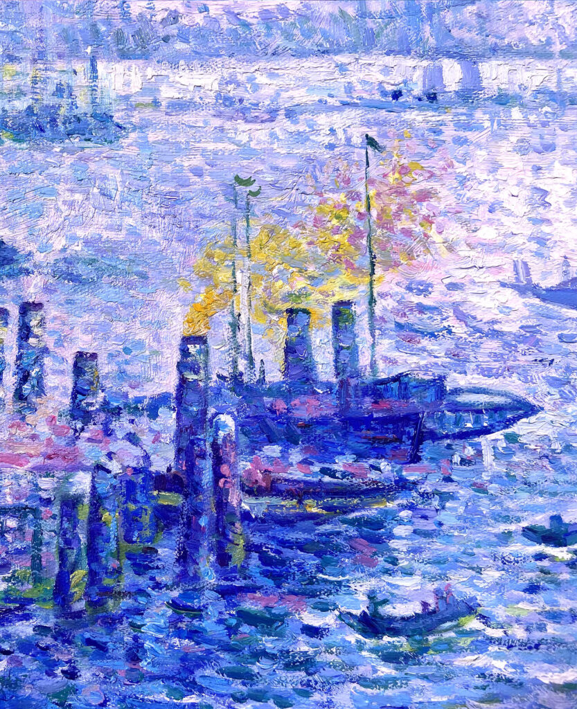
The Port of Rotterdam (1907) by Paul Signac
Signac, who was part of the Pointilist movement, used hundreds of tiny dabs of pure cerulean blue to create optical vibration that reads as sunlight.
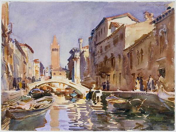
Venetian Lagoon (1882) by John Singer Sargent
Sargent used light cerulean and cobalt blues to paint the hazy sky and reflections in water.
Use in Contemporary Art
More than 150 years after its introduction, cerulean blue is still one of the most recognizable blues in watercolor painting, and is a standard pigment in many modern watercolor palettes. Here are a few contemporary artists known to use it.
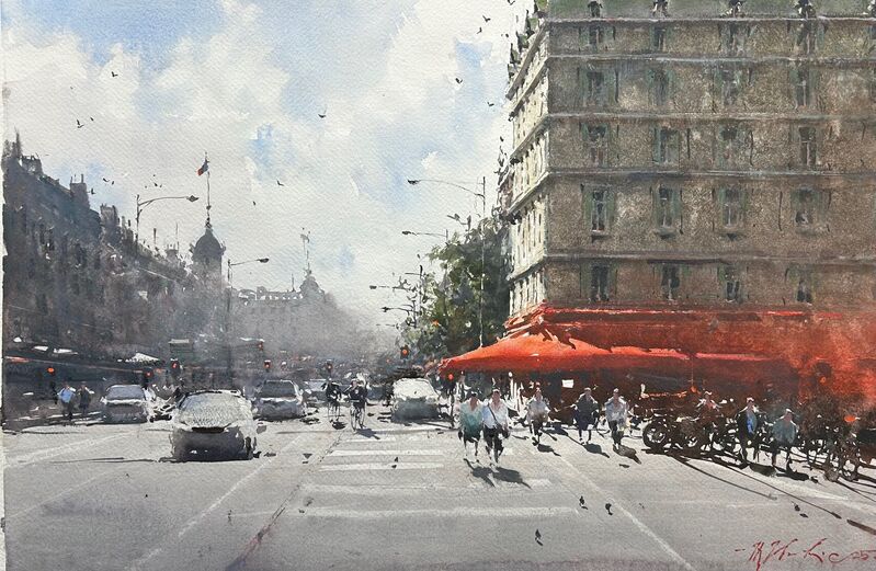
Sunny Corner, Paris by Joseph Zbukvic
Joseph Zbukvic frequently uses cerulean blue in watercolor. Its granulation helps create distant skies.
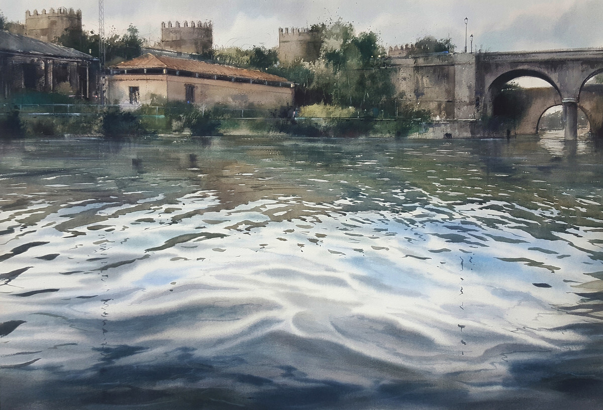
Reflections on the Tiber by Pablo Rubén López Sanz
In this painting by Pablo Ruben, nearly half the painting is water, which becomes the main subject. Cerulean blue is used in broken wet washes for accents in the water.
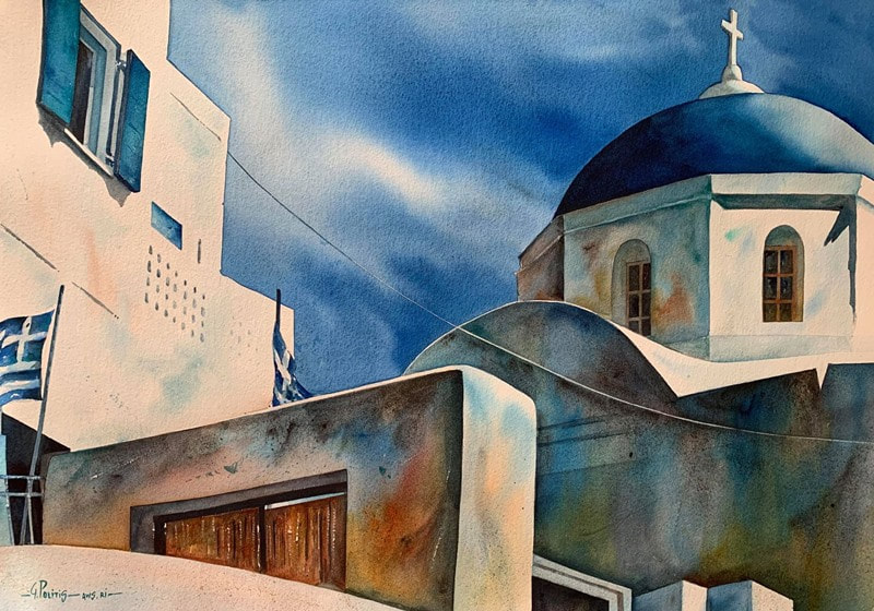
Santorini Light by George Politis
This is one of Politis’s recognizable Mediterranean architectural subjects, combining strong sunlight, simplified forms, and luminous color transitions.
PB35 vs PB36
One of the confusing things about Cerulean Blue is that there are actually two pigments commonly sold under the name Cerulean.
PB35 — Cerulean Blue
This is the traditional Cerulean Blue.
![]()
PB36 — Cerulean Blue Chromium
Its chemical name is Cobalt Chromium Oxide, and it is sometimes marketed at Cerulean Blue Chromium or simply Cerulean Blue – which means two paints with the same name may actually contain different pigments.
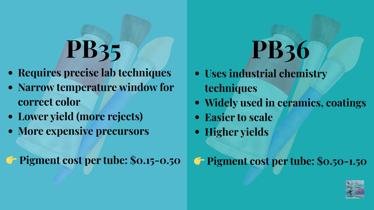
The Cost Question
Both pigments are among the most expensive paints in a given brand because they are cobalt-based pigments. Cobalt pigments require high-temperature calcination during manufacturing, which is energy-intensive. However, there’s an interesting twist: PB36 is generally much cheaper to manufacture than PB35, yet many paint brands sell them at exactly the same price. So two paints labeled “Cerulean Blue” may have:
• different pigments.
• different physical characteristics.
• different manufacturing costs.
• but the same retail price.
Which is why reading the pigment label is incredibly important! We’ll get into which one is right for you a little later.
A Quick Warning About “Cerulean Hue”
Many paints labeled Cerulean Blue Hue are not PB35 or PB36 at all. Instead they are often mixtures of pigments like:
• Phthalo Blue (PB15).
• Titanium White (PW6).
• or other blends designed to mimic the color.
These paints can look similar at first, but they behave very differently. Most importantly: they do not granulate the way true Cerulean Blue does. So if you’re looking for that beautiful texture, you need to check the label for PB35 or PB36.

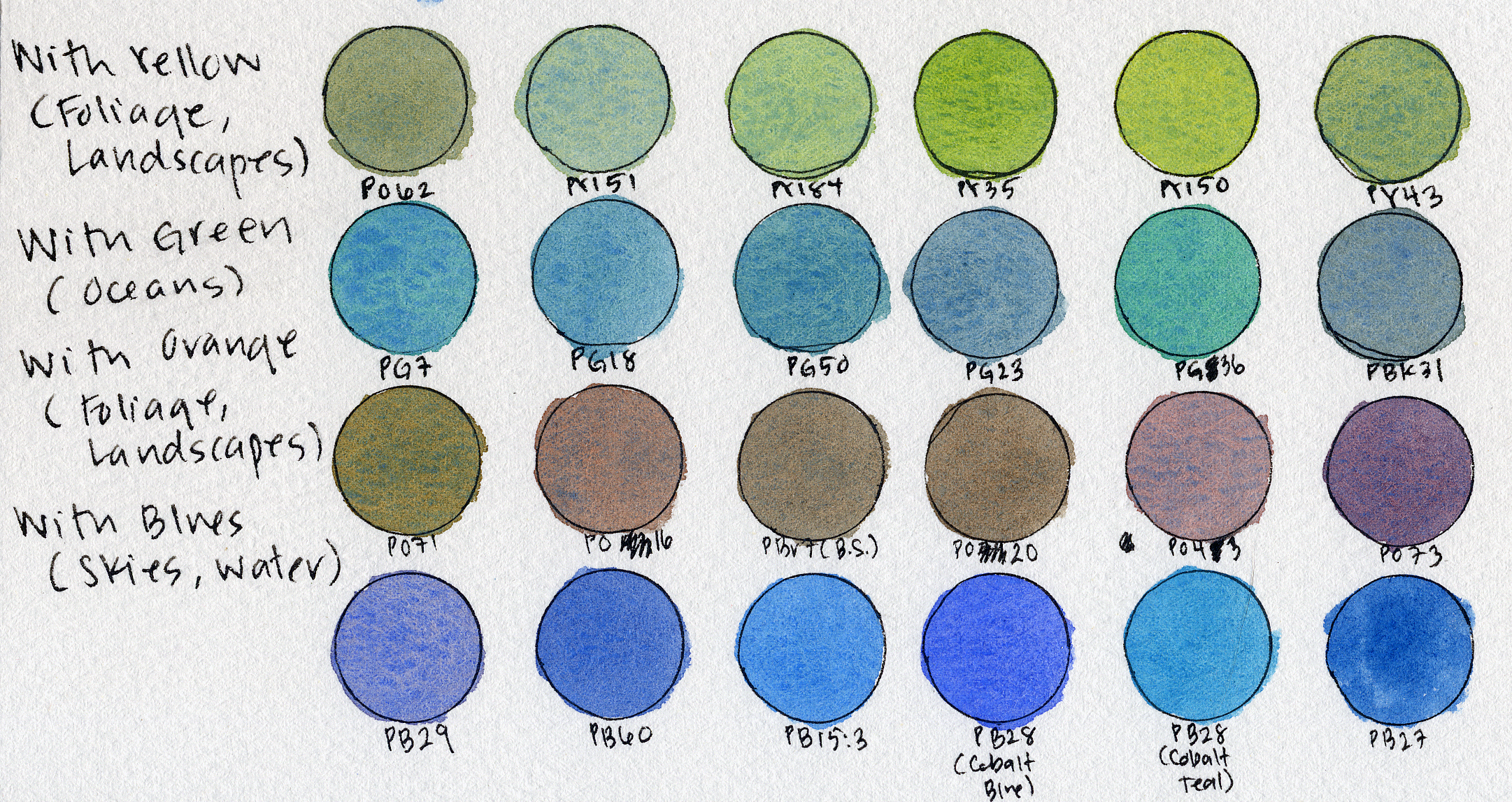
How Artists Typically Use Cerulean Blue
Cerulean blue is most famous for skies. Its granulation naturally creates a slightly mottled texture that feels very atmospheric. But I actually find it useful in a lot more places.
Foliage
Mixed with warm yellows, Cerulean Blue creates natural, slightly muted greens that are perfect for distant trees. Because it granulates, it can add texture to foliage without much effort.
Ocean
Cerulean can produce beautiful coastal water colors, especially when layered with deeper blues like PB60 or PB15. Its softness helps capture the haze and light scattering over water.
Mountains
For distant mountains, Cerulean Blue works beautifully because it naturally shifts toward that cool atmospheric blue we see in real landscapes.
The Downsides
Cerulean Blue is beautiful, but it does have a few drawbacks.
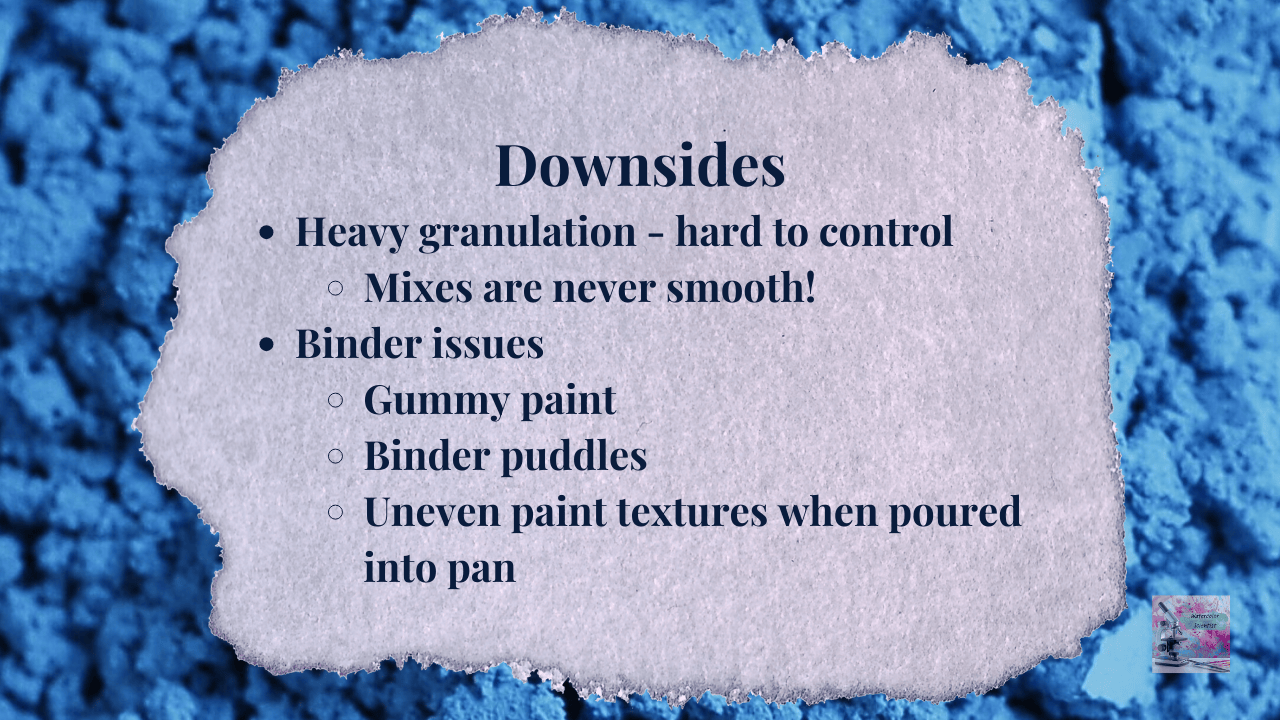
Strong Granulation
The granulation can sometimes be a lot. Mixes with Cerulean almost never dry perfectly smooth. That texture can be gorgeous — but it’s something you need to be aware of.
Gummy Paint
Another common issue is that Cerulean Blue paints can feel gummy or sticky. This happens because cobalt pigments are very dense, and sometimes the pigment separates from the binder. You may notice:
• binder separation
• glossy puddles
• uneven paint texture
A quick stir or remix usually fixes this.
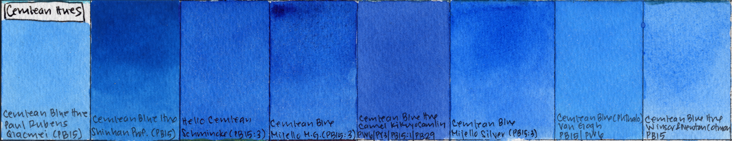
Swatch Comparison Section
Let’s now take a look at the different Cerulean paints I have. I’ve grouped them into several categories.
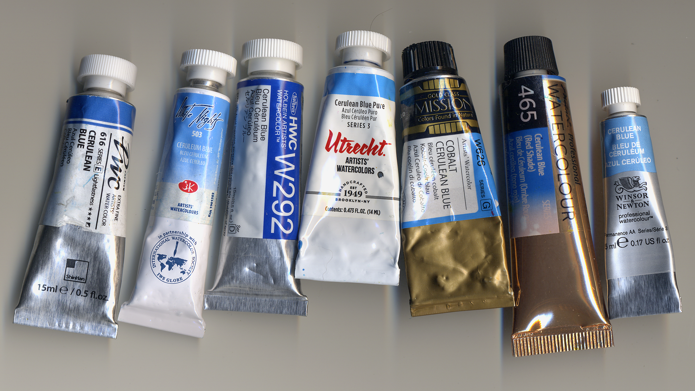
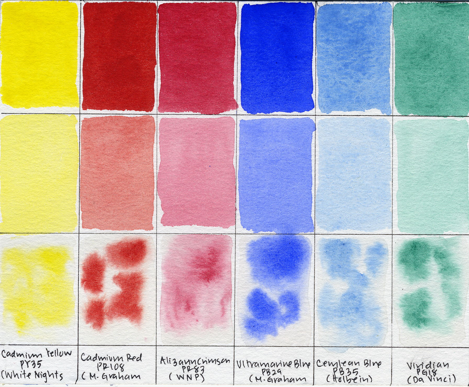
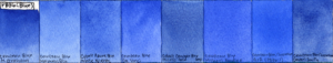
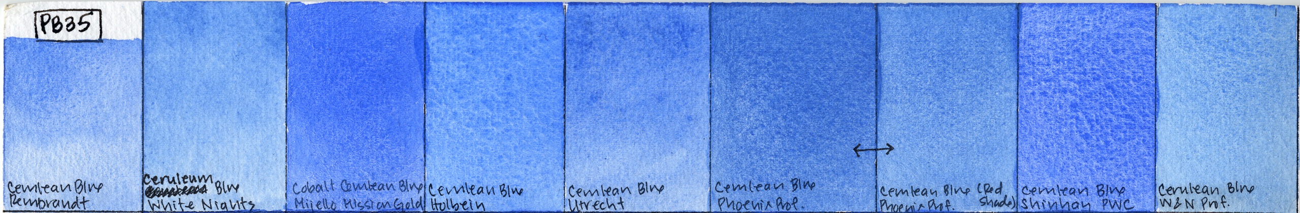
PB35 — True Cerulean Blue
The classic version – a light, cool, soft sky blue. Of these, Rembrandt’s and White Nights’ versions are most low tinting. Surprisingly, Shinhan PWC is the most granulating! Their paints are almost never wildly granulating like this. It is probably my favorite, along with Holbein’s version. Utrecht’s version is lovely but so gummy, both on pan and on paper.
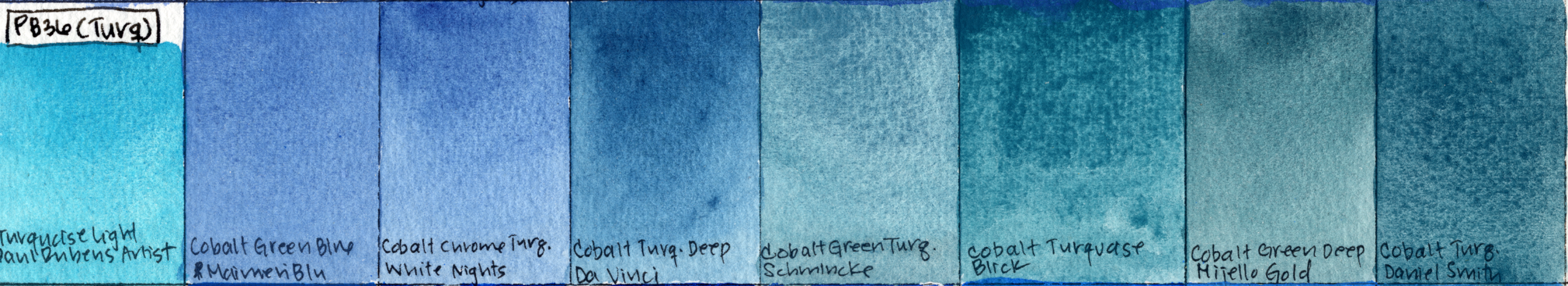
PB36 — Blue-Leaning
Some PB36 paints are quite blue and behave similarly to PB35, but are generally warmer and more highly tinting and staining. PB36 handles a lot more like cobalt blue, and the granulation isn’t as prominent. PB36:1 is a specific chromium-modified version that I’ve only seen QoR use – and it is my favorite PB36. Michael Harding’s version is also a winner.

PB36 — Green-Leaning
Other PB36 versions lean noticeably greener, and are often called Cobalt Turquoise. Daniel Smith’s version is probably my favorite, although I’m also fond of Blick’s version (RIP).
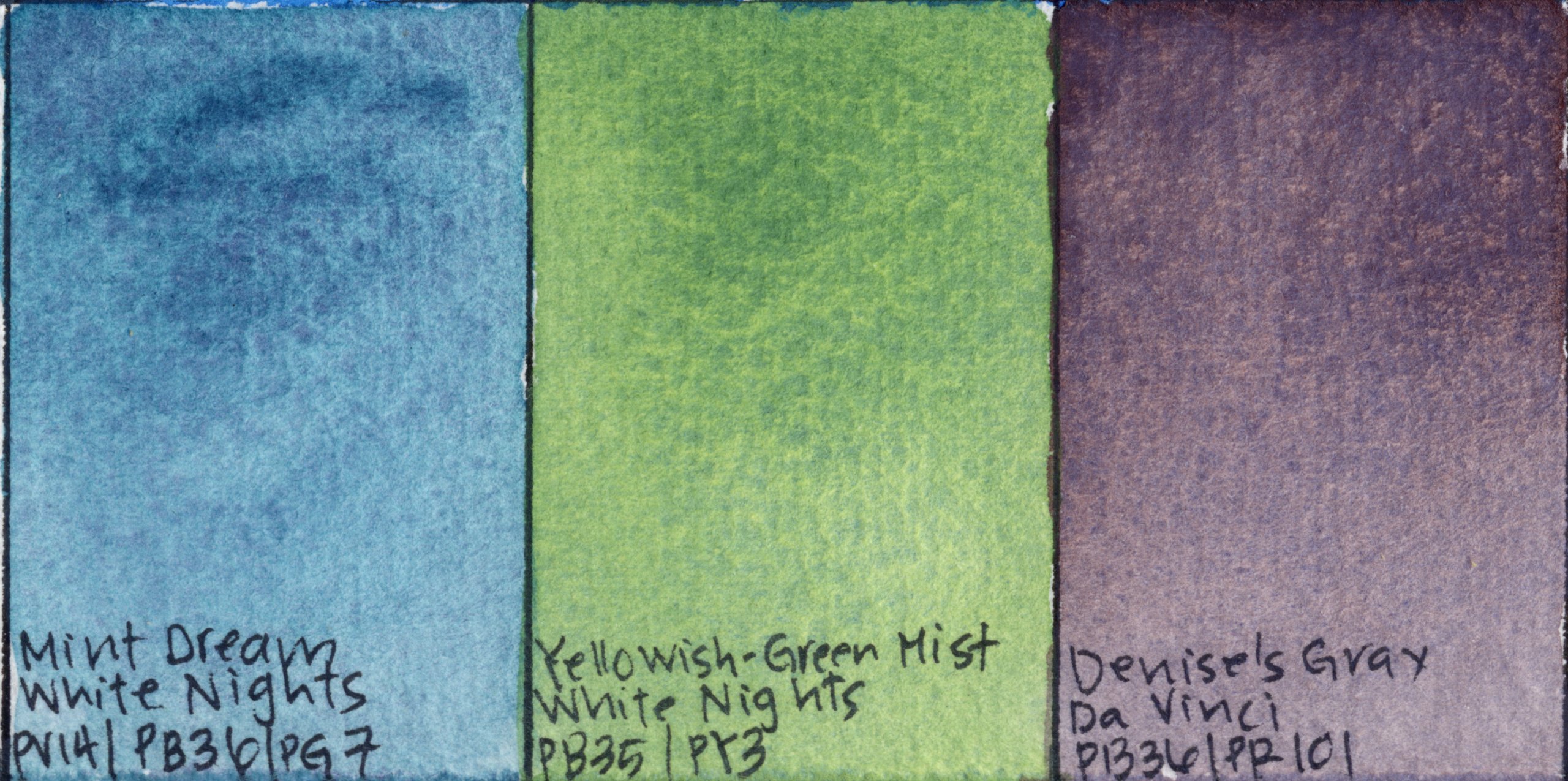
5. Cerulean Blue Hue
We already took a look at these dupes of the real Cerulean Blue. These generally lack the granulation of Cerulean Blue, and are too transparent and vibrant, especially those made with Phthalo Blue. I believe Cerulean Blue Hue by Winsor & Newton Cotman is the best dupe by far, although it is quite unpleasant to use due to issues with gumminess.
Convenience Mixtures
Some paints include Cerulean Blue as part of a convenience mixture — often for sky colors or landscape greens. These can be very useful, although I will say that the other pigments tend to easily overpower the Cerulean Blue. Of these, Denise’s Gray by Da Vinci is my favorite – beautiful on its own, and also quite useful as a neutral tint, and for animal paintings.
Sample Painting
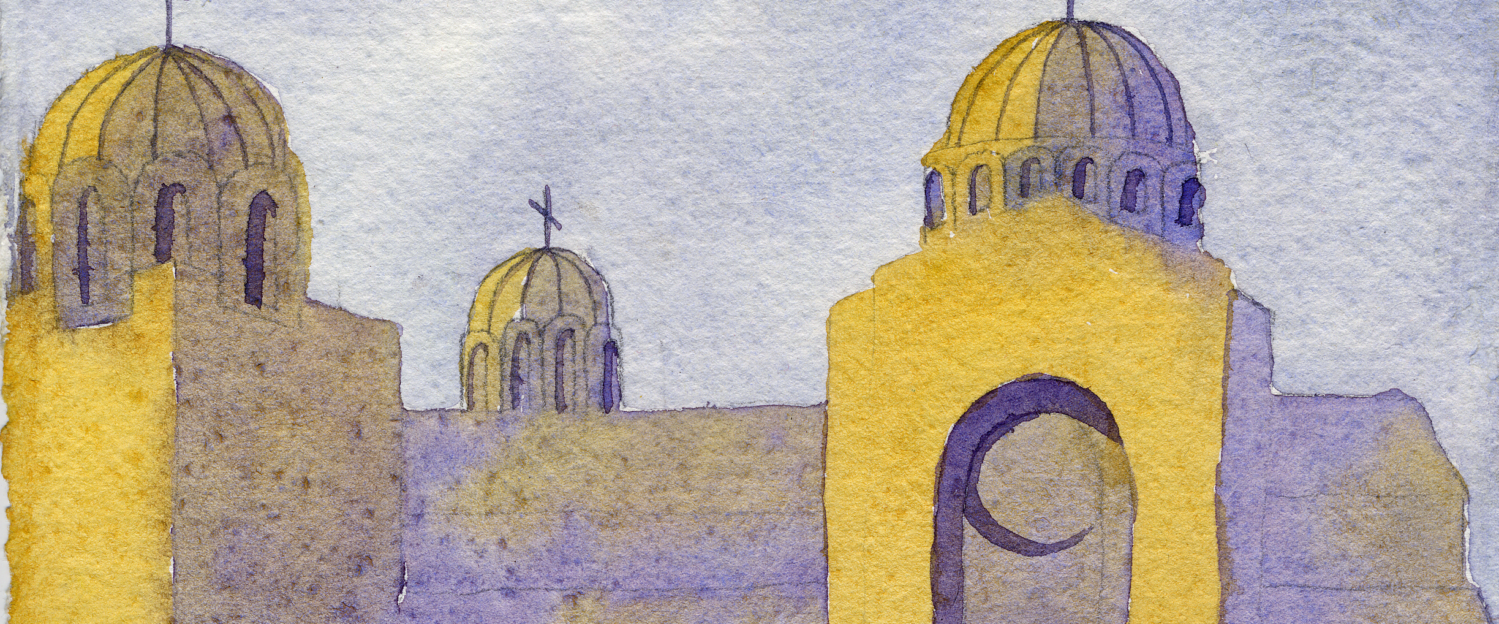
To finish off this exploration of Cerulean Blue, I made a small abstract landscape study to see how the pigment behaves in a real painting. For this test I used Cerulean Blue PB35 by Shinhan PWC along with Nickel Azo Yellow PY150 (White Nights), Pyrrol Orange PO73 (Da Vinci), Phthalo Blue PB15:3 (MaimeriBlu), and Lamp Black PBk7 (White Nights).
Used in juicy brushstrokes in the sky, Cerulean Blue really shines—it’s easy to see why artists have loved it for painting skies for more than a century. It has that slightly cool, atmospheric quality that just reads as sky. Mixed with Pyrrol Orange, it produced a beautiful muted violet that worked perfectly for the shadows under the clouds.
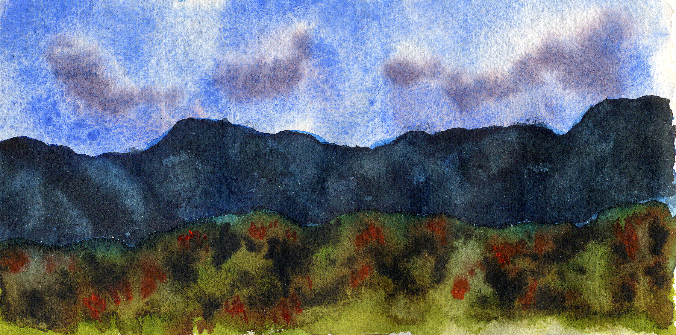
In my first attempt at this painting, I also tried using Cerulean in the distant mountains. But I quickly ran into one of the pigment’s classic limitations: I could never quite get a deep, dark neutral. That’s very typical of light-valued, granulating pigments like Cerulean.
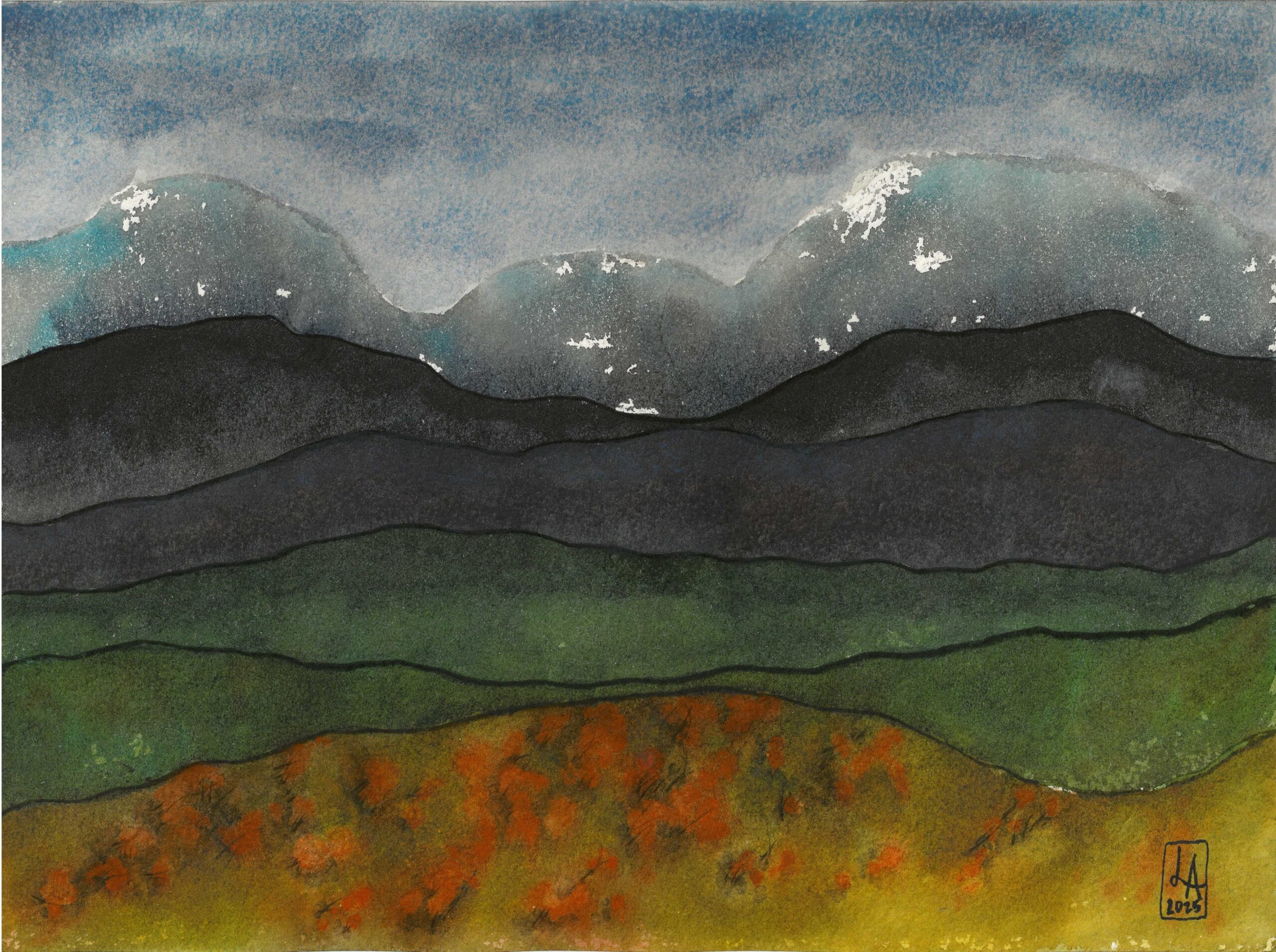
So, my takeaway? Cerulean Blue is at its best in juicy brushstrokes, where its soft granulation and natural sky color can really shine. And when it’s mixed with other pigments, it’s fantastic for creating hazy, atmospheric washes, but not as good for dark neutrals.
Final Thoughts
Cerulean Blue is one of those pigments that has been loved by artists for more than 150 years, and for good reason. It produces some of the most natural skies in watercolor, and its granulation can add beautiful texture to landscapes. But like all pigments, it has quirks. Understanding the difference between PB35, PB36, and Cerulean Hue can help you make much better decisions when building your palette.

If you enjoy these watercolor experiments and want to go deeper, I share a lot more behind the scenes on Patreon.
Members get access to my Watercolor Lab Notebook, where I post pigment deep dives, mixing experiments, and detailed notes from the tests we run on this channel.
You’ll also get early access to new videos, the full replay of my Watercolor Lab livestreams, and the ability to vote on upcoming experiments.
Thank you!