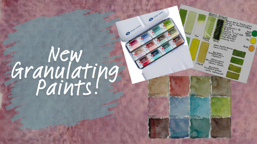
Granulating watercolors are wildly popular right now — but not all granulation is created equal. Today I’m taking a deep dive into the Granulation Metamorphoses set from Nevskaya Palitra White Nights, breaking it down by behavior, usefulness, and how these actually perform in real painting.
This is a 12-color limited edition set, divided into three conceptual series: Brume, Dream, and Mystery. Each series has a distinct mood — and more importantly, very different pigment behavior. I’m evaluating these paints the same way I evaluate everything on my channel: hue usefulness, staining and tinting strength, flow, glazing behavior, and I’ll do this through rigorous examination of these specific characteristics along with a small painting for each as a field test. I’ll be paying special attention to the quality of granulation, and what it adds to the paint, and whether I’d actually reach for these in a real palette.
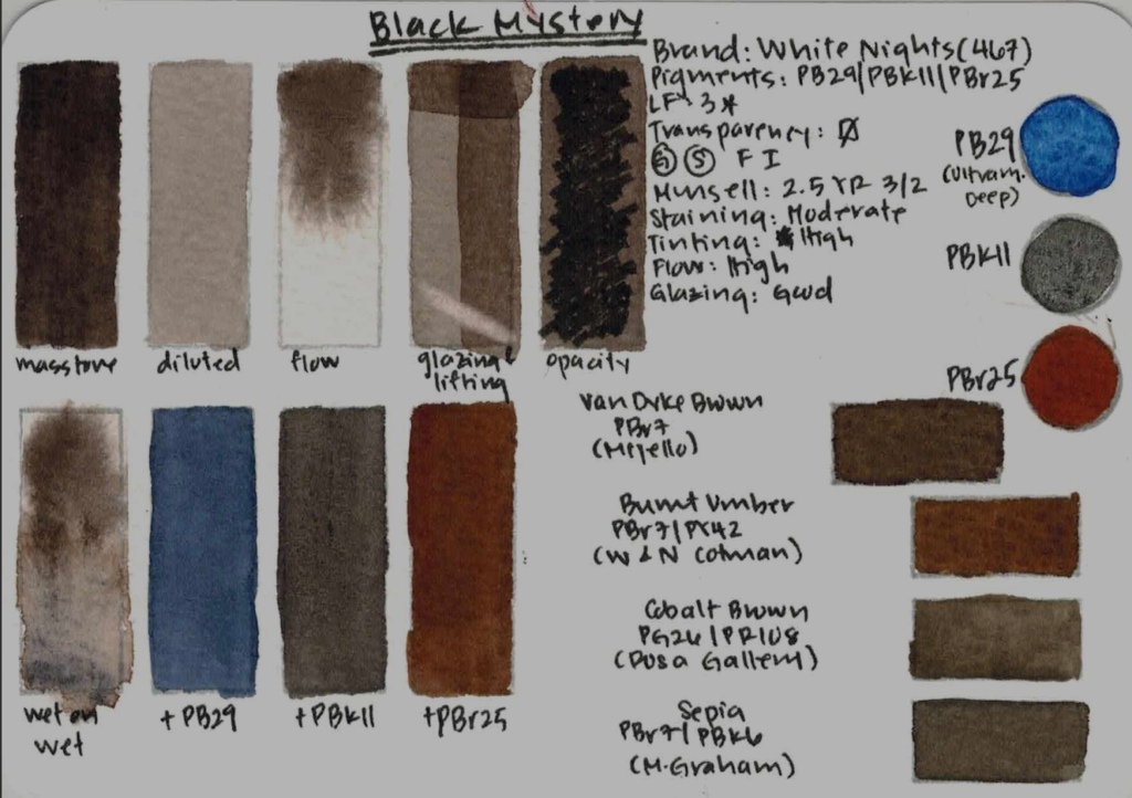
Note: I’ve painted a sample of the component pigments of each granulating paint at the side of the card. When I am not sure which version of the pigment was used (for example, Cobalt Turquoise PB28 vs Cobalt Blue PB28), or when I’ve used a version that is not the White Nights version, I’ve noted it on the card. These paints are all granulating and semi-transparent, so I won’t mention again hereafter.
BRUME SERIES — Muted, Foggy, Earthy
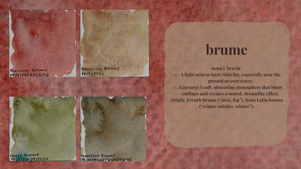
We’ll start with Brume — which translates to fog or mist — and these paints immediately set the tone for how White Nights is thinking about granulation: muted hues, earthy palettes, and atmosphere over brightness.
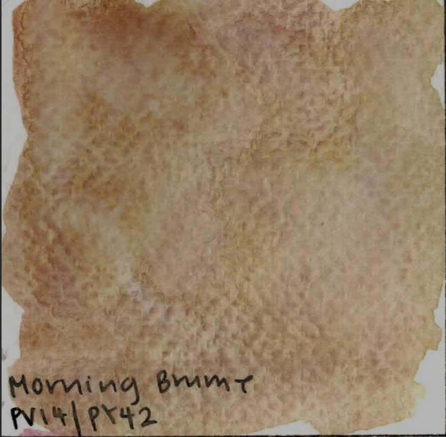
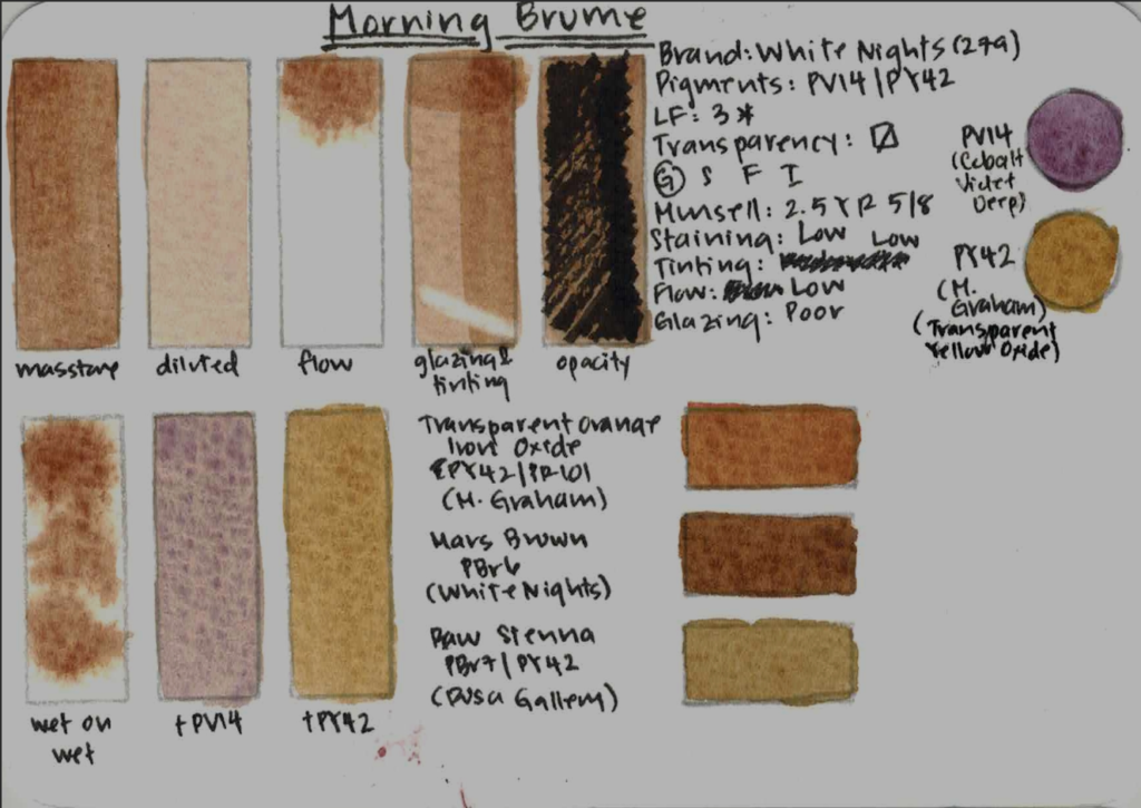
Morning Brume (PV14 / PY42)
Morning Brume is a muted, earthy mix, and its hue is similar to transparent orange iron oxide by M. Graham and Raw Sienna by Rosa Gallery. It’s lightfast, semi-transparent, low staining, low tinting, and very low flow, although it is active wet in wet. You can see that I tried it out in two sunsets, hoping to bring out the purple granulation – I find purple sunsets so beautiful. Curiously enough, although it is granulating, it is not very separating, which is disappointing. I personally didn’t find the hue very useful, and the paint feels gummy to me. It also glazes poorly. This was my least favorite in the set.
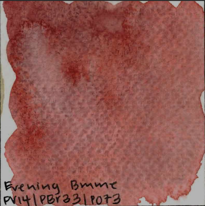
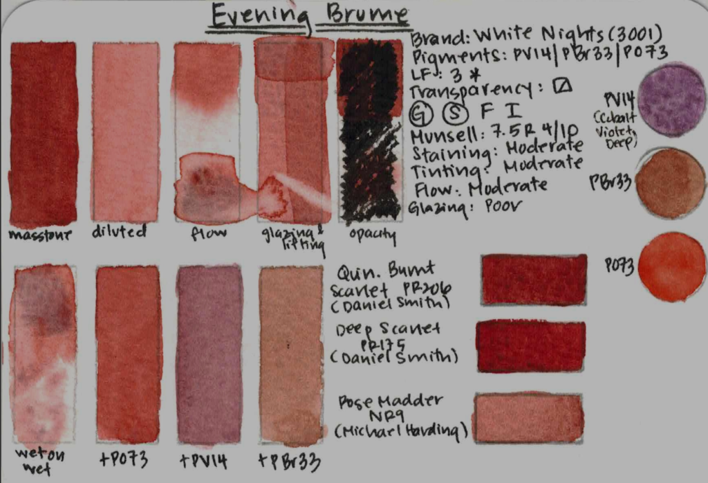
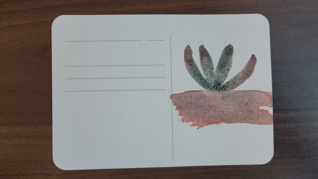
Evening Brume (PV14 / PBr33 / PO73)
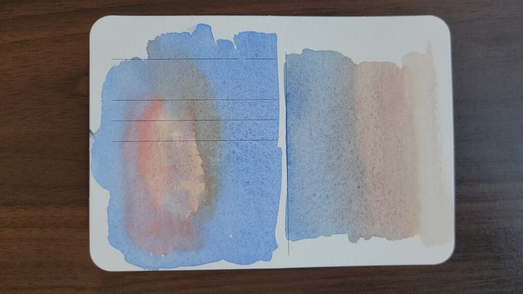
Evening Brume, on the other hand, is excellent. This could absolutely fill the role of a burnt sienna in a granulating palette, and you can see it here compared to Quinacridone Burnt Scarlet PR206, Deep Scarlet PR175, and Rose Madder NR9. It is lightfast, is moderately staining, moderately tinting, moderate flow, and is poor at glazing. I painted a small desert cactus using this paint and Chromium Oxide Green PG17, and they created really fun textures. If you like quinacridone burnt scarlet or rose madder but want a version that granulates AND separates, this one is a standout.
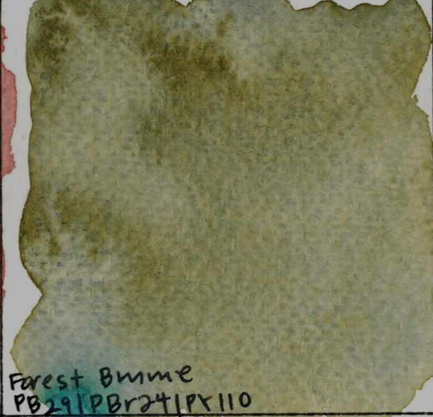
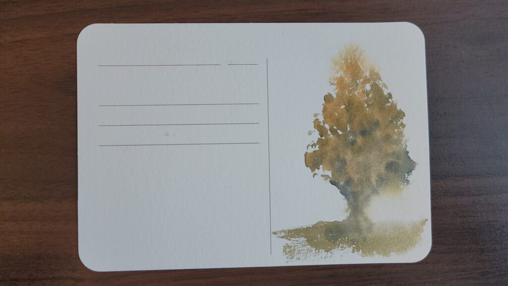
Forest Brume (PB29 / PBr24 / PY110)
Forest Brume is a natural, moody green similar to Bohemian Green Earth, olive Green, Aquarius Green, or Davy’s Grey. It’s lightfast, semi-transparent, moderately staining, highly tinting, with low flow and poor at glazing. I painted a hazy forest tree using this paint along with Chrome Titanate Yellow, which is one of its component paints. This is a very serious landscape color and is extremely versatile.
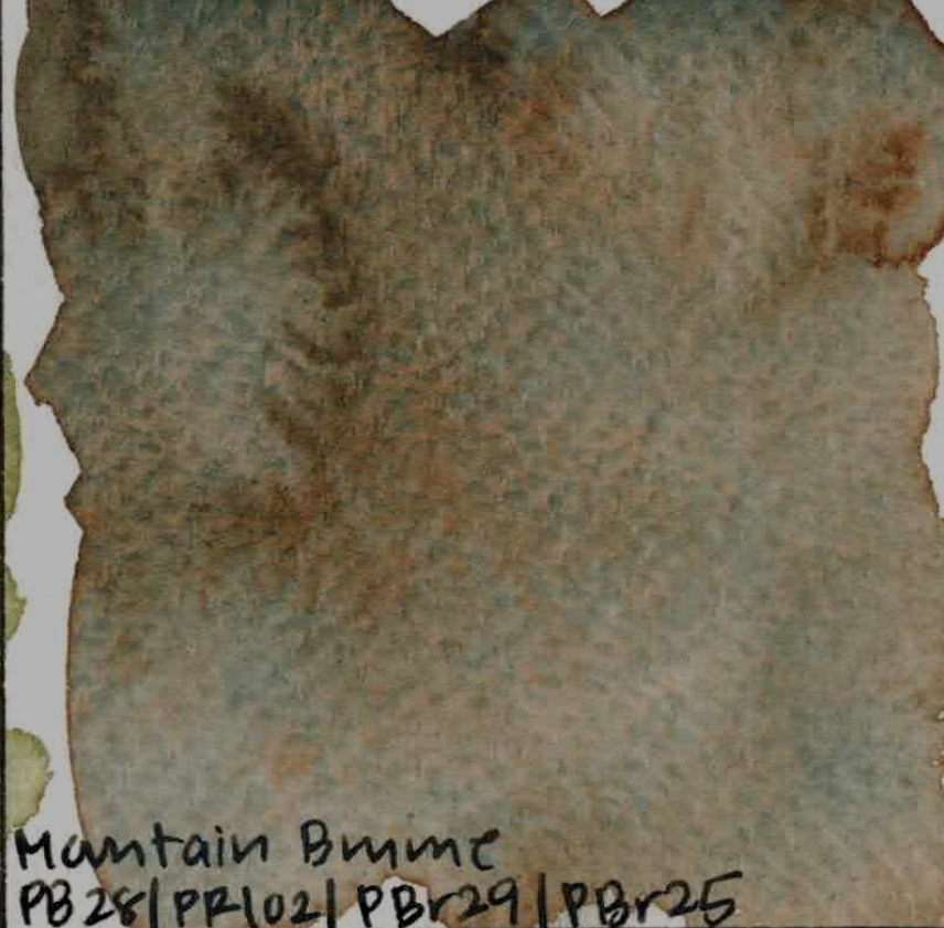
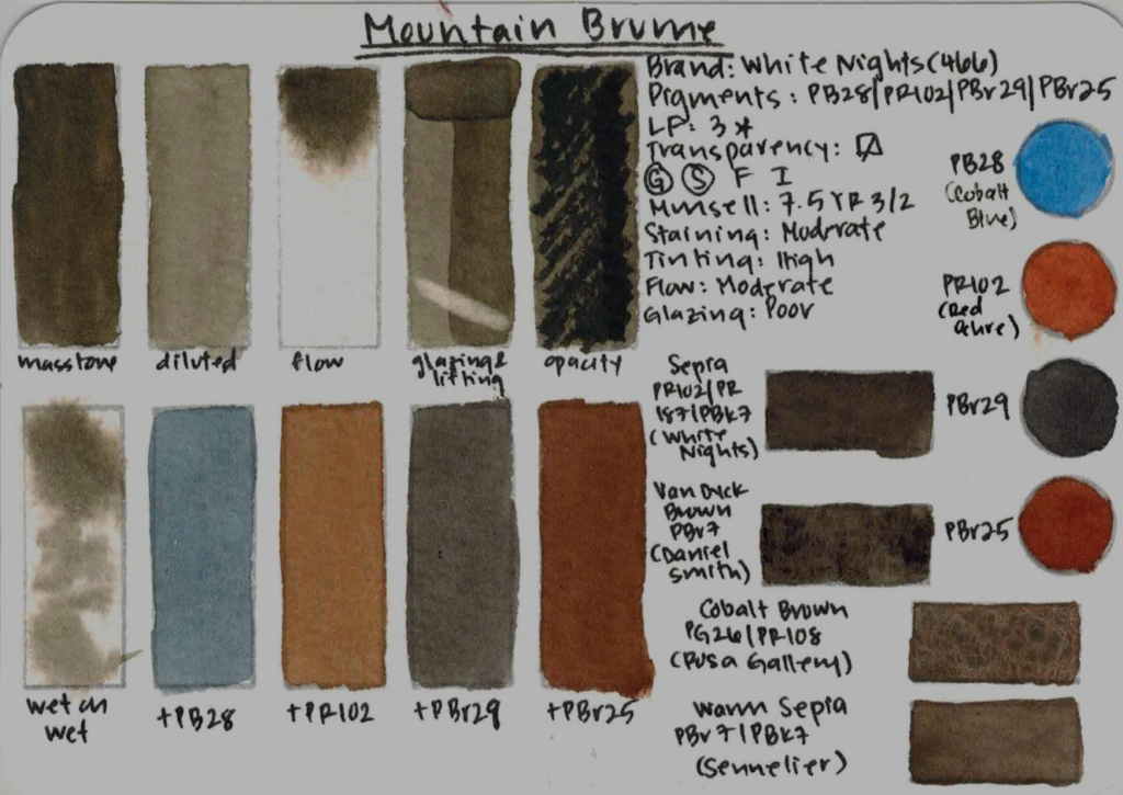
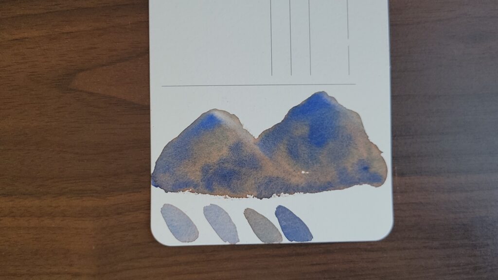
Mountain Brume (PB28 / PR102 / PBr29 / PBr25)
Mountain Brume sits in that earthy green-brown space, similar to sepia, Van Dyck brown, or Cobalt Brown by Rosa Gallery. It is lightfast, moderately staining, highly tinting, has moderate flow and is poor at glazing. It does have gentle hazy separation wet on wet. I painted some mountains using it along with Ultramarine Deep PB29, and it created striations that are very effective at capturing rocky texture. It’s fun to paint with, strongly granulating, and especially effective in landscapes. This is one of those colors that creates depth almost automatically.
Dream Series – Light, Airy, Whimsical
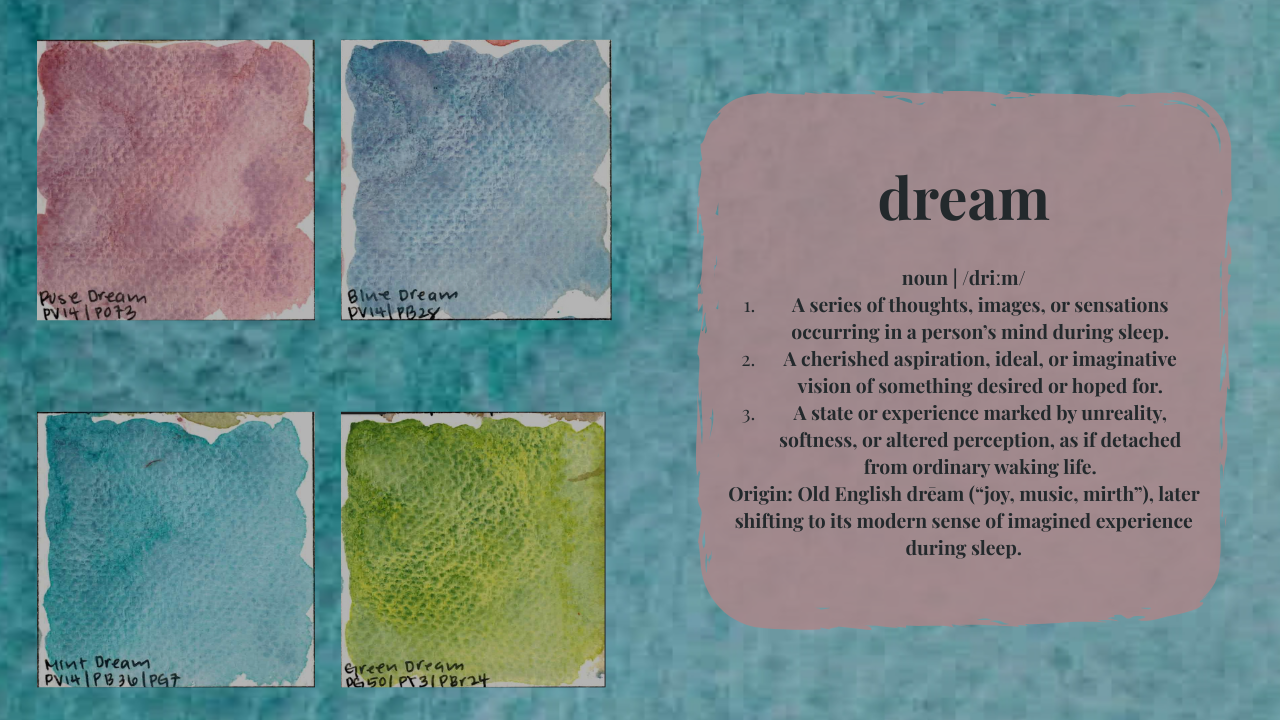
The Dream series is lighter, higher flow, and more whimsical — very much living up to the name.
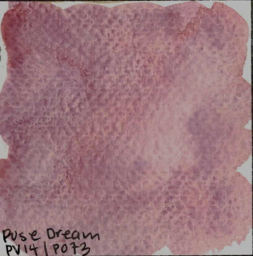
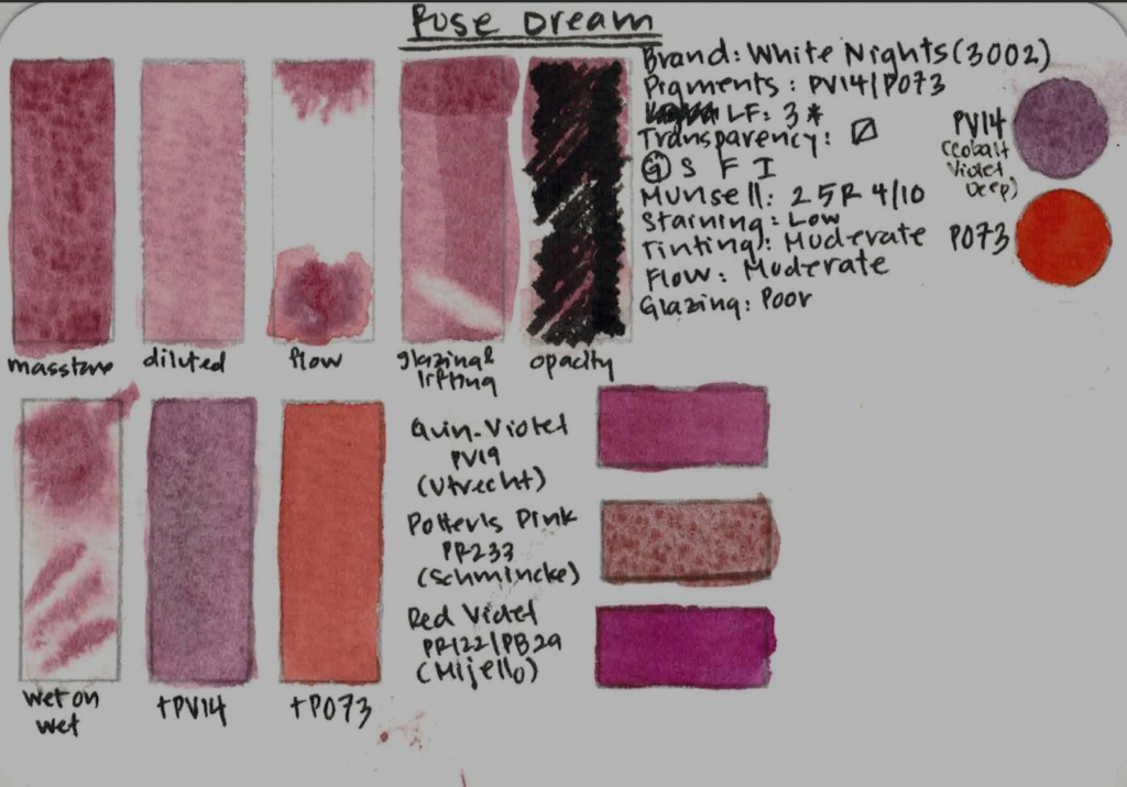
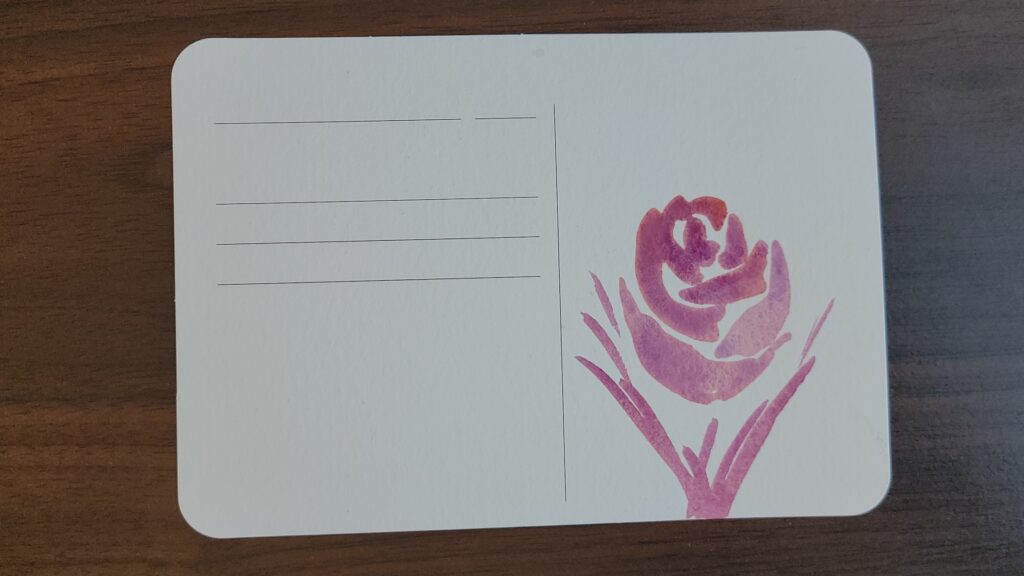
Rose Dream (PV14 / PO73)
Rose Dream is a beautiful hue, somewhere between quinacridone violet, potter’s pink, and Red Violet by Mijello Mission Gold. It is lightfast, low staining, moderately tinting, with moderate flow and poor at glazing. It has very minimal separation wet in wet. With a name like Rose Dream, of course I had to paint a rose. The hue is beautiful, and I did find that it separated more readily in this field test. If you’re buying this purely for dramatic granulation, this one is more subtle, though still very pretty.
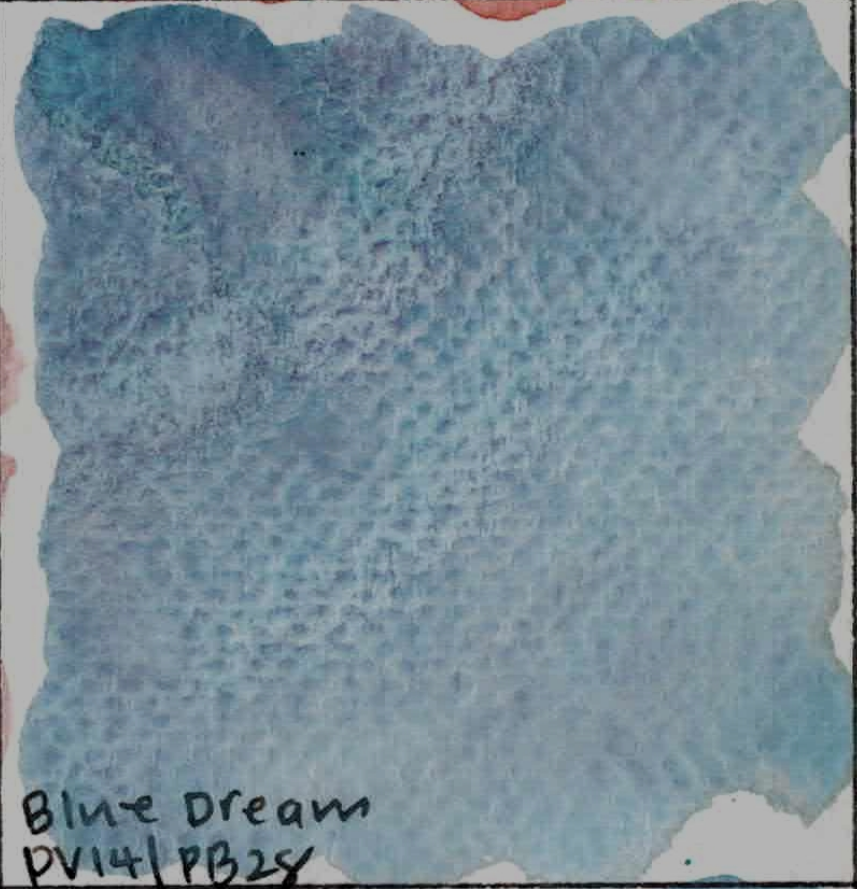
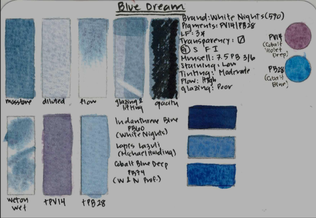
Blue Dream (PV14 / PB28)
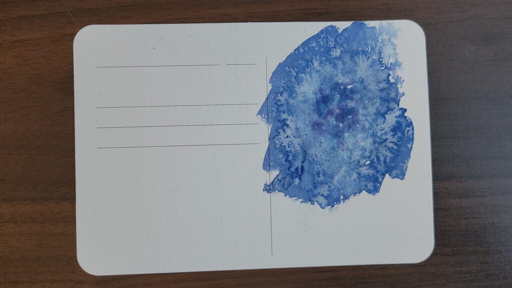
Blue Dream separates dramatically and flows very easily. It reminds me of lapis lazuli or Cobalt Blue Deep PB74 by Winsor & Newton. It’s lightfast, low staining, moderately tinting, with high flow and is poor at glazing. The blue and violet components reminded me of a nebula, and so I used the salt technique to achieve some nice feathering that brought out the separation easily. Personally, I prefer my warm blues to be higher tinting so I can achieve dark neutral mixes more easily, so this one isn’t a staple for me. But visually, it’s lovely and very expressive for special effects.
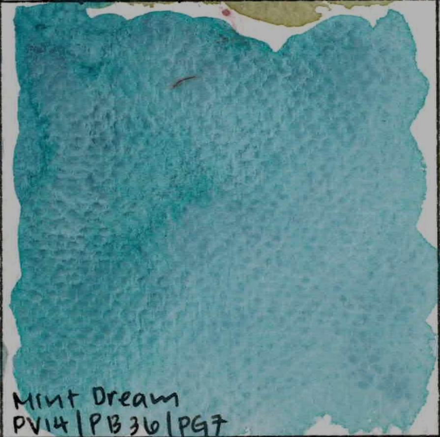
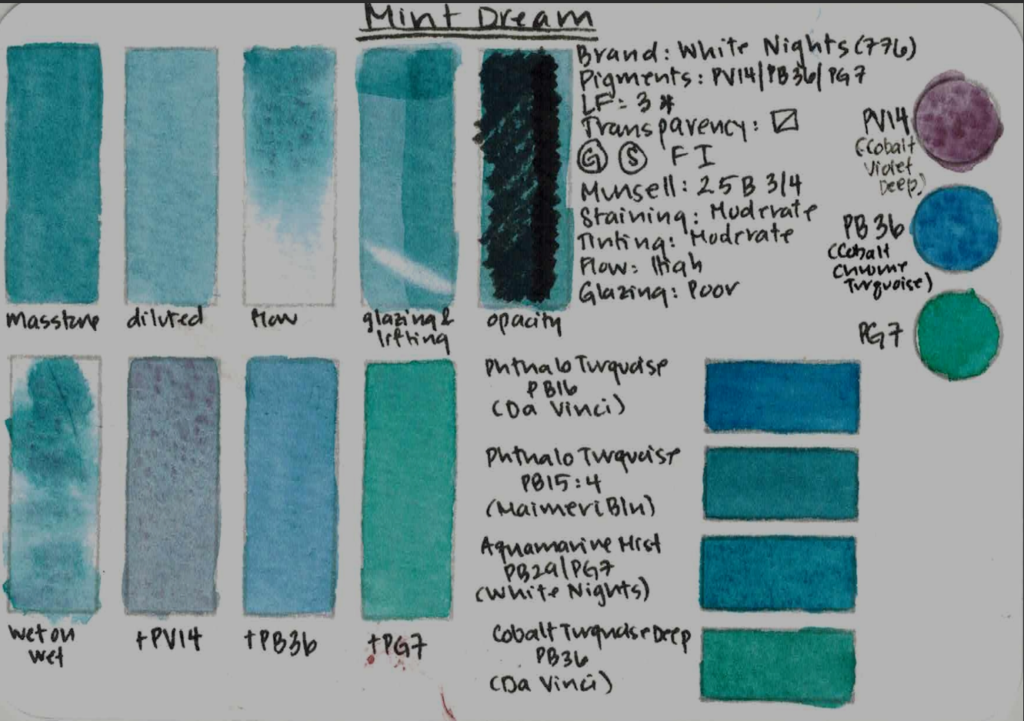
Mint Dream (PV14 / PB36 / PG7)
Mint Dream is playful and light, similar in hue to Phthalo Turquoise, Aquamarine Mist, or Cobalt Turquoise PB36. It is lightfast, moderately staining, moderately tinting, with high flow and poor at glazing. It granulates lightly and the separation is very subtle. I painted a sweet lavender plant. hoping to get more granulation from the Cobalt Violet Deep PV14, but no luck. I do wish it were darker in value, so although it’s an enjoyable paint, I probably won’t be reaching for it often.
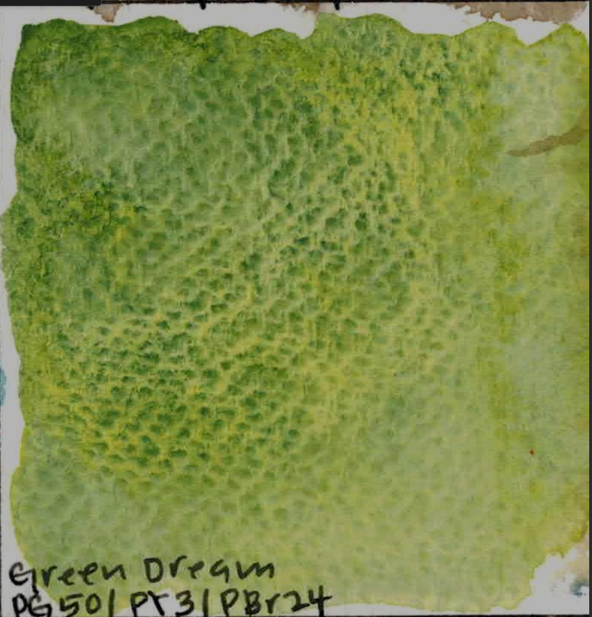
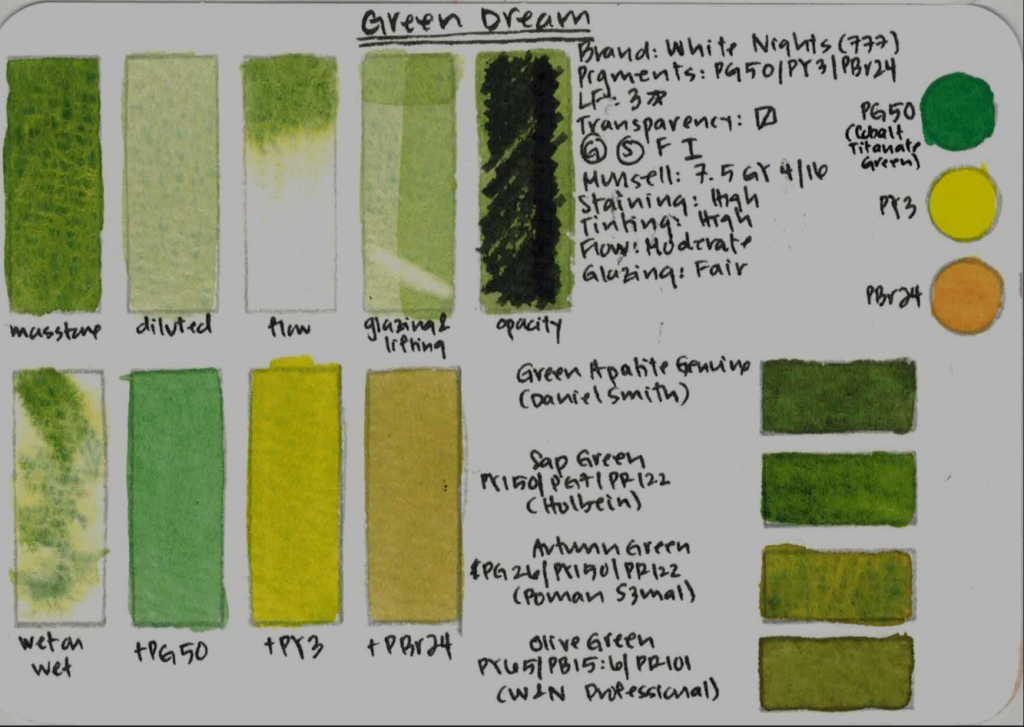
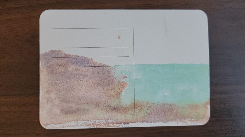
Green Dream (PG50 / PY3 / PBr24)
This vibrant green-yellow paint is the only paint in the set that is less lightfast, due to the inclusion of PY3, and that’s an important detail. This is really tragic, because it’s one of the strongest paints in the entire set! It is similar to Green Apatite Genuine by Daniel Smith and Sap Green by Holbein. It is highly staining, highly tinting, with moderate flow and fair at glazing. It granulates and separates beautifully, forming a halo of yellow pigment around the heavier cobalt green. I used it to paint some sand dunes with a peaceful ocean, and it brought out lovely green highlights both on the sand and in the water. It works extremely well in landscape and ocean palettes and behaves beautifully wet-on-wet. This was my favorite paint in the set.
Mystery Series – Dark, Cool, Value-focused
The Mystery series is my favorite overall!
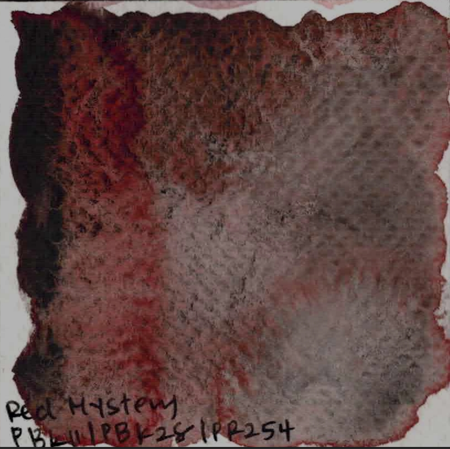
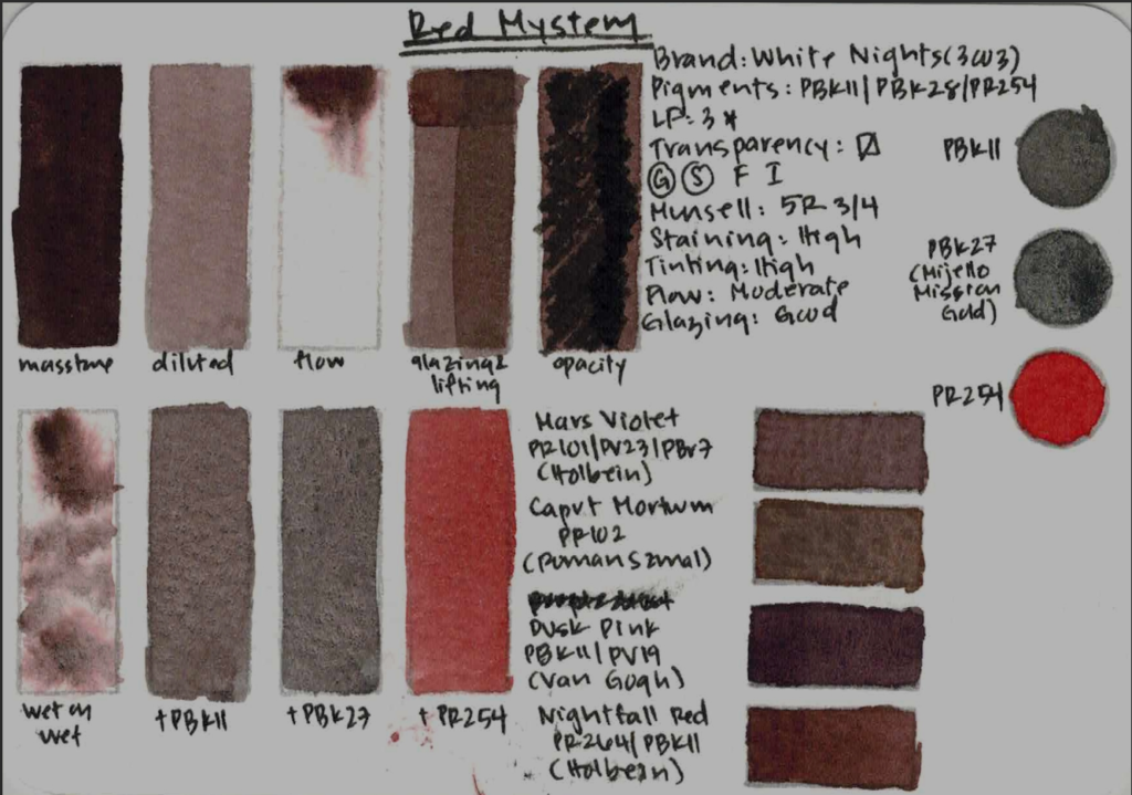
Red Mystery (PBk11 / PBk28 / PR254)
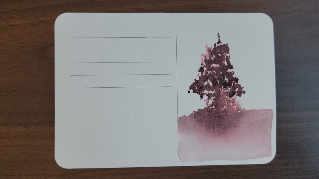
This paint is fascinating. It includes PBk28, which is rare in watercolor and not part of the standard White Nights range. I used Cobalt Black PBk27 by Mijello Mission Gold as an approximate replacement. This paint is highly staining, high tinting, and excellent for glazing. This is a beautiful color for value studies — think Mars Violet, Caput Mortuum, or Dusk Pink. I painted a spooky tree in a dark forest with it, and the black pigments definitely show through and settle beautifully. This is a really special paint with an unique pink undertone.
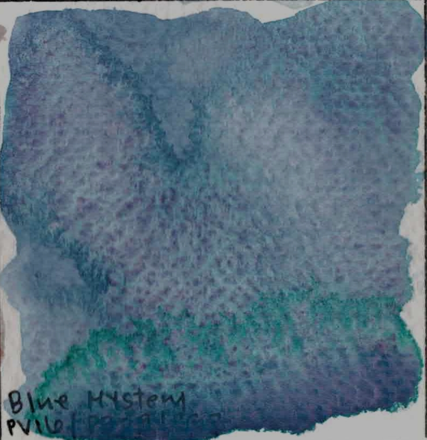
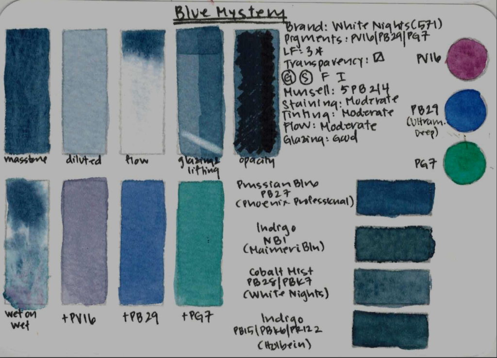
Blue Mystery (PV16 / PB29 / PG7)
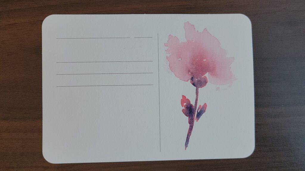
Blue Mystery sits somewhere between Prussian blue, indigo, and cobalt mist. It is light fast, moderately staining, moderately tinting, with moderate flow and pretty good at glazing. White Nights actually has a pink very similar to it already in hue, Cobalt Mist PB28/PBk11. But the components are totally different, and you can see that wet on wet really brings out the gorgeous purple granulation, and the PG7 forms a greenish halo around it – so so beautiful! I painted an abstract flower with it, and watching the pigments flow into the watery petals was super fun. I wish it were higher tinting, but it’s still very beautiful and honestly perfect for painting outer space and night skies.
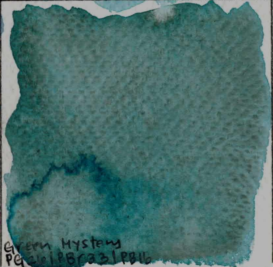
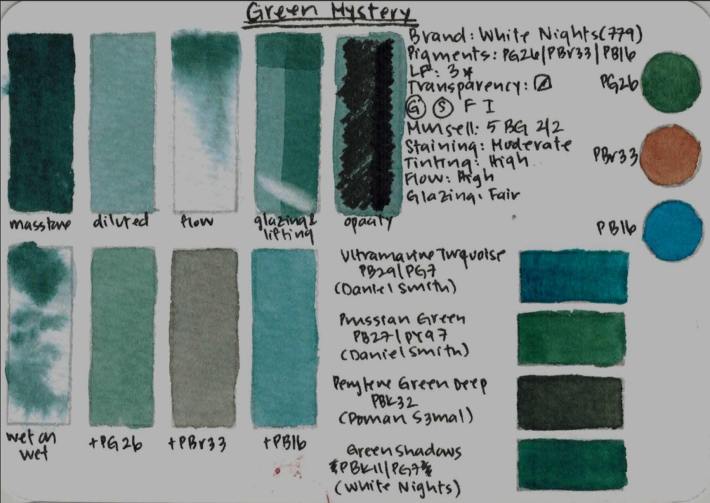
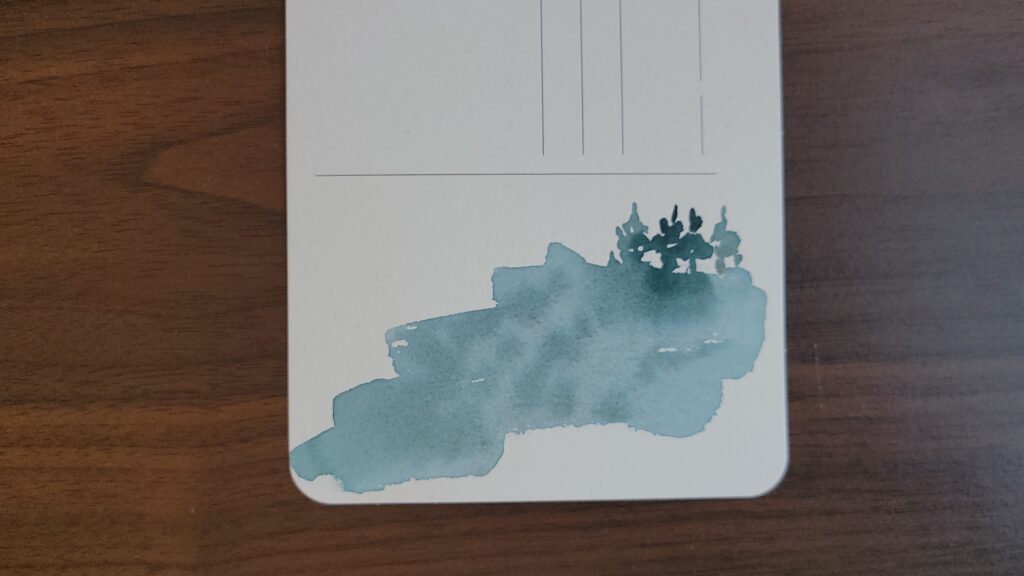
Green Mystery (PG26 / PBr33 / PB16)
This is a deep teal-green that is light fast, moderately staining, highly tinting with excellent flow but not very separating wet-on-wet. I was disappointed thinking that the brown granulation wouldn’t show through, but on my small painting of a mountain range, you can see that although it is subtle, the brown granulation definitely does show through. Because the granulation is subtle, it might be it easier to integrate into a daily palette. It behaves more predictably than many of the other paints in this set, while still being rich and expressive.
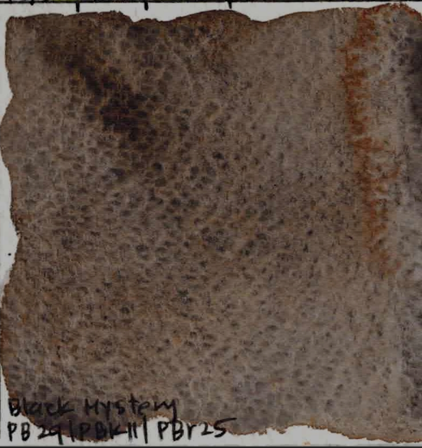
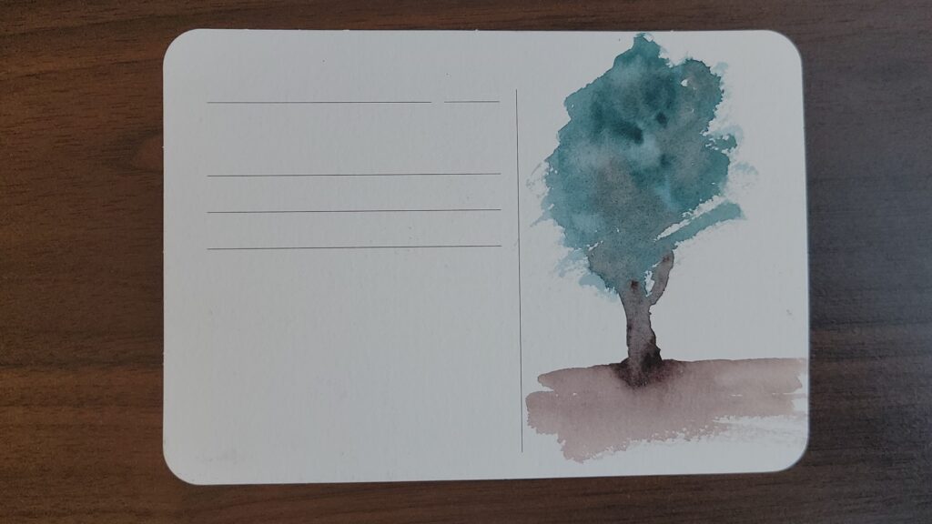
Black Mystery (PB29 / PBk11 / PBr25)
I love this paint. It’s a beautifully separating dark neutral — somewhere between Van Dyck Brown, Burnt Umber, Cobalt Brown, and Sepia. It’s lightfast, moderately staining, highly tinting, with excellent flow and is good at glazing. The separation is so lovely wet on wet, and it’s absolutely perfect for dark forest scenes like in this painting.
Final Thoughts
Thank you for joining me on this deep dive on how to explore the properties of granulating watercolors, and on how to decide if they fit into your palette and into your painting practice!
As far as this White Nights Metamorphoses Set: as with most super-granulating paints, this set isn’t about clean, flat washes. It’s about atmosphere, texture, and letting the pigments do some of the work for you. Not every paint here is a winner (I’m looking at you, Mountain Brume!), but several of them are genuinely excellent, especially in the Mystery series.
If you enjoyed this kind of deep, pigment-focused review, consider subscribing to my YouTube chennel and my Patreon for more watercolor science!