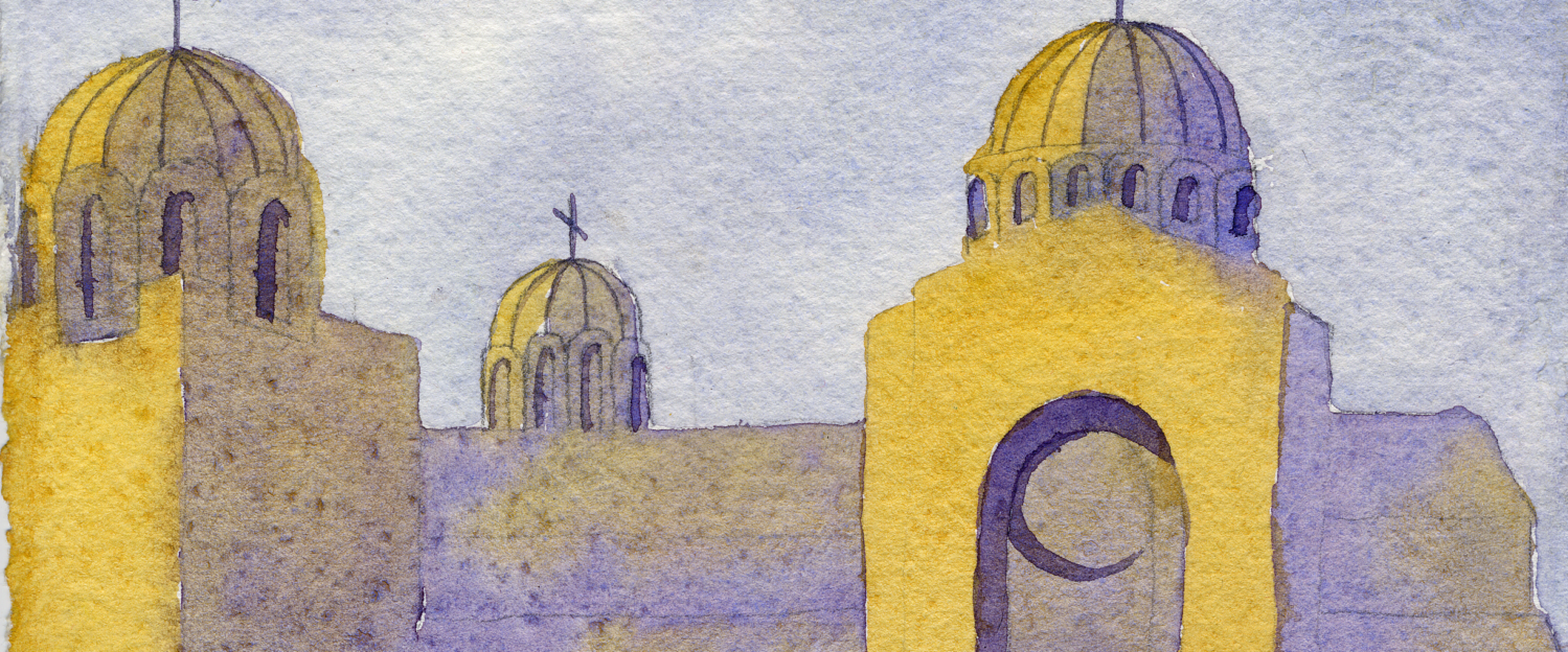

Hi everyone, and welcome to Watercolor News Report — your monthly roundup of what’s new in watercolor, from paint releases and pigment changes to research, exhibitions, and the art market.
This week, we’re looking Tonic Watercolors’ new paints, Schmincke, White Nights, Da Vinci, Holbein, and more, plus new discussions around lightfastness testing, major watercolor sales at auction, and exhibitions you won’t want to miss.
Let’s get into it.
Paint Brand Updates, New Paints, and Discontinuations
Three New Historical Shades from Schmincke
Schmincke just released three “historical special shades” inspired by colors from the 1930s:
–Gamboge Gum PY150/PY65
–Solferine PW4/PR122
–Cassler Brown NBr8
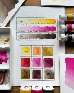
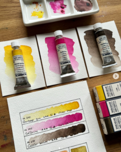
These are purported to be lightfast alternatives to historical pigments, but I am suprised about the inclusion of NBr8. NBr8 is the original Van Dyke Brown, a lovely but fugitive natural pigment that is also offered by Roman Szmal. This is a good reminder to us all to test a new paint’s lightastness for yourself rather than taking the word of the manufacturer.
But aside from that, I do like to concept. This isn’t just “new colors” but rather a curated historical limited palette. If you’re into ancient pigments and art history, this one may be a fun addition to your stash.
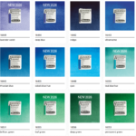
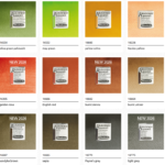
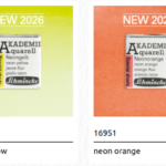
Brand Update: Schmincke Akademie Expands to 40 Colors
Schmincke’s student-grade line, Akademie Aquarell, is expanding — adding 14 new colors to bring the range up to 40 total.
Here’s what’s new:
- Brilliant Red (PR254)
- Deep Red (PR179)
- Violet Blue (PV23)
- Lavender Violet (PV15 / PB29)
- Deep Blue (PB60)
- Cobalt Blue Hue (PB29 / PB15:1)
- Teal Blue Hue (PB15 / PG7)
- Leaf Green (PG36)
- Deep Green (PB15:3 / PG7 / PY42)
- Golden Rosa (PY150 / PR101 / PY42)
- Burnt Sienna (PR101 / PBk6)
- Van Dyke Brown (PY150 / PBr7 / PBk7)
- Light Grey (PBk7)
- Plus three fluorescent dye colors: Neon Yellow, Neon Orange, and Neon Pink
From a pigment perspective, this is actually a pretty modern upgrade for a student line.
PR254 and PR179 are serious, high-performance reds. PB60? That’s a beautiful deep Indanthrone Blue — very respectable and unusual in student lines. They also opted for some wildcard paints with fluorescent dyes, which are quite fugitive but great for sketchbooks. Overall, this feels like Schmincke is treating beginners like real color nerds. And I respect that.
White Nights Releases Three New Sets
White Nights has released three new extra-fine watercolor sets — and there’s a very clear theme emerging.
We have:
- Atlas Botanical — a 12-pan set made of vibrant transparent paints built for botanical realism and controlled glazing.
- Russian Fairy Tales — a 12-pan set that includes two metallic paints to create a mood-driven, atmospheric palette.
- Journeys — a unique 24-pan set designed around travel-inspired color storytelling. It includes a core palette along with Cityscape, Marine, and Woodland palettes.
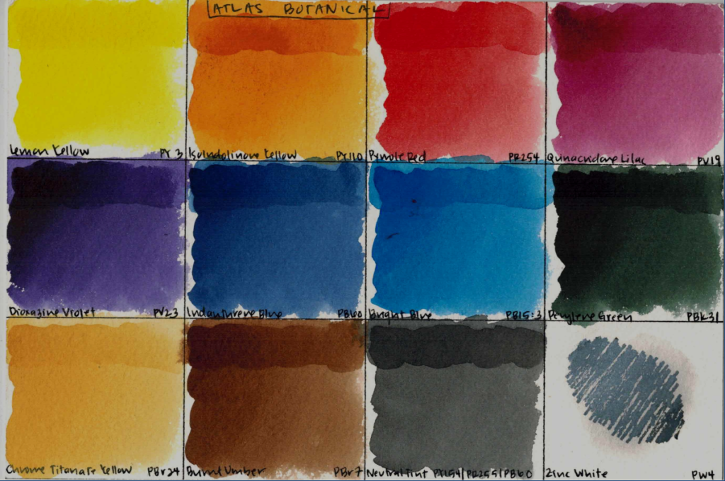
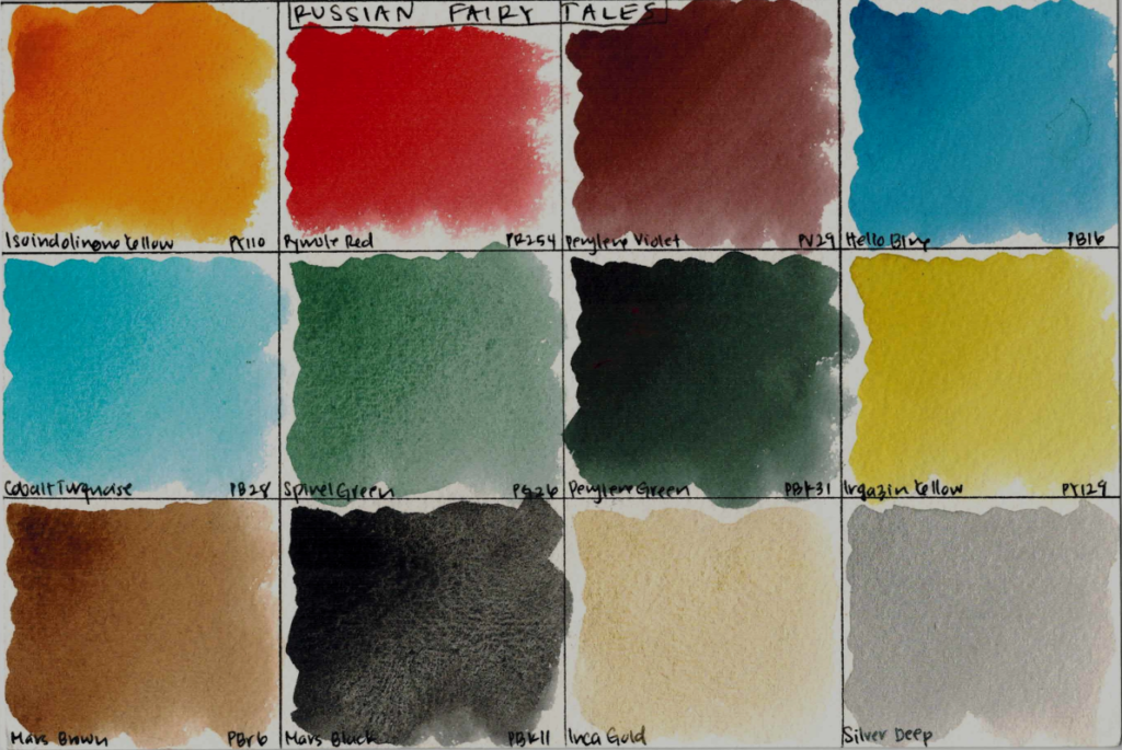
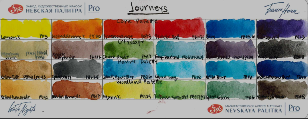
What’s interesting is that all three lean into curated, limited palettes with strong conceptual identities. This continues a trend we noted last month: brands moving toward themed limited palettes, with a focus on color systems with a narrative. As someone who loves structured palette logic… I’m paying attention.
Della Magna Expands Its Historical Lineup
Over at Della Magna, the folks who focus on historically inspired single-pigment watercolors, five new paints have just been added to their range.
- Isoindoline Lemon Yellow (PY109) — a bright, grainy cool yellow.
- Manganese Violet (PV16) — that classic, soft violet with marked granulation.
- Burnt Umber of Cyprus (PBr8) — a deep, earthy, historical brown.
- Dark Gold Quinacridone (PO49) — a rich, golden tone.
- Natural Sienna from Monte Amiata (PY43) — a beautifully earthy transparent sienna.
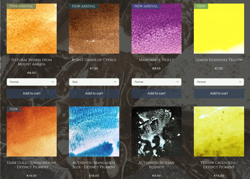
What I like about this update is that it stays true to Della Magna’s ethos: single pigments with historical resonance, not trend-driven mixing hues. These additions will mix beautifully into old-master inspired palettes and will help you understand traditional color relationships.
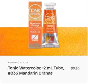
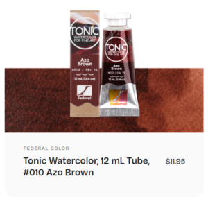
Tonic Watercolors Expands Its Range
Tonic Watercolors just added five new paints to their intentionally limited lineup. Here’s what’s new:
- Mandarin Orange (PY110)
- Utopian Yellow (PY138)
- Quinacridone Violet (PV19)
- Dioxazine Violet (PV23)
- Azo Brown (PBr25)
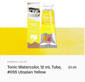
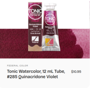
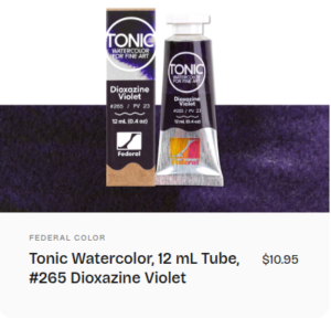
What’s especially interesting is that they focused on filling a real gap: violets. Their range was noticeably lacking strong, single-pigment purples, and now they’ve added both a Quinacridone Violet and a Dioxazine Violet — two transparent, high-impact options with very different personalities. At the same time, they added a very unusual pigment PY109 as their cool yellow.
This is the kind of expansion I like to see. Instead of adding trendy convenience mixes, they reinforced the structural weak points in the palette — transparent yellows and true violets. That immediately increases neutral-mixing potential and expands the chromatic range without bloating the lineup. That’s smart palette design.
Roman Szmal Updates Artist-Curated Sets
Roman Szmal continues to expand their range — and alongside all the new paints added in recent years, they’re now updating several of their artist-curated palettes, including the 24-pan sets by Mona Omrani and Krzysztof Ludwin.
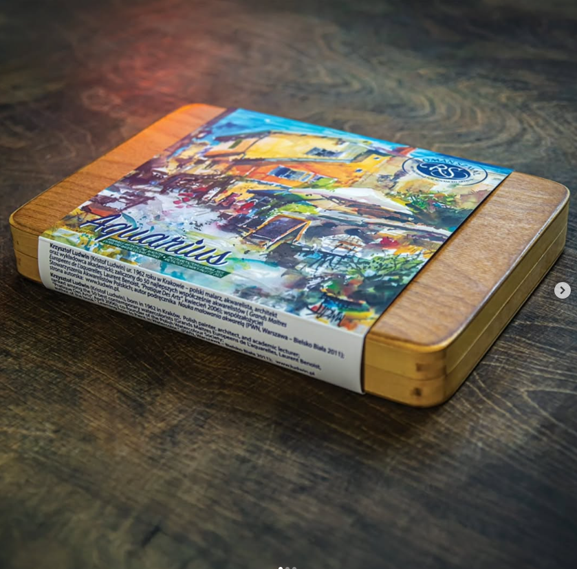
These refreshed sets feature many of Roman Szmal’s well-loved proprietary colors — including Aquarius Green, Aquarius Red, Aquarius Grey, and Aquarius Violet — paints that have developed a bit of a cult following for their unique character.
Artist sets like these are more than just curated assortments. They’re a window into how a specific painter actually thinks about color in practice — which pigments they rely on, how they structure their primaries, how they handle neutrals.
If you’re someone who learns through reverse-engineering working palettes, artist sets are one of the most practical ways to study real-world color systems.
Watercolor Science and Research in the Community
The Art of Not Mixing: Optical Color in Practice
This week, Idyll Sketching published Chapter 10 of The Art of Not Mixing: Making Color Sing, focusing on glazing and optical color mixing. They approach the topic with a very methodical, almost experimental mindset — comparing layered versus pre-mixed applications to observe how light, transparency, and pigment interaction affect the final result. The core idea? Instead of physically mixing pigments on the palette, you layer transparent washes and let light blend them on the paper. That preserves chroma, reduces muddiness, and creates more luminous results.
If you’re working with transparent pigments — especially in limited palettes — understanding optical mixing can dramatically expand your color range without adding more tubes. I don’t use glazing in my paintings very often, but I’ve been working on portraits this week, and these findings have really helped with my understanding of how the order in which you glaze matters!
New Sizing and New Methods: How Paper Has Evolved
Erik Lundgren published a fascinating look at how watercolor paper sizing has changed over the last few decades. Rather than a how-to, it’s a rigorous, observational exploration of the materials themselves: how surface sizing has become more uniform, how synthetic and plant-based sizing agents are replacing older gelatin formulas, and what that means for paint behavior.
Through rigorous testing with smooth washes on different paper samples, we learn that modern paper is far more predictable and consistent right out of the gate — you don’t need to pre-wet or temper it like older papers — but also a bit less textured and characterful than historical papers could be. This was an effective way to learn that sizing isn’t just technical jargon! It directly affects how pigment sits, spreads, and absorbs. Understanding how this invisible layer has evolved helps you anticipate how paint will behave on different papers and adjust your technique accordingly.
Rediscovering Core Pigments: Daniel Smith’s First Yellows & Earths
Daniel Smith’s latest blog post takes a rigorous, almost experimental look back at six of the original watercolors that shaped their Extra Fine range — from transparent yellows like Aureolin and New Gamboge to classic earths like Yellow Ochre and Raw Sienna. The piece explores how those early choices weren’t random but chosen for their mixing harmony, versatility, and naturalistic warmth.
Understanding the foundational colors of a range, and the reasoning behind them, can give you clearer insight into building balanced palettes and choosing pigments that play well with others in transparent washes and layered mixes.
Focusing on Red: A Structured Color Investigation
Liz Steel’s latest post dives deeply into the color red – not just aesthetically, but analytically. She examines how different red pigments behave across washes, value shifts, and mixes, comparing them side by side in a very deliberate, experiment-based way. Her approach feels almost laboratory-like: isolating variables, testing transparency and intensity, and observing how each red responds in real painting situations rather than relying on theory alone.
In my opinion, red is one of the easiest colors to overwork or muddy. Seeing it tested systematically helps you choose reds more intentionally based on the behavior you need from them in your art practice.
Secrets to Depth & Perspective in Watercolor
American Watercolor Weekly’s newest article from Thomas Schaller explores how to create the illusion of depth and perspective in landscape painting. Rather than relying on rigid, technical one-point perspective, Schaller compares two approaches: classical vanishing points versus expressive layering of light, mid-tone, and dark. Schaller uses these to show how effective value structure can create believable dimensional space almost as if by magic. He takes a methodical, almost experimental approach, discussing how and why different techniques affect spatial perception in a painting.
I learned that depth isn’t just about drawing lines; it’s about how value, contrast, and atmosphere work together to trick the eye into seeing three dimensions on a flat sheet. Whether you’re painting landscapes or compositionally planning any scene, this kind of analytical exploration can sharpen how you think about spatial relationships and improve the realism and impact of your work.