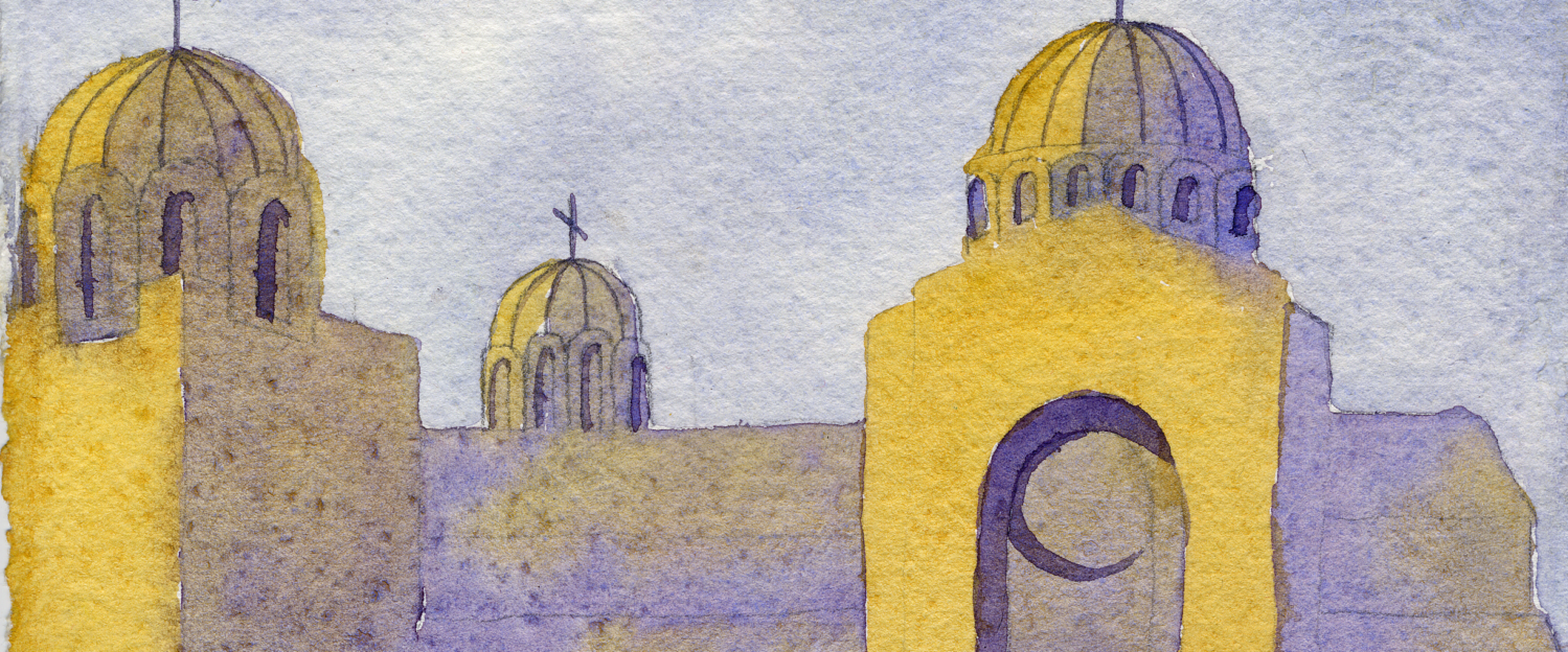
Hi everyone, and welcome back to Watercolor Scientist! Today I’m bringing you the ultimate guide to building a custom watercolor palette like a watercolor scientist, using a system I built for building a mixing palette. Then, we’ll swatch the fourteen paints I chose for my palette, and I’ll show you how to mix just about any convenience color, earth tone, and neutral.
This is not a “look at my favorite colors” video. Instead, I walk you through how to build a palette like a watercolor scientist: using high-chroma pigments, carefully chosen around the color wheel, with no earth tones or premixed neutrals. Before we start, let me know in the comments what pigments are must-haves in your palette and why!
BASIC COLOR MIXING PRINCIPLES
Let’s establish a few color mixing principles, so that we can understand HOW and WHY my method works.
Hue, Value, Chroma, and Physical Characteristics Determine Mixing Behavior
Mixing behavior of a paint is determined by four important characteristics: hue (the “color”), value (how “light” or “dark”), chroma (how much “color”), and the physical characteristics of the paint (opacity, granulation, etc). Value and chroma are kind of hard to understand, so I think of value as how much black/white a paint has, and chroma as how much color (not counting black or white) a paint has. This is a clumsy but effective way to remember the difference!

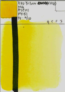
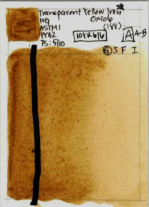
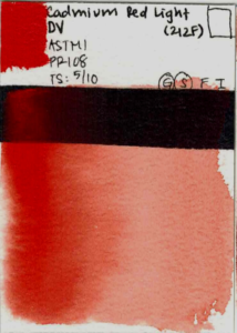
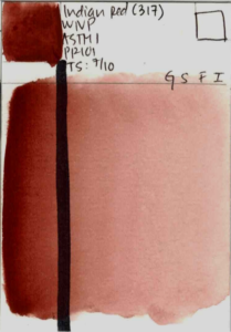
Azo Yellow PY151 and Transparent Yellow Iron Oxide PY42 have a similar hue, but the difference in value, chroma, transparency, and granulation lead to very different mixing results. The same is true for Cadmium Red Light PR108 and Indian Red PR101.
High Chroma Paints Have a Greater Mixing Range
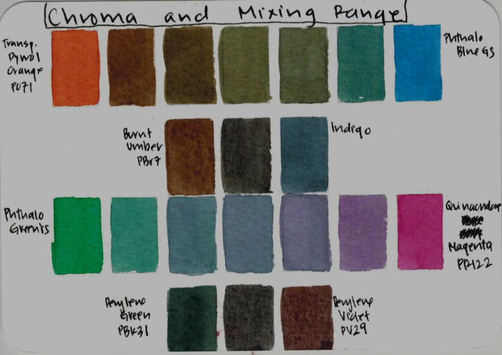
To illustrate this, take a look at comparing Transparent Pyrrol Orange (PO71) and Burnt Umber, and Phthalo Blue GS (PB15:3) and Indigo. PO71 has a similar orange hue to Burnt Umber, but you can see that if you start with PO71, you are able to achieve burnt orange, burnt sienna, and burnt umber. Starting with Burnt Umber locks you into a smaller mixing range. Essentially, the bright and vibrant Transparent Pyrrol Orange can always be muted and neutralized, but the reverse is not true – you can’t add saturation to a muted paint!
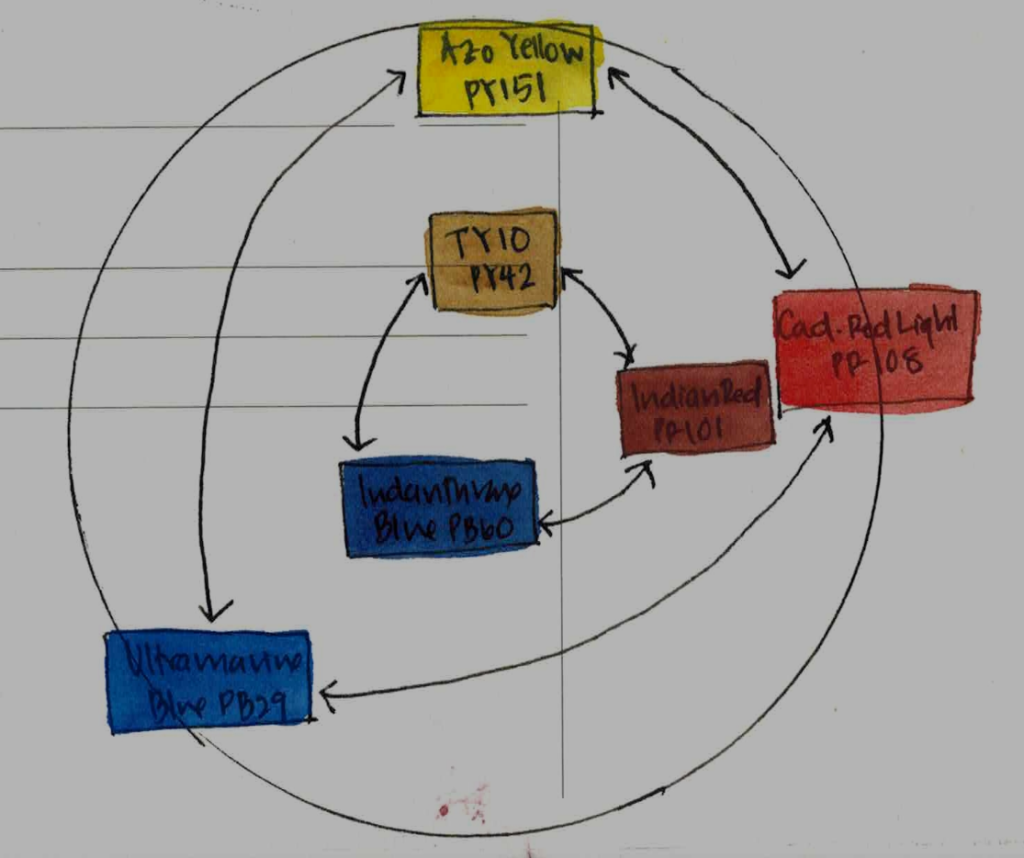
Following that logic, triads with high-chroma paints have the largest mixing range. Think of the mixing range of three paints as a triangle – the higher the chroma of the paints in the triad, the larger the triangle. A triad of Azo Yellow (PY151), Cadmium Red Light (PR108), and Ultramarine Blue (PB29) will have a much larger mixing range than Transparent Yellow Iron Oxide (PY42), Indian Red (PR101), and Indanthrone Blue (PB60).
Every Limited Palette Has Gaps
Every palette has gaps where the mixing range is limited. This is especially true for limited palettes because they have fewer paints are each paint contributes heavily to the mixing range. You as the artist have to decide where you are okay with a gap, based on your own art practice. For example, you may have a gap between Ultramarine Blue (PB29) and Quinacridone Rose (PV19) where you can only mix a muted purple. This may be just fine for your art practice. But also, if you add Dioxazine Violet (PV23) to your palette, then you may not miss the ability to mix a high-chroma violet.
Every Color Has a Complement
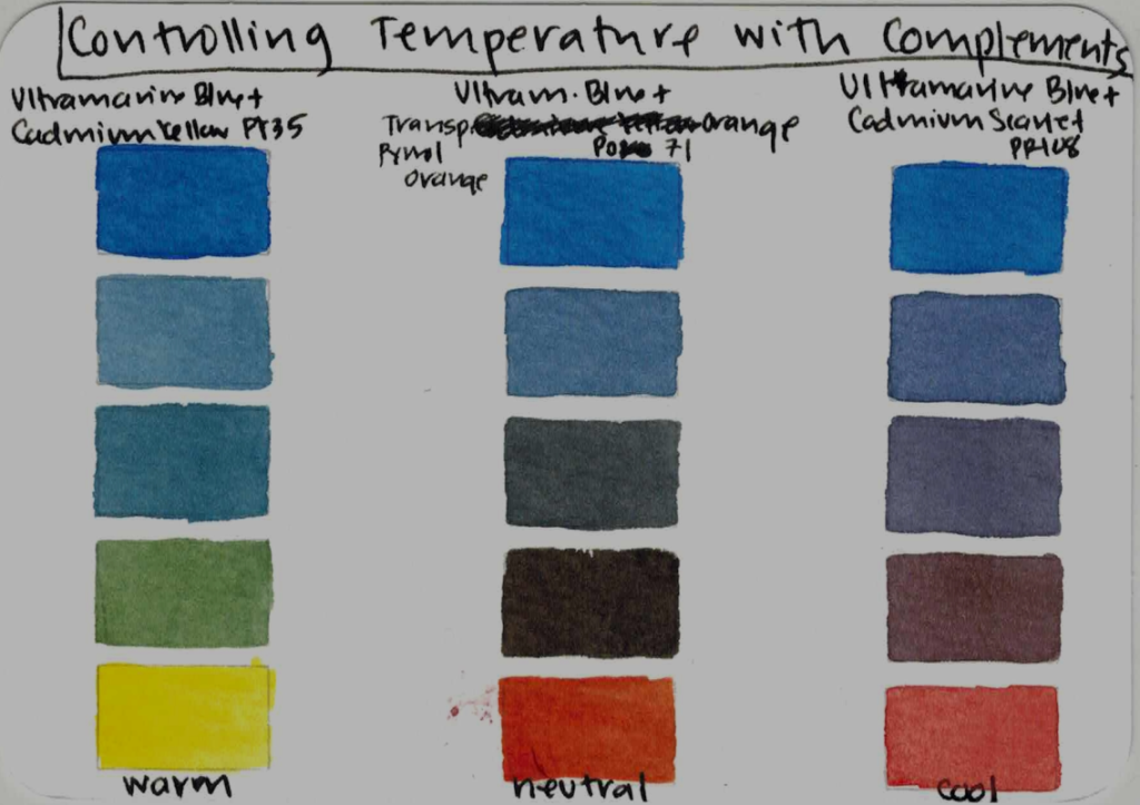
Complements aren’t just theoretical concepts in color theory and color wheels, but rather extremely useful tools for mixing. Complements are how you control chroma and value in your paintings. Good complements allow you to neutralize a paint and shift the temperature reliably. So, I recommend that every paint in your palette have a direct complement. This will also help to ensure that your paints stay evenly spaced across the color wheel.
BUILDING A PALETTE LIKE A WATERCOLOR SCIENTIST
Now that we’ve established some basic color mixing principles, let’s review my recommendations for building your custom mixing palette.
Start with High-Chroma Paints
We established that when you start with high-chroma paints, your mixing range is automatically larger – so when building a limited palette, starting out with high-chroma paints is essential. Keep in mind that there will be some points on the color wheel where you will sacrifice chroma because you may have few lightfast options. I am thinking especially in the green and purple range. Just do the best you can!
Compare mixing Phthalo Green YS (PG36) with Quinacridone Magenta (PR122) versus Perylene Green (PBk31) with Perylene Violet (PV29). PG36 and PV19 give me access to moody greens, inky neutrals, deep purples, and crimson. PBk31 and PV29 are already doing the “neutralizing” for me, which can be useful but is far less flexible. And that’s what high-chroma paints give you: flexibility. They let you decide when a color becomes subtle, rather than locking you into dull mixtures from the start.
Space Your Paints Evenly Along the Color Wheel
This is an important principle in my system for building your custom palette. If you cluster your high-chroma paints too closely together, you will create gaps – areas of the color wheel where you simply cannot reach saturated mixtures. By spacing high-chroma pigments evenly around the wheel, you minimize those gaps and maximize mixing potential.
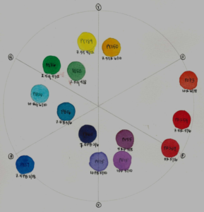
If I choose a palette with no paints between Winsor Yellow (PY175) and Quinacridone Magenta (PR122) – a lovely palette, nothing wrong with it at all – but it does leave me without a high-chroma orange, which gives me less flexibility when painting bright florals, and when mixing luscious dark browns. A natural addition would be a high-chroma orange pigment like PO73, PO71, or PO20. Another example is choosing a palette with a gap between Phthalo Green YS (PG36) and Ultramarine Blue (PB29) – this is a lovely and moody palette, but adding Cobalt Teal would be a welcome high-chroma addition.
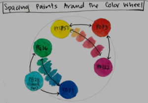
I recommend starting with your favorite pigments, the ones you can’t paint without, then look at the mixing gaps they naturally create, and choose high chroma pigments to fill in those zones.
Every Paint Should Have a Direct Complement
We’ve established that complements are useful for controlling chroma in your paintings. Here, Ultramarine Blue (PB29) and Transparent Pyrrol Orange (PO71) make lovely neutral greys. But here’s the really cool part: knowing the complement means that you can mix your paint with its neighbors, in this case cadmium yellow and cadmium scarlet, to mix warm and cool neutrals. This is so cool, and one of my favorite parts of my palette system!
Paint Characteristics Vary by Brand
Two brands can buy the pigment from the same seller, but each brand will process the pigments differently. The size of the pigment particles affect the hue, opacity, and degree of granulation. Differences in binder affect flow, staining ability, and tinting strength.
Because of all this – rather than going out and buying the exact paints I chose, I encourage you to go through your own stash and get to know your paints! I bet you already have a paint that fits this system, and can allow you to have fun, learn, and make beautiful paintings.
SWATCHING MY CUSTOM MIXING PALETTE
Let’s swatch the fourteen paints that made it into my custom mixing palette and examine how each pigment behaves on paper.
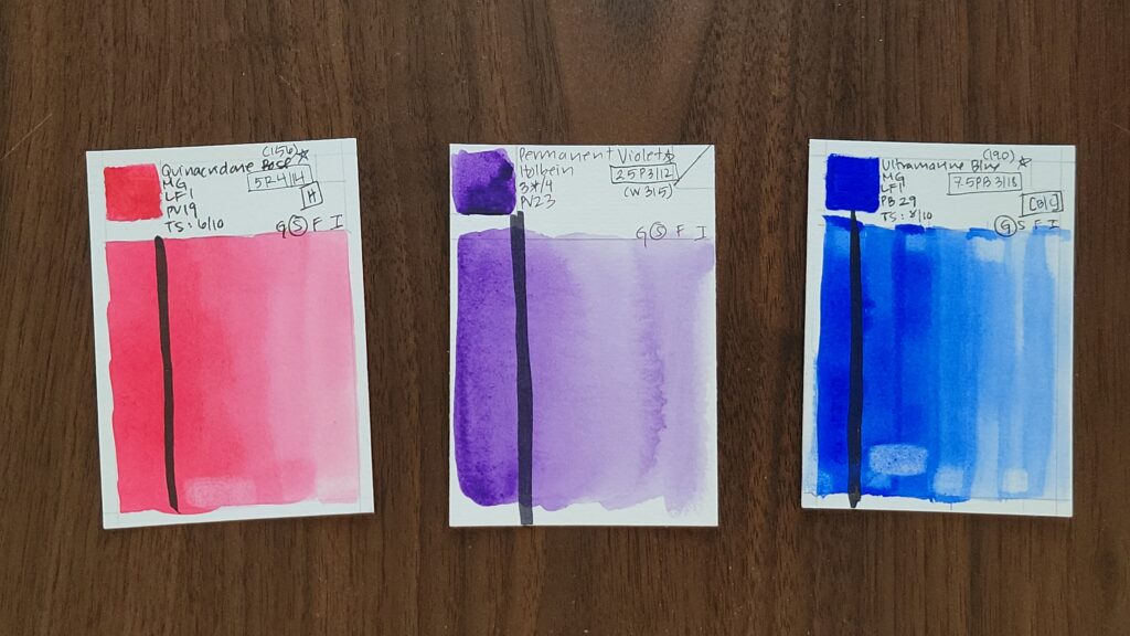
Bismuth Yellow (PY184)
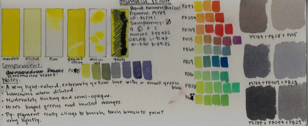
Bismuth Yellow is a very light-valued, extremely yellow paint with a small green bias. It’s semi-opaque, semi-staining, and has moderate tinting strength. It’s luminous when diluted, and behaves similarly to Cadmium Yellow Lemon, but is less toxic to the environment. Its complement is Ultramarine Violet (PV15).
It’s a cool yellow, and it mixes bright greens and muted oranges. It also makes lovely teals with Ultramarine Blue, and cool browns with Ultramarine Pink. You can see that it makes lovely warm pastel hues with Cobalt Teal and Ultramarine Pink, and cool neutrals with Pyrrol Red and Ultramarine Blue.
Nickel Azo Yellow (PY150)
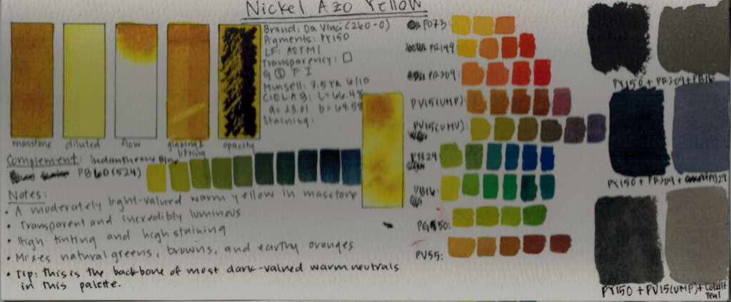
This is my favorite pigment, not just in this palette but in general. It’s a moderately light valued warm yellow in masstone, turning into a cool yellow when diluted. It’s high-tinting, highly staining, and transparent. Its complement is Indanthrone Blue (PB60) – a closer complement is Dioxazine Violet PV23, but sadly it is not lightfast.
This is a warm yellow, and it mixes natural greens, oranges, and is the backbone for mixing browns. It mixes lovely cool neutrals with Quinacridone Red and Ultramarine Blue, and dark warm neutrals with Quinacridone Red and Phthalo Turquoise.
Pyrrol Orange (PO73)
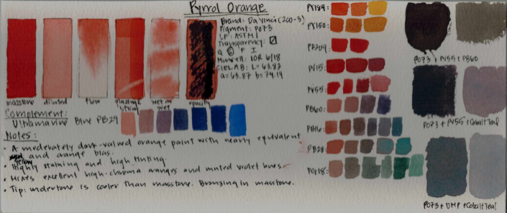
This was a later edition to my palette – I initially chose PO62, but chose PO73 for its greater mixing potential. It’s a moderately dark-valued orange with an equivalent yellow and red bias. It’s semi-transparent, high-tinting, and highly staining. Its complement is Ultramarine Blue (PB29).
It mixes muted violets and mutes greens to make earthy landscape greens. It mixes charcoal black with Quinacridone Purple and Indanthrone Blue, and gorgeous pastel greys with Ultramarine Pink and Cobalt Teal.
Pyrrol Red (PR254)
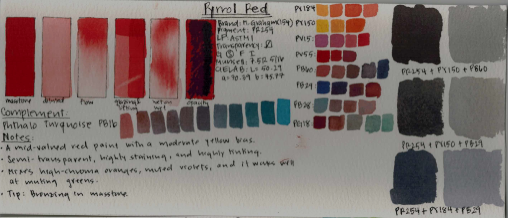
This was a late addition – I stuck to Cadmium Red for the longest time, but in the end favored Pyrrol Red for its higher tinting strength and saturation. It is a mid-valued red paint with a moderate yellow bias. Its semi-transparent, highly staining, and high-tinting. Its complement is Phthalo Turquoise (PB16).
It’s a warm red, and it mixes vibrant oranges, muted violets, and mutes greens to make shadowy green hues. It excels at making warm charcoal neutrals with PY150 and PB60, and cool light-valued greys with PY184 and PB29.
Quinacridone Red (PR209)
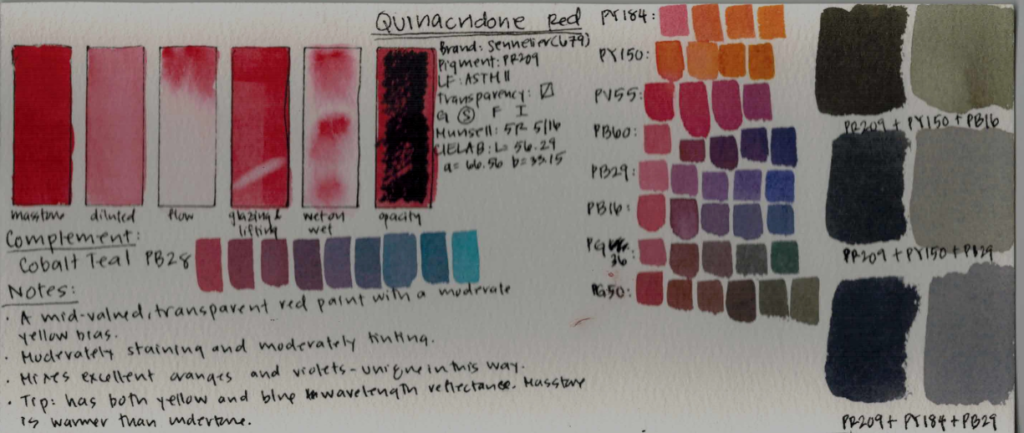
This is a mid-valued, transparent red paint with a moderate yellow bias. It is transparent, moderately staining, and has moderate tinting strength. Its complement is Cobalt Teal (PB28).
Coloristically, this is a warm red, but but don’t be fooled – it has both yellow and blue wavelength reflectance, and so it excels at making oranges and violets. Its masstone is warmer than its lovely coral pink undertone. It mixes warm neutrals with PY150 and PB16, and cool neutrals with PY184 and PB29.
Quinacridone Purple (PV55)
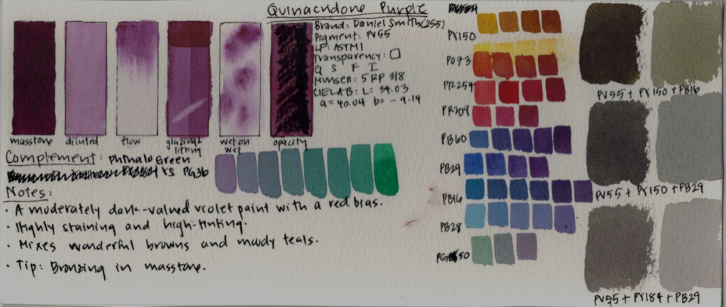
This was a late addition as well, but I found I had to add a violet because violets are just so useful for mixing. This is a transparent, moderately dark-valued violet paint with a red bias. It’s high-staining and highly tinting. Its complement is Phthalo Green YS (PG36).
This is a warm violet, and it mixes wonderful cool browns and moody teals. It makes warm neutrals with PY150 and PB16, and cool neutrals with PY150 and PB29.
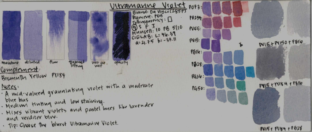
Ultramarine Pink (PV15)
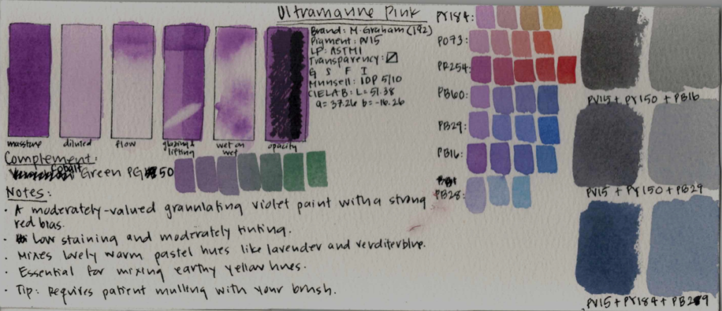
Finding a granulating cool red is really hard! I’m glad I found this wonderful choice. This is a semi-transparent, moderately-valued, nonstaining violet paint with a red bias. Its complement is Cobalt Green (PG50).
This is a warm violet that is essential in mixing earth tones and pastel hues. It mixes warm neutrals with PY150 and PB16, and cool neutrals with PY184 and PB29.
Ultramarine Violet (PV15)
This was another late addition, not because I don’t love it, but because I was stubbornly aiming for only 12 paints – but this paint was too useful to leave out. It is a semi-opaque, mid-valued, granulating violet with a small blue bias. It is medium tinting, nonstaining, and its complement is Bismuth Yellow (PY184).
This is a cool violet, and it mixes a variety of wonderful violets and pastel blues with Cobalt Teal. It makes warm neutrals with PY184 and Cobalt Teal, and cool neutrals with PG50 and PO73.
Indanthrone Blue (PB60)
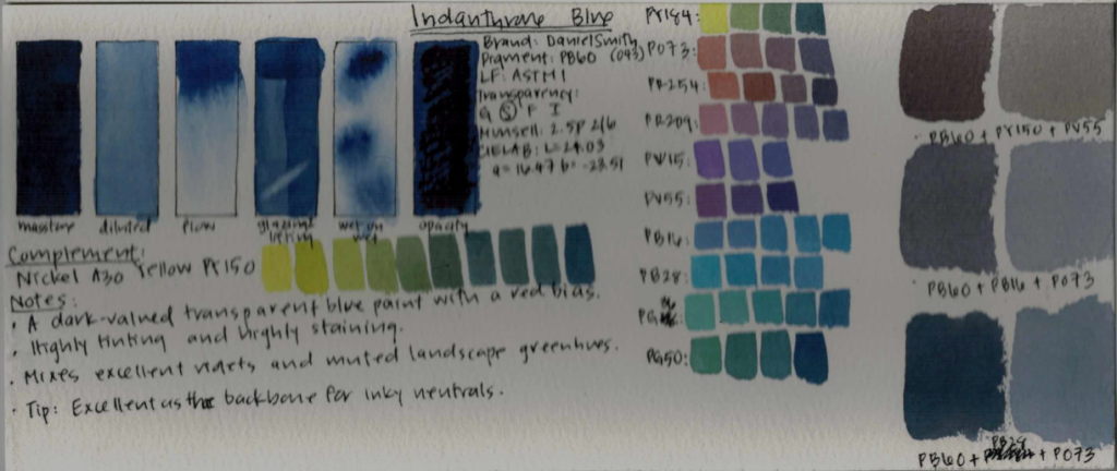
This is the most dark-valued paint in the palette, which makes it less flexible, but I decided it was worth it for the mixing potential. It is a transparent blue paint with a red bias. It’s high-staining and high-tinting. Its complement is Nickel Azo Yellow (PY150).
As a warm blue, it mixes excellent violets and muted landscape green hues. It’s an excellent backbone for inky neutrals, and in triads it tends to make cool neutrals.
Ultramarine Blue (PB29)
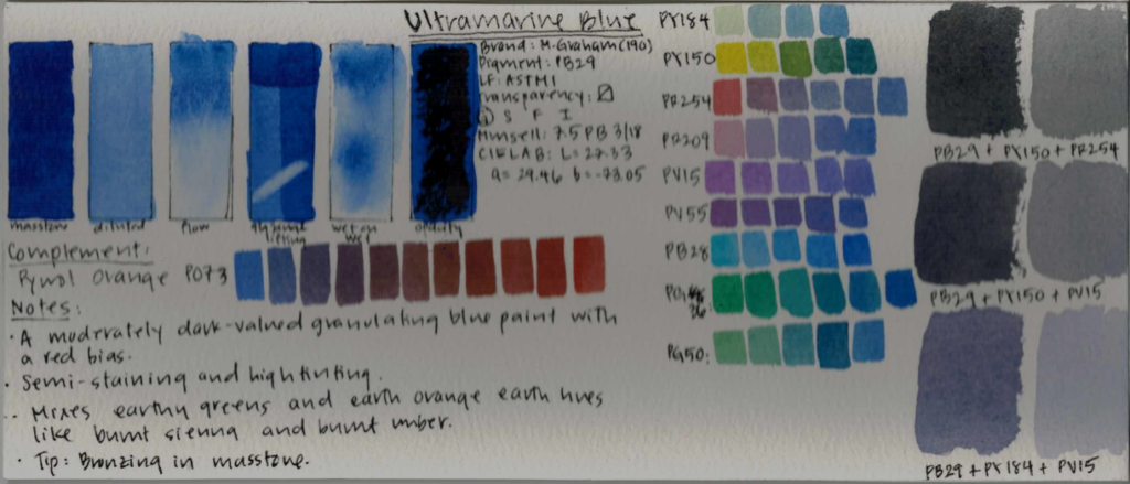
This paint is probably in everyone’s palette! I opted for Cobalt Blue initially, but a warm blue must be chosen carefully because it contributes to basically every earth hue. I chose Ultramarine Blue in the end because of its higher tinting strength, and also because it’s more environmentally friendly. It is a moderately dark-valued granulating blue paint with a red bias. It’s semi-staining and high-tinting, and its complement is Pyrrol Orange (PO73).
It mixes earthy greens, vibrant violets, and is essential for making orange earth hues like burnt sienna and burnt umber. In triads it makes cool neutrals with gentle texture.
Phthalo Turquoise (PB16)
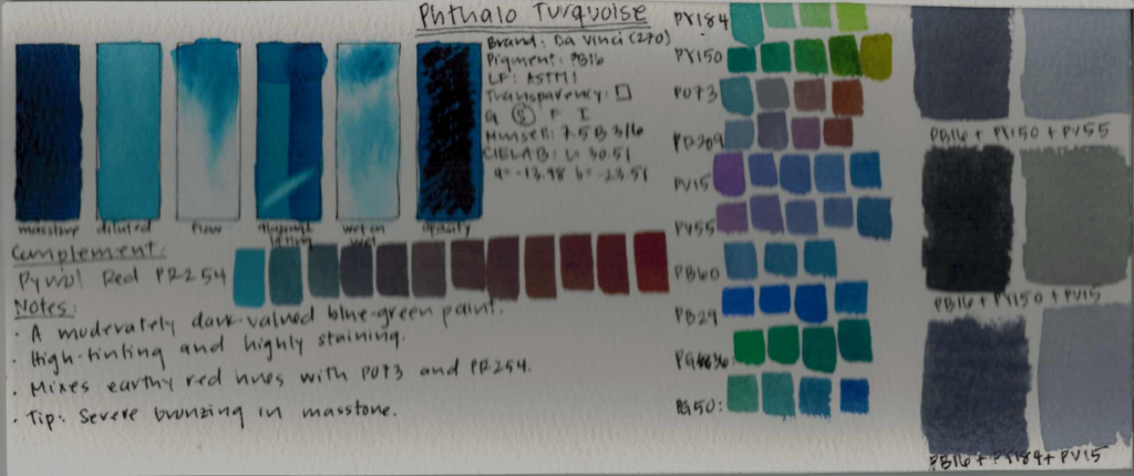
This is a moderately dark-valued blue-green paint with an equal blue and green bias. It’s high-tinting and highly staining and wonderfully transparent. Its complement is Pyrrol Red (PR254).
A turquoise paint in a palette is more useful than a Phthalo Blue because you can easily mix this with PB16 and PB60, and deep red-violet earthy hues and vibrant greens are easier to achieve with PB16. It mixes warm neutrals with PY150 and PV15, and cool neutrals with PY150 and PV55.
Cobalt Teal (PB28)
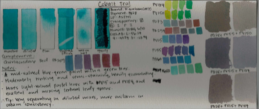
In my opinion, this is an essential paint in a palette, not just because its impossible to mix, but also because it lends itself to gorgeous texture in landscapes. It’s a mid-valued blue-green paint with a small green bias. It’s moderately tinting and semi-staining, and granulates heavily. Its complement is Quinacridone Red (PR209).
It mixes wonderful light-valued pastel hues with PV15 and PY184, and excels at mixing textured leafy greens. It makes lovely warm neutrals with PV55 and PY150.
Phthalo Green Yellow Shade (PG36)
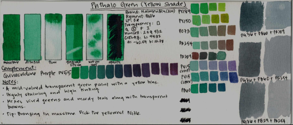
This one is a mid-valued transparent green paint with a yellow bias. It’s highly staining and high tinting. Its complement is Quinacridone Purple – just look at the magic they make together.
It mixes vivid greens and moody teals along with transparent cool browns. I recommend picking the yellowest PG36 for the greatest mixing flexibility, and this one was the yellowest one in my stash. It makes cool neutrals with PB60 and PR254.
Cobalt Green (PG50)
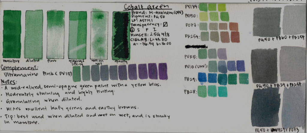
Single-pigment greens are not essential in most palettes, and this cobalt pigment can easily be nixed to make this palette more environmentally friendly. However, I do find it very useful for efficient mixing, which is very convenient when you live in a semi-arid desert climate like I do. This is a mid-valued, semi-opaque green paint with a strong yellow bias. It is moderately staining, high-tinting, and quite granulating. Its complement is Ultramarine Pink – I love the dusty greys they make together.
It mixes excellent leafy greens and earthy browns, and the neutrals it makes are interestingly textured. This paint is best used diluted – the granulation is more pronounced, and it avoids issues with streaking in masstone.
This wraps up today’s Part 1 – do join me in Part 2 in a few days, when I field test this palette by challenging myself to mix popular paints like Quinacridone Gold, Undersea Green, and Indigo, and making a few paintings to really test the limits of my system.
Thank you for joining me at Watercolor Scientist, and don’t forget to let me know what paints are must haves in your palette!