
Hi everyone, and welcome to Watercolor News Report — your monthly roundup of what’s new in watercolor, from paint releases and pigment changes to research, exhibitions, and the art market.
This week, we’re looking at brand updates from Daniel Smith, Schmincke, White Nights, Da Vinci, Holbein, and more, plus new discussions around lightfastness testing, major watercolor sales at auction, and exhibitions you won’t want to miss.
Let’s get into it.
Paint Brand Updates, New Paints, and Discontinuations
Daniel Smith Leans Into Landscape Trends
This year, Daniel Smith — one of the most widely discussed brands among watercolorists — is celebrating its 50th anniversary of bringing artists their wildly popular paints.

They officially introduced six new extra-fine watercolor paints, including three single-pigment paints, to their 2025 lineup.
- Jaune Brilliant No. 1 & No. 2: No. 1 is made of PY65/PW6, and No. 2 is made of PO62/PW6.
- Coral Reef: This is made from PO73/PW6, and is another warm pastel hue.
- Earthy Light Red: Made from PR290, an unusual warm, terracotta-leaning red with really nice granulation that is also available as Ginger Red in the Roman Szmal Aquarius range.
- Manganese Violet: Made from PV14, this is a strongly granulating violet.
- Cobalt Green Deep: Made from PG26.
These additions aren’t just “new pretty colors” — they strategically fill gaps in the latest trends of expanding soft neutrals and granulating colors, rather than high-chroma brights. It seems to me that Daniel Smith is responding to landscape and naturalistic painting trends.

Daniel Smith also launched eight Triad Tube sets that seem to me to be geared toward plein air and landscape painting. These eight curated triads are designed around moods, seasons, and subjects. Each trio combines three harmonized pigments: from the bright Spring to the dramatic Stormbreaker and the iciness of Winter. I haven’t checked these out myself — most of them use multi-pigment paints, and I don’t really use them much — but if I had to pick a favorite, I’d pick Summer for the ease of mixing with a solid primary triad, and for the excellent lightfastness of all three paints.
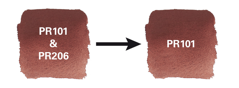
Schmincke Change Their Indian Red, Discontinues PG19
In other news, Schmincke added a single-pigment Indian Red to their watercolor range. Indian Red was made with PR101 and PR206, but since PR206 is being discontinued across multiple brands, I suppose they got ahead of the game. I haven’t had a chance to try this paint, but any Indian Red is okay in my book.
Schmincke Horadam is also discontinuing their Cobalt Green Pale PG19 and replacing this pigment with Cobalt Green PG50.
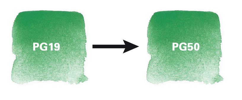
PG50 is said to offer better long-term stability and reliability compared to PG19, which is expensive, quite low tinting, and hard to re-wet. Of note, I think the swatch that Schmincke has on their website is incorrect, and both of those look like PG50 to me. PG19 looks a lot more similar to this usually.
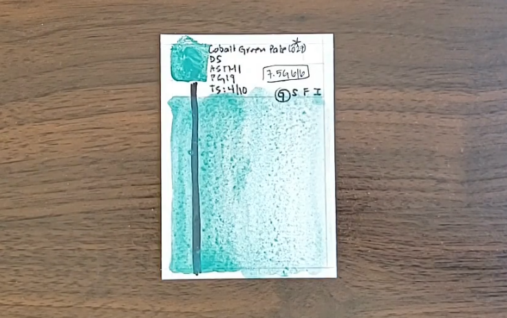
I like this change, as Cobalt Green is a favorite pigment of mine, and although PG19 is lovely, it is low tinting and the way it is often formulated makes it really gummy. Of note, they are making the same change in their gouache, oils, acrylics, and pastels as well. I did think it was interesting that they mentioned that price point for artists was a consideration, since Cobalt Green is still a Series 4 paint even after the change.
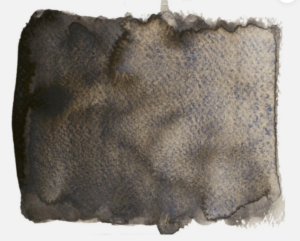
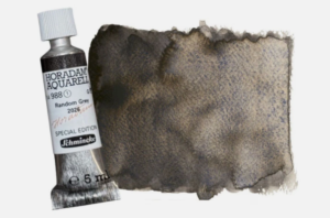
Schmincke releases a Random Grey paint each year, and 2026 was no exception. This paint is created from excess pigments, which means the shade may vary slightly with each edition. Specifics about the pigments used in Random Grey are still not fully disclosed, but the color is part of a series aimed at sustainability, utilizing excess pigments so they don’t go to waste. I have not seen it listed in Jackson’s or Blick yet, and it’s not even on Schmincke’s website yet.
White Nights Releases 24 New Standard and Granulating Paints
White Nights — known for its rich, highly pigmented professional watercolors made by Nevskaya Palitra — has expanded its palette with 12 fresh granulating shades that add texture and visual interest in paintings, along with 12 new palette staples like Pyrrole Red PR254, Isoindoline Yellow PY110, and Helio Blue PB16. Instead of pushing novelty colors for novelty’s sake, White Nights’ additions seem to aim for reliable, lightfast palette staples that can function as core colors in an artist’s kit. That’s especially important for watercolorists who want work to last without fading, which is a growing concern for modern artists.
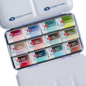
We did a deep dive into these new standard paints in a recent video, and I’m bringing you a complete review of the Metamorphoses range in a couple of weeks, so visit my channel and subscribe to stay notified.
Roman Szmal Aquarius: New Paint December 2025 PG50/PBr11 Announced
Roman Szmal Aquarius watercolors’ immense popularity continues with the release of their Mini Urban Sketching Set in mid-2025. They debuted Burnt Sienna Brownish in this eight-pan set. I have an in-depth review of this adorable set on my channel, definitely check it out.
Roman Szmal Aquarius also usually do a month-themed watercolor paint at the end of the year. This year, December 2025 is PG50/PBr11. It’s an earthy green pigment that separates remarkably well into its green and brown components. It’s not yet available in Jackson’s US, so we’ll have to wait to get it.
Da Vinci: Improved Earth Friendliness and New Harvest Set
Da Vinci updated two paints — Denise’s Green and Denise’s Turquoise — to be more earth-friendly and to remove nickel and cobalt from the Earth-Friendly Palette curated by Denise Soden from In Liquid Color. Denise’s Green looks very similar and quite beautiful. I love Cobalt Turquoise PB36, and the new one uses PW6, and I don’t usually use paints containing white pigments, so I will pass on this one. However, I really applaud their effort to bring awareness to being kind to our beloved planet.
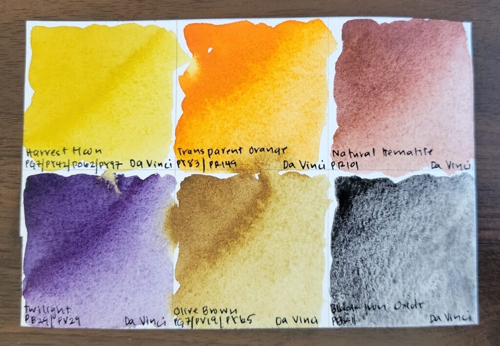
Da Vinci also released the Harvest Set, with six new autumnal paints:
- Harvest Moon (PG7/PY42/PO62/PY97)
- Transparent Orange (PY83/PR149)
- Natural Hematite (PR101)
- Twilight (PB29/PV29)
- Olive Brown (PV19/PG7/PY65)
- Black Iron Oxide (PBk11)
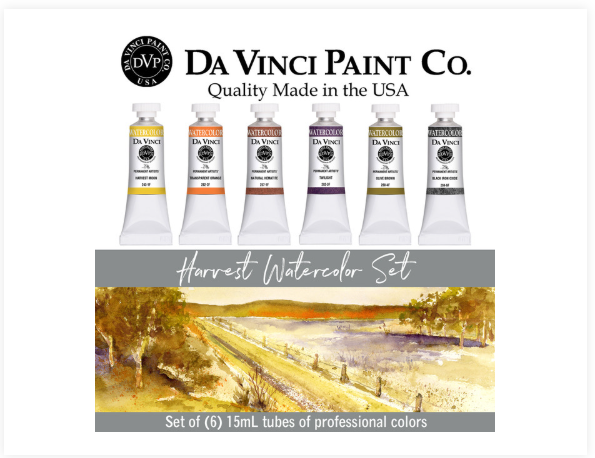
I bought this set, especially excited about Natural Hematite and Black Iron Oxide. Their initial batch was extremely gummy and unusable, with hardly any pigment. This company is well known for its excellent commitment to quality and customer service, and they immediately sent out a replacement tube with a thoughtful postcard apology to everyone who purchased it automatically. The new batch, although not as highly pigmented as the ones by MaimeriBlu and Roman Szmal Aquarius, was very usable and quite lovely.
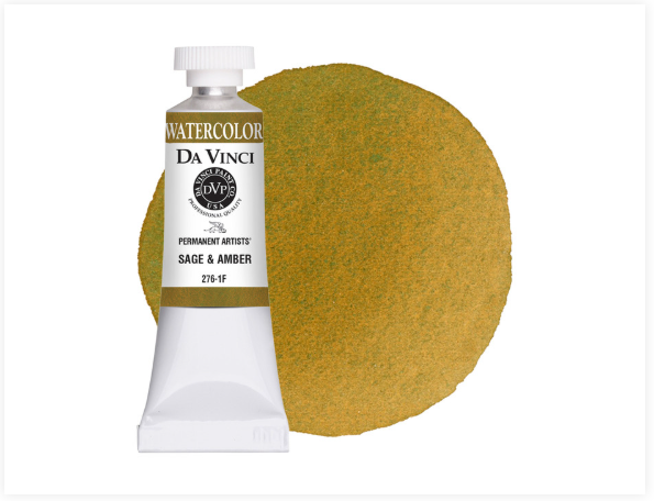
Lastly, Da Vinci introduced another new paint — Sage & Amber, a granulating and separating multi-pigment paint made of PB36/PG7/PO62/PW6. I haven’t purchased it, as I am not sure how it would fit into my paint practice, but it looks extremely lovely and would fit in well into landscape and urban sketching palettes.
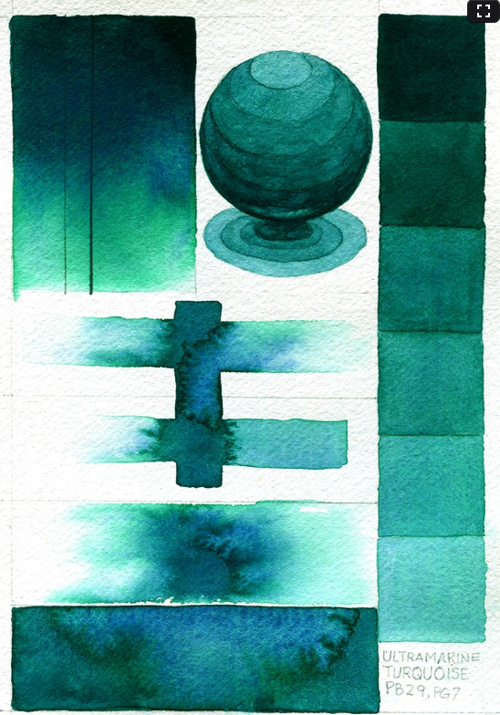
QoR Ultramarine Turquoise Hits the Scene
Golden QoR watercolor introduced one new paint to their open stock selection in 2025 — Ultramarine Turquoise made from PB29/PG7. It also comes as part of Ali Cavanaugh’s Portrait Colors set, which I have and really love and recommend. Ultramarine Turquoise is greener and more dark-valued than their Phthalo Turquoise, made from PG7/PB15:3. I’ve found this paint to be both beautiful and quite a good mixing color.
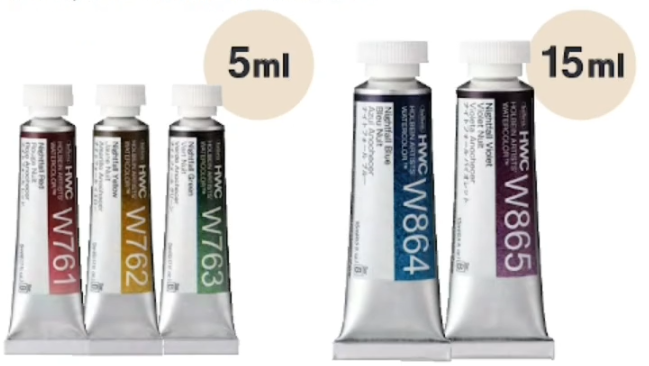
New Release: Holbein Nightfall Colors
Holbein has just released five new Nightfall colors, expanding their watercolor line with dusky moody hues. These paints lean into deep value ranges that I think would be very appealing for painters exploring nighttime landscape paintings. The set includes:
- Nightfall Yellow (PY110/PBk11)
- Nightfall Red (PR264/PBk11)
- Nightfall Violet (PV19/PBk11)
- Nightfall Blue (PB15/PBk11)
- Nightfall Green (PY154/PG7/PBk11)
M. Graham Finally Adds Indigo and Quinacridone Magenta
M. Graham recently expanded their watercolor line with two new additions: Indigo and Quinacridone Magenta. Indigo offers a deep, classic blue ideal for shadows and atmospheric passages, while Quinacridone Magenta brings a vivid, high-chroma pink-violet. Both paints feature M. Graham’s signature honey-based formulation, known for high pigment load, smooth flow, and excellent rewetting. I’ve already done a deep-dive video on both of these paints, analyzing their hue, mixing behavior, and how they function in a real working palette — check that out on the channel if you want to see how they perform on paper.
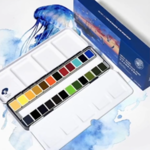
Paul Rubens Hits the Beach
Paul Rubens continues to be popular among watercolor artists for their professional and student-grade watercolor sets made with high-quality pigments at an affordable price. The latest for them is their Ocean Landscape Set, which includes 24 half pans in a metal palette. These are the details for the paints found in the set. Ten of the 24 paints are blue or turquoise paints, and so it certainly makes for a proper ocean palette. I have their 36-tube set, along with their Floral Set that I absolutely love, and I realized that this set doesn’t include any paints that I don’t already have. However, if you haven’t tried this brand, this is a good introductory set, since it features some of their best colors like Cobalt Blue Light and Payne’s Grey Bluish, and bypasses some of the earth tones that are less popular in their range.
Pigment Science and Research in the Art Community
Lightfastness Discussion Continue
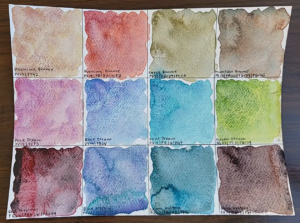
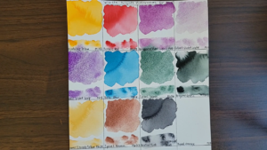
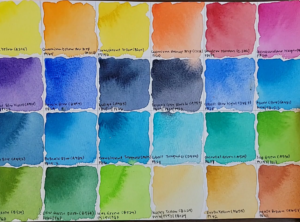
Several artist analysts and testers have noted ongoing community interest in real-world lightfast behavior — not just manufacturer labels. A long-term sunlight exposure test across 220+ paints is now available as a reference when comparing pigment durability. In a deep dive into pigment permanence, artist and educator Miwa Gardner spent seven months exposing 250+ watercolor swatches from more than ten brands to direct sunlight to see which colors truly withstood light exposure (and which faded surprisingly fast!) and published it on their blog last summer.
What makes this test stand out is its real-world approach: instead of relying on manufacturer ratings, this artist taped swatches to a sunny window and documented visible changes over time. The results were eye-opening. Some well-loved pigments held up beautifully — even from major brands — while others labeled “excellent lightfast” faded noticeably under the sun’s rays. Key takeaways from their findings include.
- Not all lightfast claims tell the whole story. Some paints marketed as highly permanent didn’t perform as expected in direct sunlight.
- UV protective sprays didn’t stop fading in this test — meaning surface protection isn’t a cure-all.
- Fugitive colors still have a place! Beautiful but unstable paints (like certain opera pinks and neons) can still be perfect for sketchbooks or works you plan to digitize, just not for archival pieces you plan to display.
Watercolor Science in the Community
Jane Blundell Spotlights Michael Harding Watercolors
Watercolour fans will be excited to know that Jane Blundell shared her first hands-on look at Michael Harding’s watercolour range — a collection with 135 colours including 92 single-pigment paints. These paints are loved for their rich colour intensity, lovely rewetting properties. Their range of green paints is especially striking. I really love Michael Harding paints, and really appreciate Jane Blundell’s commitment to cataloguing this range of paints along with many others for the past years.
Watercolor Misfit’s Palette Picks and Budget Options
On Watercolor Misfit’s blog, they break down their favorite limited watercolor palette — a curated set of core colors that mix beautifully and keep color decisions simple and intuitive. But what I really liked is that they paired these pro colors with affordable student-grade alternatives, including Winsor & Newton Cotman and Kuretake Gansai Tambi, so beginners and budget-minded painters can build a functional palette without sacrificing quality or their wallet. I appreciate that this roundup makes finding the right paints feel exciting instead of overwhelming.
Lines and Colors Features Andrew Wyeth
Today’s Eye Candy feature from Lines and Colors’ blog highlights a drybrush watercolor study by Andrew Wyeth. The loose, textured work — titled Noah’s Ark Study and drawn from the Wyeth Foundation’s collection — showcases the artist’s remarkable control of watercolor’s textural potential, even in sketchy pieces of art. It’s part of an ongoing series of exhibitions at the Brandywine River Museum that brings rarely-seen works into public view.
Quick Art Tip: Salt Texture for Watercolor
Jackson’s Art highlights the salt texture technique — sprinkling salt onto damp watercolor to create spontaneous, organic marks as the salt pulls moisture and pigment across the paper. Their experiments showcase how this is a watercolor technique popularized by modern experimental watercolor artists, and wasn’t used by older masters. You can see both sea salt vs table salt, and transparent vs granulating pigments, all influence what the resulting texture will be. It’s a fun way to enliven washes with feathery patterns an unexpected highlights.
Market Readout
Record Setting Watercolor Sale
A stunning watercolor by David Hockney — Courtyard, Palace of Carlos V. Alhambra, Granada (Second Version) — just sold for $1.39 million, making waves in the art world and reminding painters everywhere of the medium’s expressive power and market impact. The panoramic piece, painted during Hockney’s travels in Spain, showcases his masterful control of light and space and highlights how watercolor continues to command serious attention and value among collectors.
Edward Hopper Sells for Over One Million USD
A rare 1927 watercolor on paper by Edward Hopper, titled Spurwink Church was sold for over $1 million at auction. Executed en plein air during Hopper’s summers in Cape Elizabeth, the work captures his signature quiet light and architectural focus, and its sale underscores the strong market for early American watercolors.
John Singer Sargent’s Gondolier’s Siesta Attracts Attention From Collectors
At Christie’s 20th Century Evening Sale in New York, a stunning gouache and watercolor on paper by John Singer Sargent titled Gondolier’s Siesta — painted in 1903 and capturing two sleepy gondoliers and luminous water reflections — drew attention from collectors and museum-goers alike. The piece exemplifies Sargent’s mastery of light and shadow developed during his visits to Italy. It’s a beautiful reminder of how watercolor and related media continue to command serious appreciation more than a century after their creation.
Exhibits You Can’t Miss
Watercolors That Changed The Course of American Painting
Discover how Winslow Homer’s watercolors — once considered merely study media — revolutionized American art by harnessing the medium’s transparency, immediacy, and its potential to capture motion. A new exhibition at the Museum of Fine Arts in Boston reunites dozens of his works on paper, showing why these pieces helped elevate watercolor from secondary sketch tool to a force in modern art history.
St. Louis Watercolor Society Welcomes William Curtis
The St. Louis Watercolor Society has shared An Invitation from William Curtis, spotlighting acclaimed St. Louis-based artist William “Bill” Curtis and his ongoing contributions to the watercolor community. Curtis is known for his watercolors of classic cars, with decades of exhibitions and awards from regional art groups and juried shows.
Wendy Artin’s Cornucopia XXV Exhibition!
Celebrating 25 years with Gurari Collections, Rome-based watercolorist Wendy Artin presents Cornucopia XXV — a lush new suite of 50 watercolors featuring ripening fruit, delicate blossoms, and classical statuary. They are one of my favorite watercolorists – I really admire their command of the human form, and of shadow and light. The Boston show at Gurari Collections is a testament to Artin’s lifelong devotion to watercolor.
That’s this week’s Watercolor News Report. If you have the scoop on a new paint, pigment change, study, or exhibition that caught your eye, drop it in the comments — I’d love to keep this a community-driven report!
If this was helpful, consider subscribing to my YouTube channel so you don’t miss the next update every second Saturday of each month. And remember: ask weird questions, test your hypotheses, and share your results with the world.